
About:
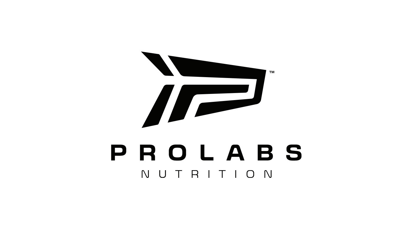
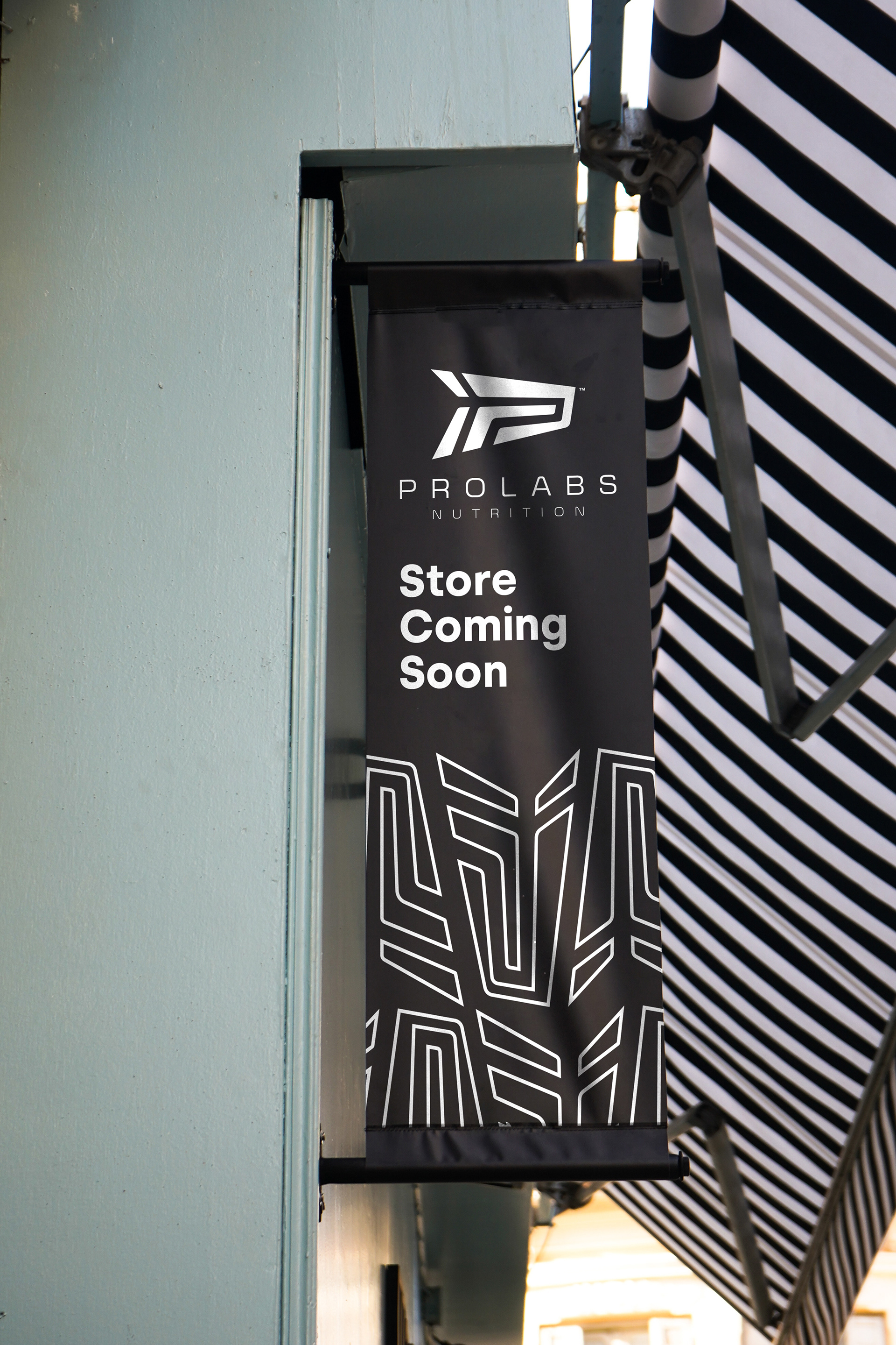
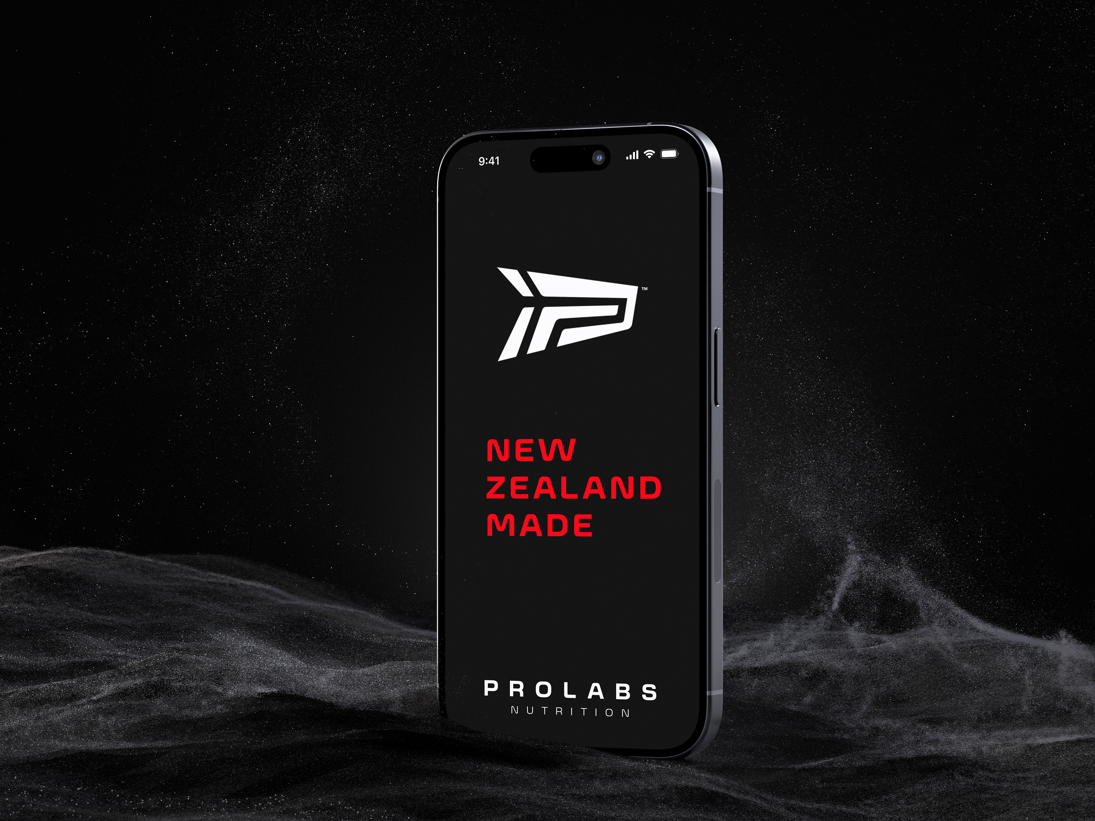
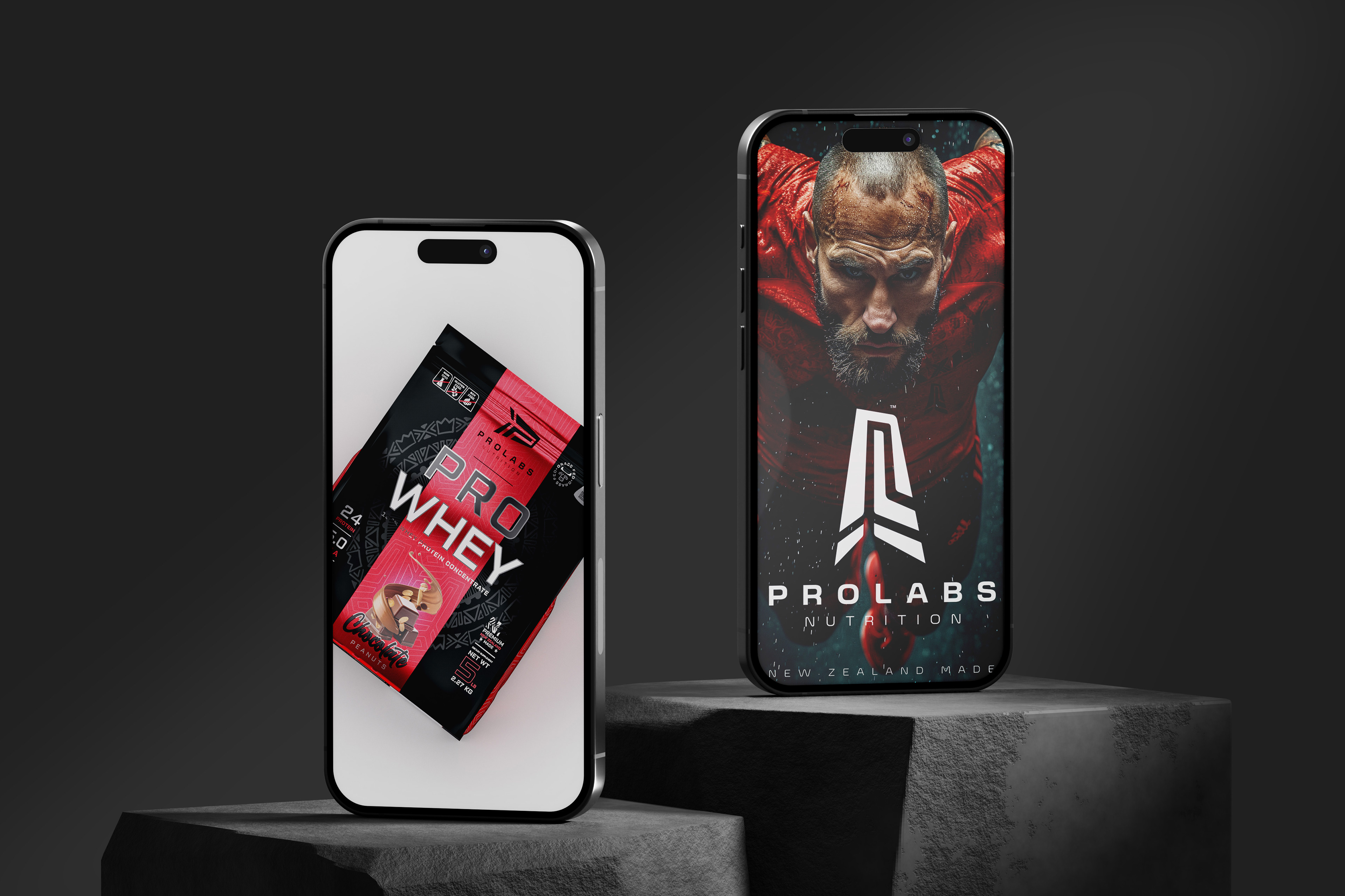
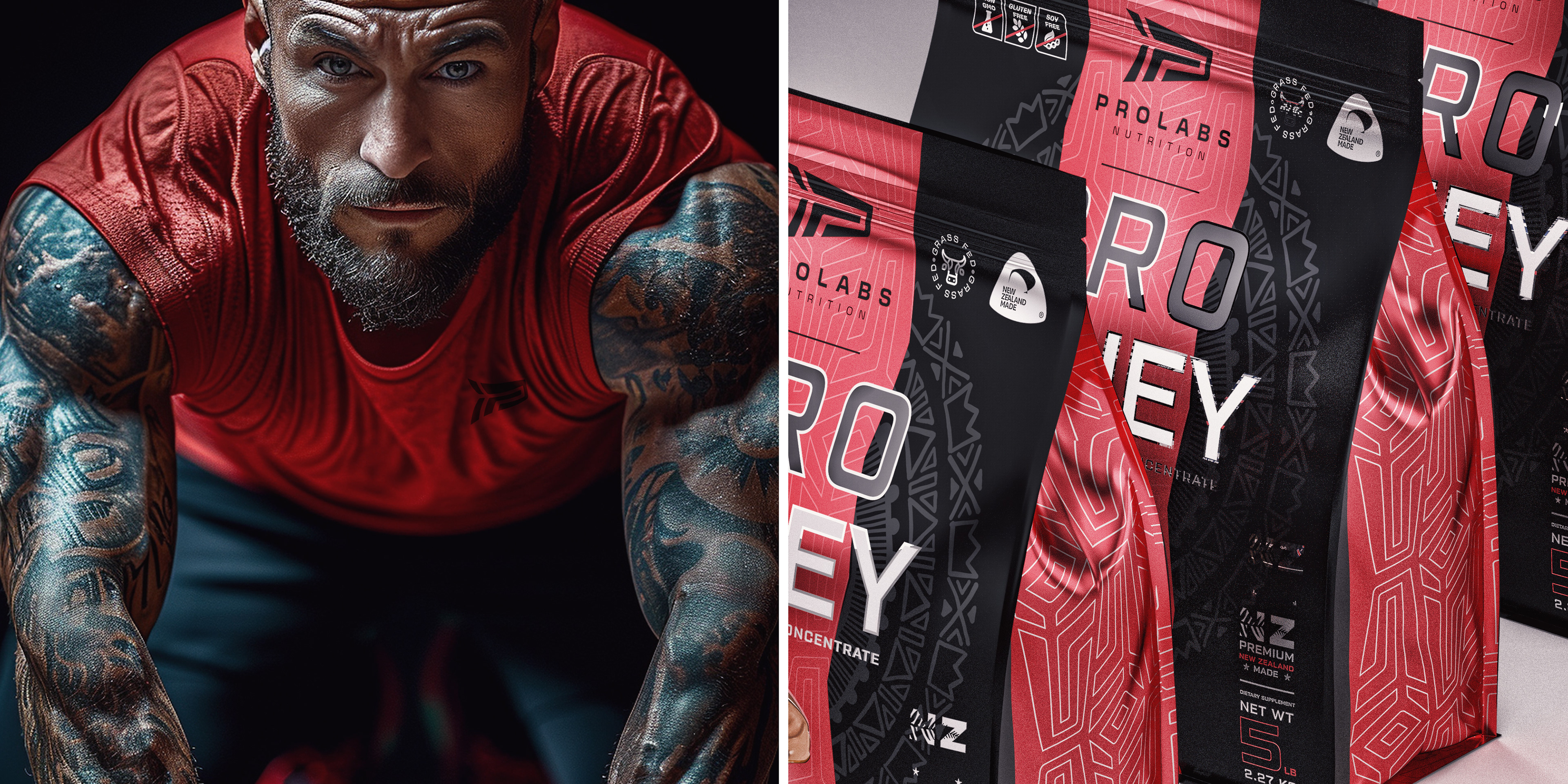
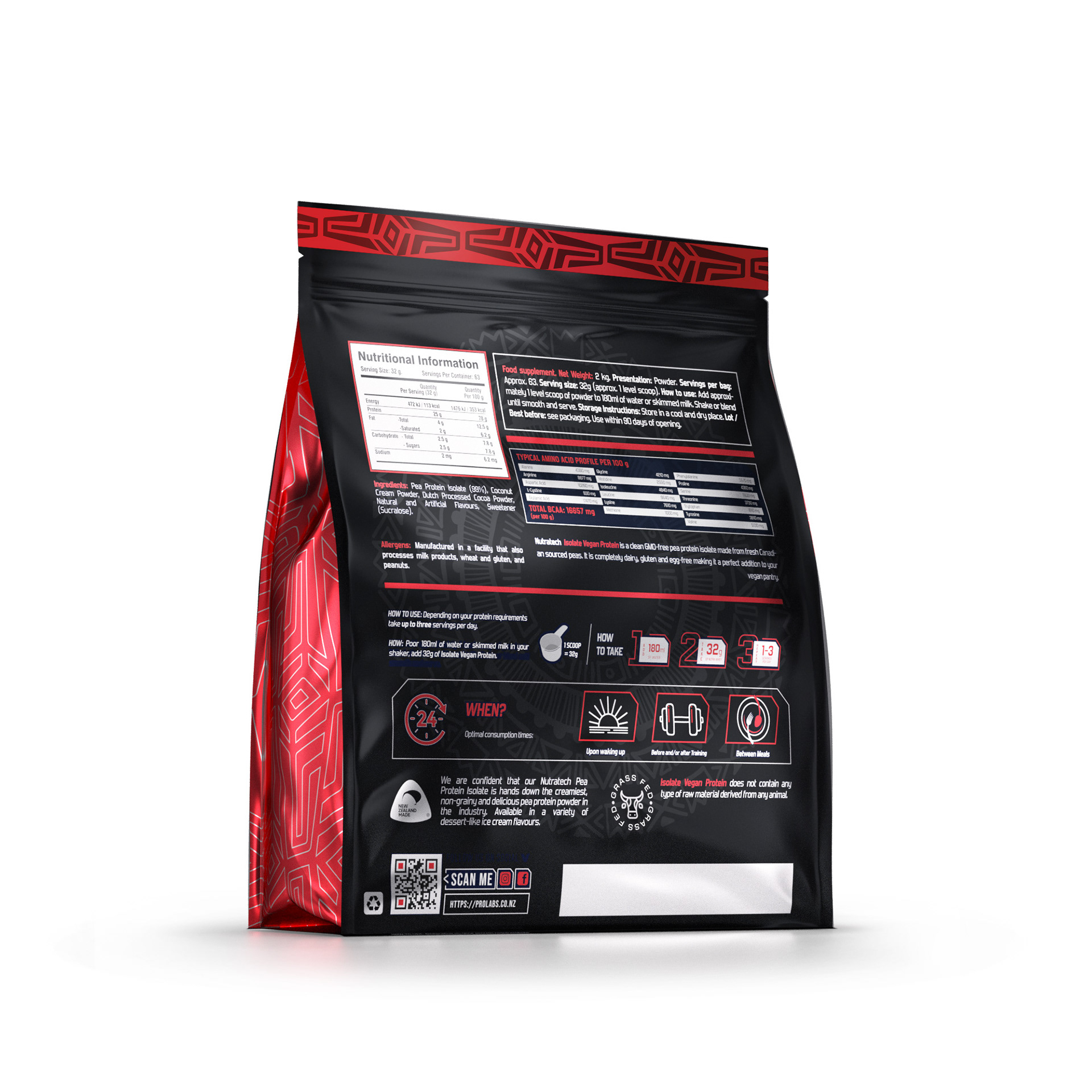
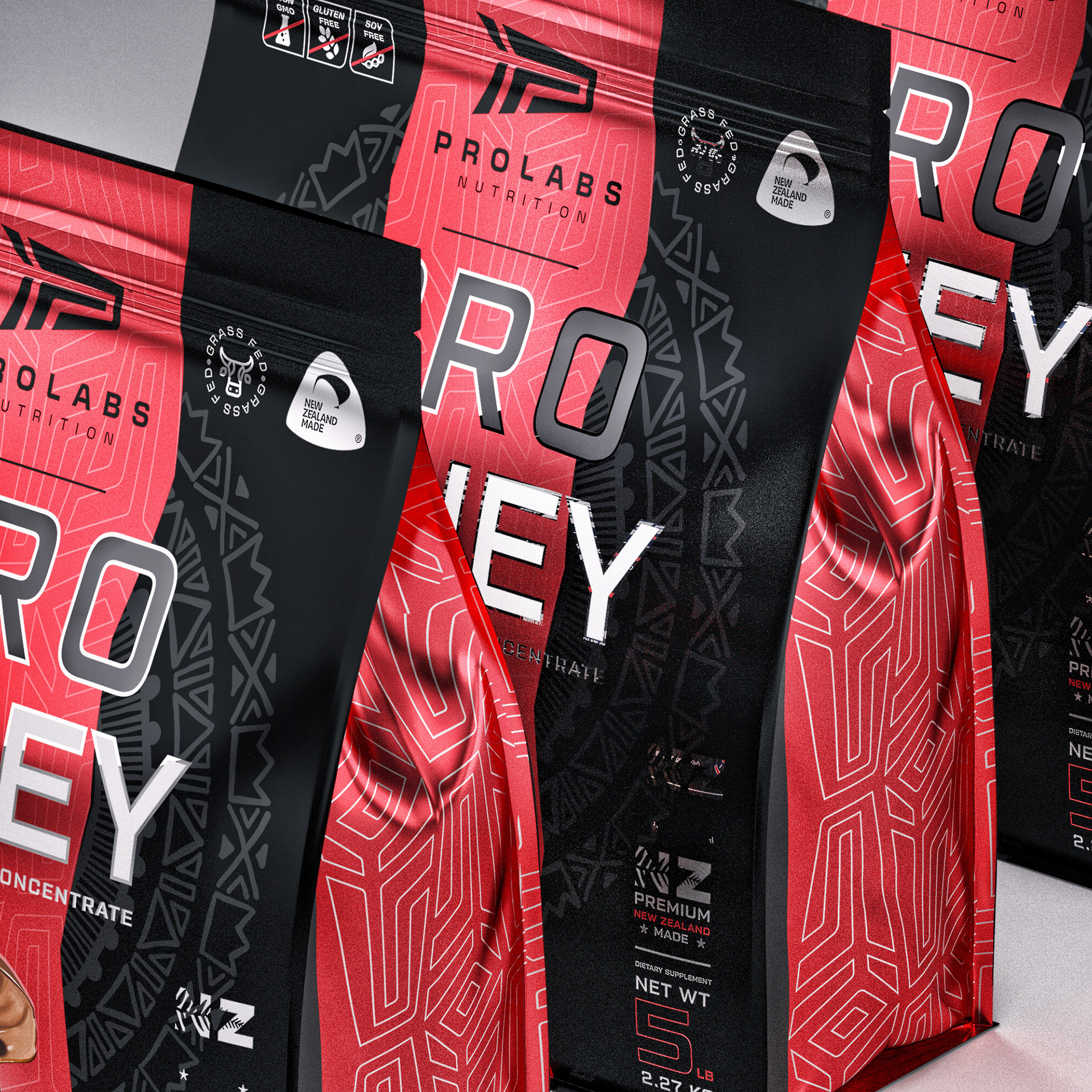
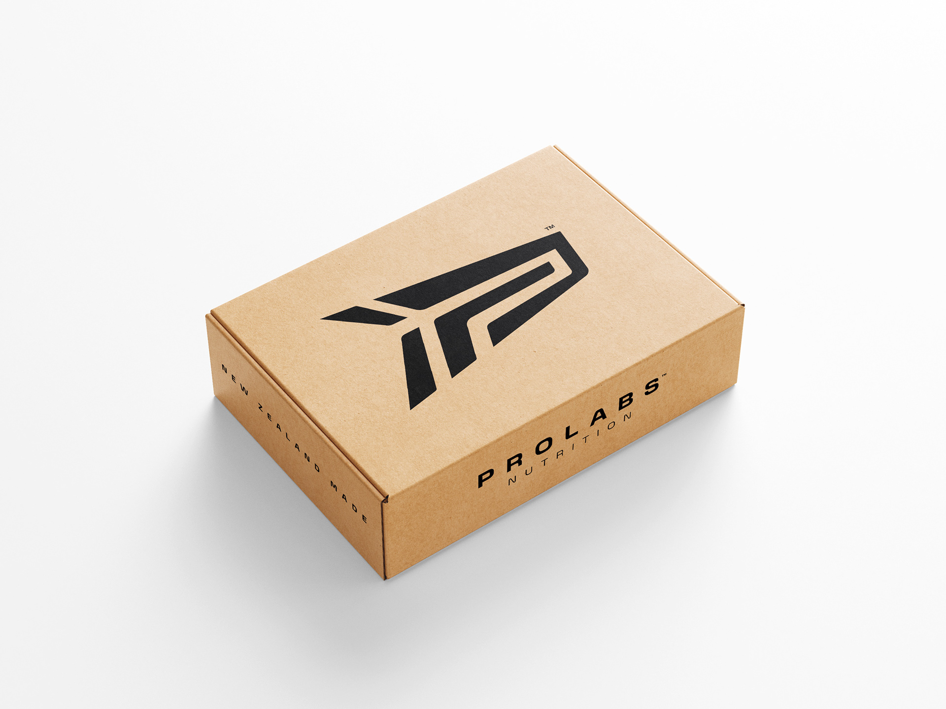
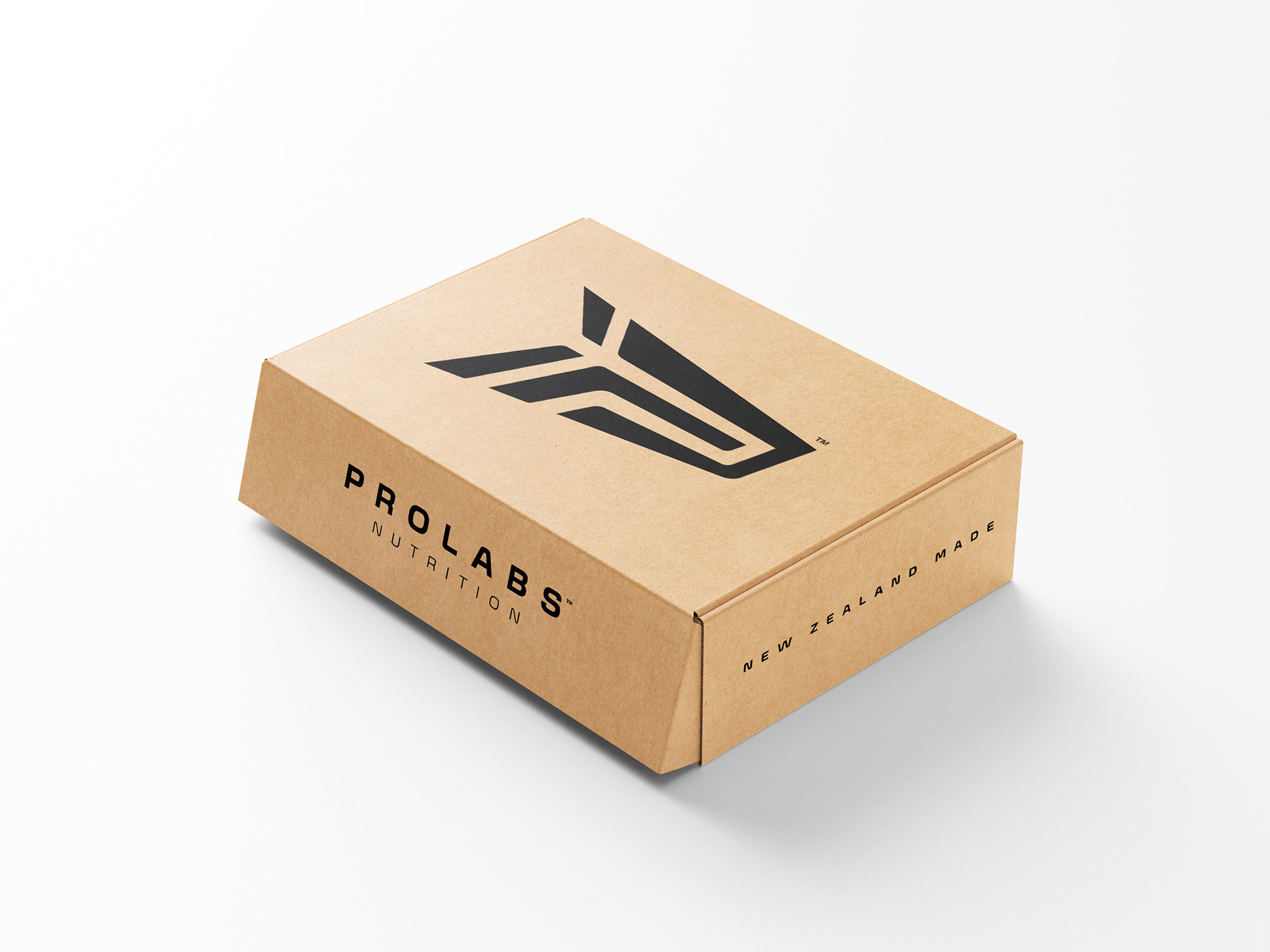
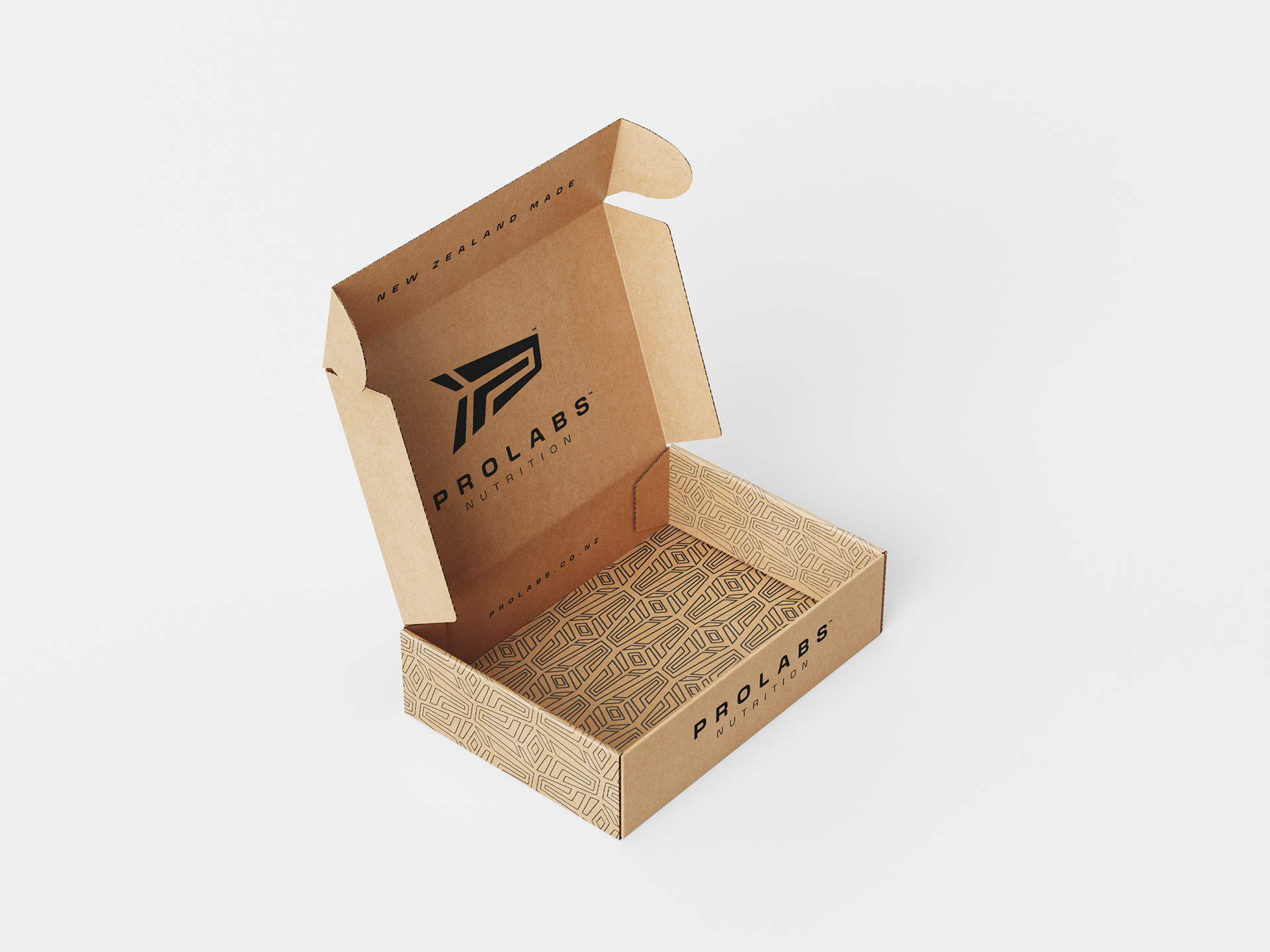
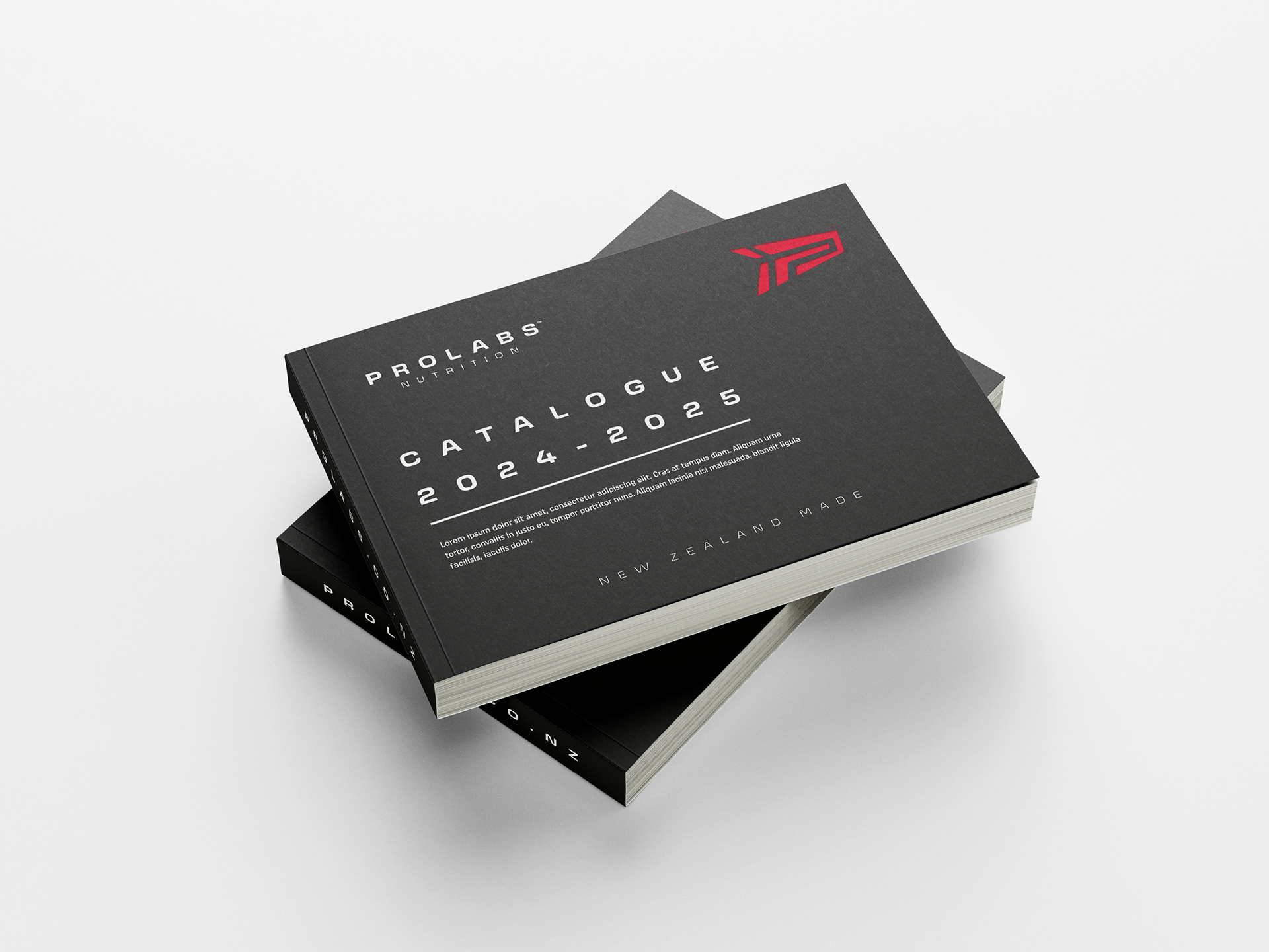
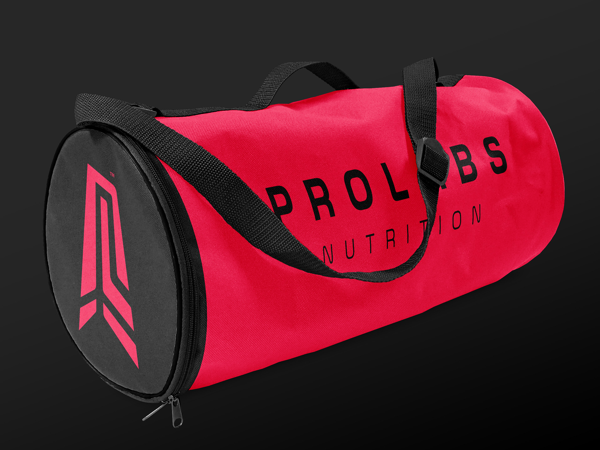
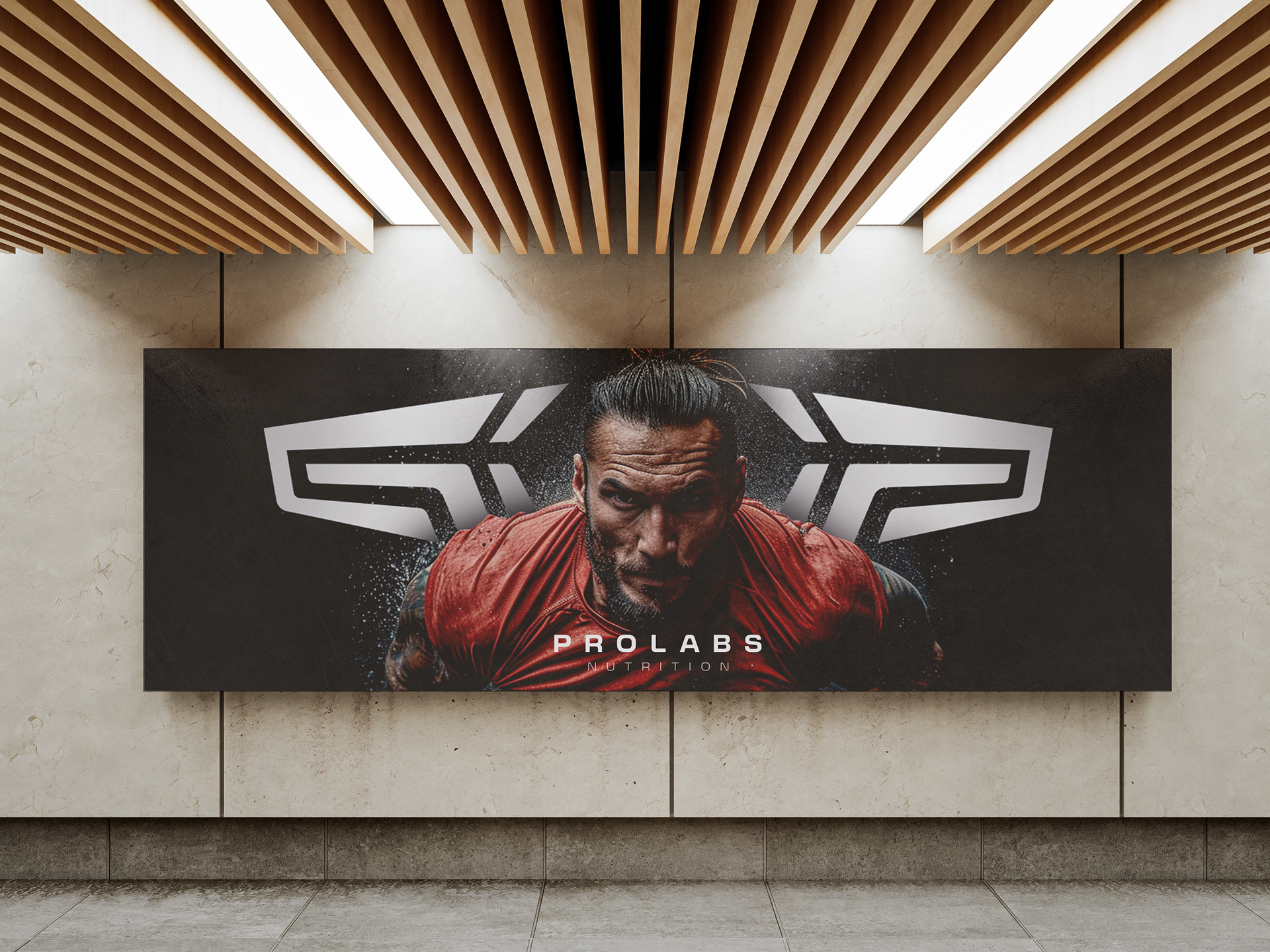
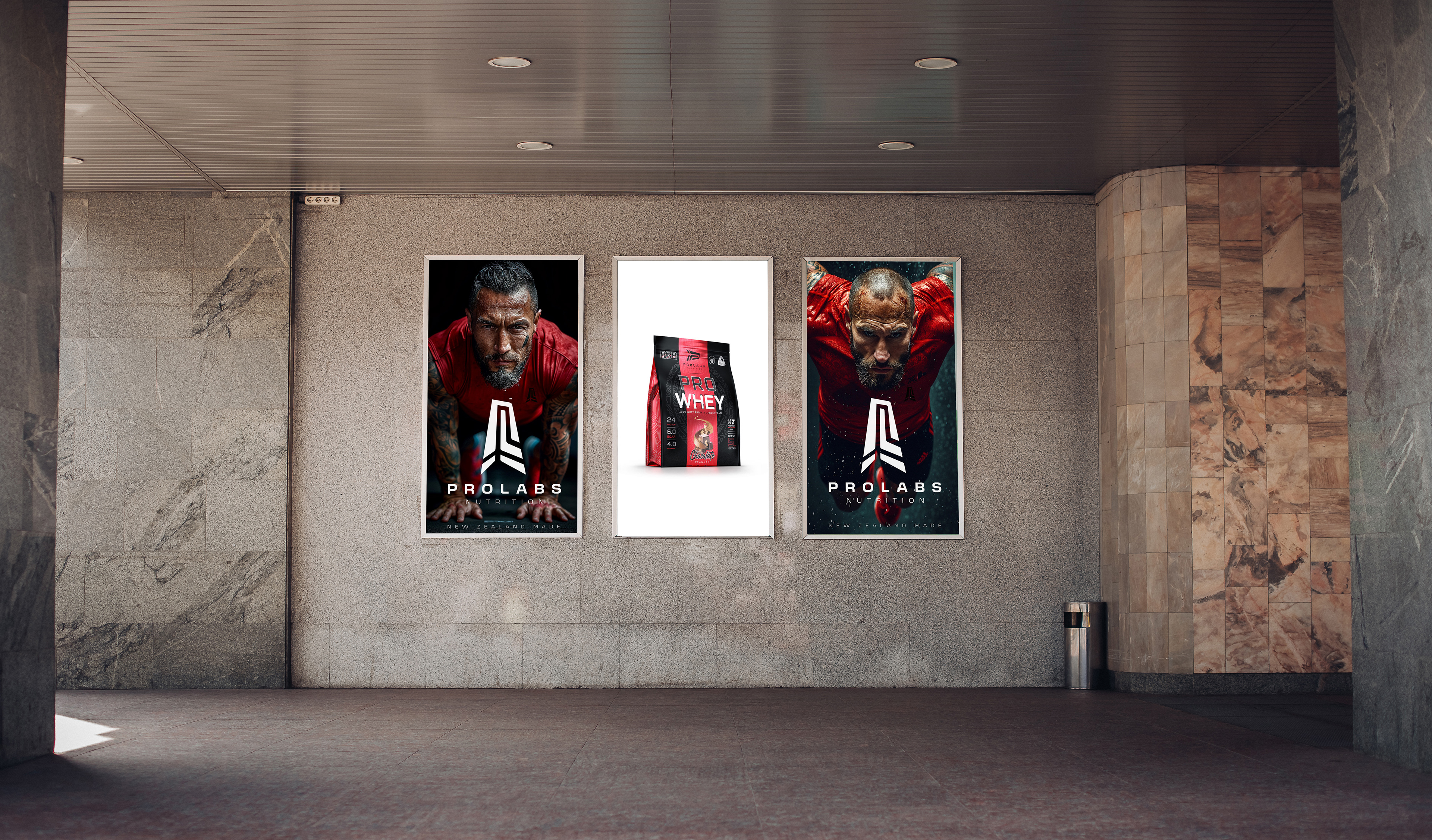
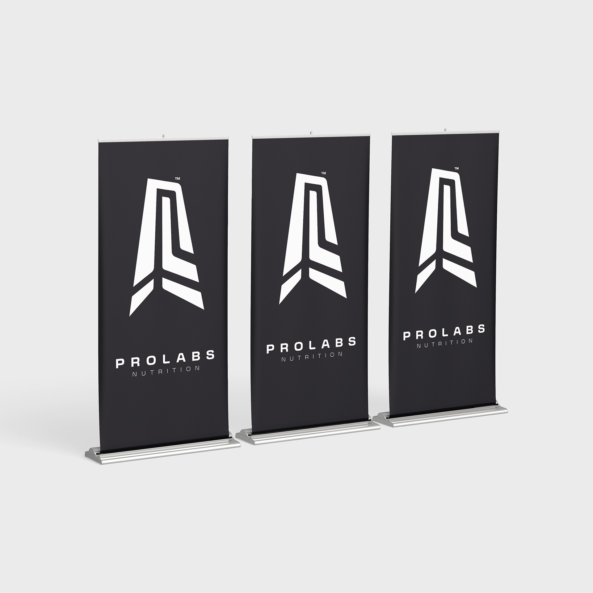
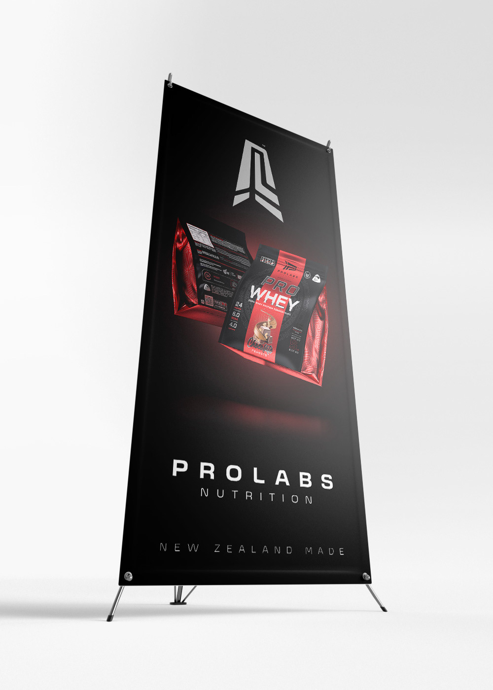
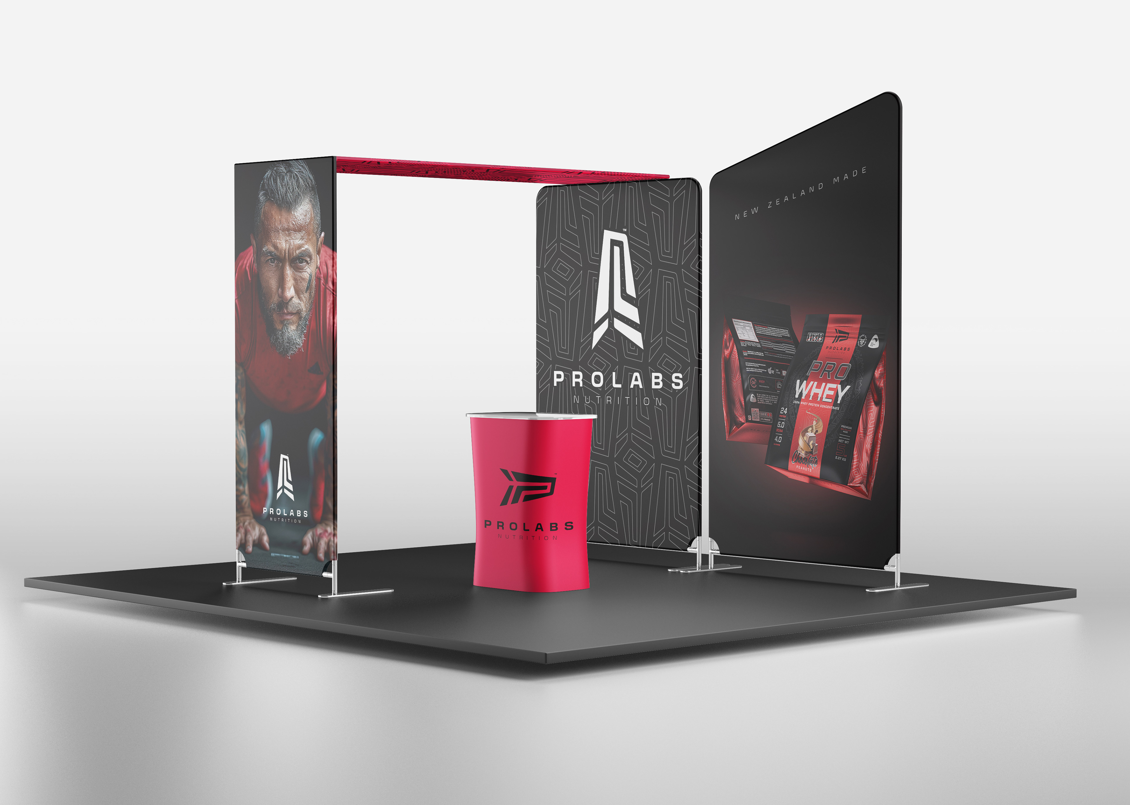
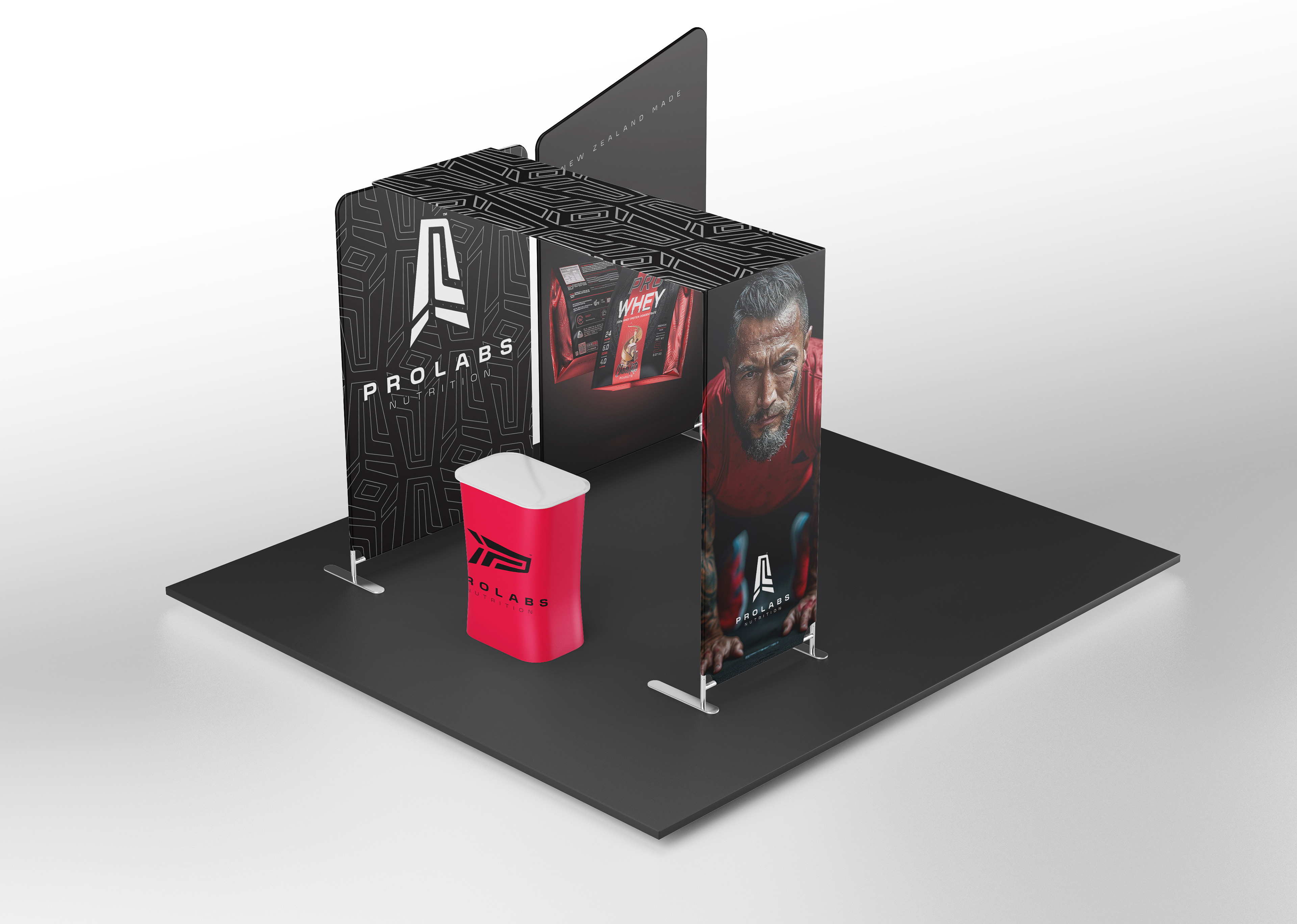
ProLabs' language encapsulates a blend of performance, energy, and quality. By associating modernity and technology with health, we immerse the brand in the lifestyle of its audience – athletes, physical activity enthusiasts, and individuals seeking an enhanced quality of life. This integration is evident in all graphical elements and packaging details, coupled with a strong sense of patriotism and confidence in the values of New Zealand's people and culture.

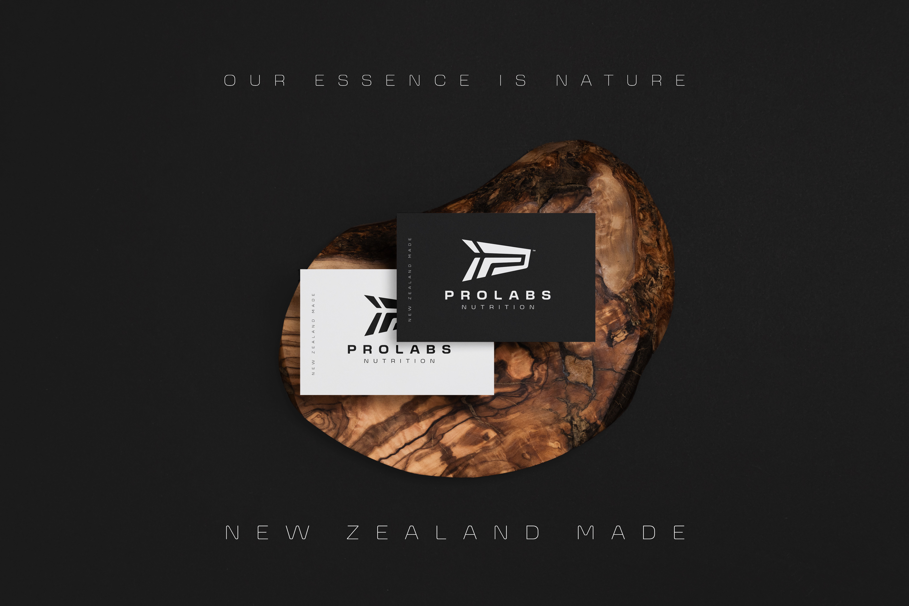
We've crafted an active, optimistic, and robust personality that prioritizes the diverse vitamin and food supplements offered by the brand. This identity engages with various audiences through commanding typography and a memorable symbol, drawing inspiration from the brand's initials reminiscent of Maori tattoos and the distinctive emblem of the New Zealand Fern.
javiertoscano.com


T H A N K S F O R W A T C H I N G
'PROLABS' | Rebranding | New Zealand
Graphic Designer | Javier Toscano
Modeler and Renderer 3D | Javier Toscano
Art Director | Javier Toscano
Modeler and Renderer 3D | Javier Toscano
Art Director | Javier Toscano
hola@javiertoscano.com