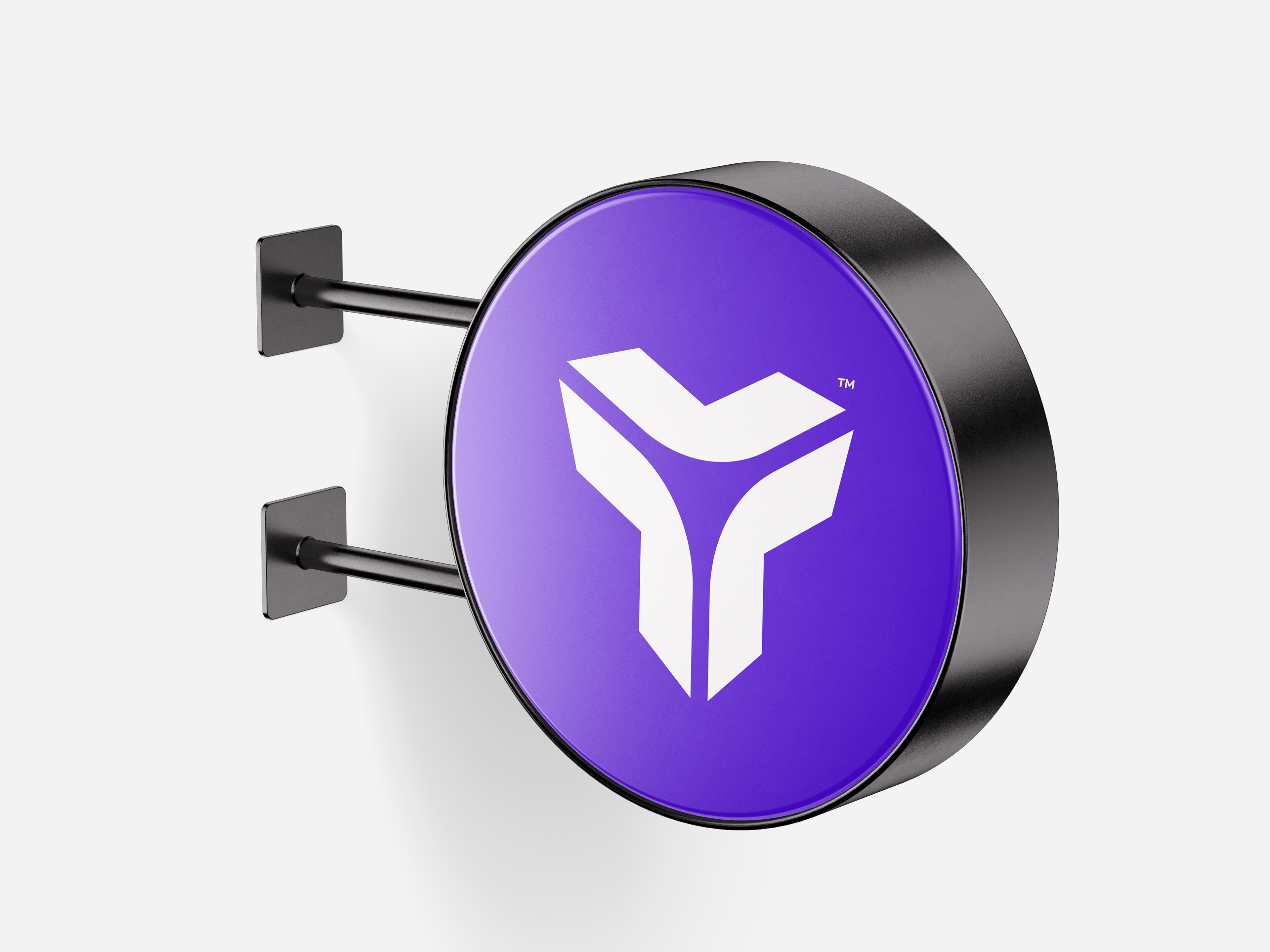
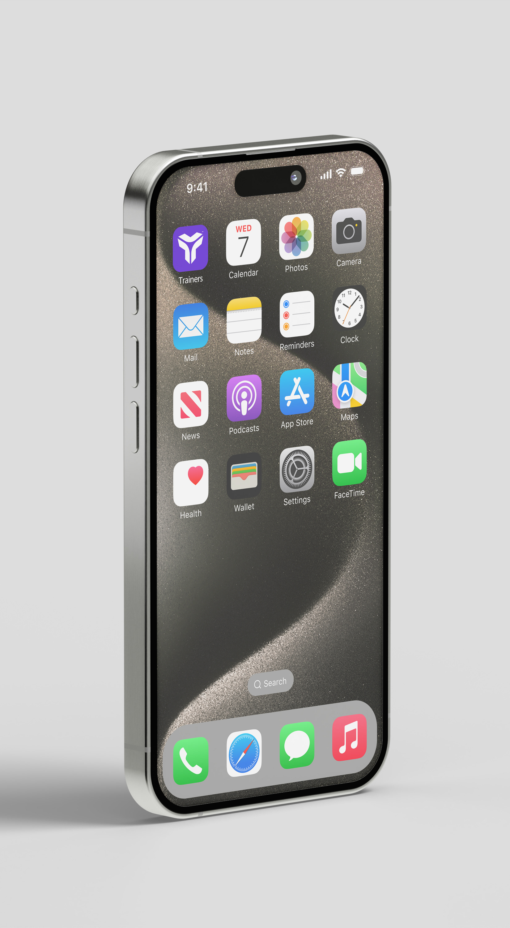
Logo Conceptualization:
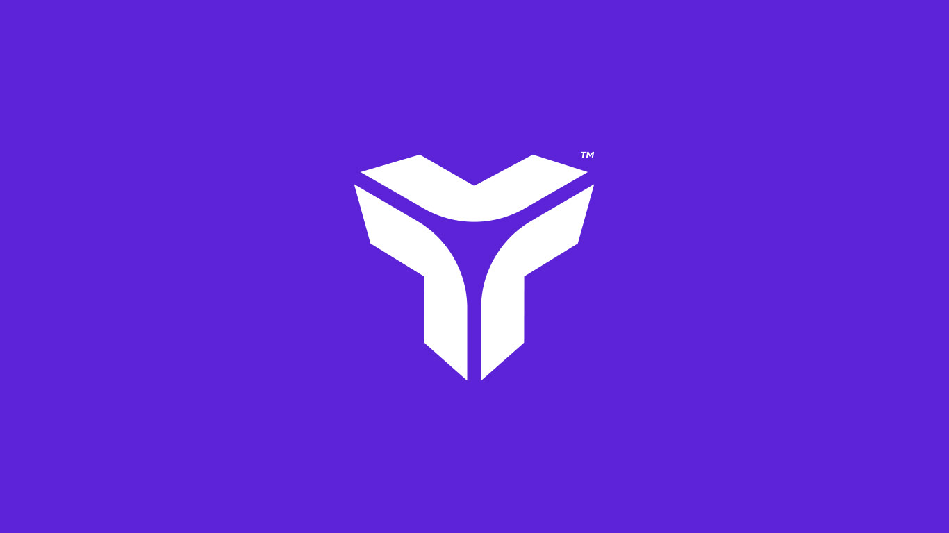
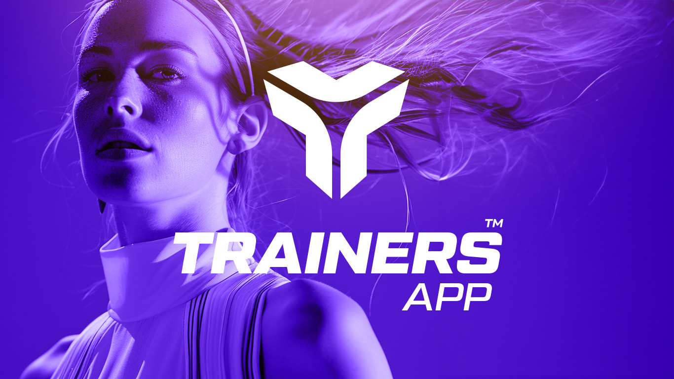
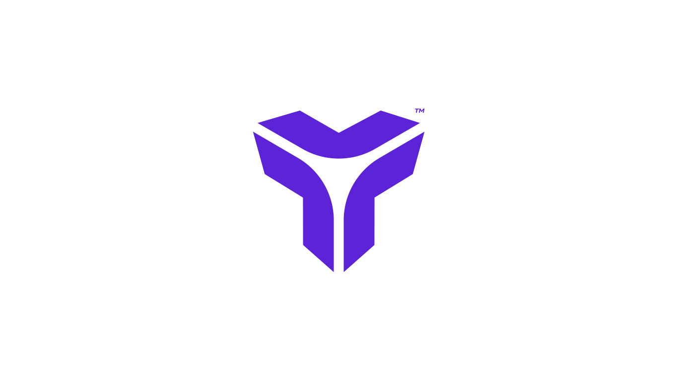
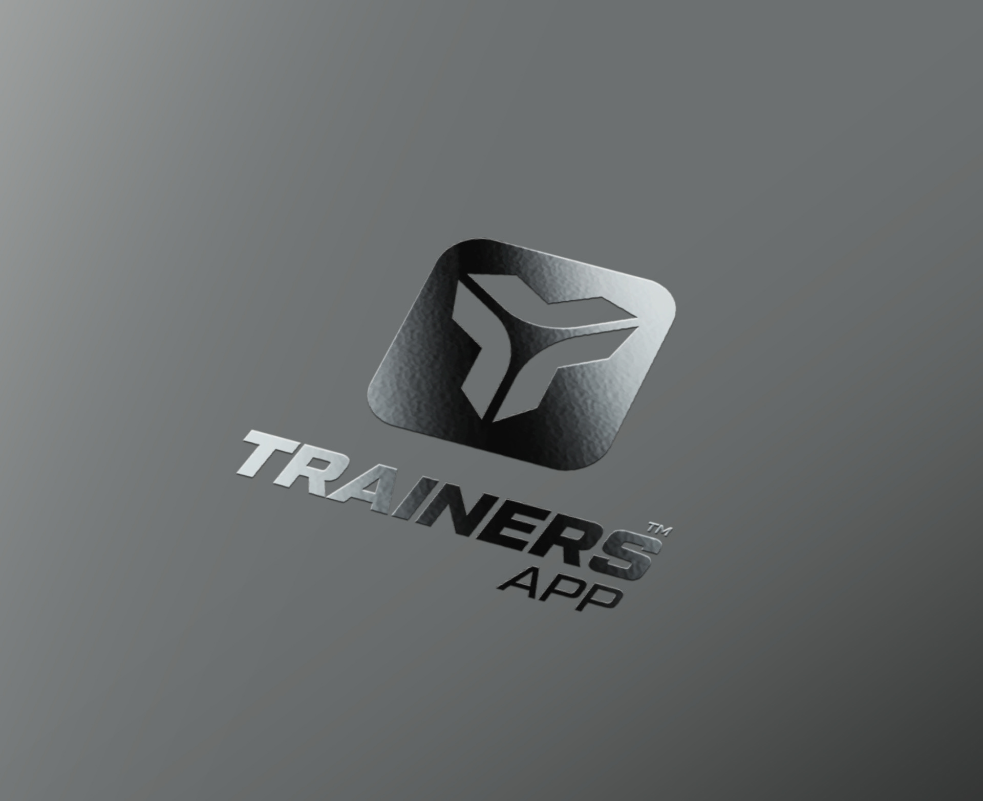
The visual identity of the personalised training app is centred around a logo based on the letter "T", representing "Trainers". This "T" has been designed with modern and stylised lines, which not only evoke the shape of the letter, but also suggest dynamism and movement, essential for a fitness training app.
The visual identity of the personalised training app is centred around a logo based on the letter "T", representing "Trainers". This "T" has been designed with modern and stylised lines, which not only evoke the shape of the letter, but also suggest dynamism and movement, essential for a fitness training app.
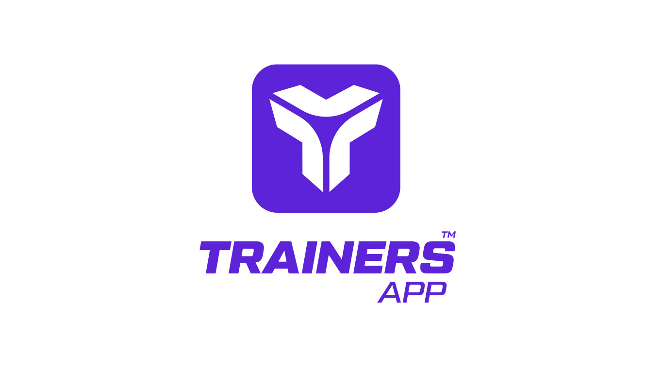

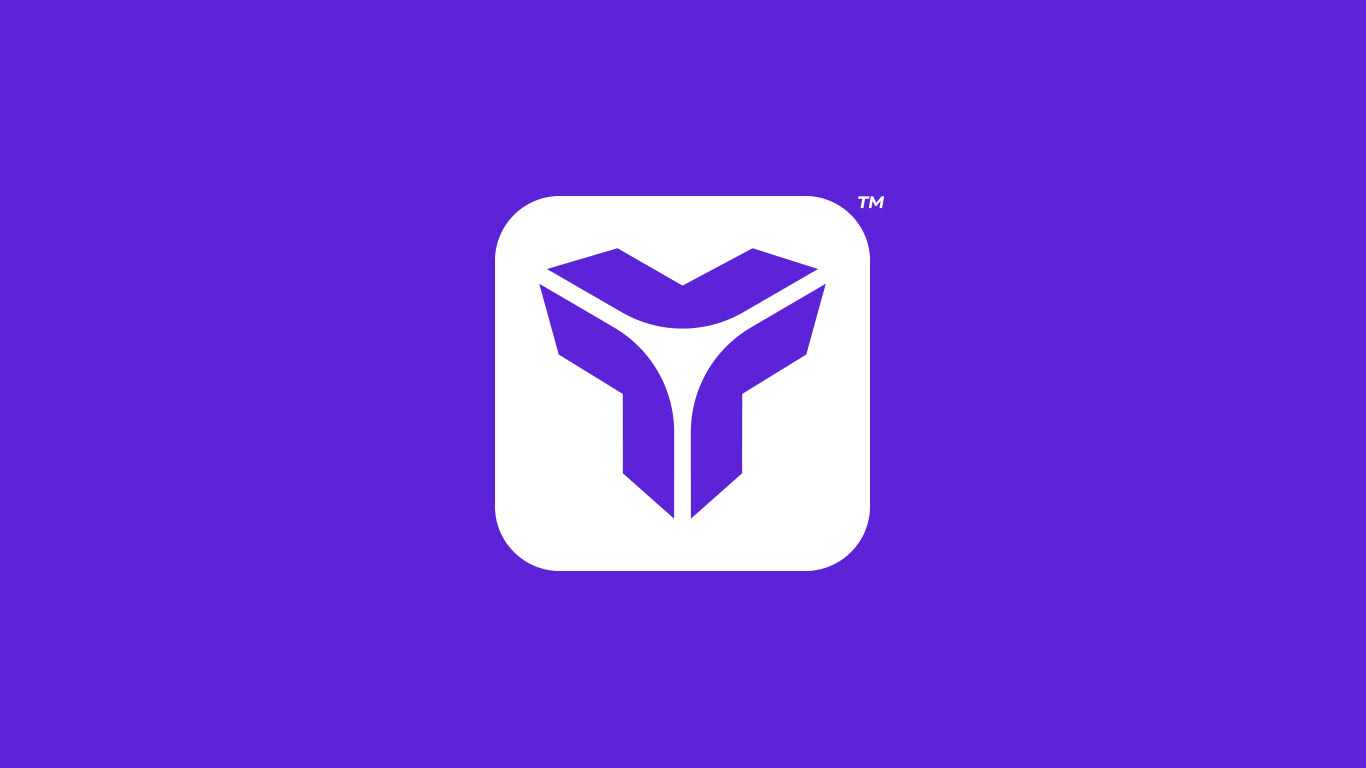
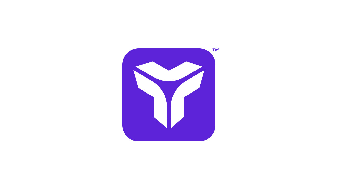
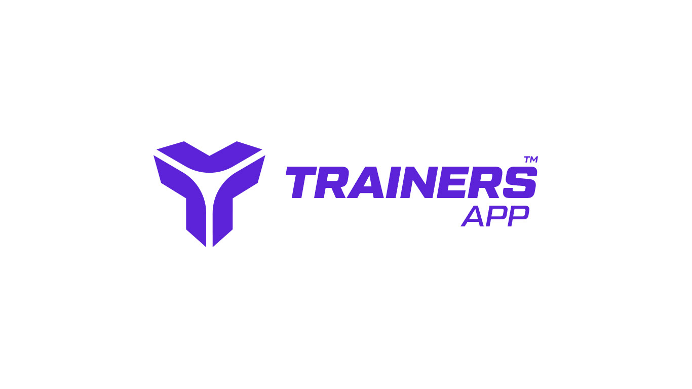
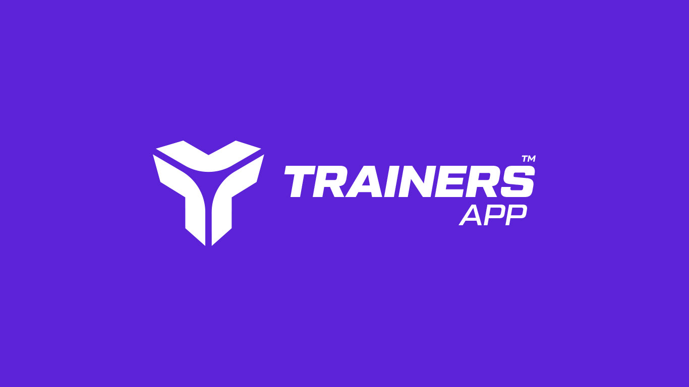
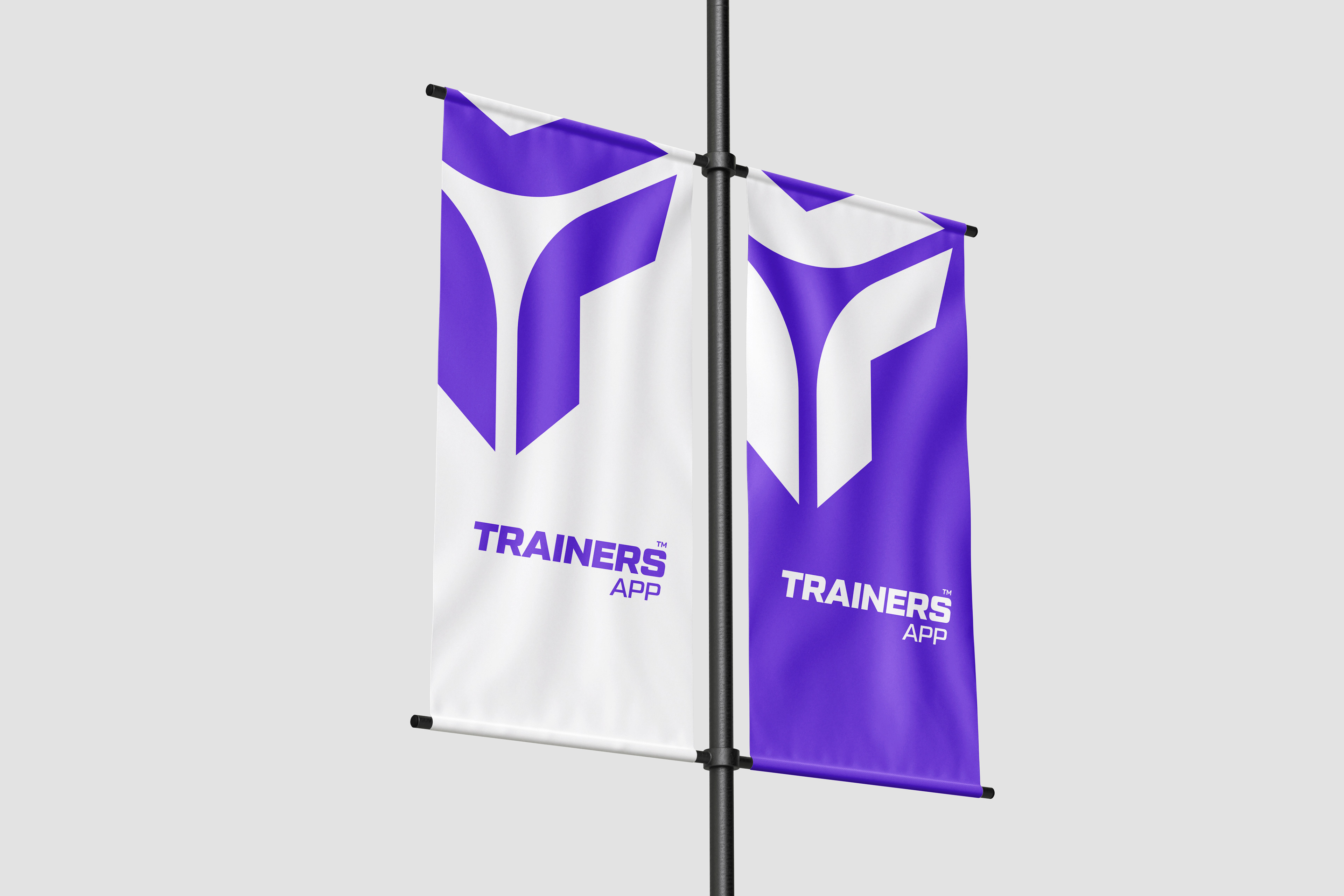
Negative and Positive LOGO versions
HORIZONTAL LOGO
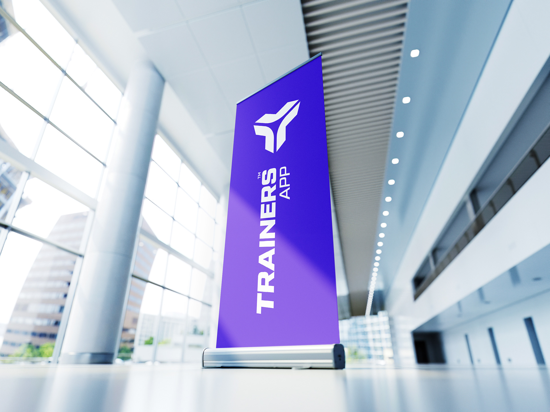
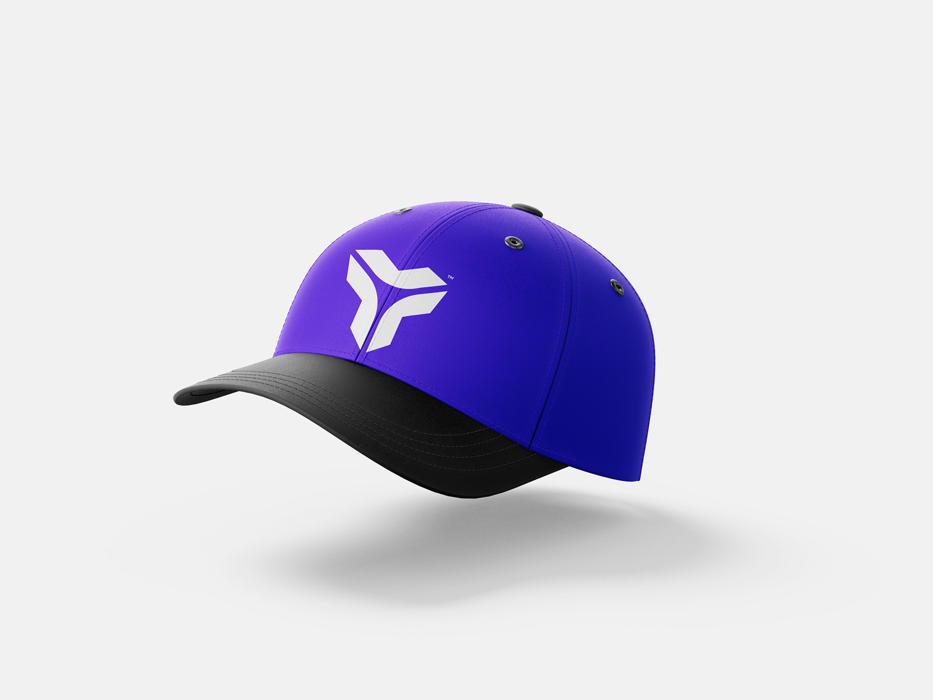
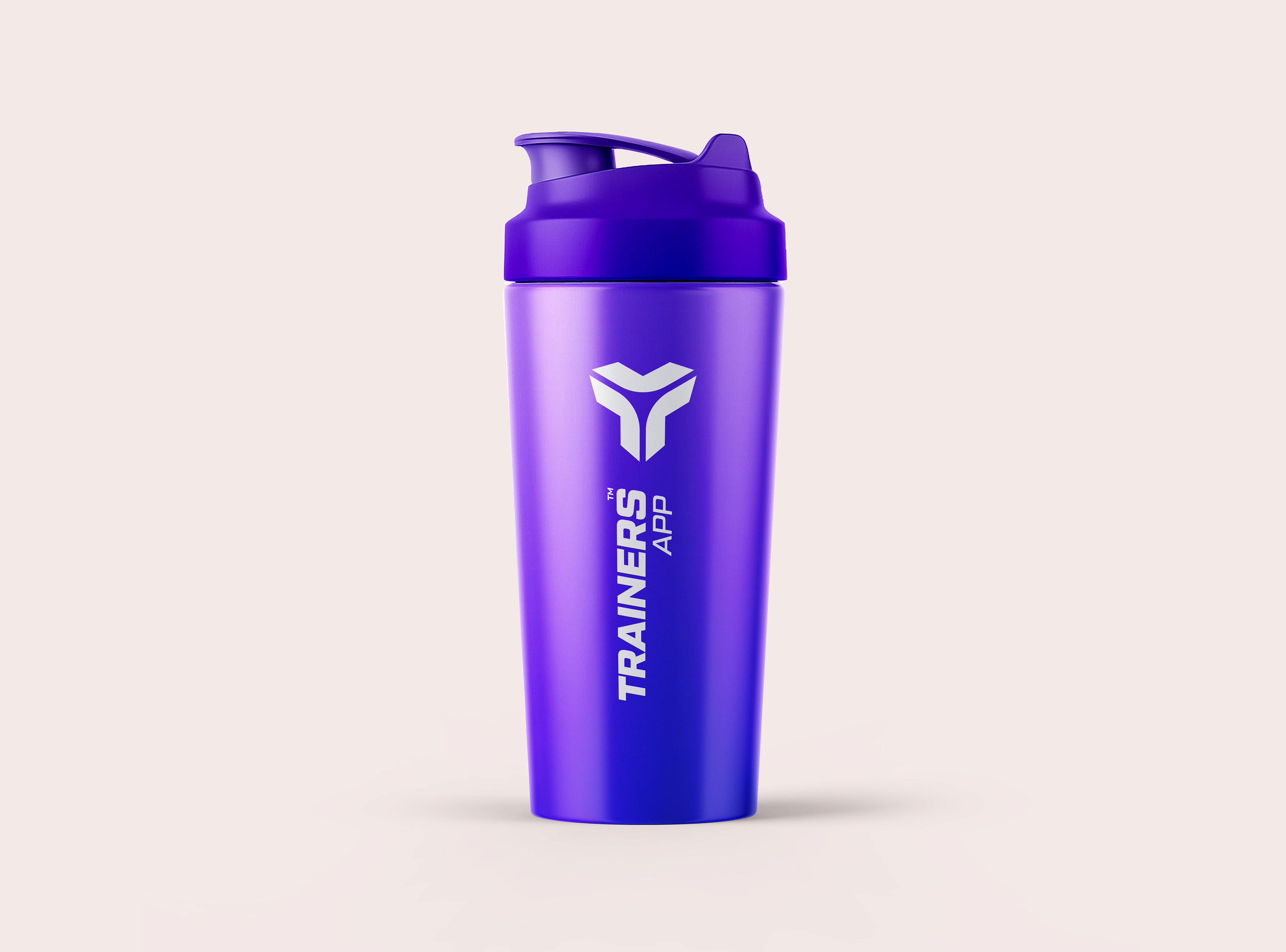
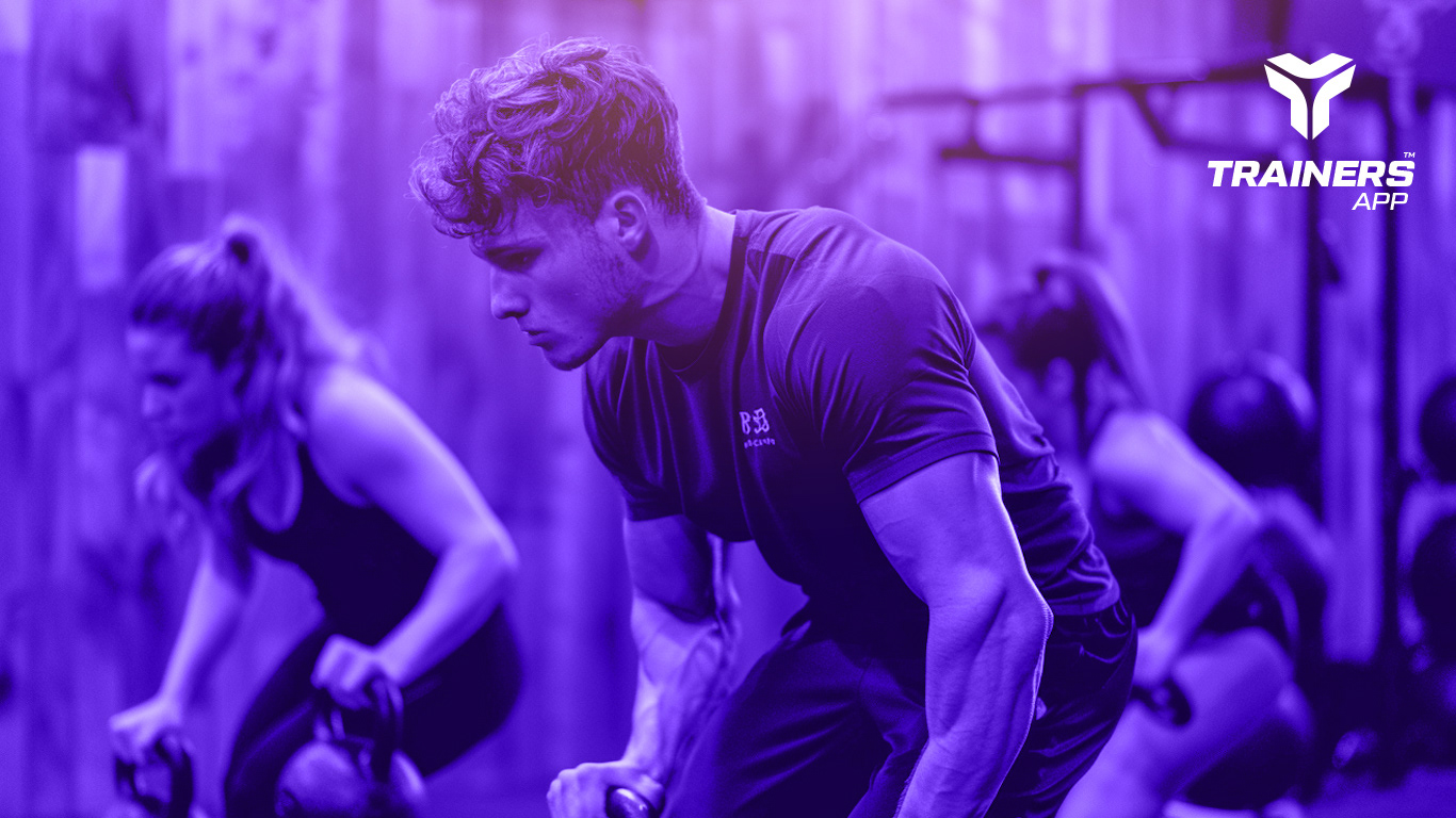
Colour Scheme:
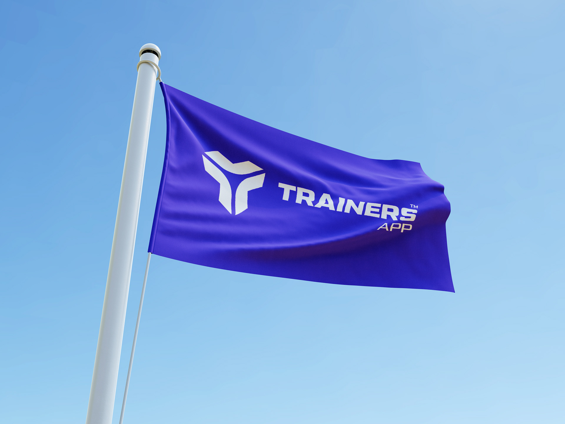
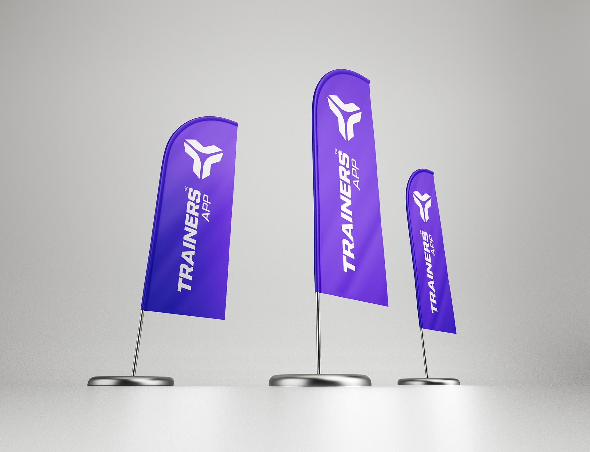
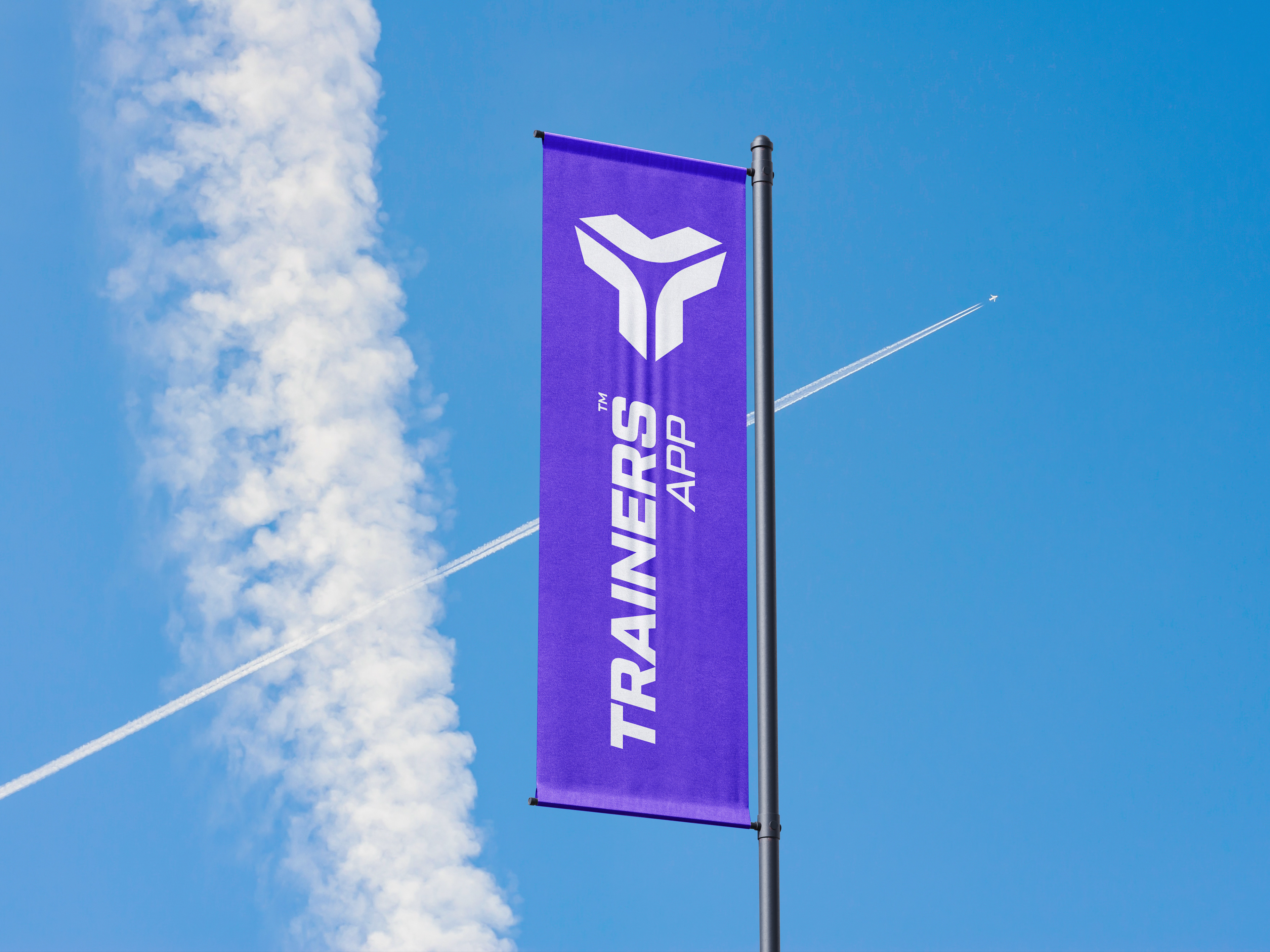
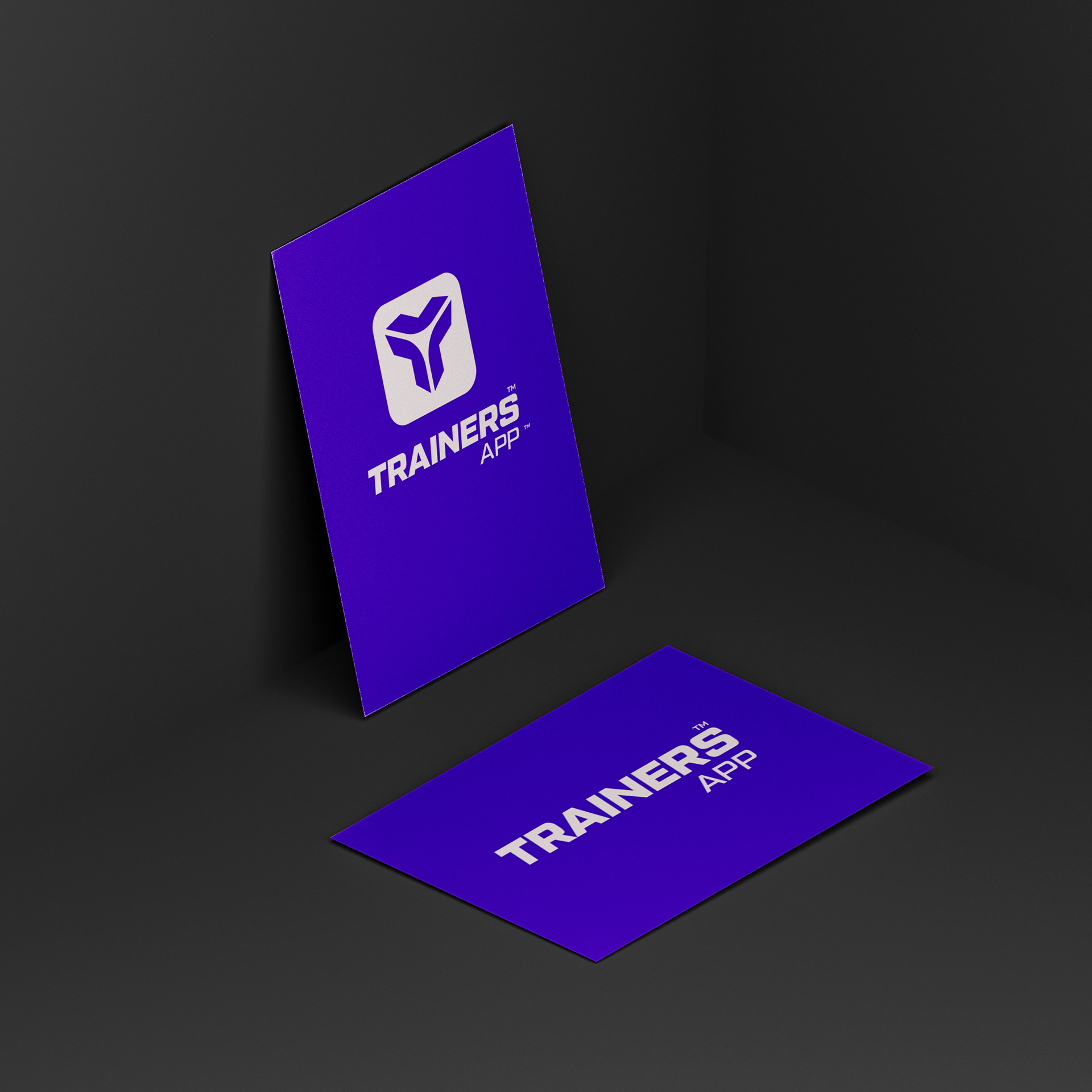
Purple has been chosen as the brand's main colour. This shade is commonly associated with qualities such as creativity, innovation and wisdom, attributes that align perfectly with the goals of the app. Purple also conveys a sense of luxury and quality, positioning the app as a premium option in the personalised coaching market.
Purple has been chosen as the brand's main colour. This shade is commonly associated with qualities such as creativity, innovation and wisdom, attributes that align perfectly with the goals of the app. Purple also conveys a sense of luxury and quality, positioning the app as a premium option in the personalised coaching market.

Typography and Style:
The typography used in the visual identity is modern and sans-serif, complementing the simplicity and elegance of the logo. The clean, unadorned lettering reinforces the idea of a clear and direct approach to training, without unnecessary distractions, emphasising the efficiency and effectiveness of the training programmes offered.
The typography used in the visual identity is modern and sans-serif, complementing the simplicity and elegance of the logo. The clean, unadorned lettering reinforces the idea of a clear and direct approach to training, without unnecessary distractions, emphasising the efficiency and effectiveness of the training programmes offered.
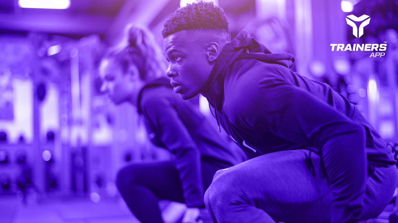

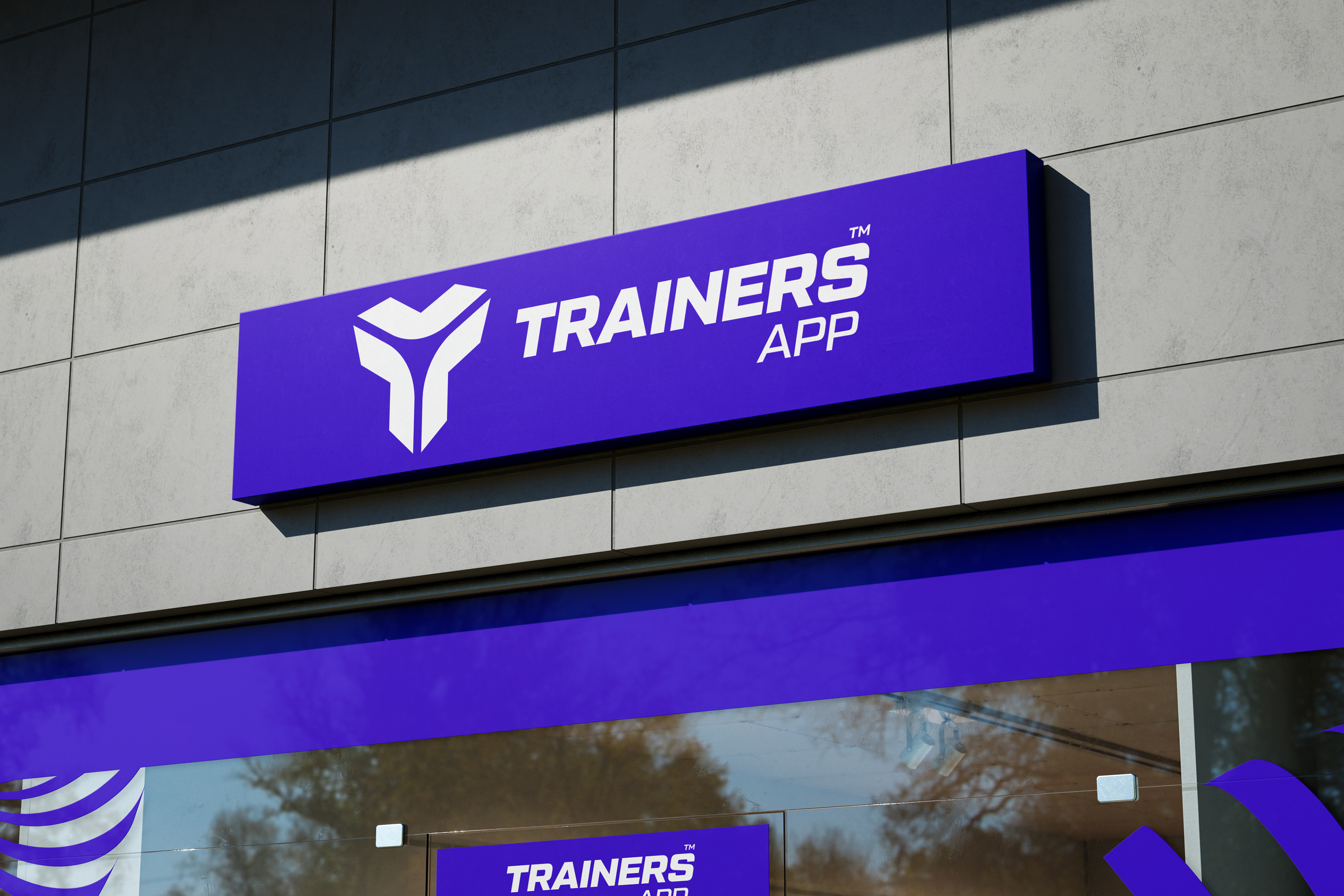
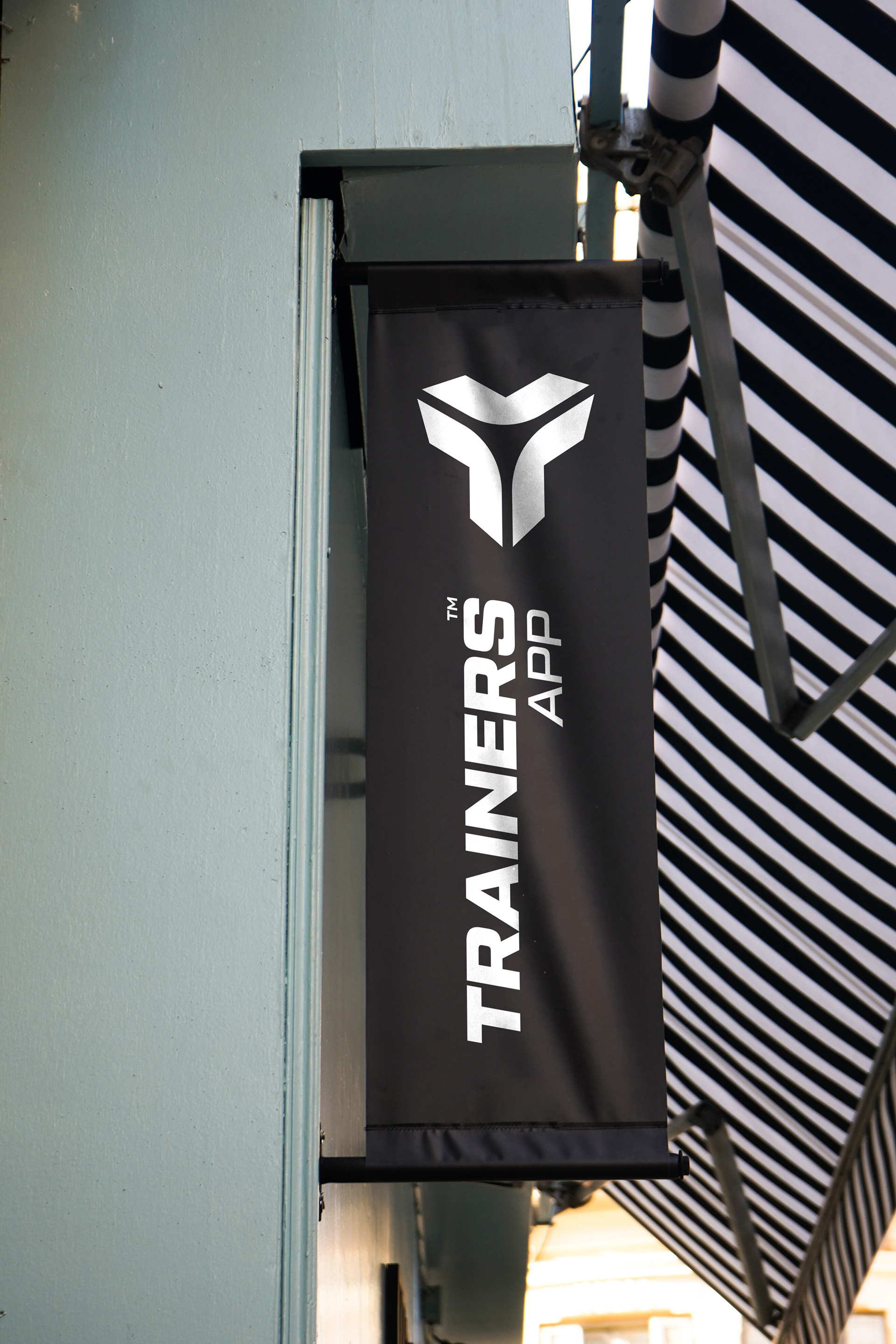
Marketing Material:
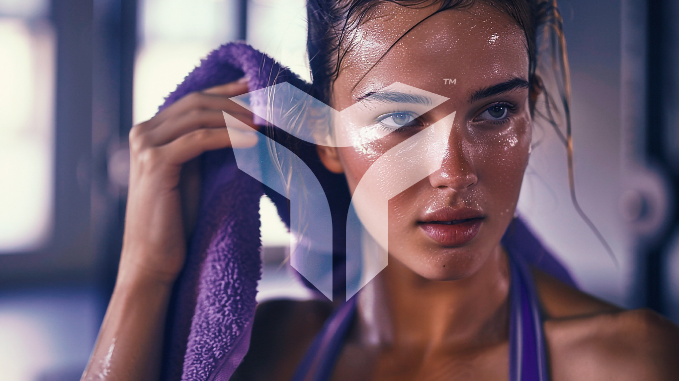
In marketing material, from social media ads to printed brochures, the logo and the colour purple are used prominently. This consistency in visual usage helps build brand recognition, making the logo and colour easily identifiable and associated with the app. In addition, the use of high quality images and motivational graphics boosts the perception of the app as a reliable and engaging resource for personalised trainings.
In marketing material, from social media ads to printed brochures, the logo and the colour purple are used prominently. This consistency in visual usage helps build brand recognition, making the logo and colour easily identifiable and associated with the app. In addition, the use of high quality images and motivational graphics boosts the perception of the app as a reliable and engaging resource for personalised trainings.


APP
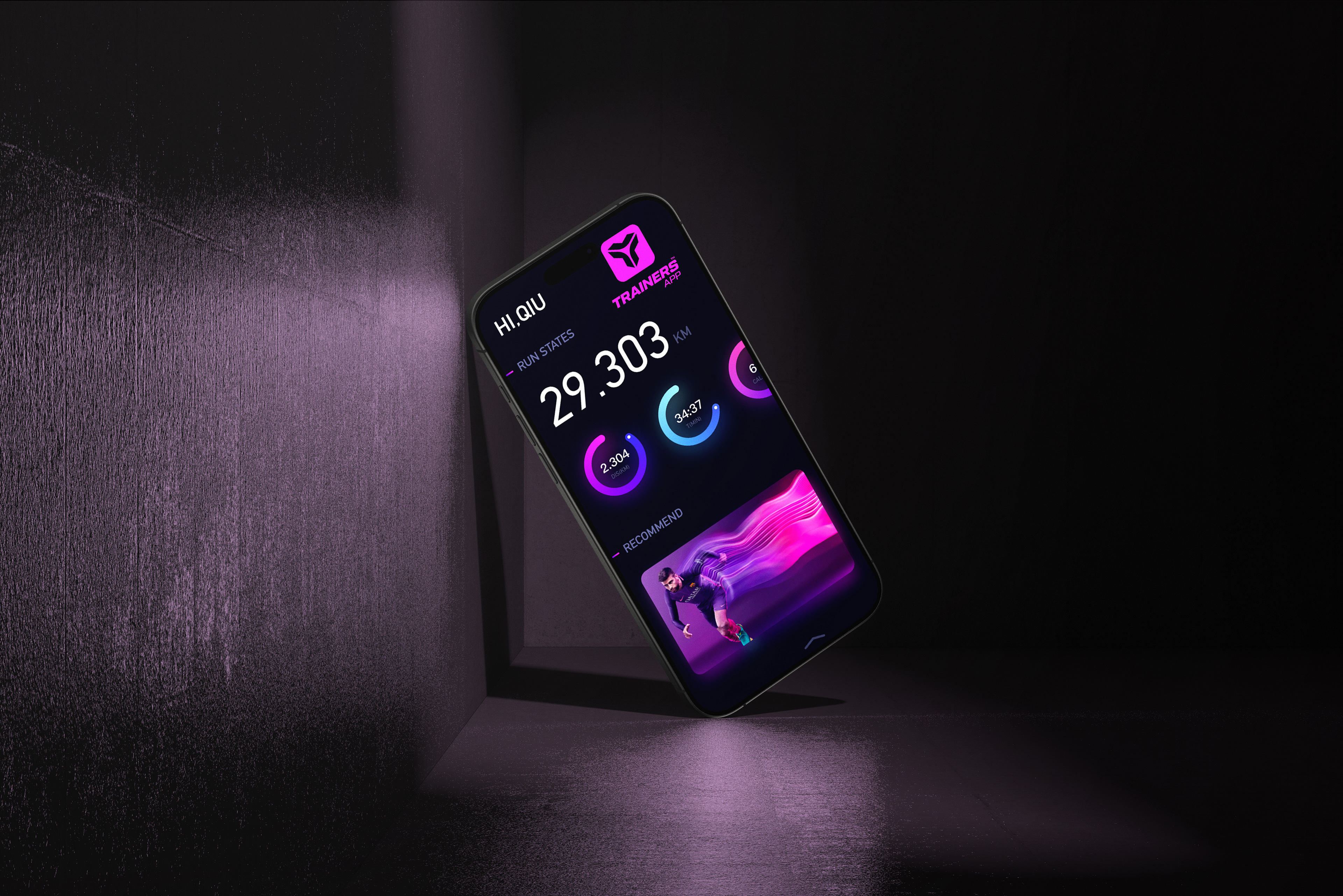
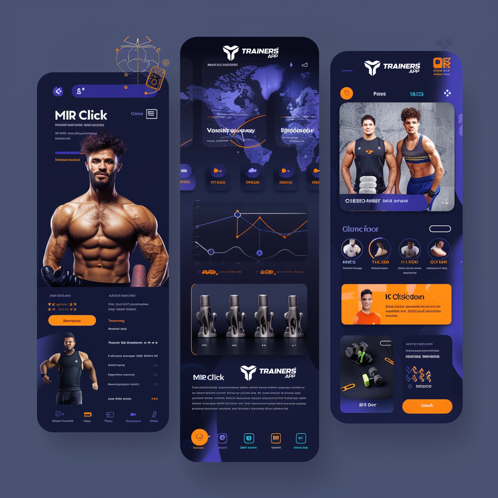
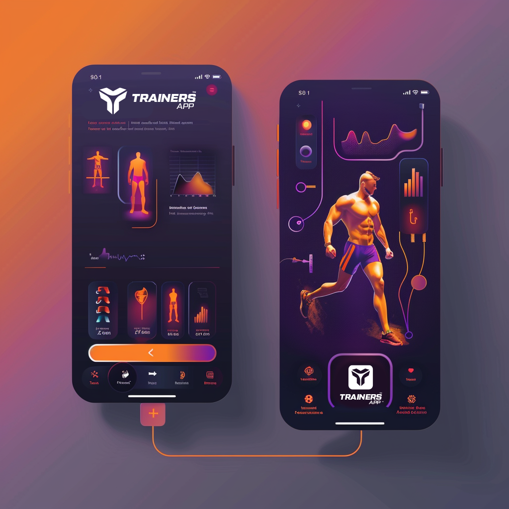
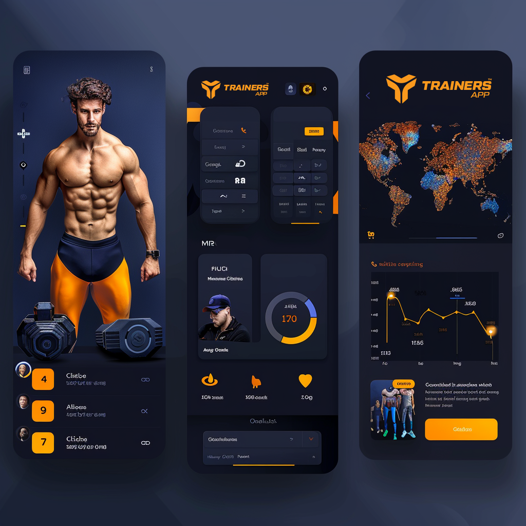
Interface Design:
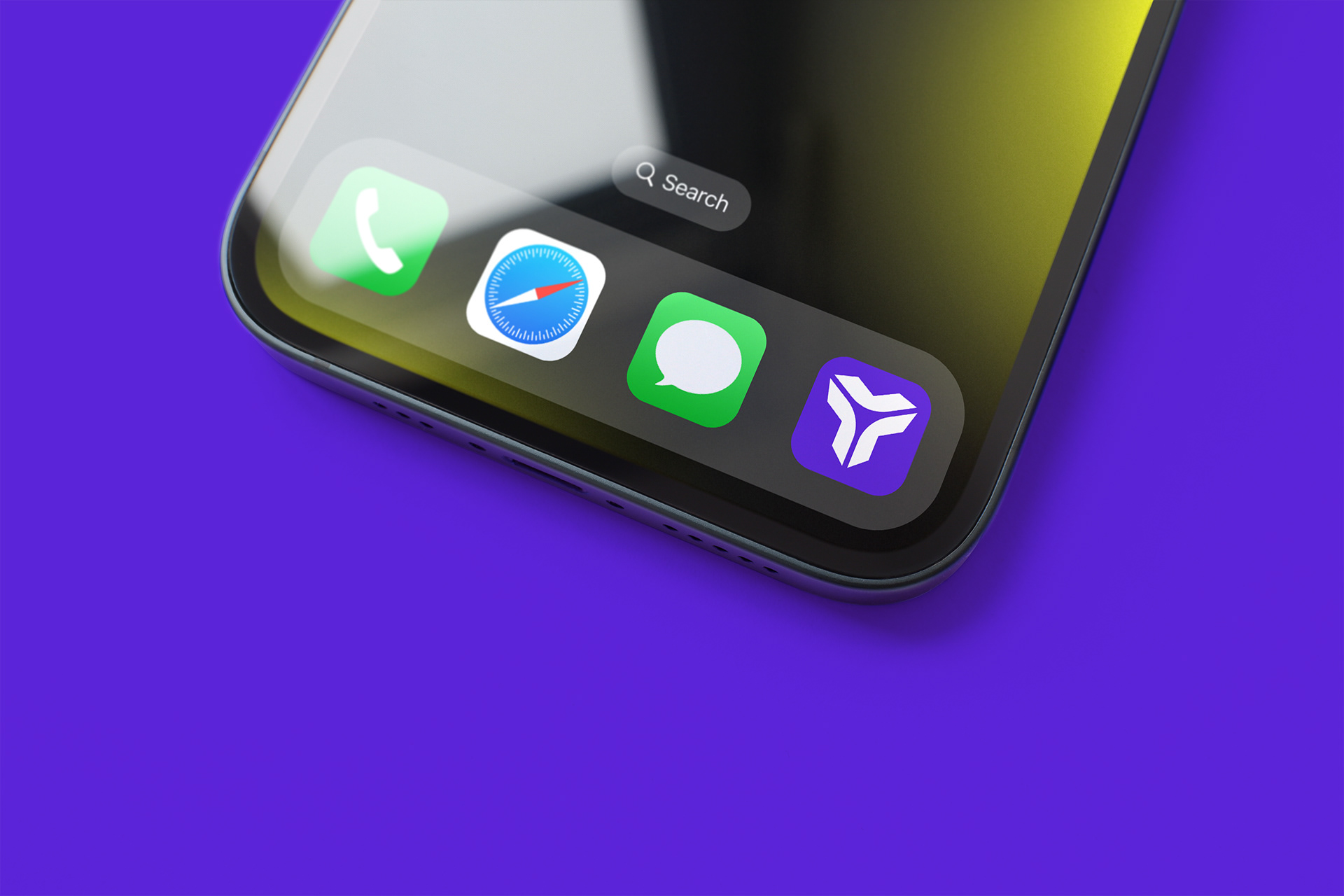
The user interface (UI) follows a minimalist line, using the colour purple on key elements such as buttons, icons and highlighting important sections. This approach not only ensures intuitive and enjoyable navigation, but also continually reinforces the brand presence, creating a cohesive and memorable user experience.
The user interface (UI) follows a minimalist line, using the colour purple on key elements such as buttons, icons and highlighting important sections. This approach not only ensures intuitive and enjoyable navigation, but also continually reinforces the brand presence, creating a cohesive and memorable user experience.
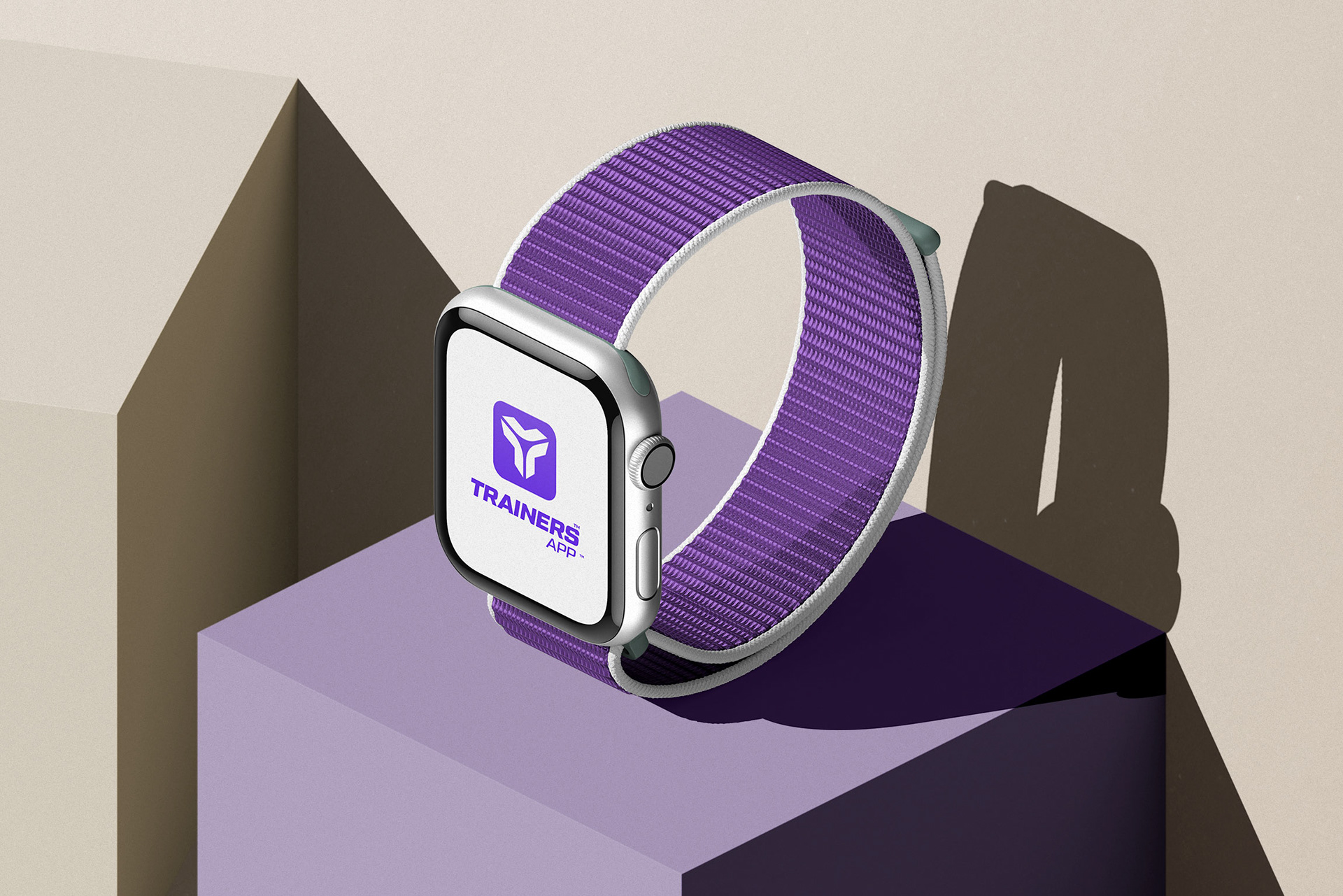

Impact and recognition:
The combination of a distinctive "T" based logo and the colour purple ensures that the visual identity of the app is strong and recognisable. These visual elements not only capture the attention of potential users, but also communicate the values and mission of the app: to offer high quality personalised training with an innovative and professional approach. The cohesive visual identity reinforces users' trust and loyalty, positioning the app as a leader in its category.
The combination of a distinctive "T" based logo and the colour purple ensures that the visual identity of the app is strong and recognisable. These visual elements not only capture the attention of potential users, but also communicate the values and mission of the app: to offer high quality personalised training with an innovative and professional approach. The cohesive visual identity reinforces users' trust and loyalty, positioning the app as a leader in its category.