G R A N D P O R M U L A
T H E L O G O
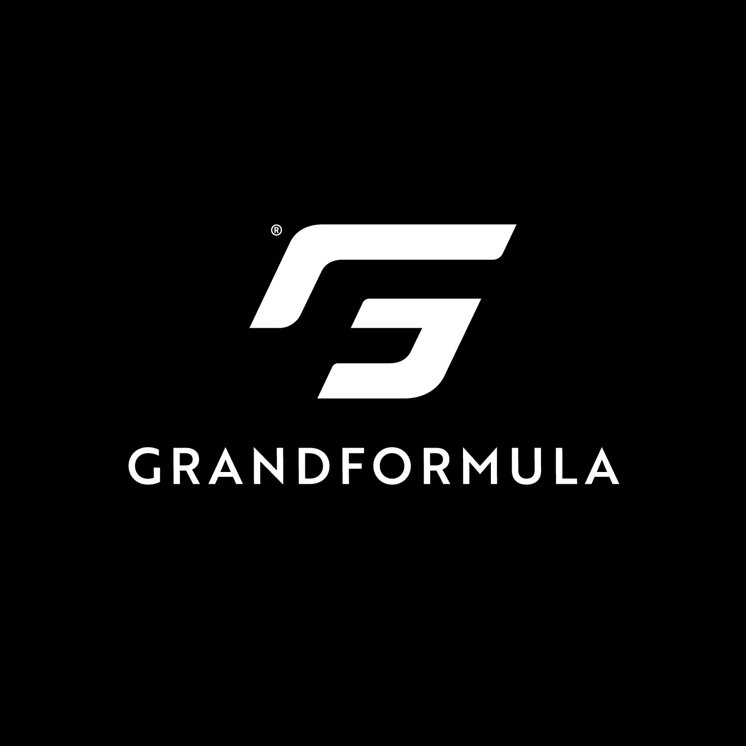
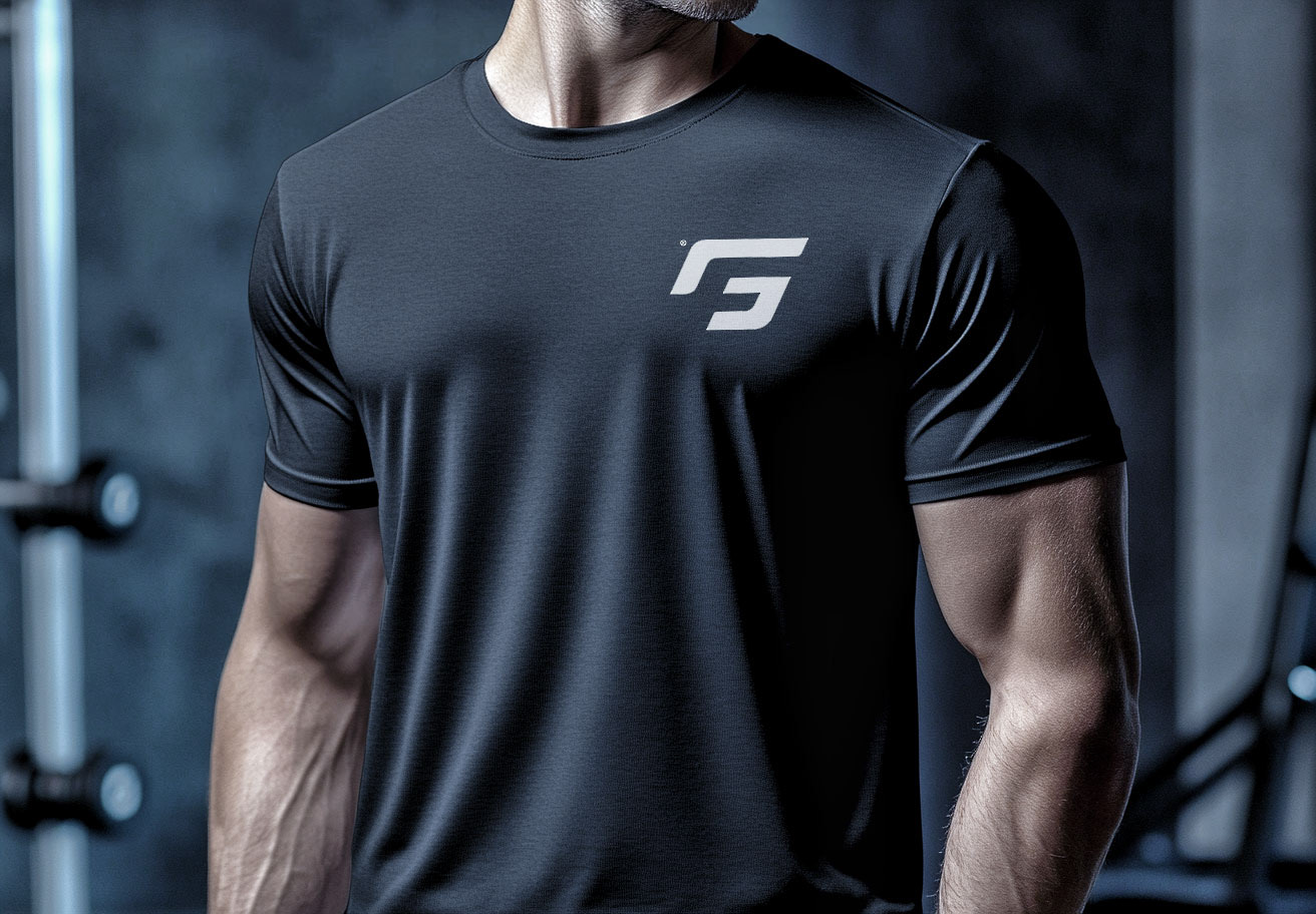
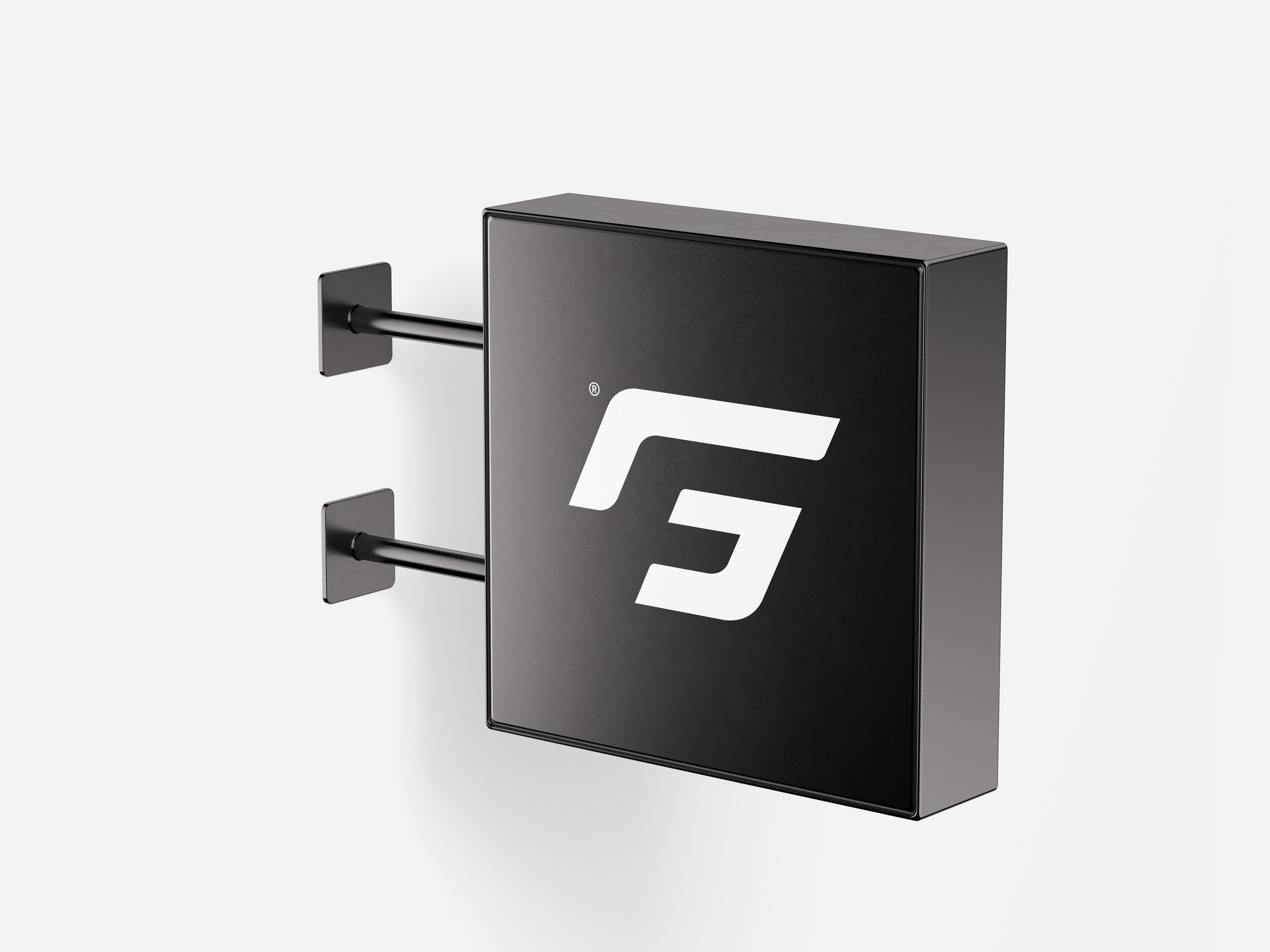
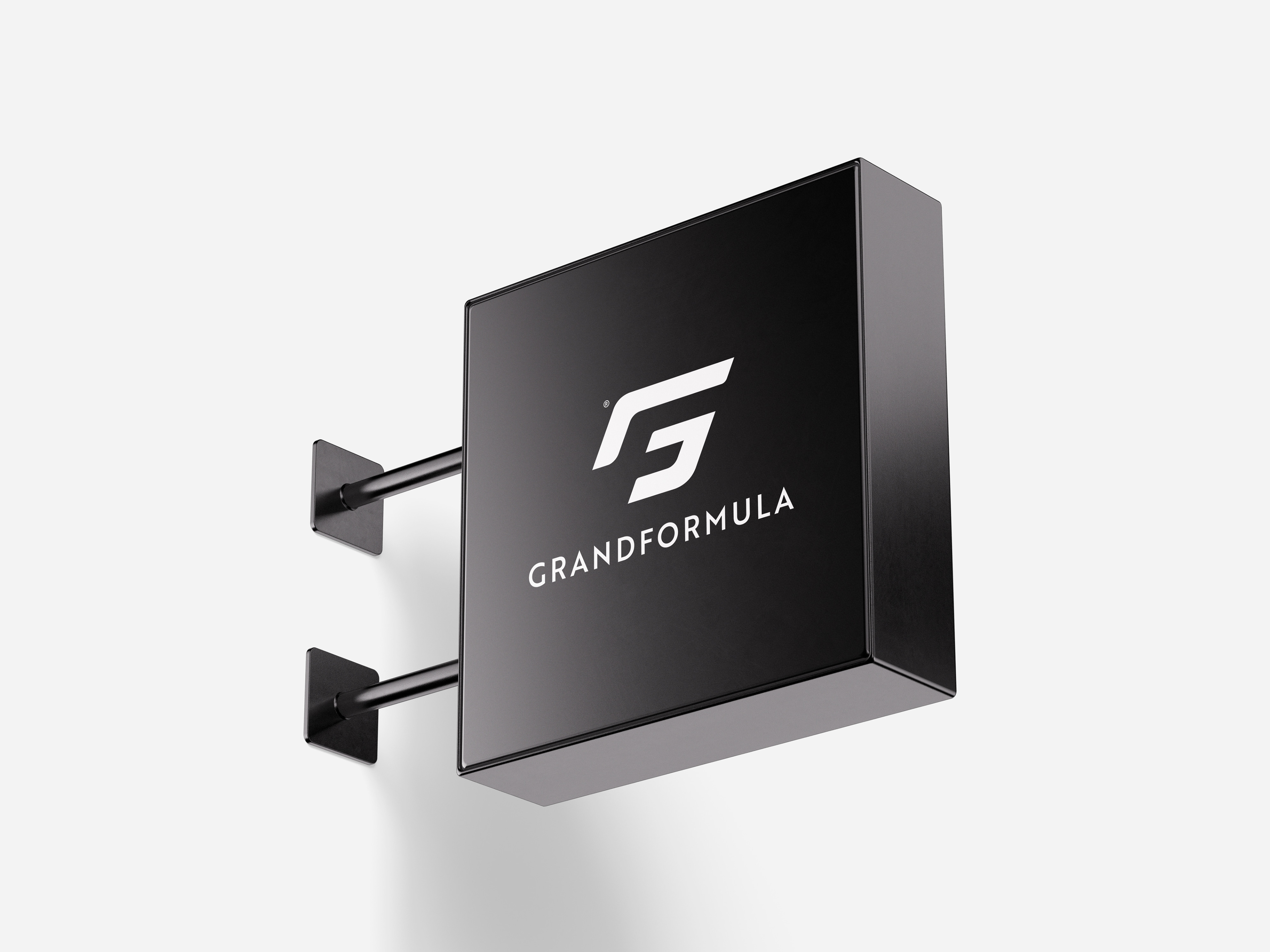
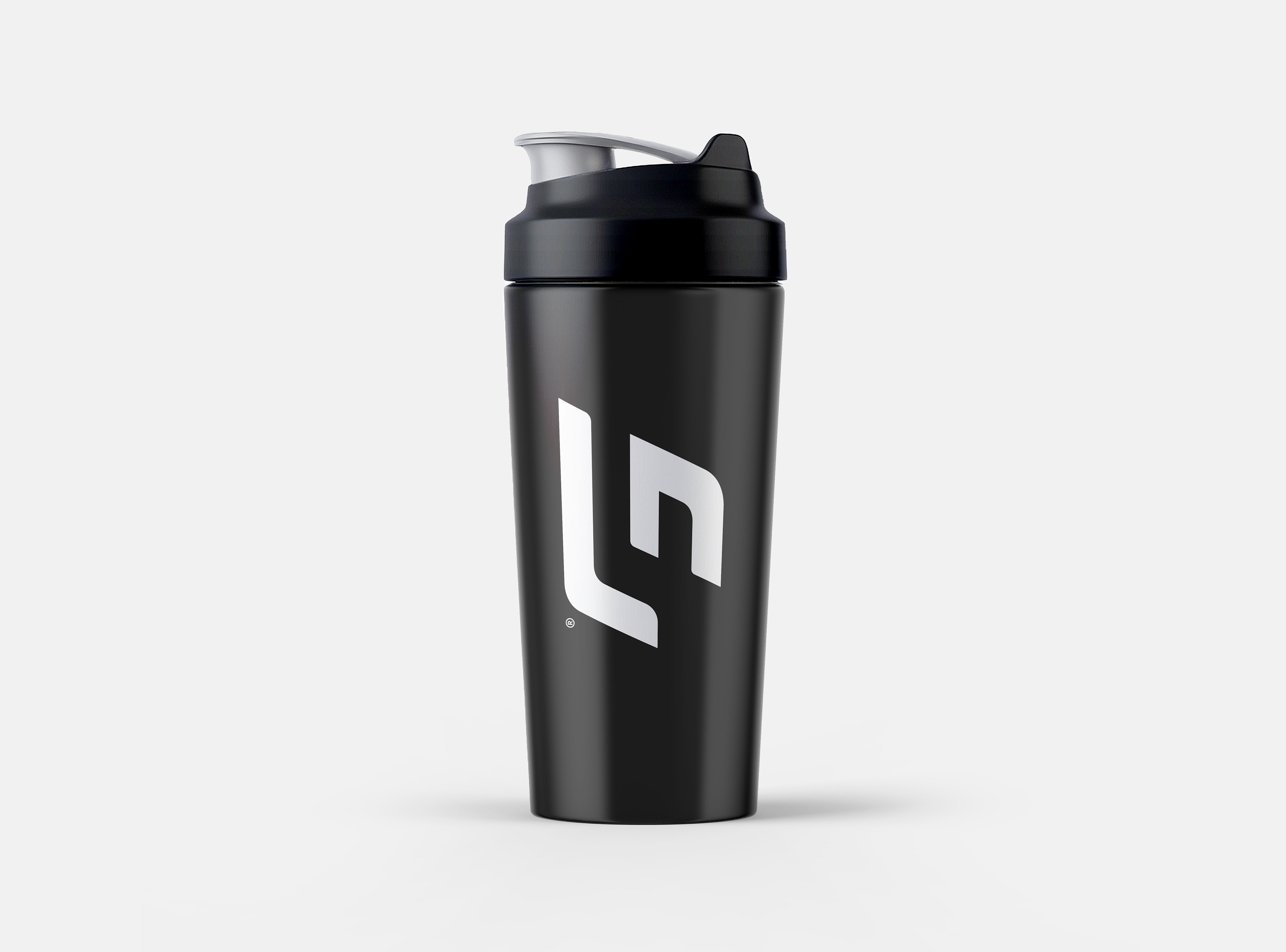
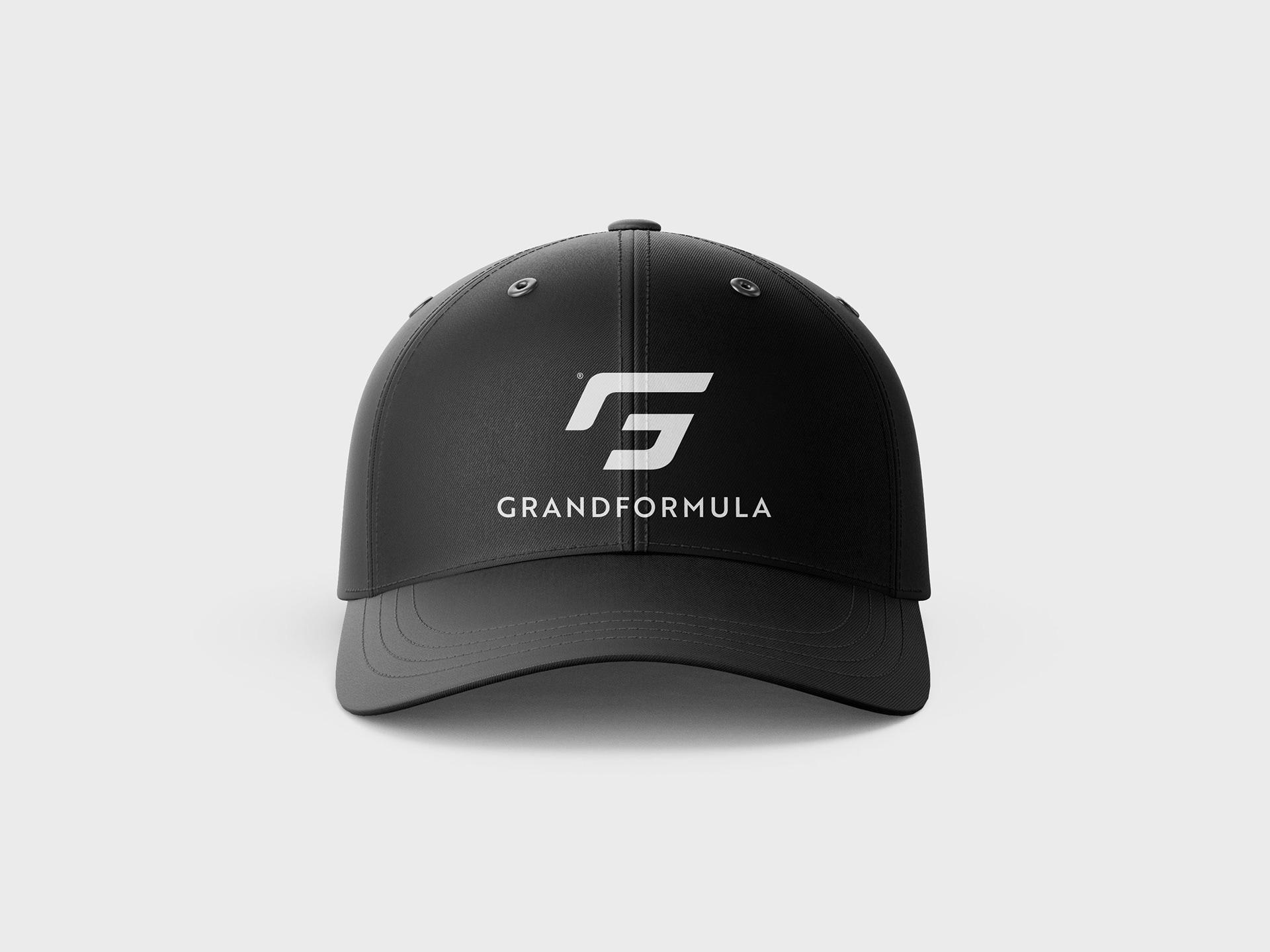
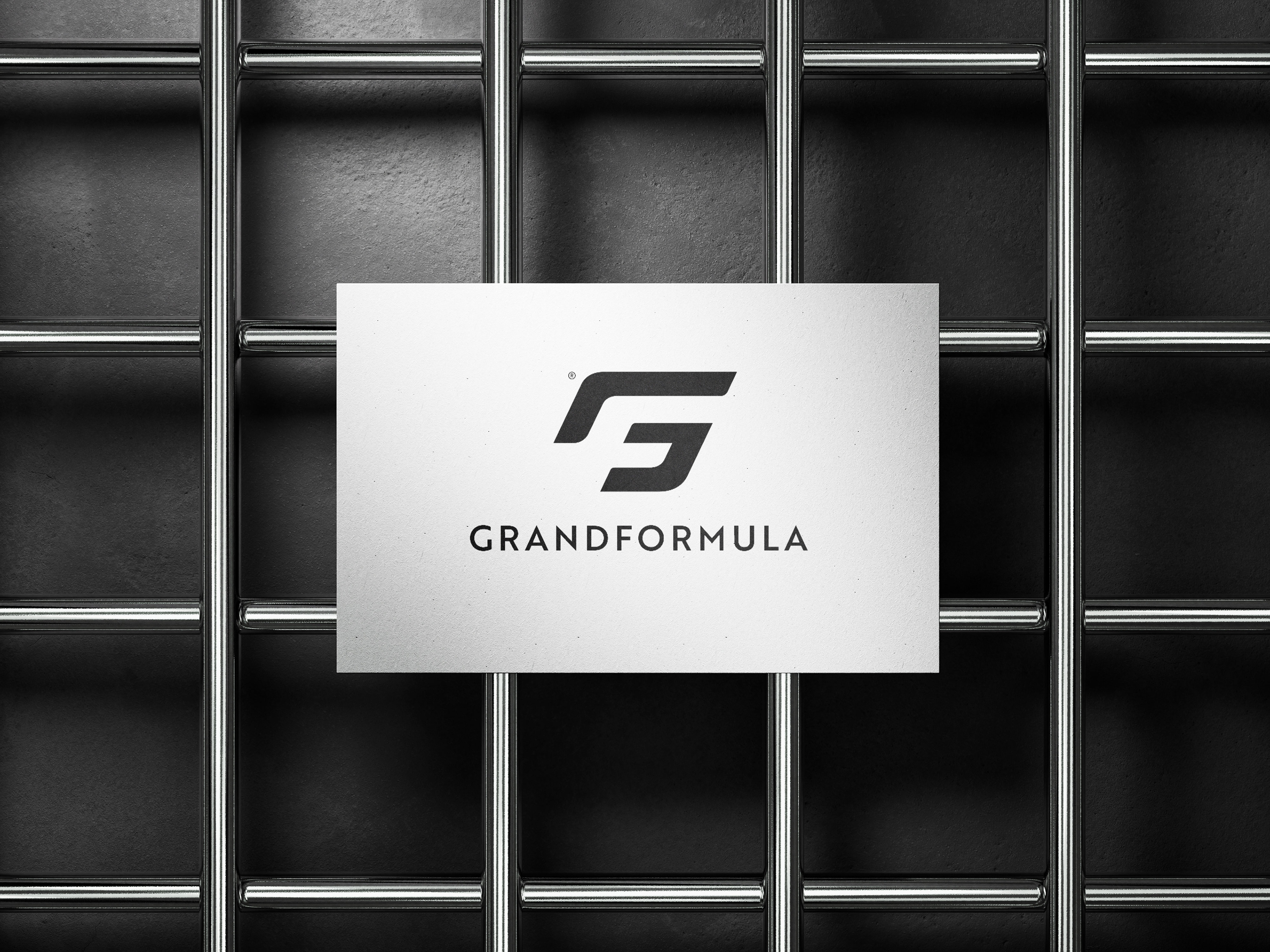
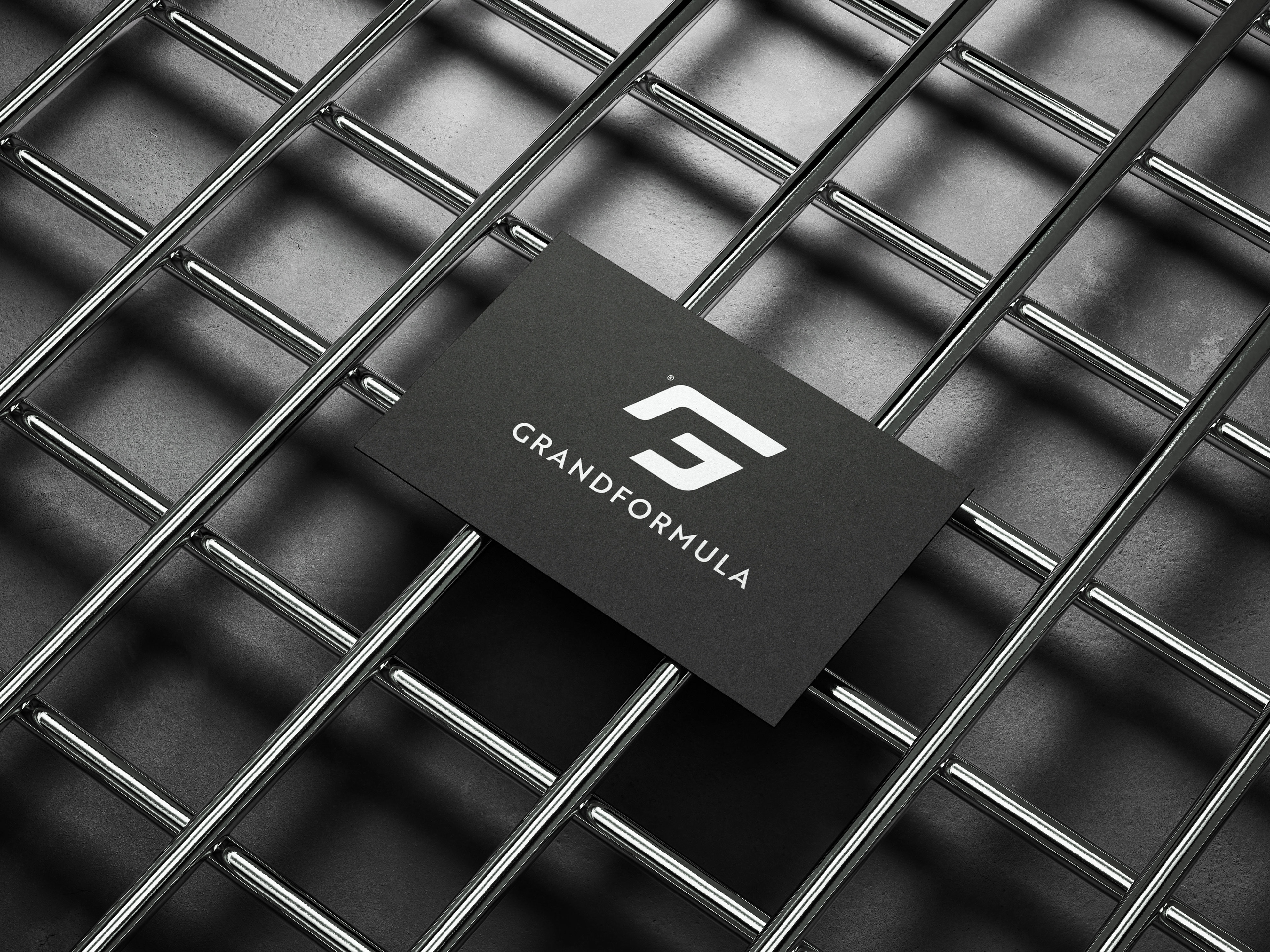
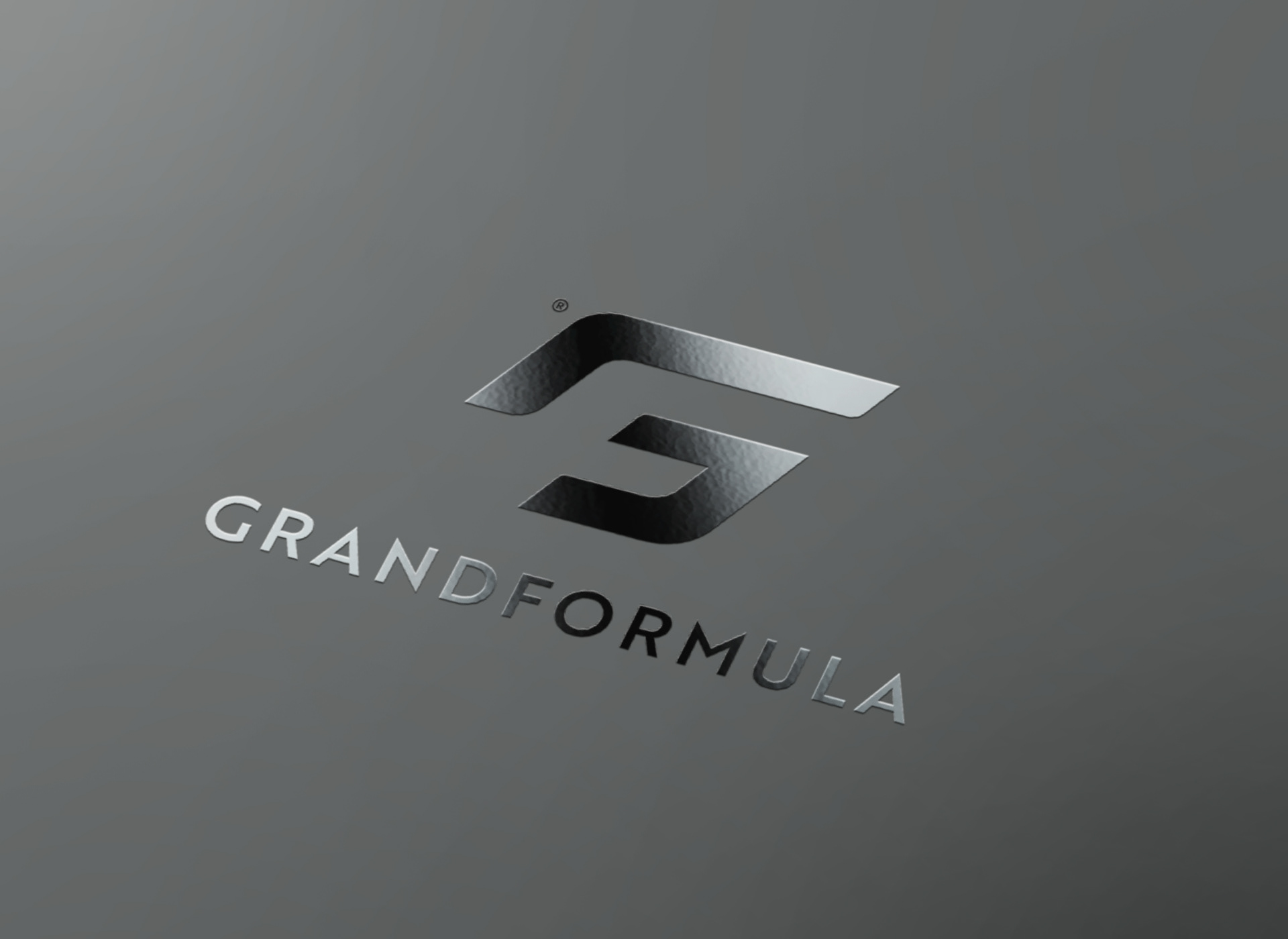
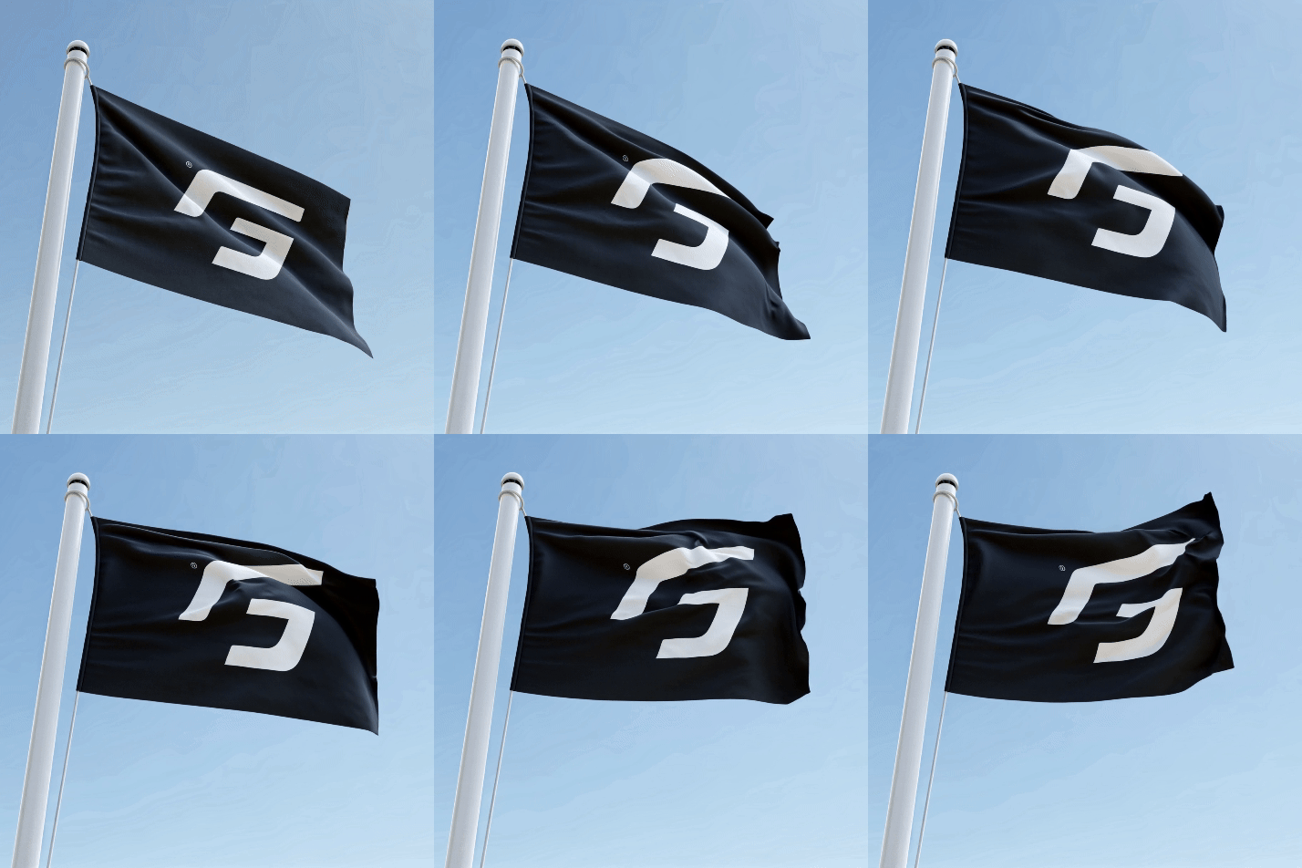
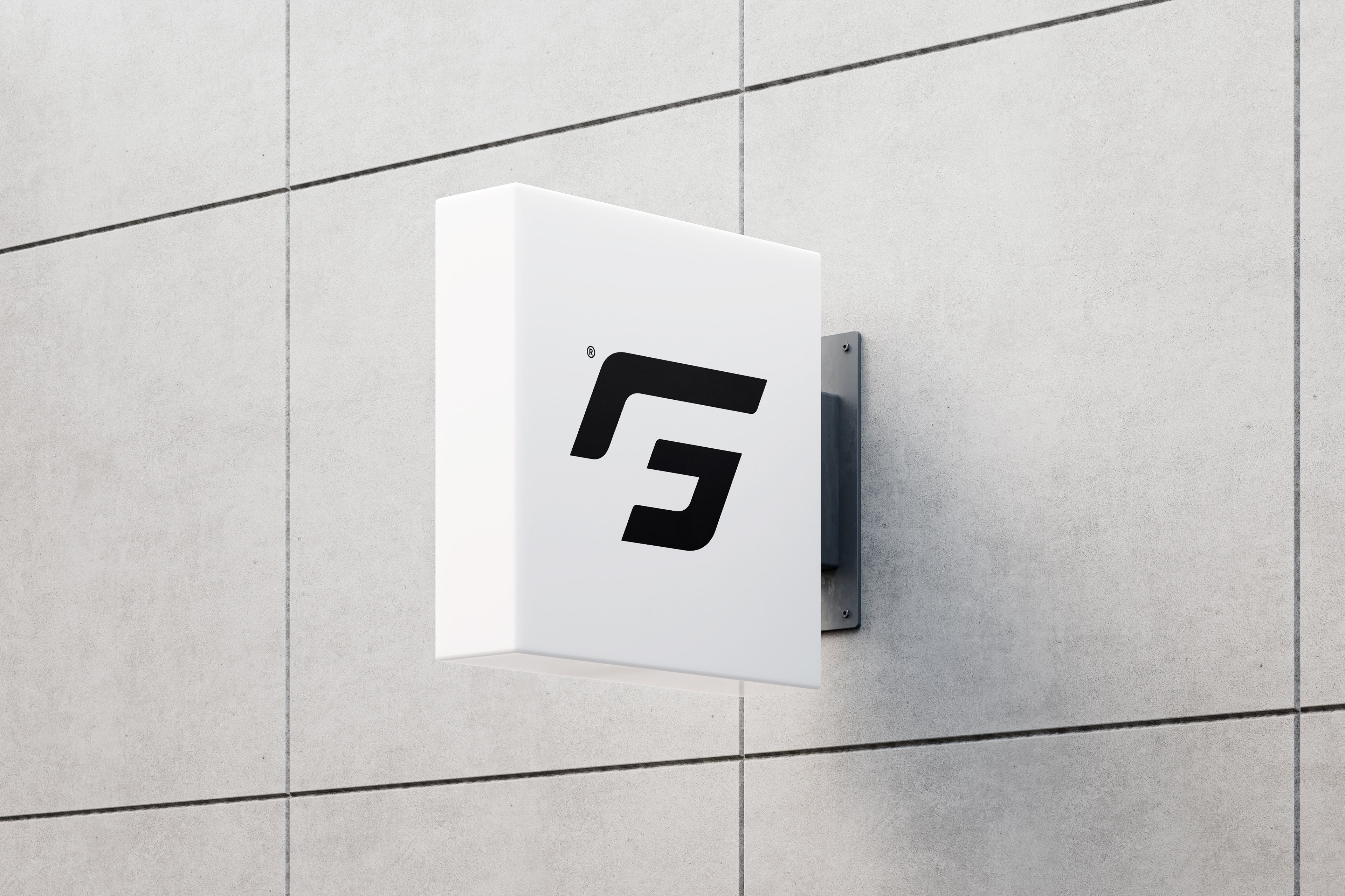
The GrandFormula logo is a masterpiece of visual design that skillfully plays with positive and negative space to create a lasting impression. The G stands out in its positive form, exuding strength and clarity, while the F cleverly emerges from the negative space, adding a dynamic balance and profound meaning to the design.
This visual interplay not only highlights the creativity behind the logo but also symbolizes the duality and harmonious connection between two essential elements. With this brand mark, GrandFormula perfectly encapsulates innovation, precision, and vision.






CLEAN CREATINE
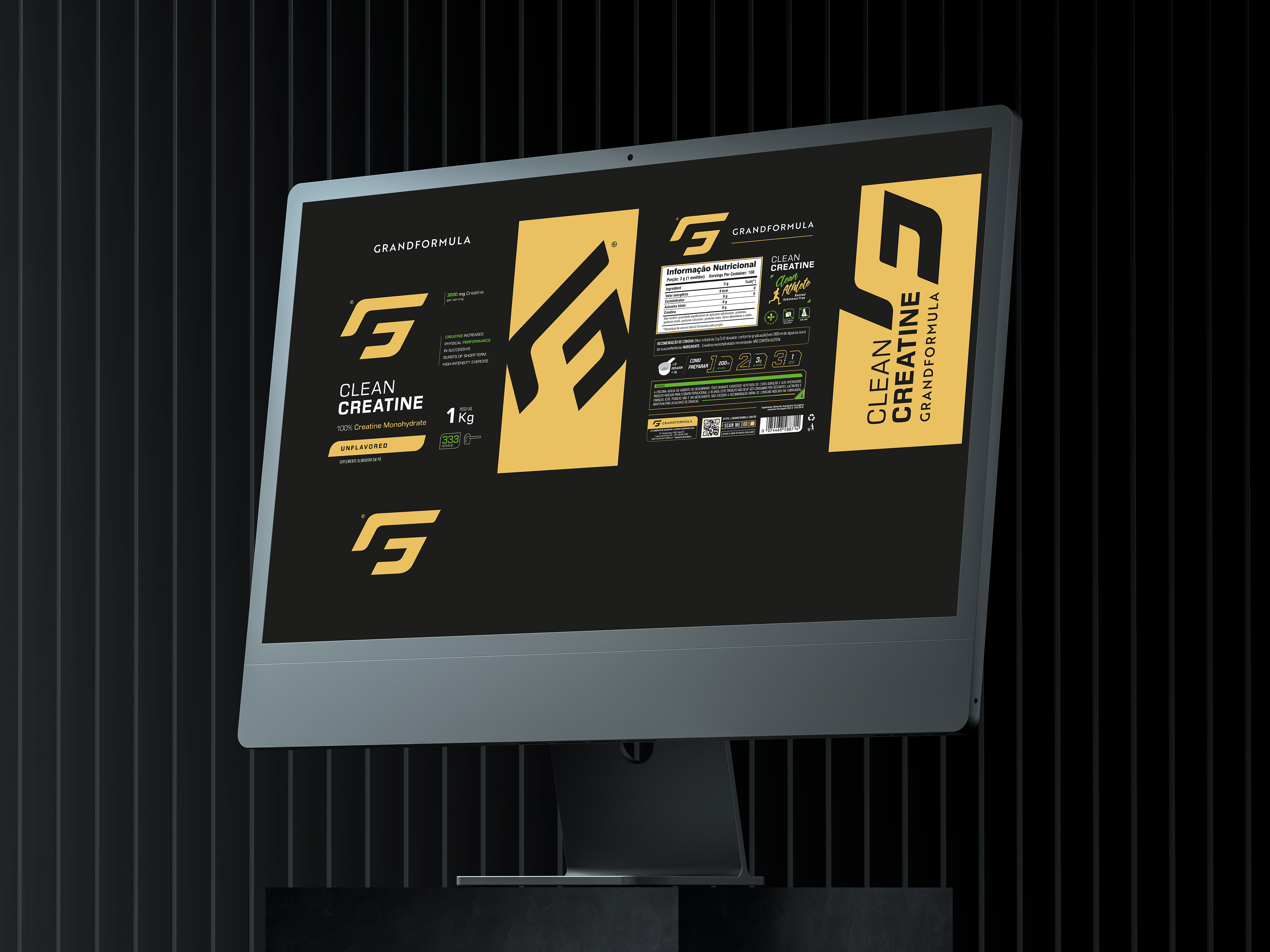
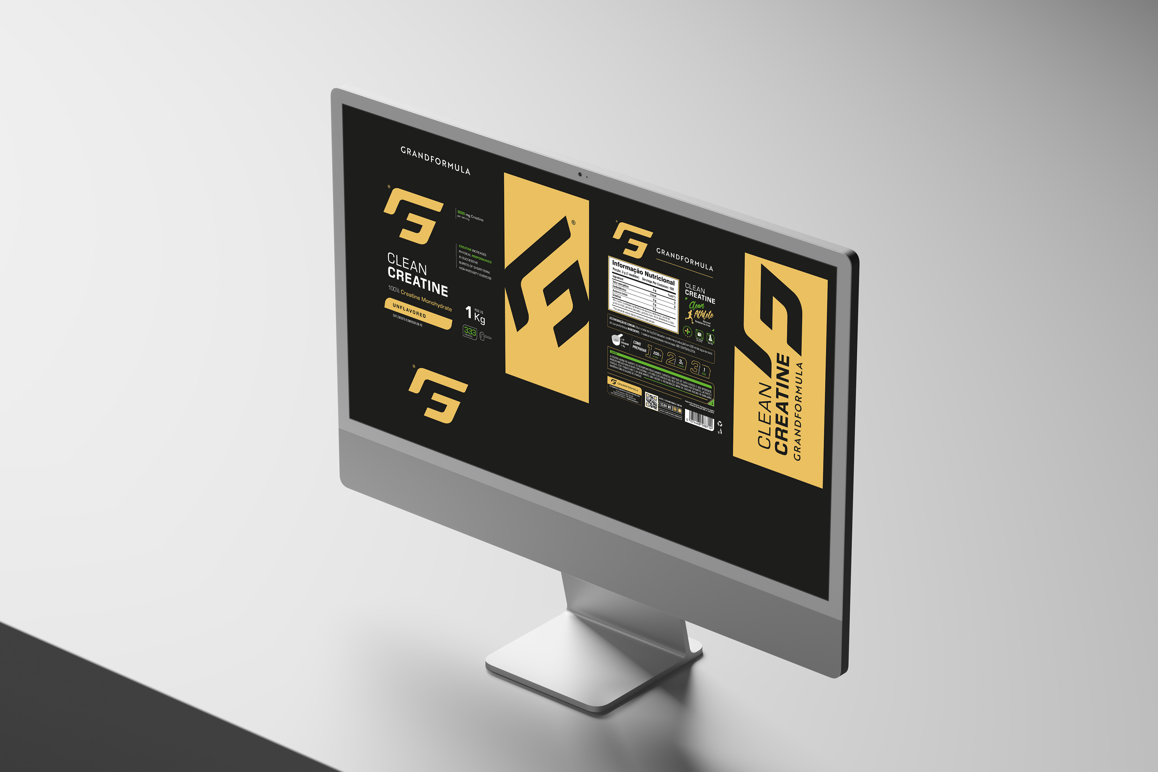
The doypack design for this creatine supplement conveys a modern, athletic, and premium aesthetic, with a strong focus on power and performance. Let's break it down from a graphic designer's perspective.
1. Color Palette & Visual Finish.
—The black base gives the packaging a high-end and professional feel.
—Metallic gold accents reinforce the sense of luxury and high quality, while also symbolizing strength and energy.
—Text elements in white and neon green create a sharp contrast, enhancing readability and highlighting key information.
2. Typography & Hierarchy.
Different weights and colors are used to emphasize essential details:
—"CLEAN CREATINE" in bold, uppercase white letters makes a strong and direct impact.
—"100% Creatine Monohydrate" in yellow reinforces the idea of purity and effectiveness.
Technical details in green neon and white add a dynamic, high-tech feel.
The text layout is well-structured and easy to scan, guiding the viewer effortlessly through the information.
3. Graphic Elements & Branding.
—The background features a repetitive pattern with the brand’s logo, adding visual texture without overwhelming the design.
—The large golden “G” logo in the center acts as a powerful brand identity mark, evoking stability and motion.
—Simple iconography, such as the serving count icon and weight indicator, enhances quick comprehension.
4. Shape & Presentation.
—The matte-finished doypack with metallic details is not only visually appealing but also feels premium and modern.
—The design is clearly targeted at athletes and fitness enthusiasts, with a high-performance, professional look.
This packaging design is a perfect example of premium branding for sports supplements. The combination of dark tones, metallic details, bold typography, and dynamic graphics makes it stand out on shelves while effectively conveying power, exclusivity, and performance.
If the goal is to communicate strength, quality, and effectiveness, this design nails it.

