GodSend — Branding
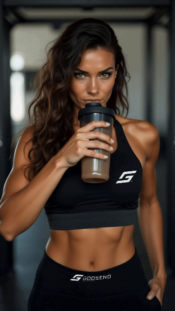
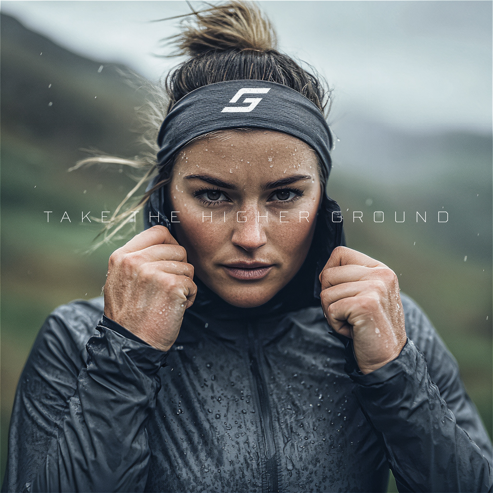
GodSend Nutrition is a high-performance sports nutrition brand designed for runners and endurance athletes striving to reach their peak potential. Guided by the motto "Take the higher ground," the brand embodies strength, resilience, and the unwavering drive to keep moving forward.
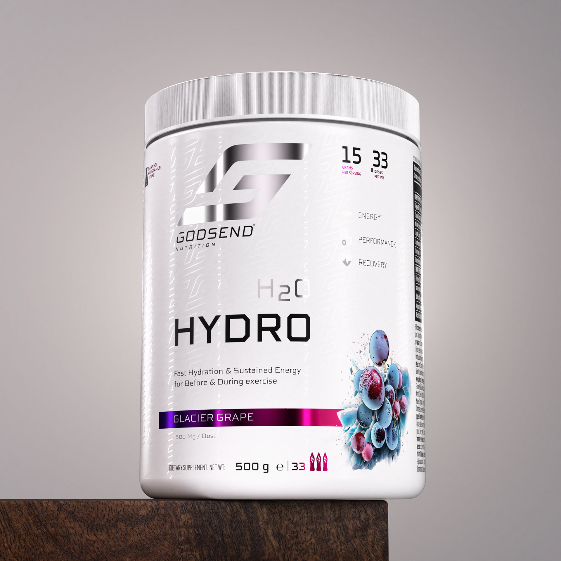
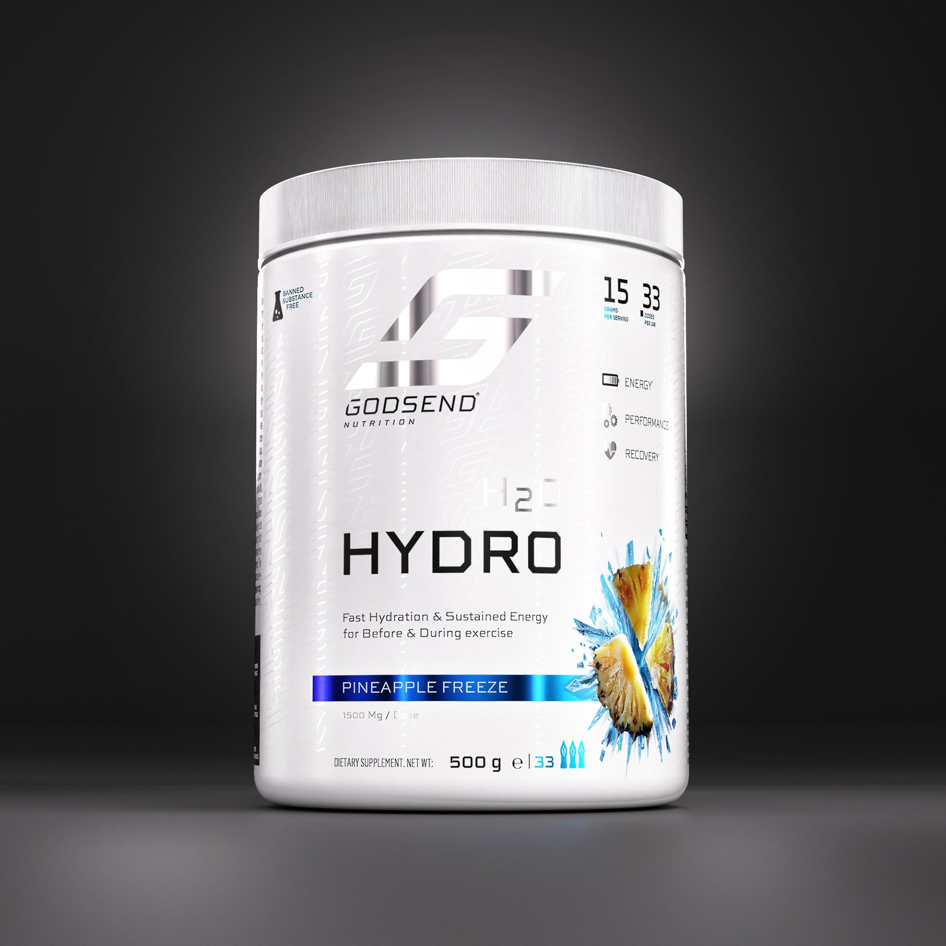
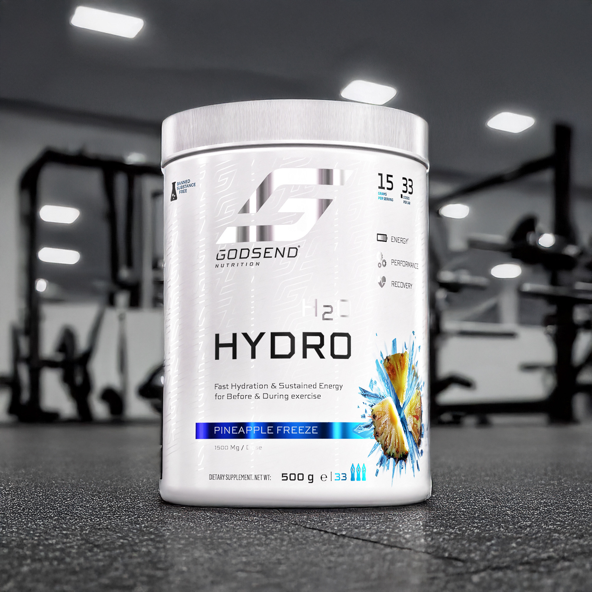
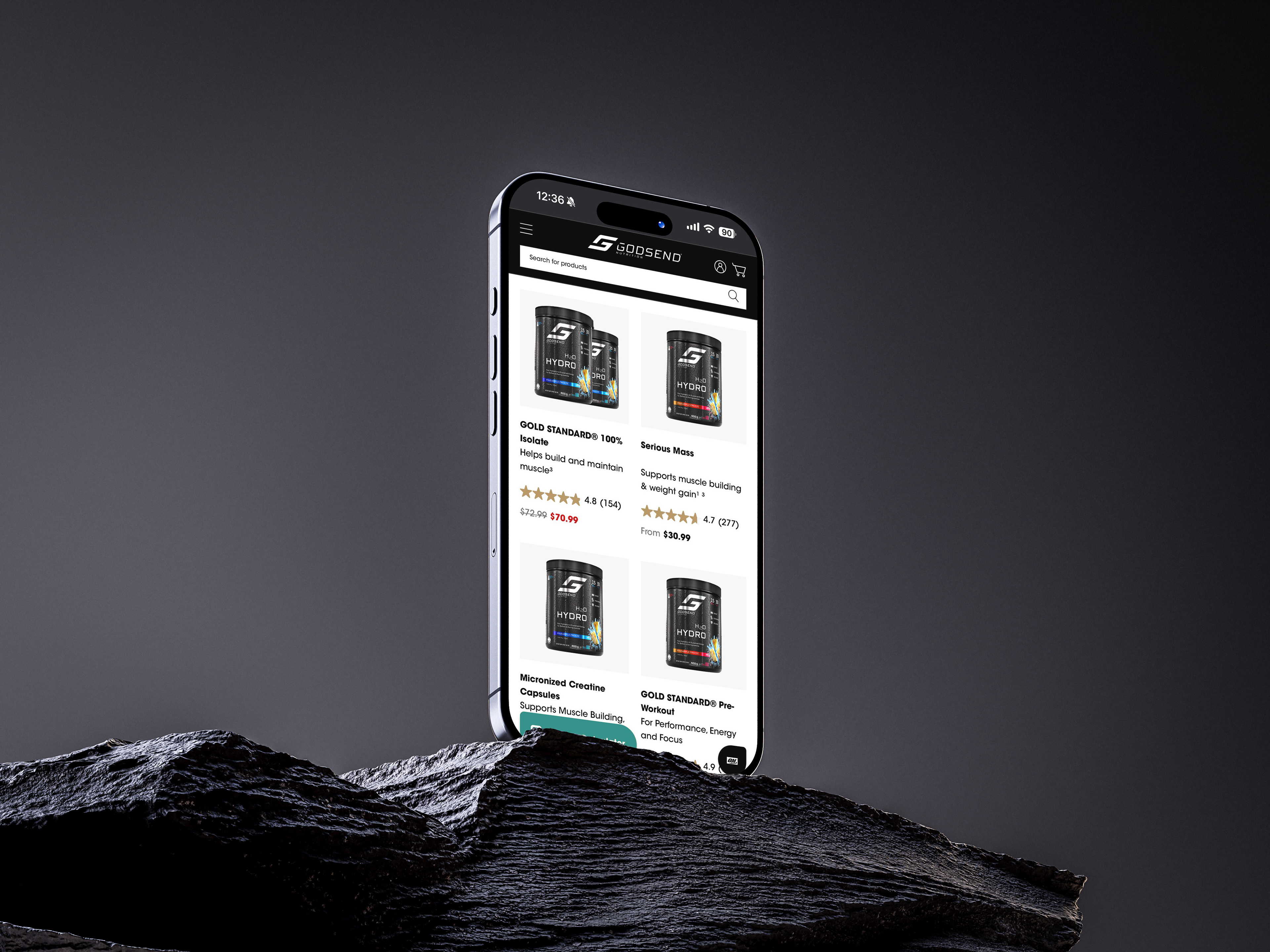
Our flagship product, H2O Hydro, represents the essence of our commitment: fast hydration, sustained energy, and optimal recovery. Each formula is backed by science, tailored to meet the needs of elite runners pushing their limits in training and competition.
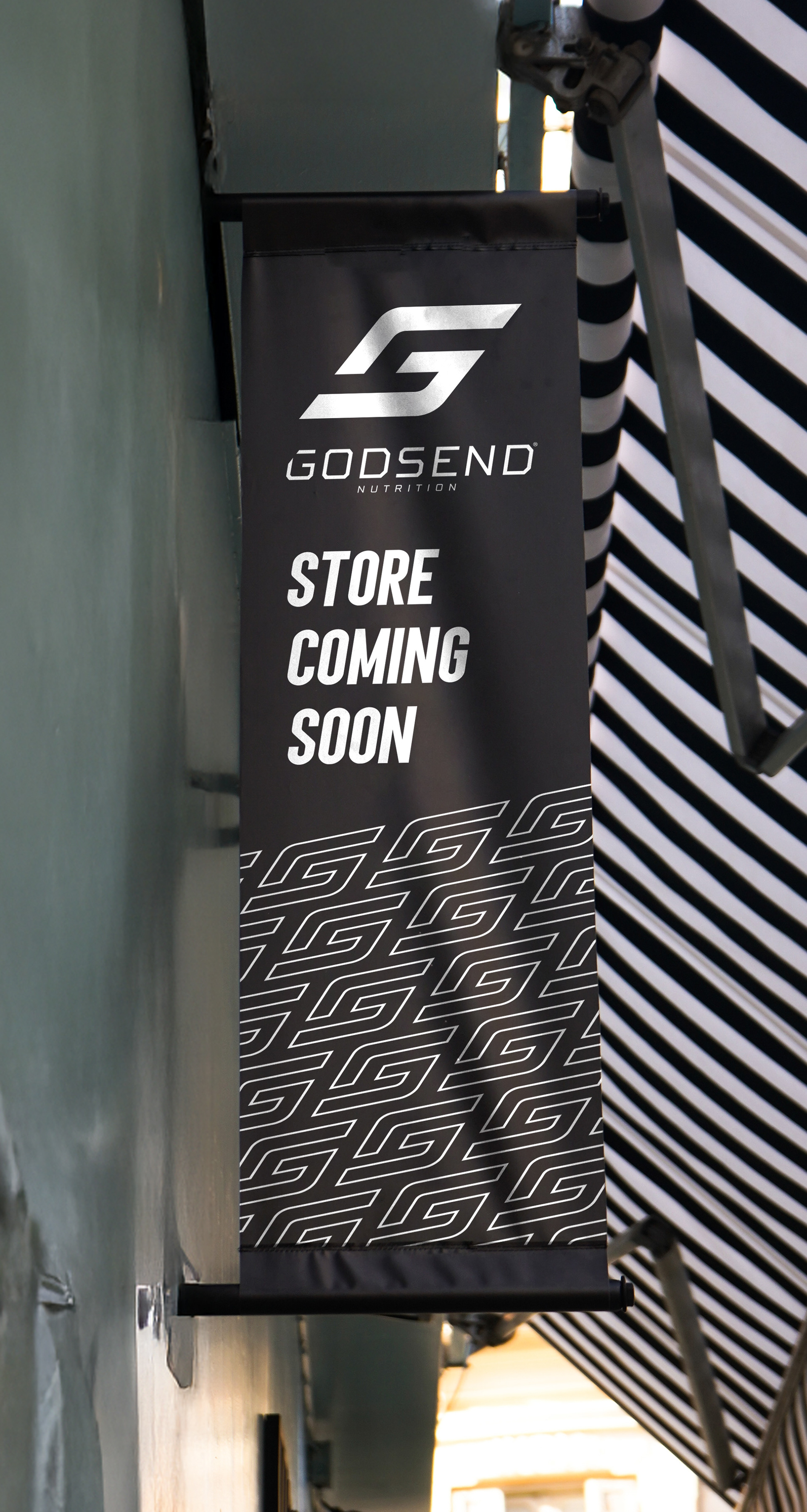
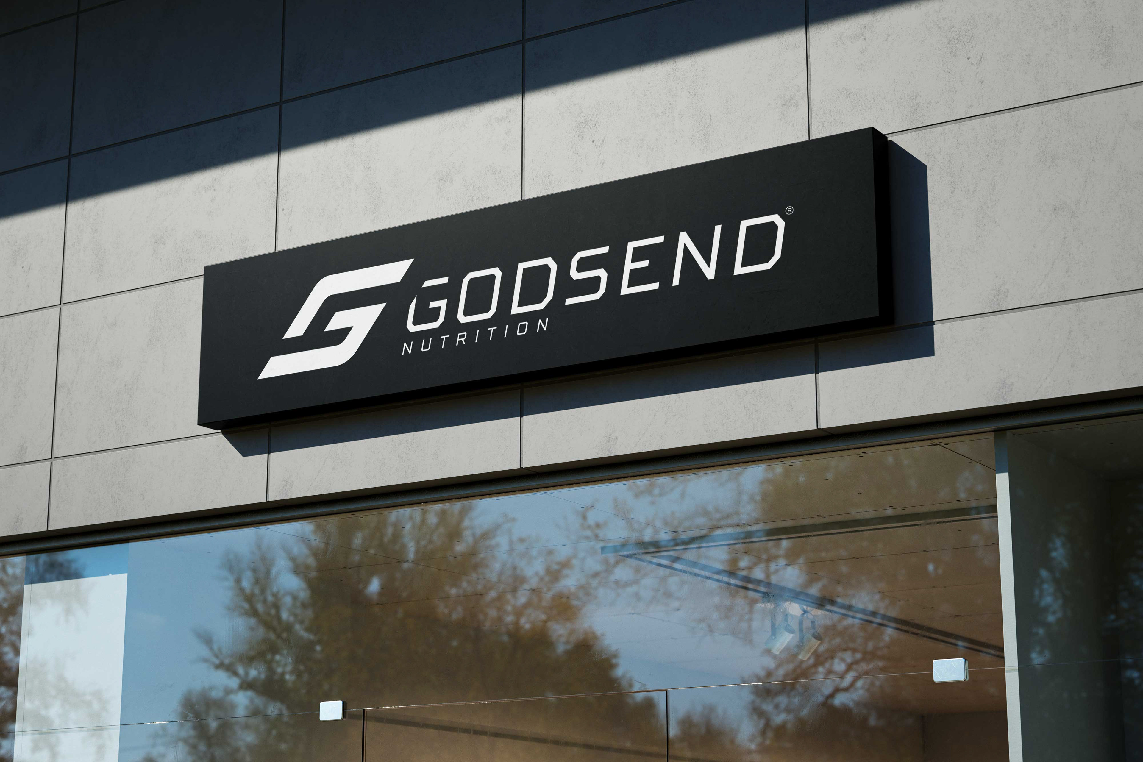
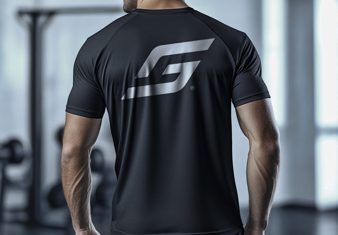
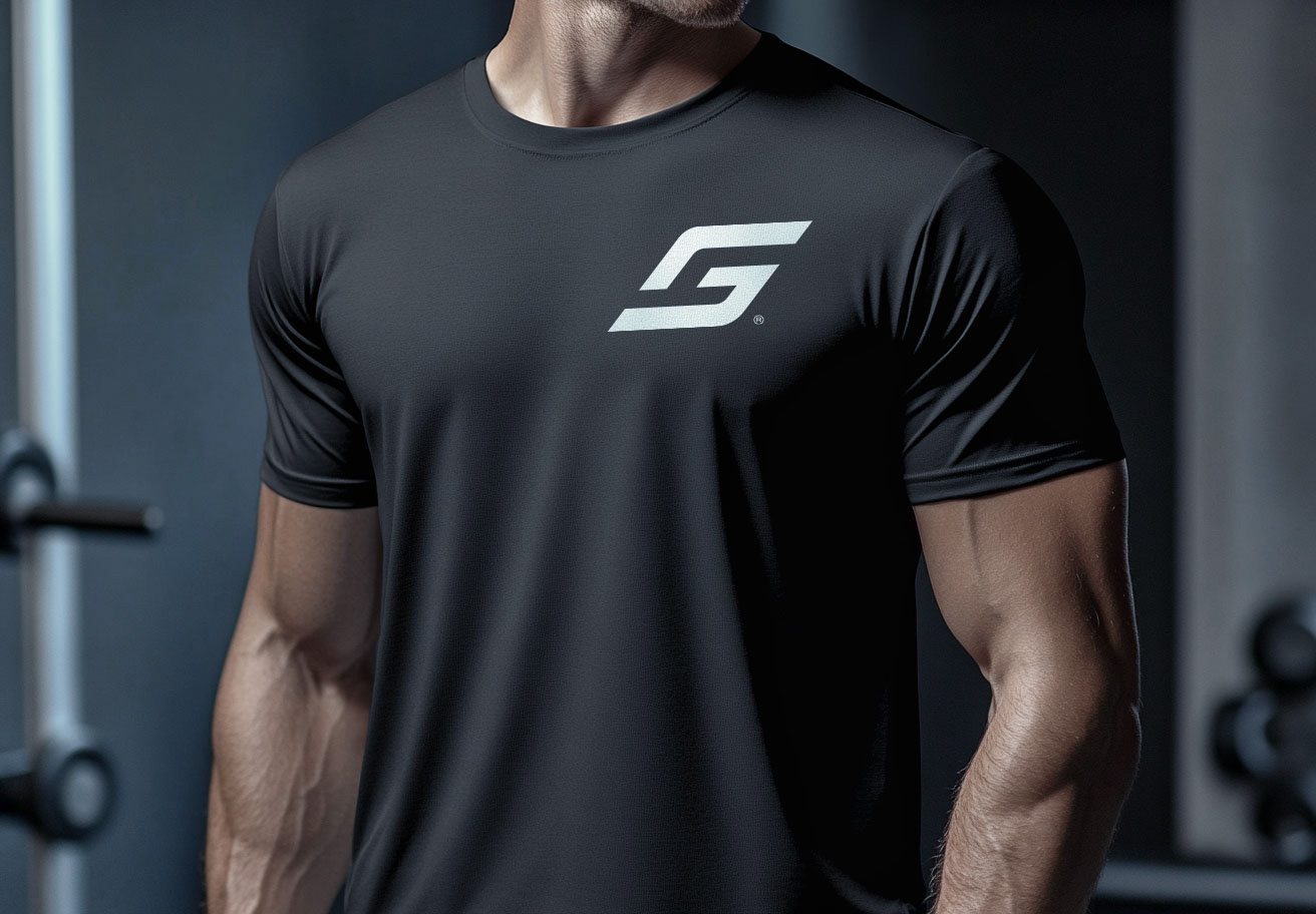
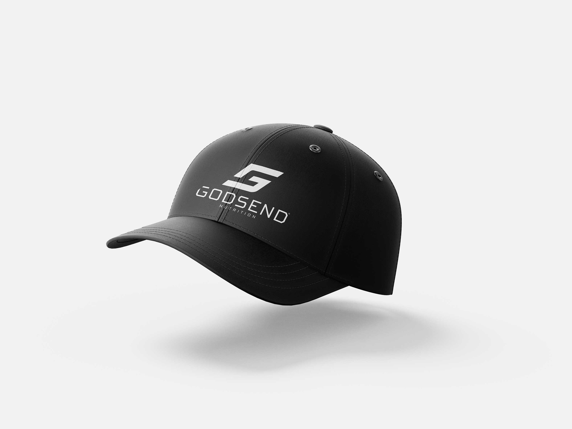
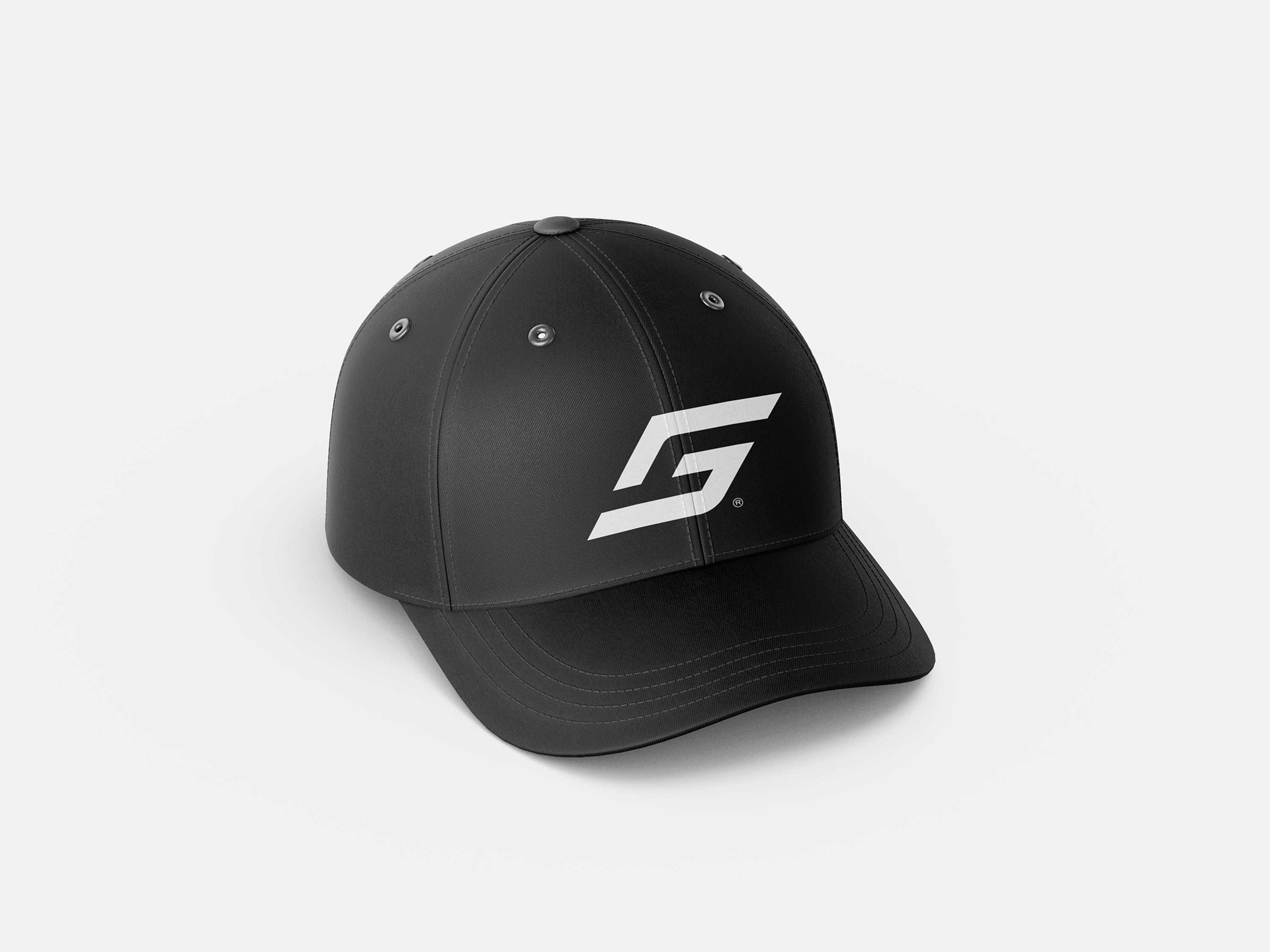
The visual identity reflects power and determination, with bold, dynamic designs that inspire action and confidence. The contrast of sleek metallic accents and energetic pops of color captures the spirit of strength and forward momentum.
At GodSend Nutrition, we also value sustainability, adopting environmentally conscious practices and recyclable packaging to support both athletes and the planet.
GodSend Nutrition stands as a partner in every stride, empowering athletes to rise above and conquer their goals.
Client: GodSend Nutrition
Art Director: Javier Toscano
3D Modeling: Javier Toscano
Year: February 2025
Art Director: Javier Toscano
3D Modeling: Javier Toscano
Year: February 2025
*Javier Toscano Studio; "Where brands become unforgettable."

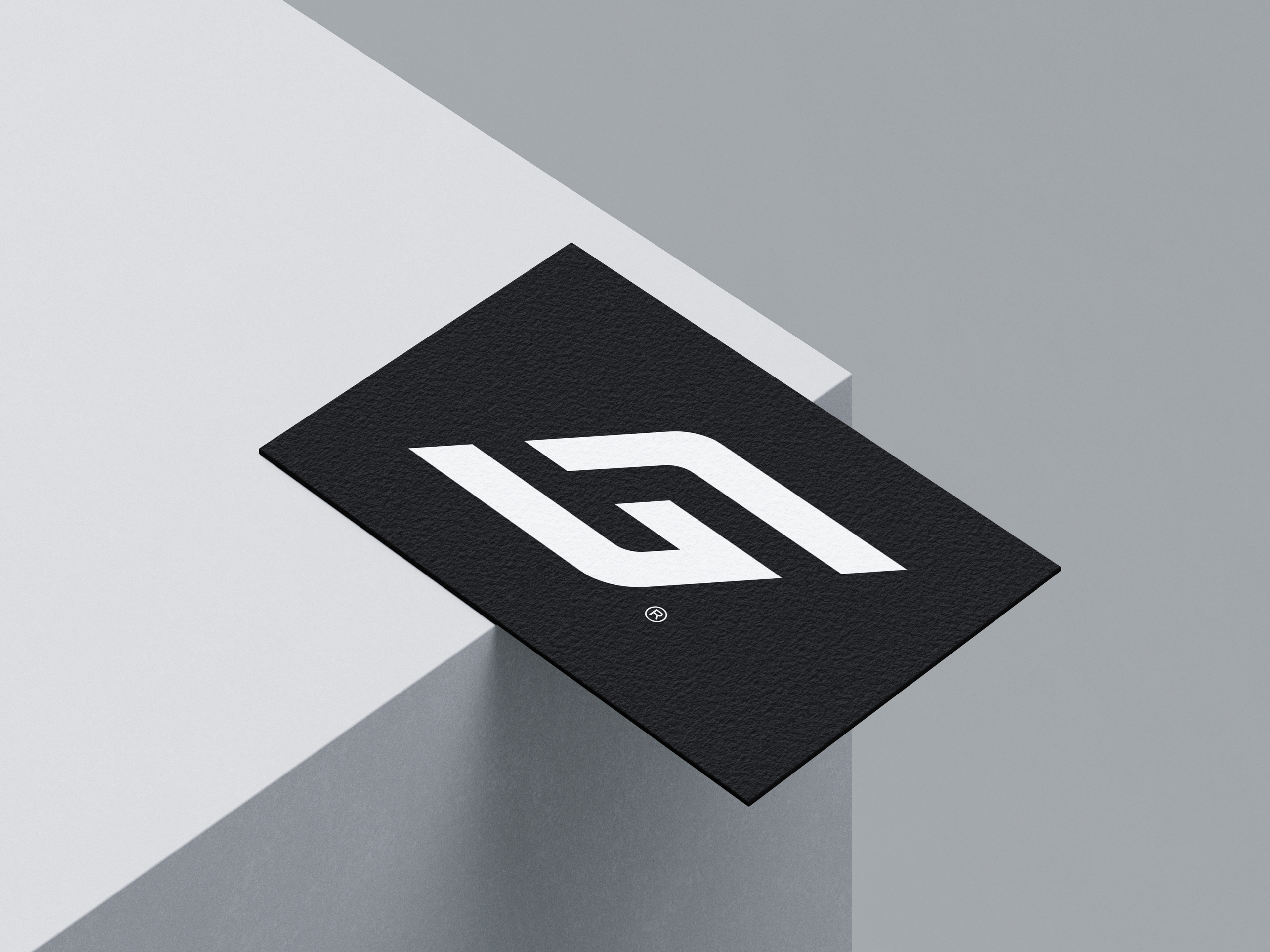
T H E L O G O


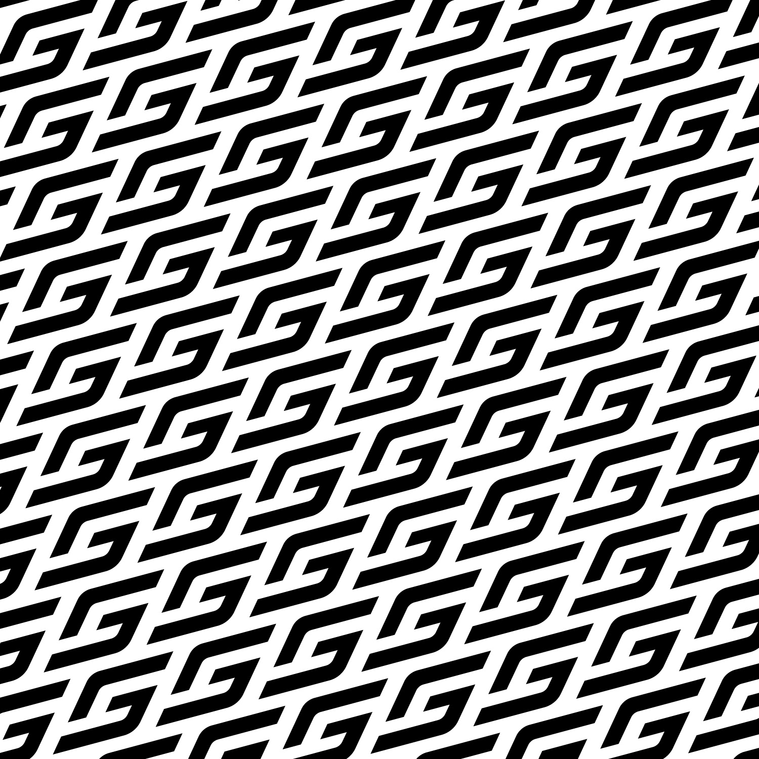
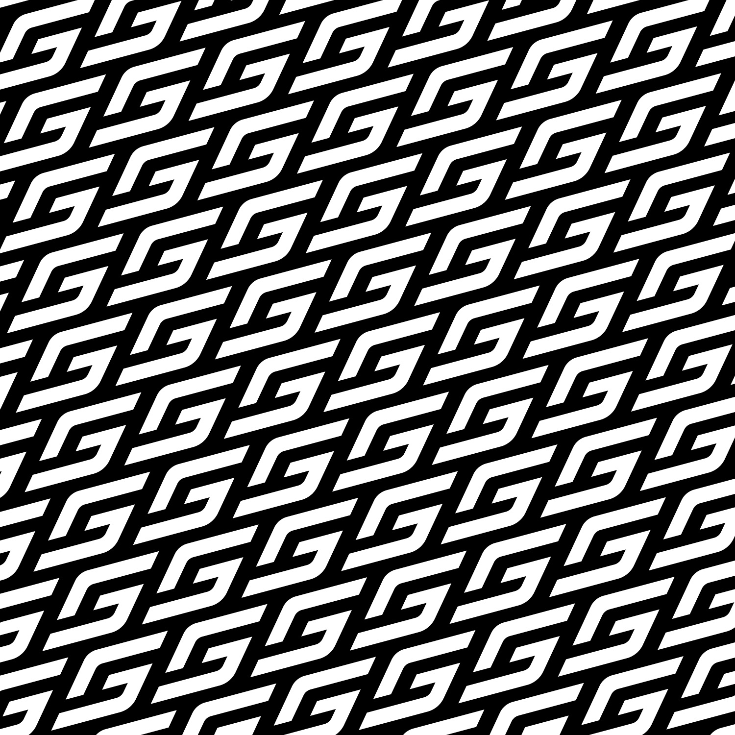
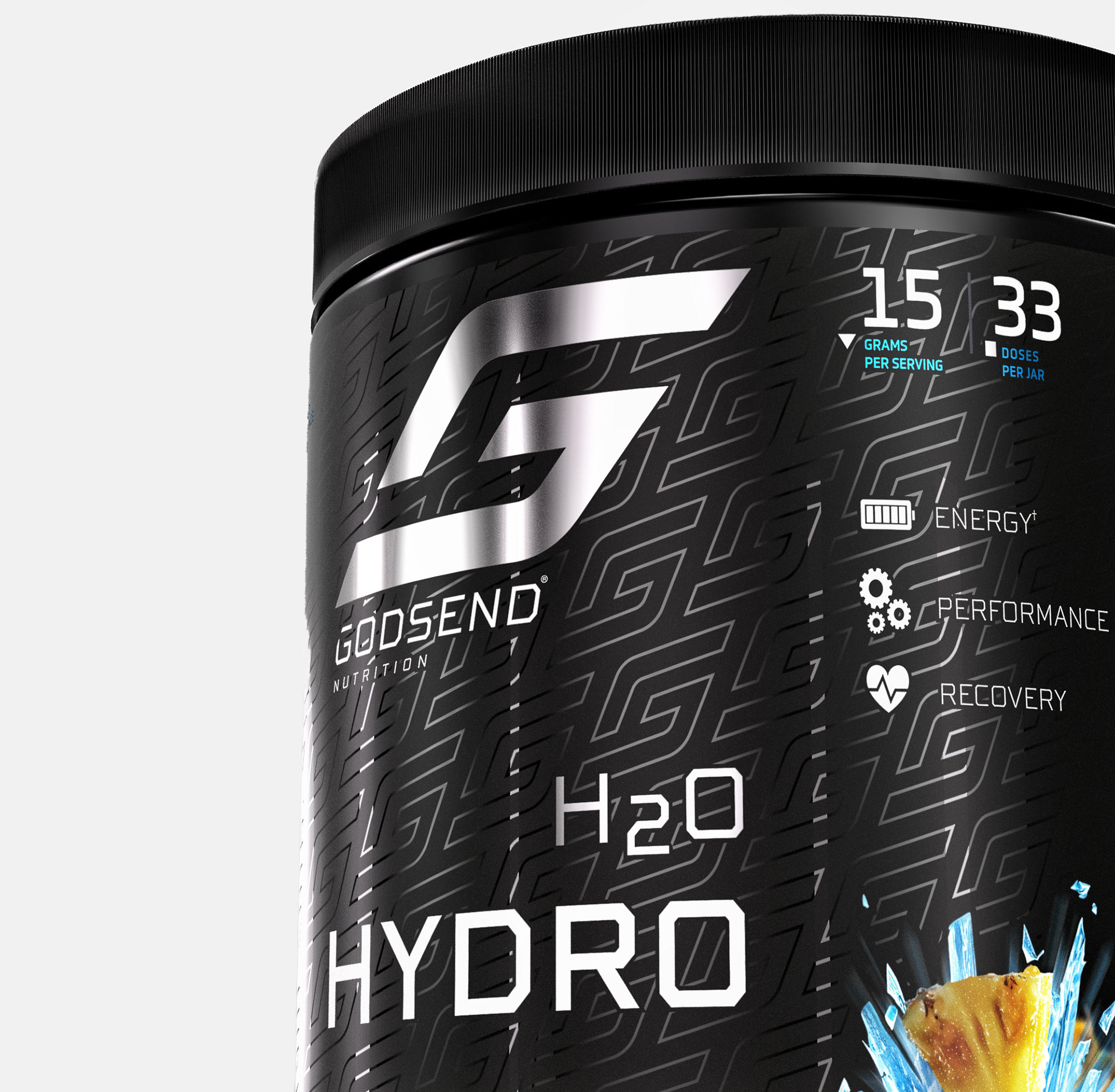
The "GodSend Nutrition" logo seamlessly fuses the letters "G" and "S" into a sleek, dynamic symbol that embodies motion, strength, and sophistication. Its minimalist design, bold lines, and angular typography convey professionalism and energy, appealing to athletes and fitness enthusiasts. The clean and versatile structure enhances brand recognition and works effectively across platforms, while its polished style balances sportiness with elegance, reinforcing the brand’s premium and high-performance image.

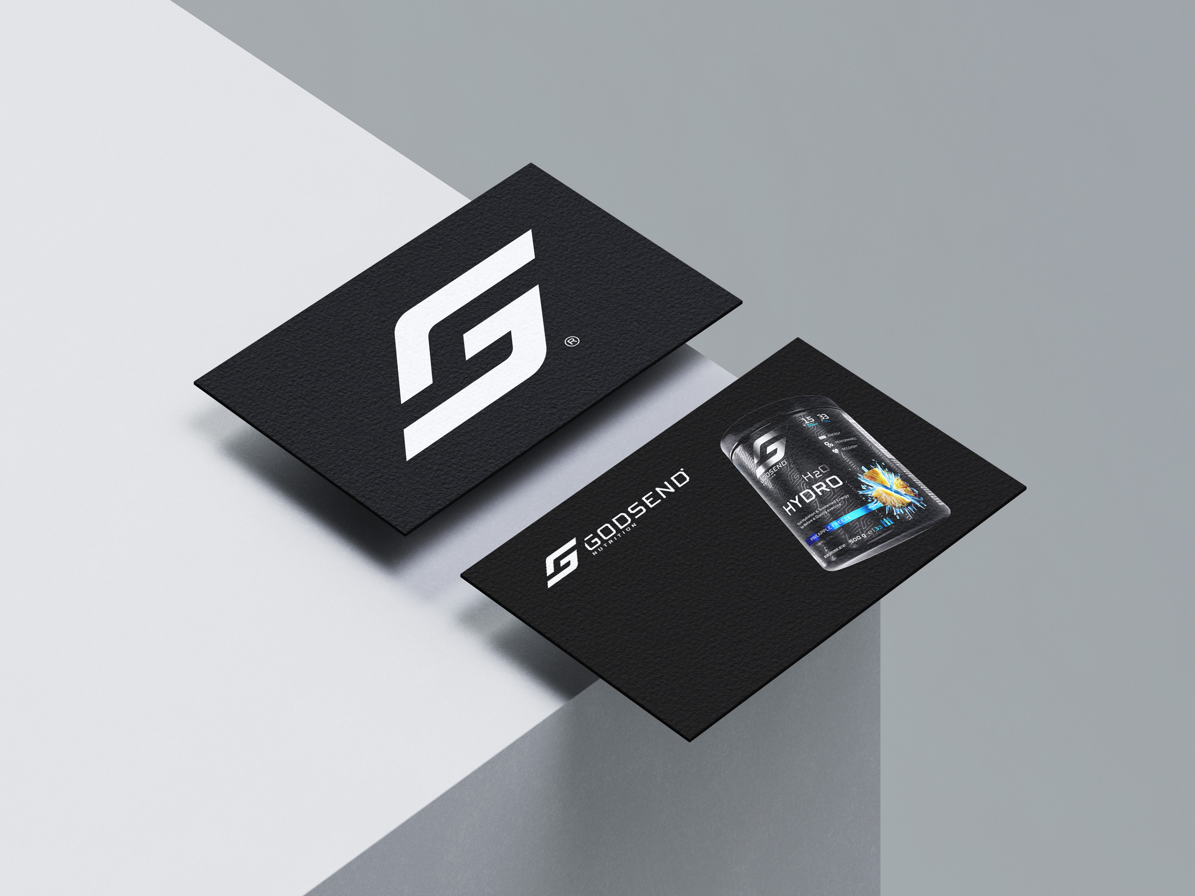

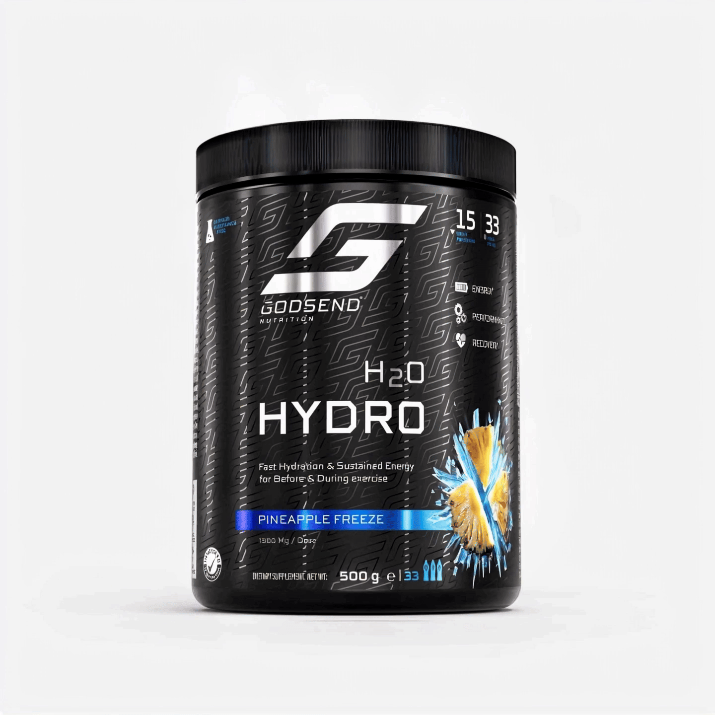
B L A C K M O D E
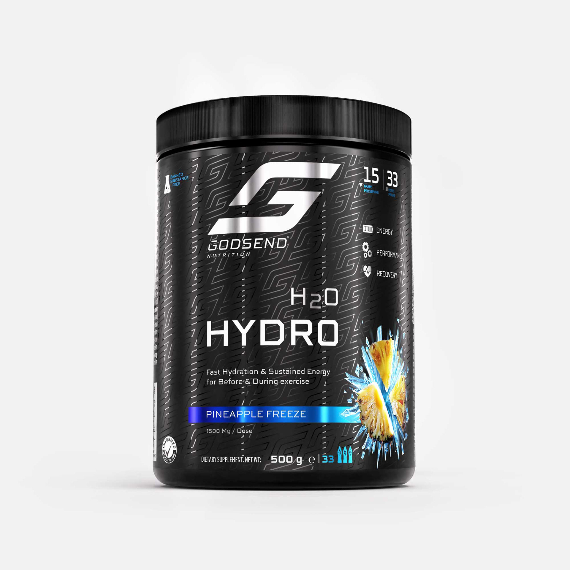
The label design for "GodSend Nutrition H2O Hydro" masterfully combines sportiness and elegance through its modern and minimalist aesthetic. The bold logo, set against a sleek black background with a repeating pattern of the brand symbol, creates a dynamic and high-energy feel.
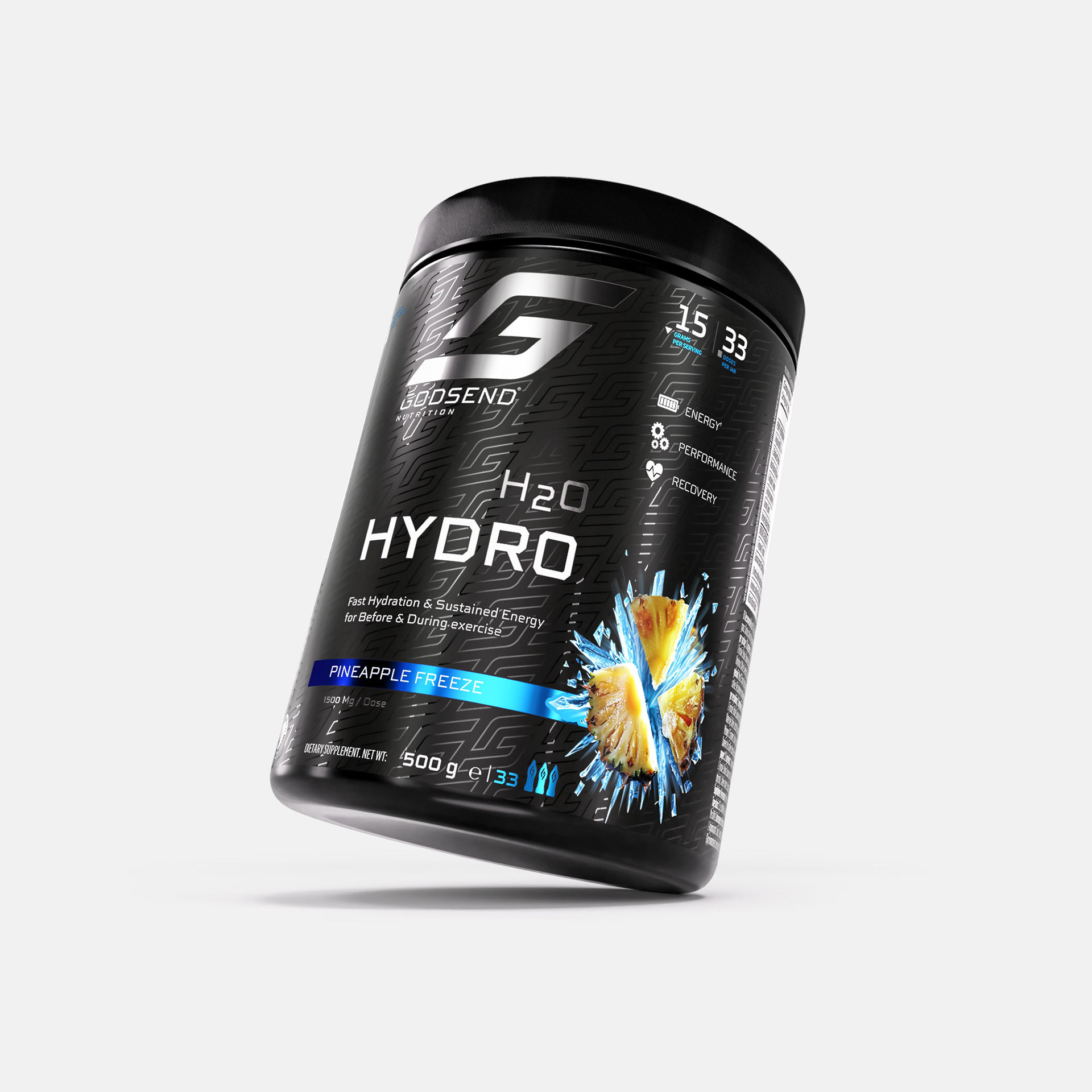
The clean typography and strategic use of blue accents for the "Pineapple Freeze" flavor add vibrancy and freshness, while the icy pineapple imagery enhances visual appeal and communicates the product's refreshing nature. The clear icons and text highlighting energy, performance, and recovery make the packaging both functional and visually striking, reflecting the brand's focus on premium quality and athletic performance.


W H I T E M O D E