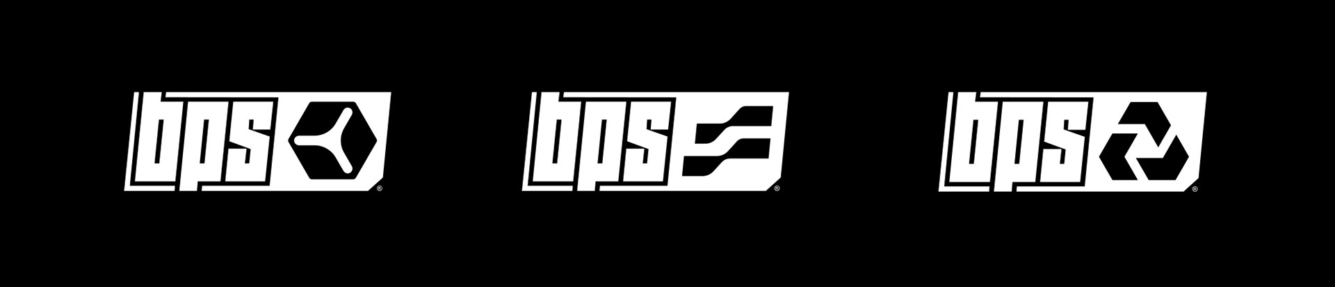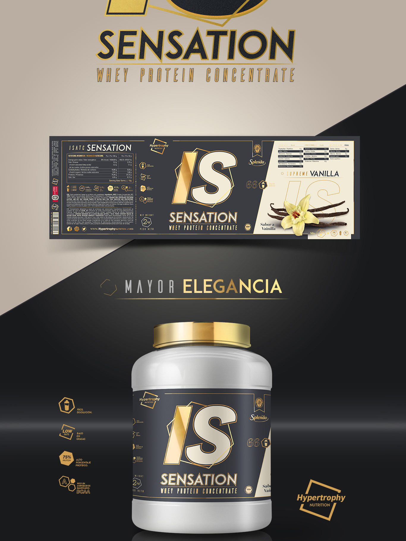
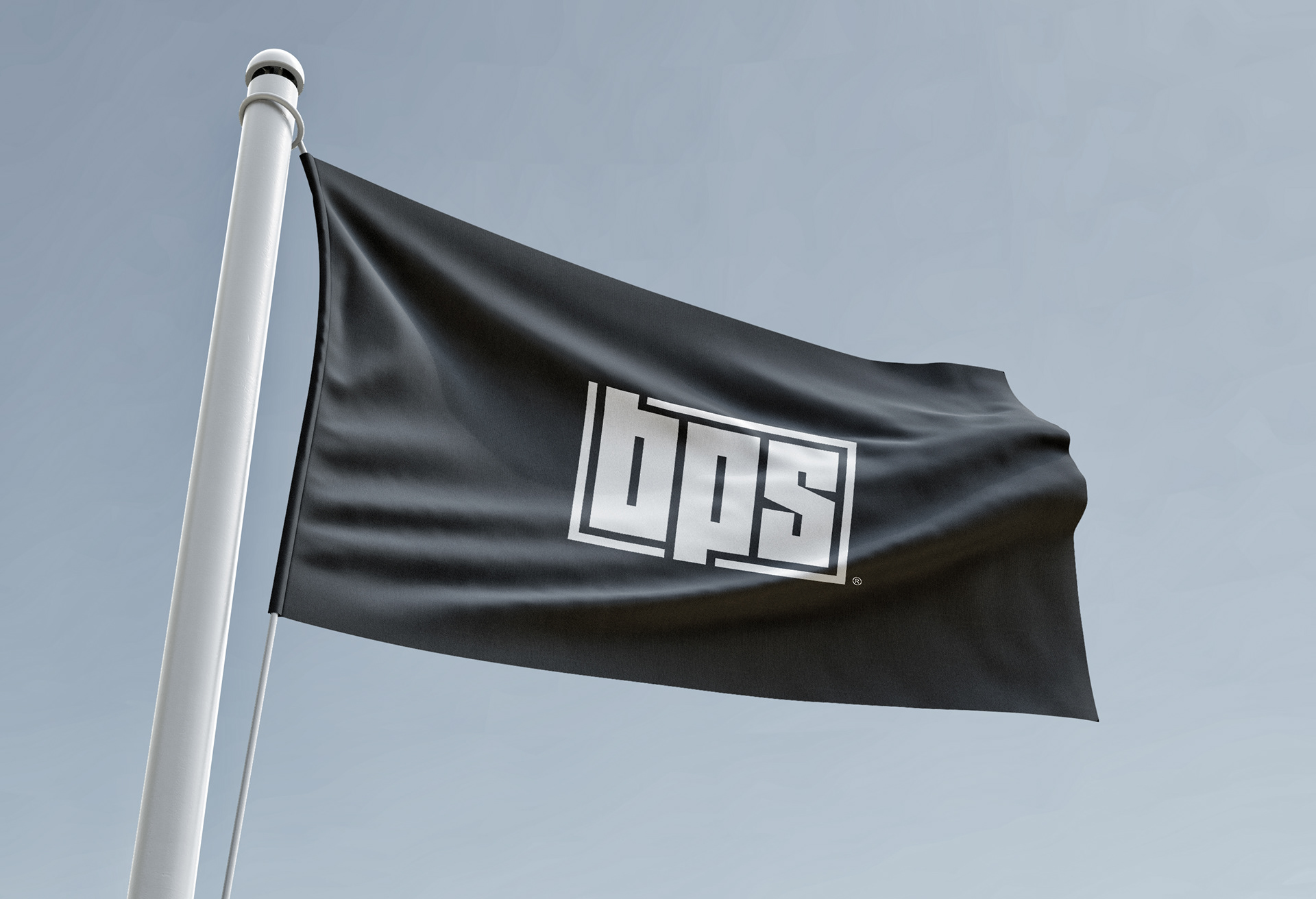
BPS
The new identity of BPS represents a bold evolution, more impactful, more modern, and with a rebellious edge that demands attention. This rebranding brings a fresh energy that feels both athletic and elegant, projecting a strong visual character that will remain relevant for years to come.
We've designed a contemporary style that’s assertive, sporty, and refined at once. From the dynamic typography to the sleek compositions, every element has been thought out to reflect a brand in motion — one that is confident, structured, and ready to lead.
To support this new direction, we introduced three powerful sub-lines. Each one is defined by a distinct color and a unique energy that contributes to the brand’s flexibility and coherence. ESSENCE is brought to life through green tones that suggest balance and clarity. CORE speaks in red, radiating strength and determination. And RECOVERY finds its voice in deep blue, evoking calm, regeneration, and a sense of control.
This strategic chromatic system ensures that the BPS brand can evolve, adapt, and grow while staying instantly recognizable. It’s a rebranding that brings clarity and purpose to every visual expression.
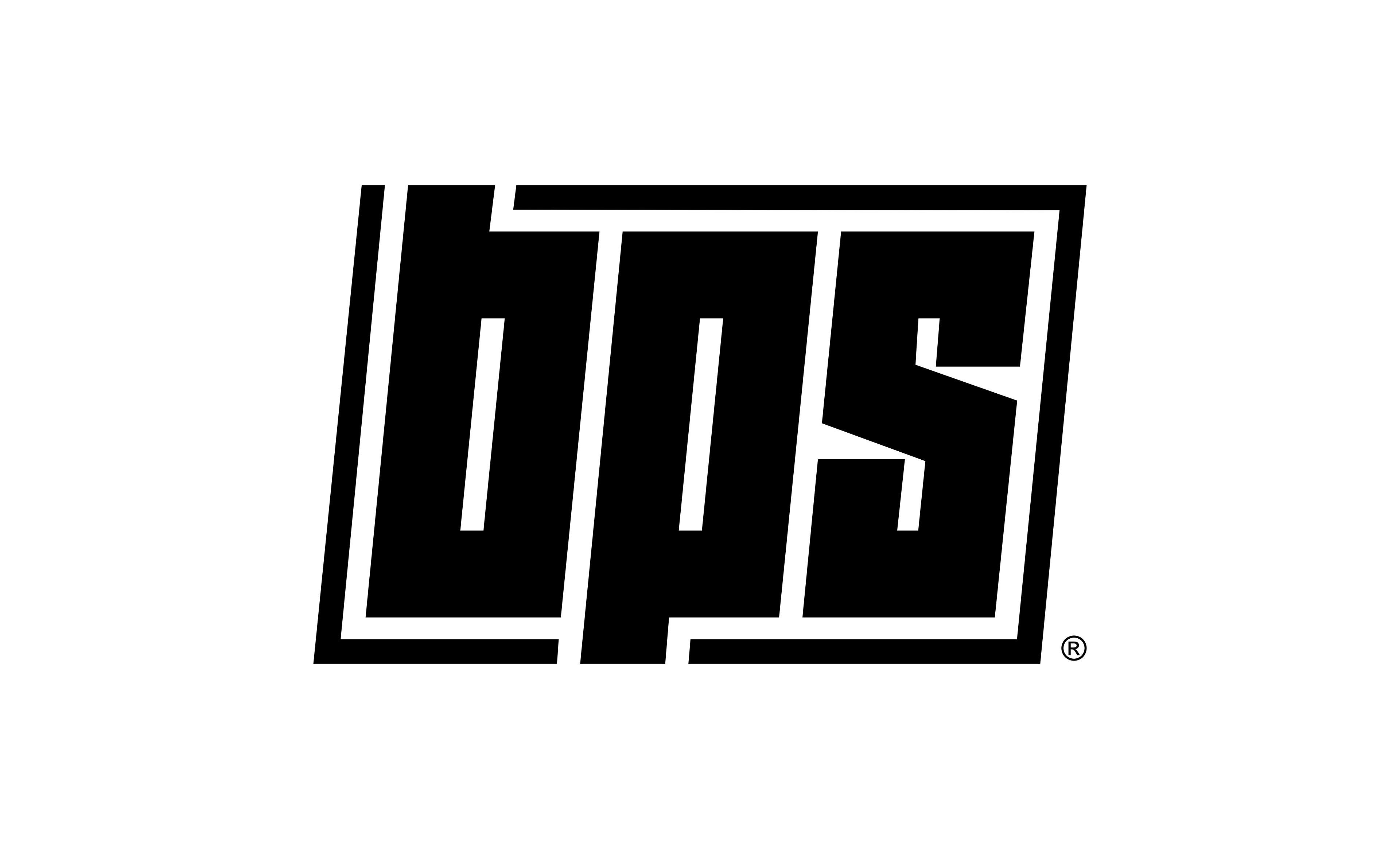
THE FONT
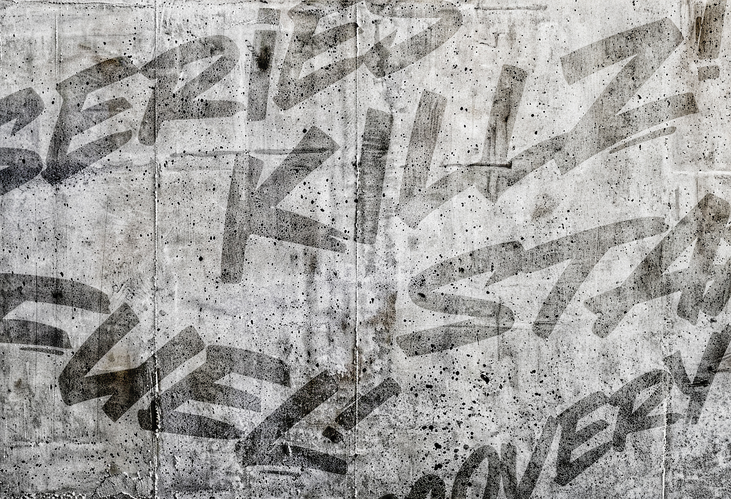
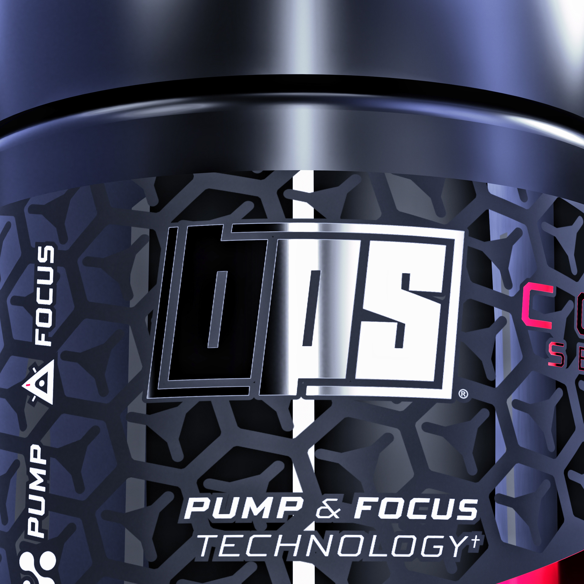
To give each product line a strong and distinctive voice, I created a fully custom display font using AI-assisted techniques. Starting from generative prompts and rough sketches, I refined the results into a graffiti-inspired type style, raw, dynamic, and completely unique. The bold lettering adds a rebellious edge to the brand, perfectly capturing the street-smart, unapologetic attitude behind BPS. It’s more than just typography, it’s a statement.
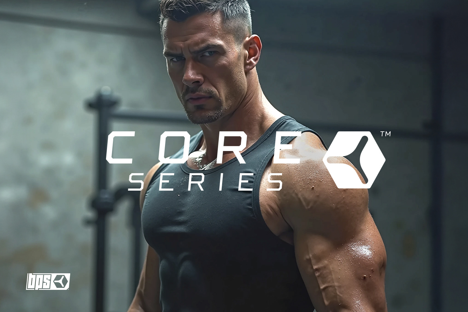
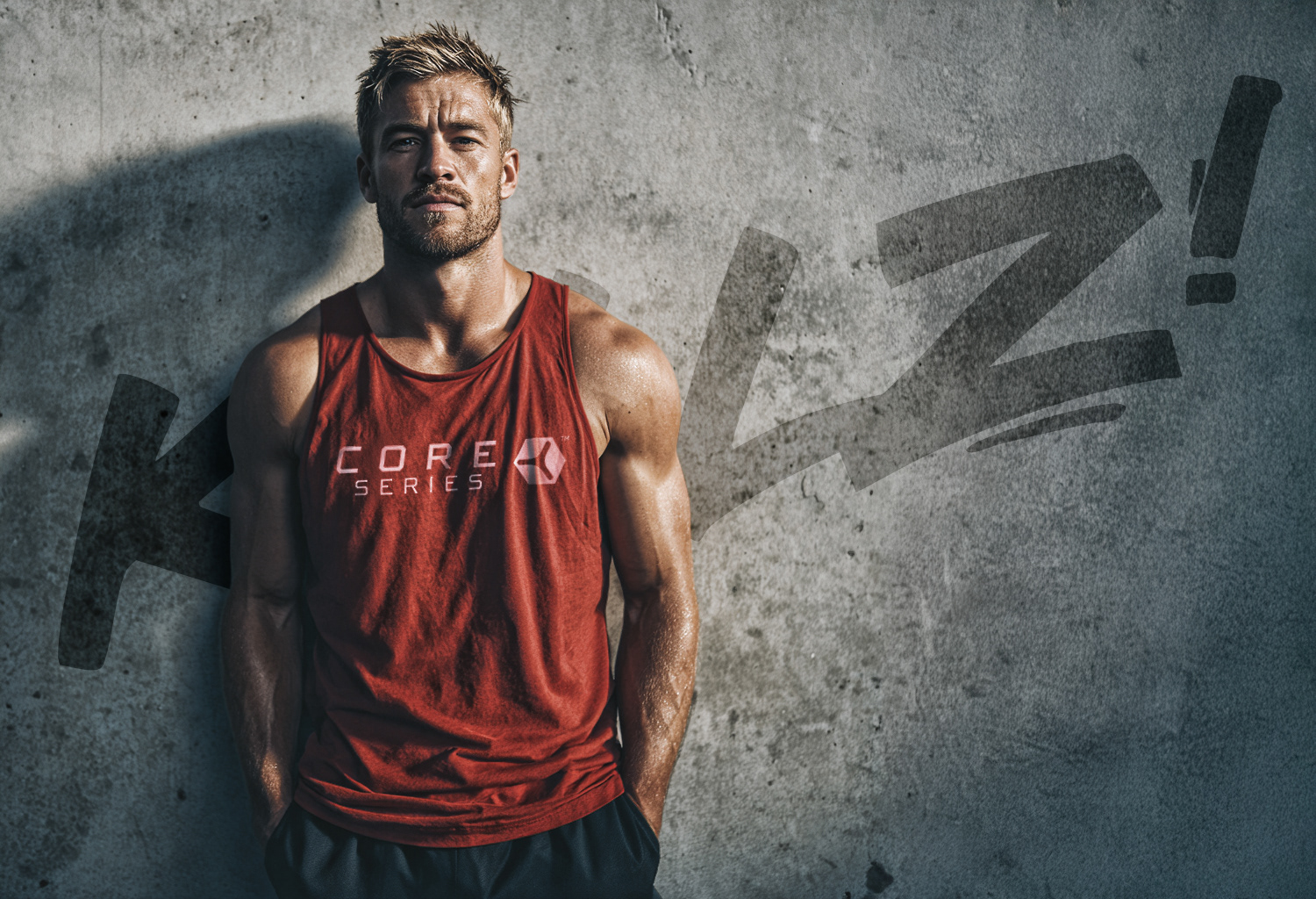
CORE SERIES
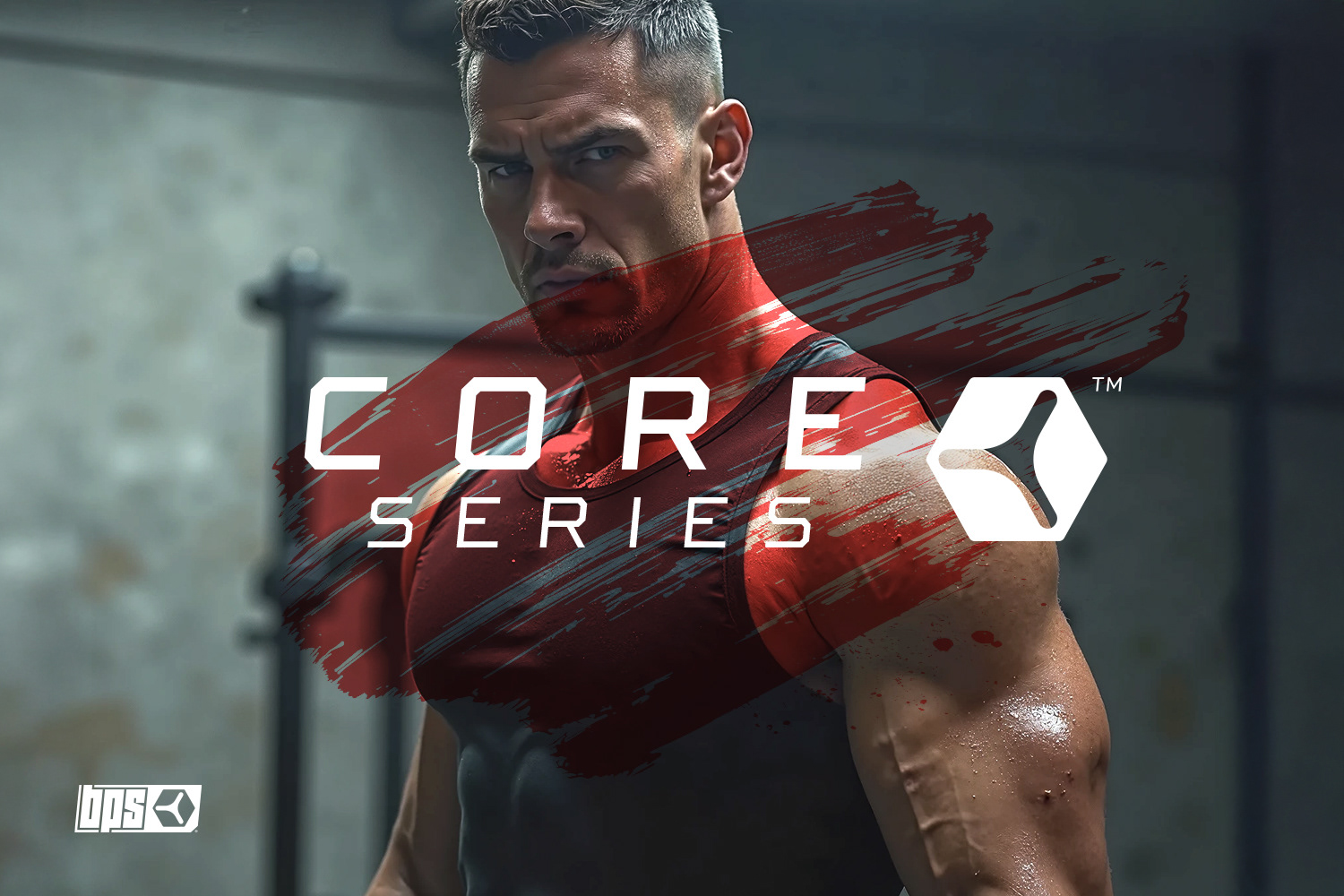
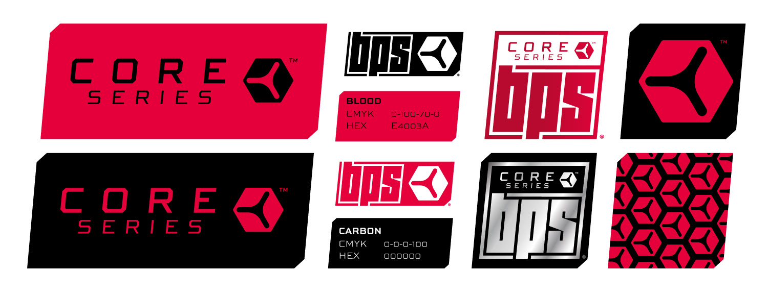
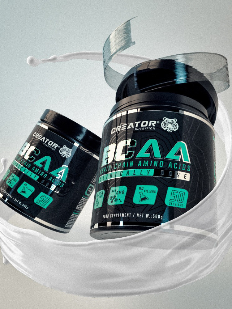
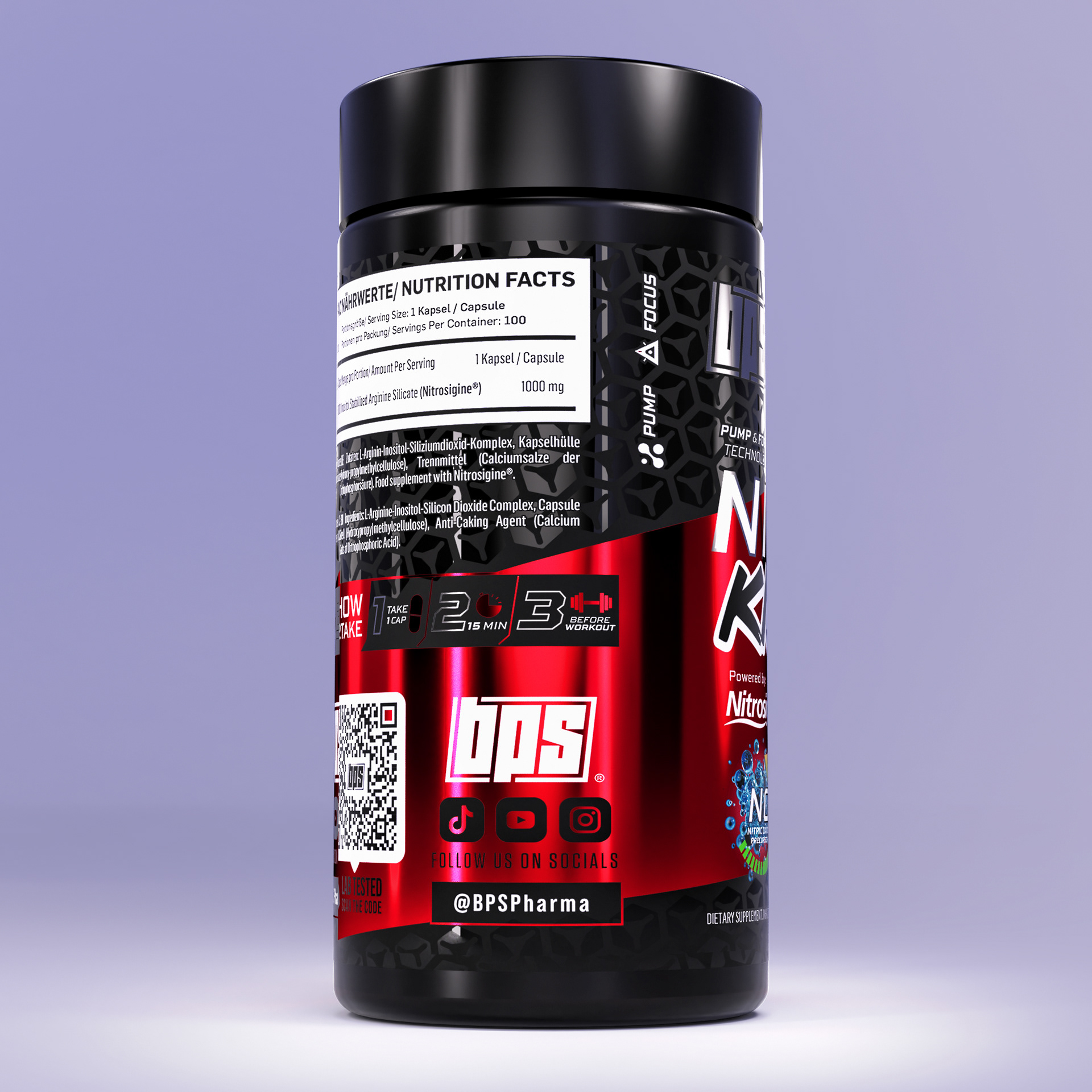
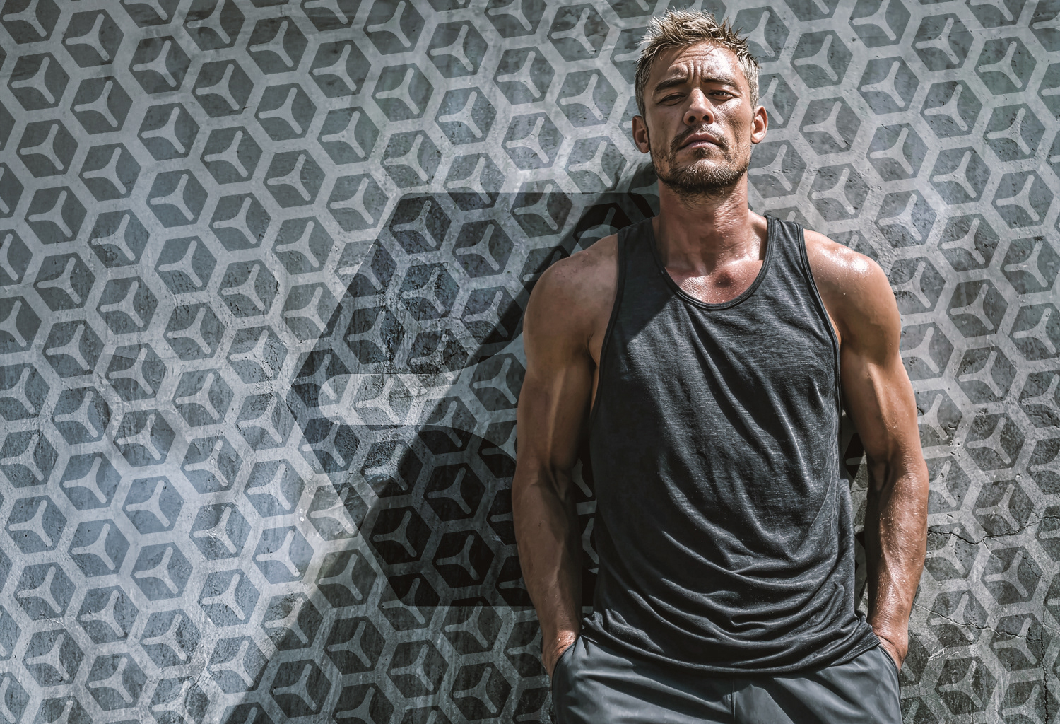
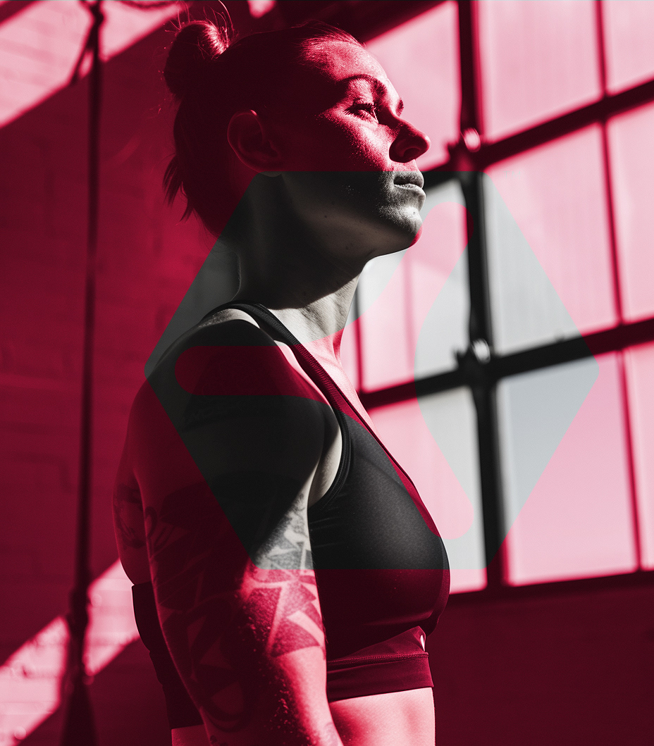
CORE Series is the most intense and raw expression of the BPS universe. The bold red, named “Blood,” defines its aggressive and high-impact personality. Every visual element in this line is designed to feel powerful and direct, with sharp geometric shapes, thick contrasts and compact logotypes that speak of control, force and performance. The graphic system plays with dark tones and bold textures, creating a visual tension that pushes the viewer forward. The symbol created for CORE is angular and solid, built from a dynamic triangle shape that suggests direction and strength. It acts as a badge, a stamp of physical power and mental focus.

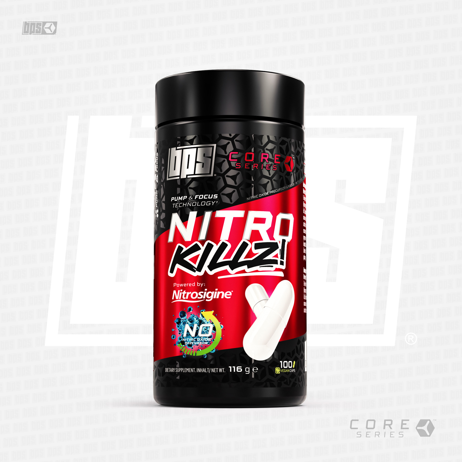
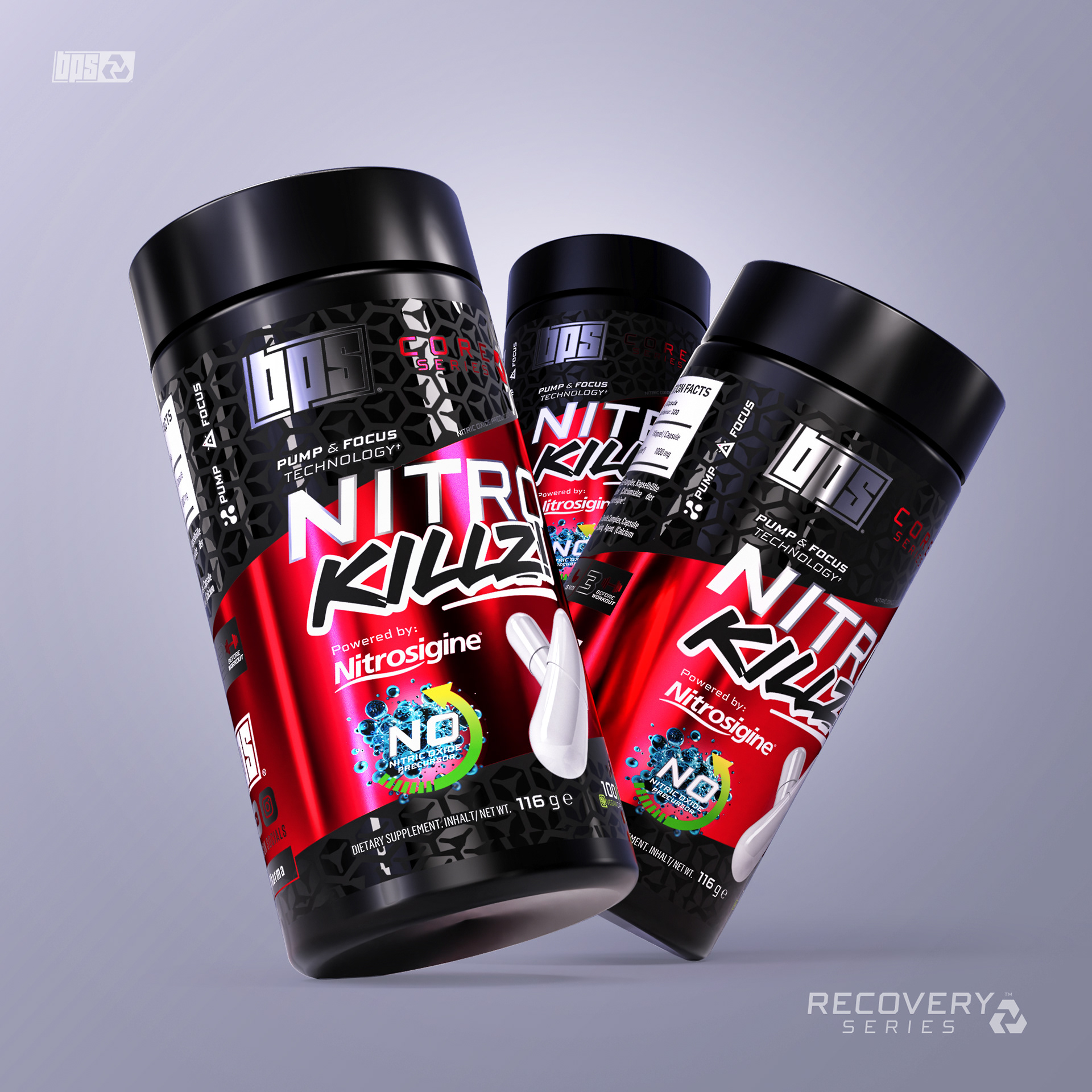
The label design for NITRO KILLZ! was created to make an instant impact. The layout uses sharp diagonals, high-contrast blacks and reds, and layered textures that emphasize energy and aggression. The graffiti-inspired product name adds a rebellious and raw character, breaking from traditional supplement packaging. We introduced a visual rhythm that guides the eye across key information, using bold typography and metallic effects that reinforce the product’s high-performance identity. The CORE Series icon is subtly integrated into the background through a repeating pattern, strengthening brand cohesion while adding visual depth.
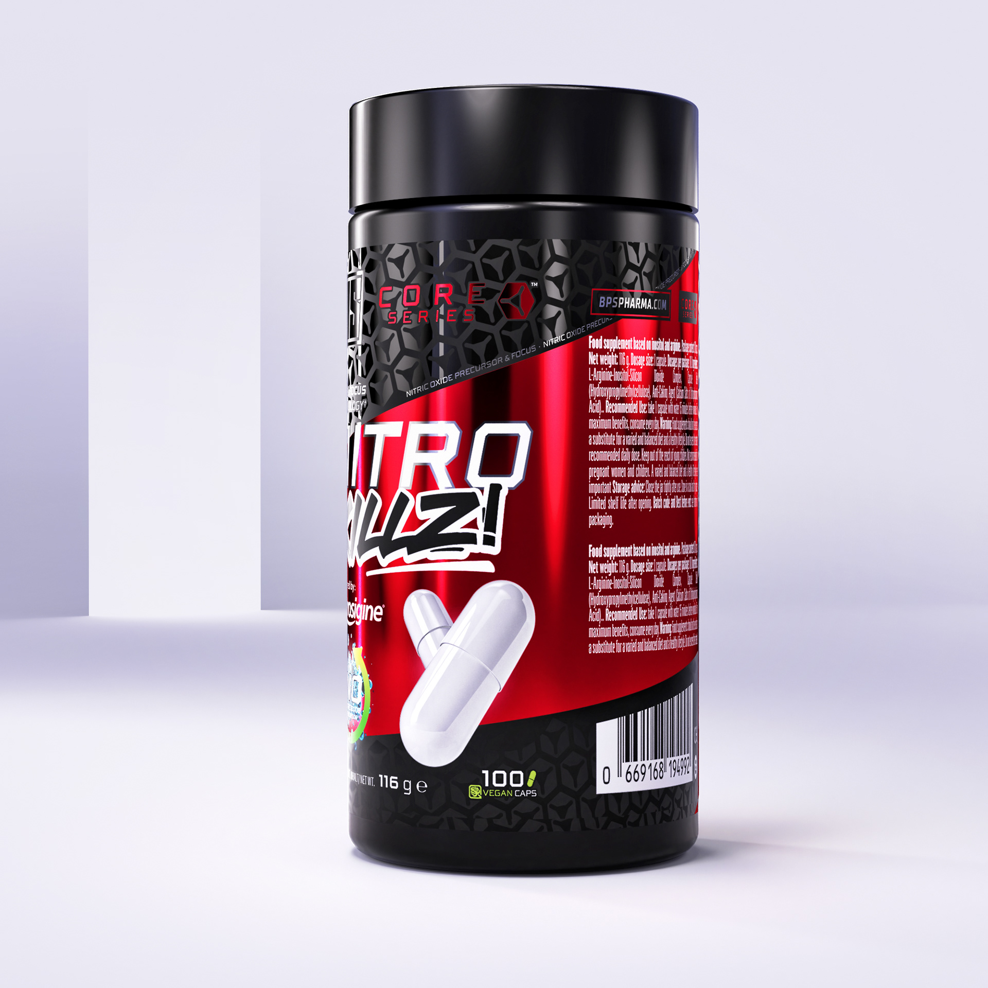
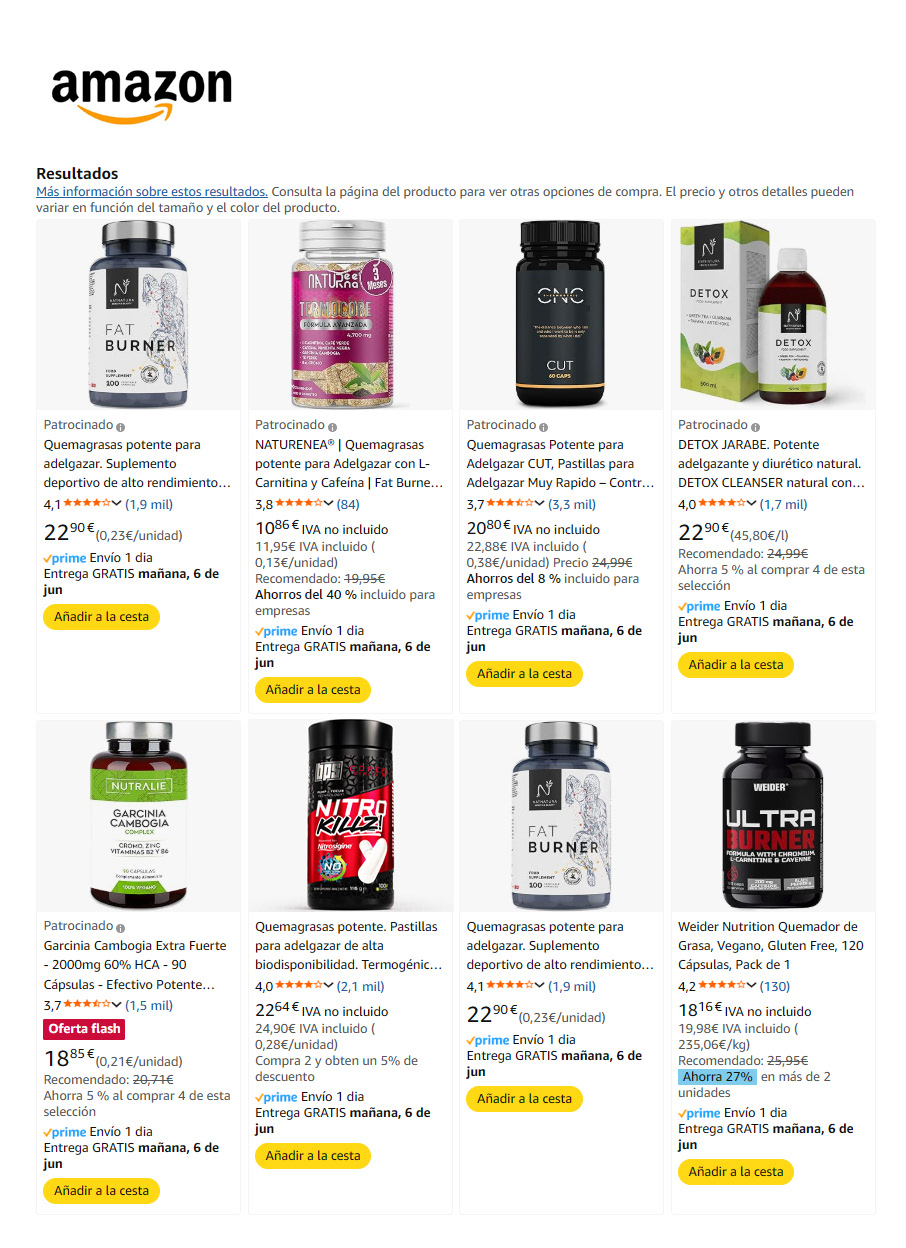
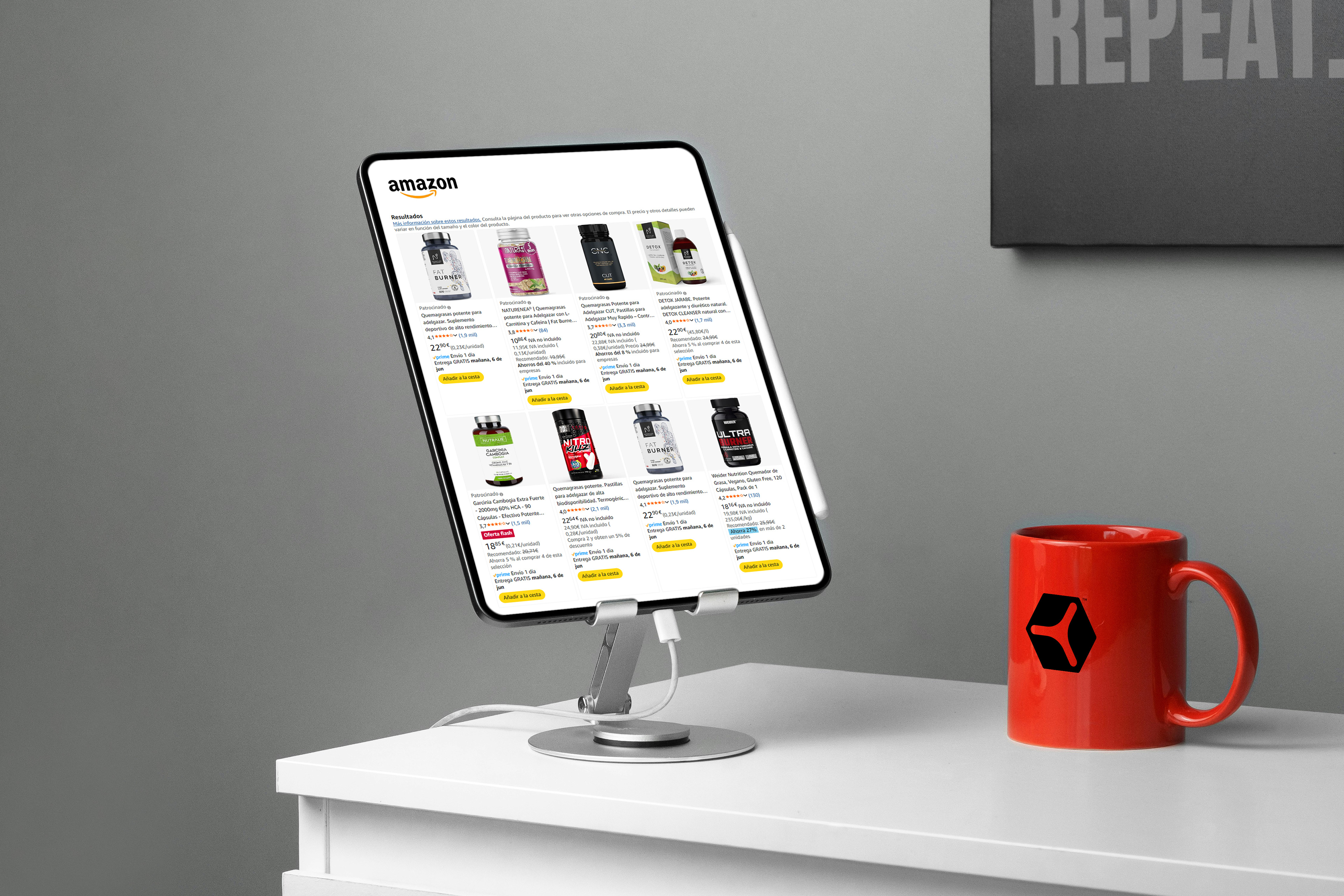
Thanks to its bold and striking design, NITRO KILLZ! immediately stands out on digital shelves. In highly competitive marketplaces like Amazon, where hundreds of products fight for attention, its aggressive red tones, sharp graphics and layered textures create an unmistakable presence. The visual identity is not only functional but strategic, designed to catch the eye in a split second and communicate power, energy and quality without the need for words.
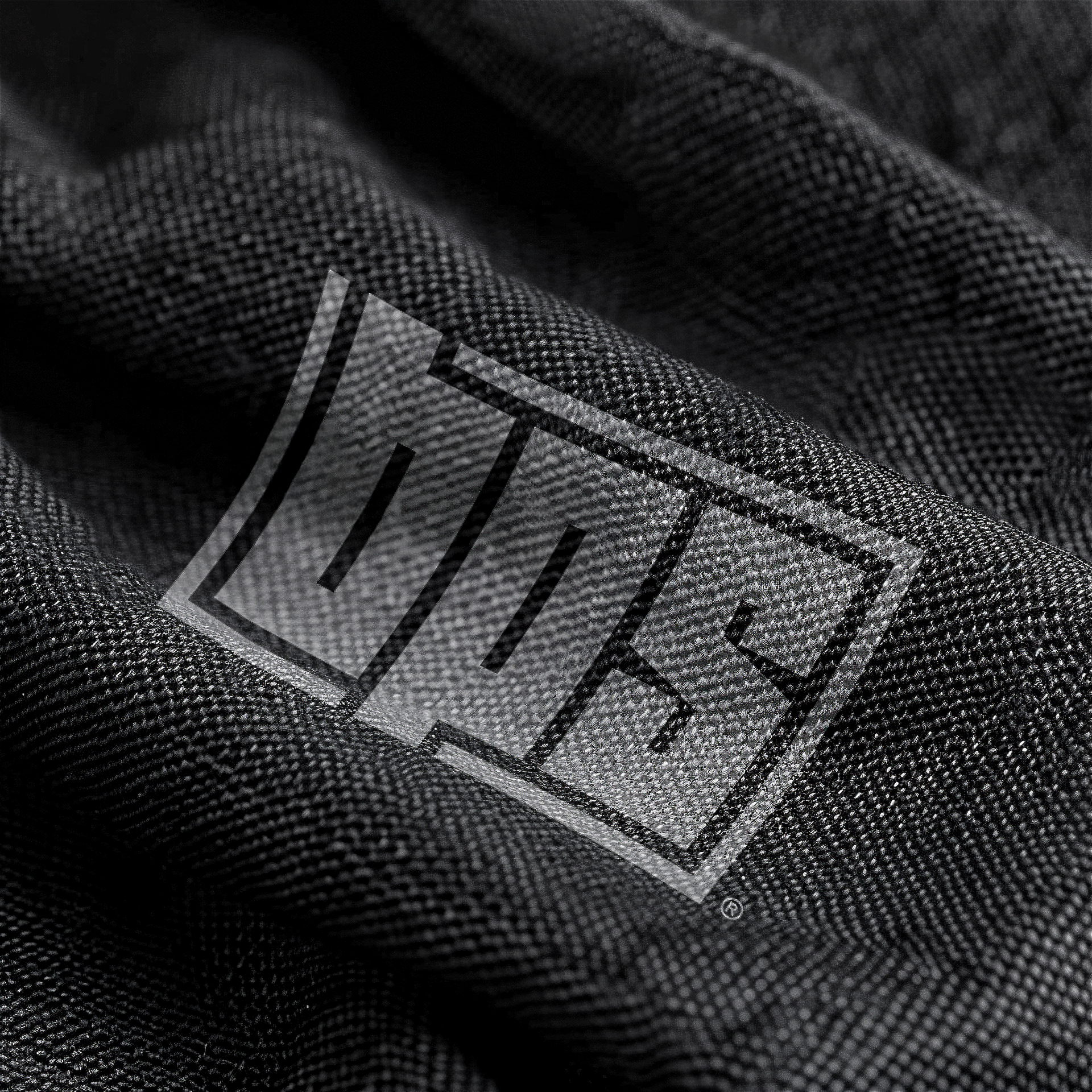
THE PATTERN

ESSENCIE SERIES
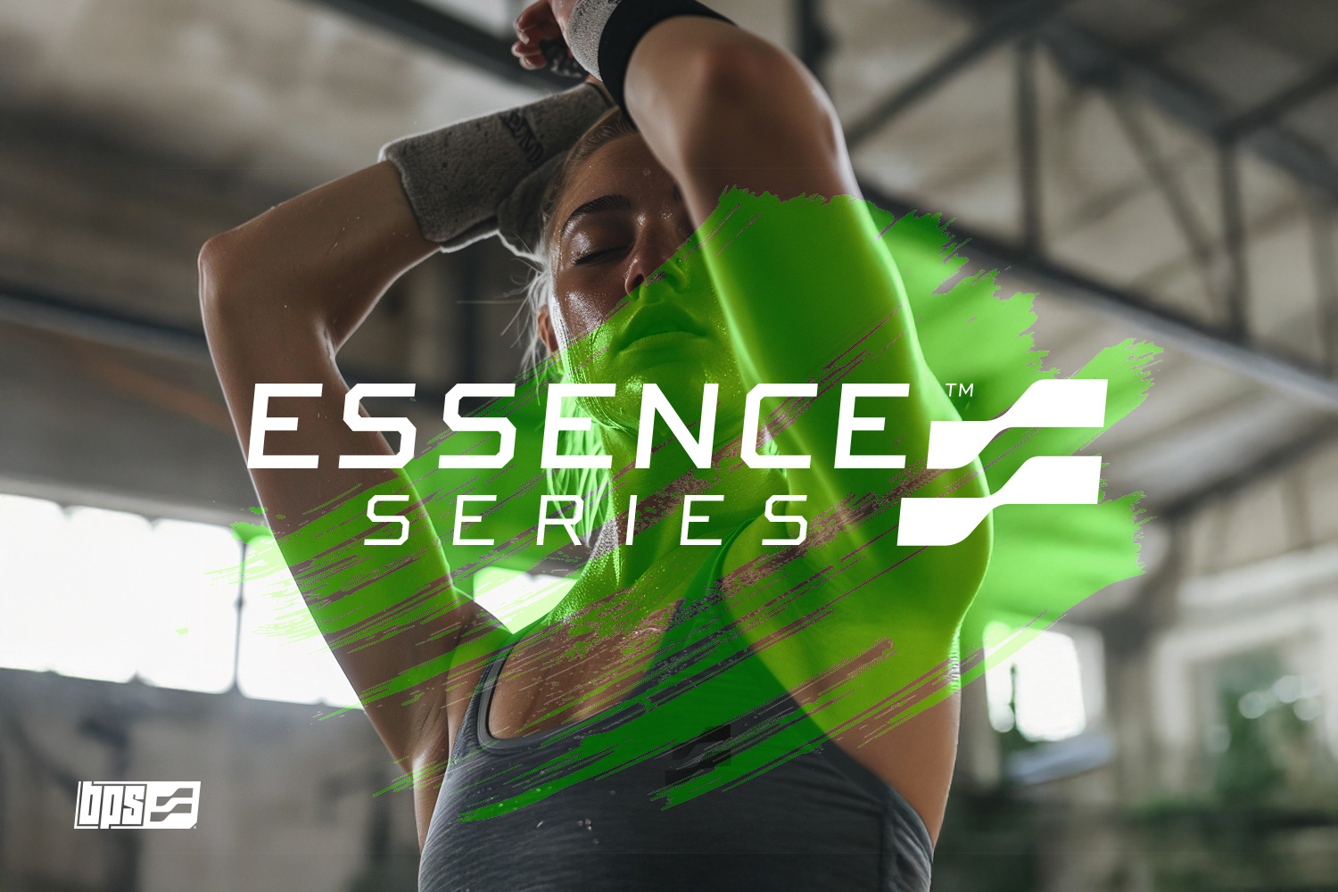
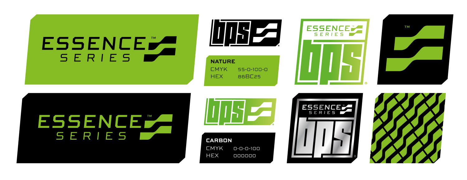
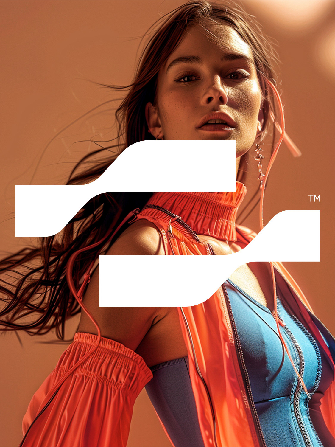
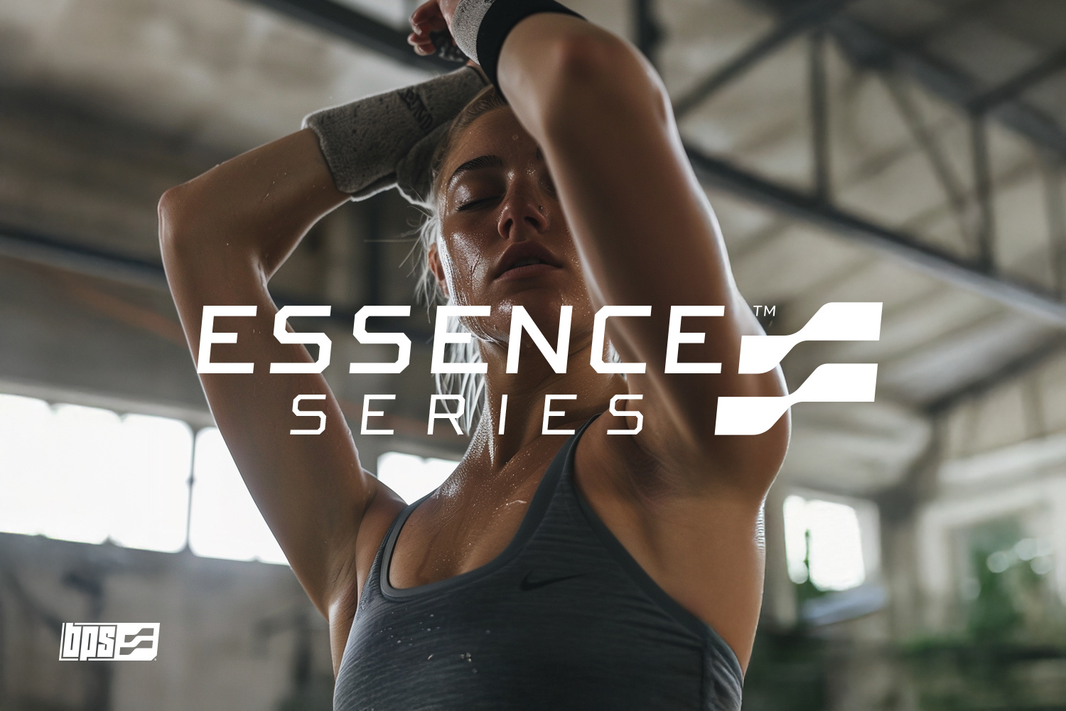
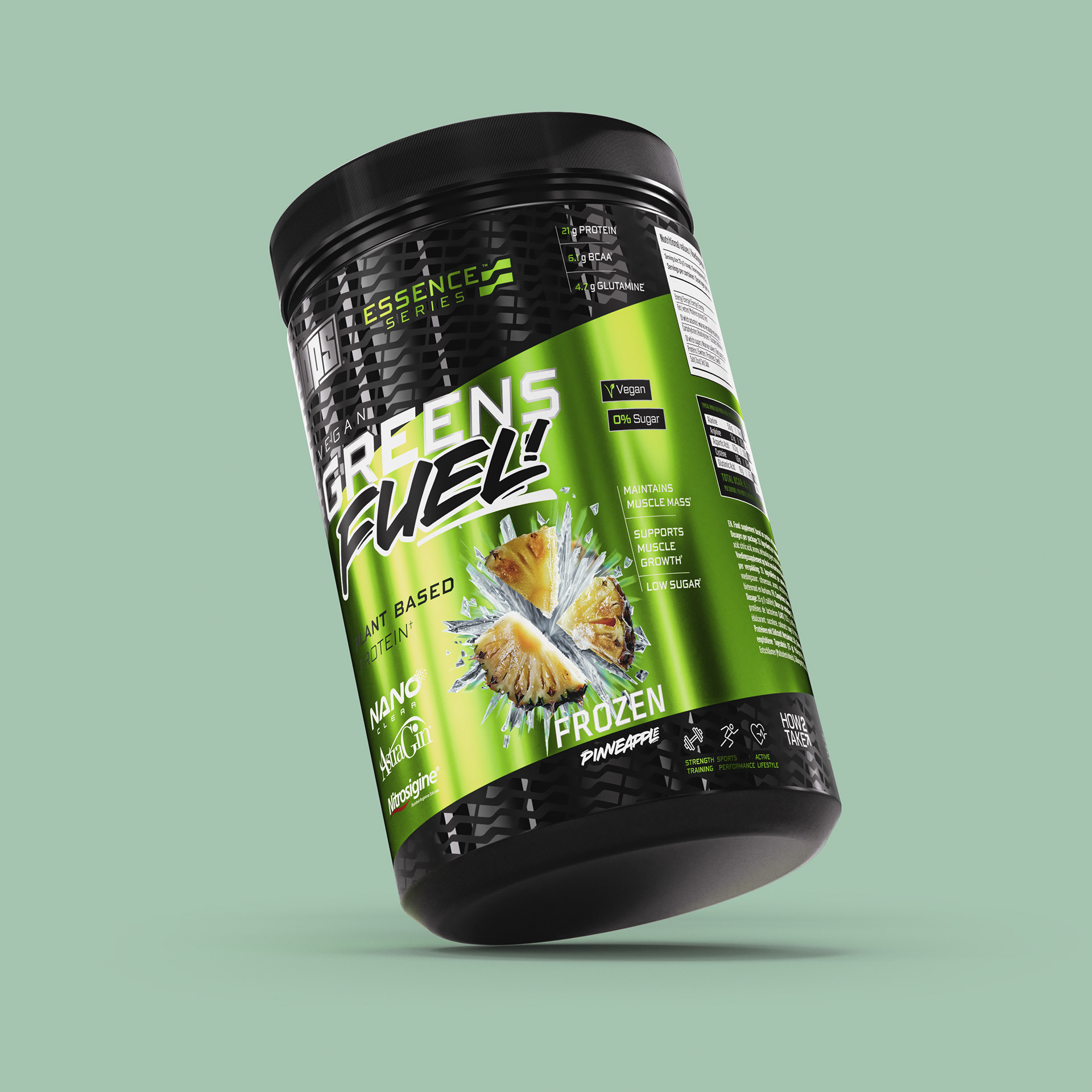
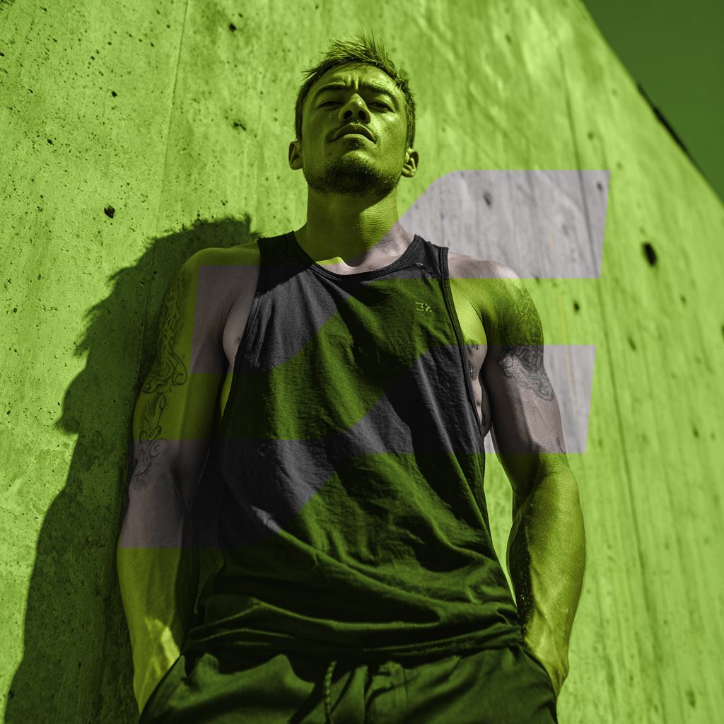
ESSENCE Series brings balance to the BPS universe. With its fresh green tone named “Nature,” this line focuses on purity, clarity and connection with the body. The visual design is clean but full of character. Geometric lines and smooth curves define a more fluid identity that speaks of movement, rhythm and inner strength. The custom icon for ESSENCE uses parallel waves, suggesting breath, flow and harmony. Unlike the raw force of CORE, ESSENCE is about control, focus and wellbeing. Its palette and graphics are built to feel light, breathable and revitalizing, offering a contrast that expands the brand’s emotional range.
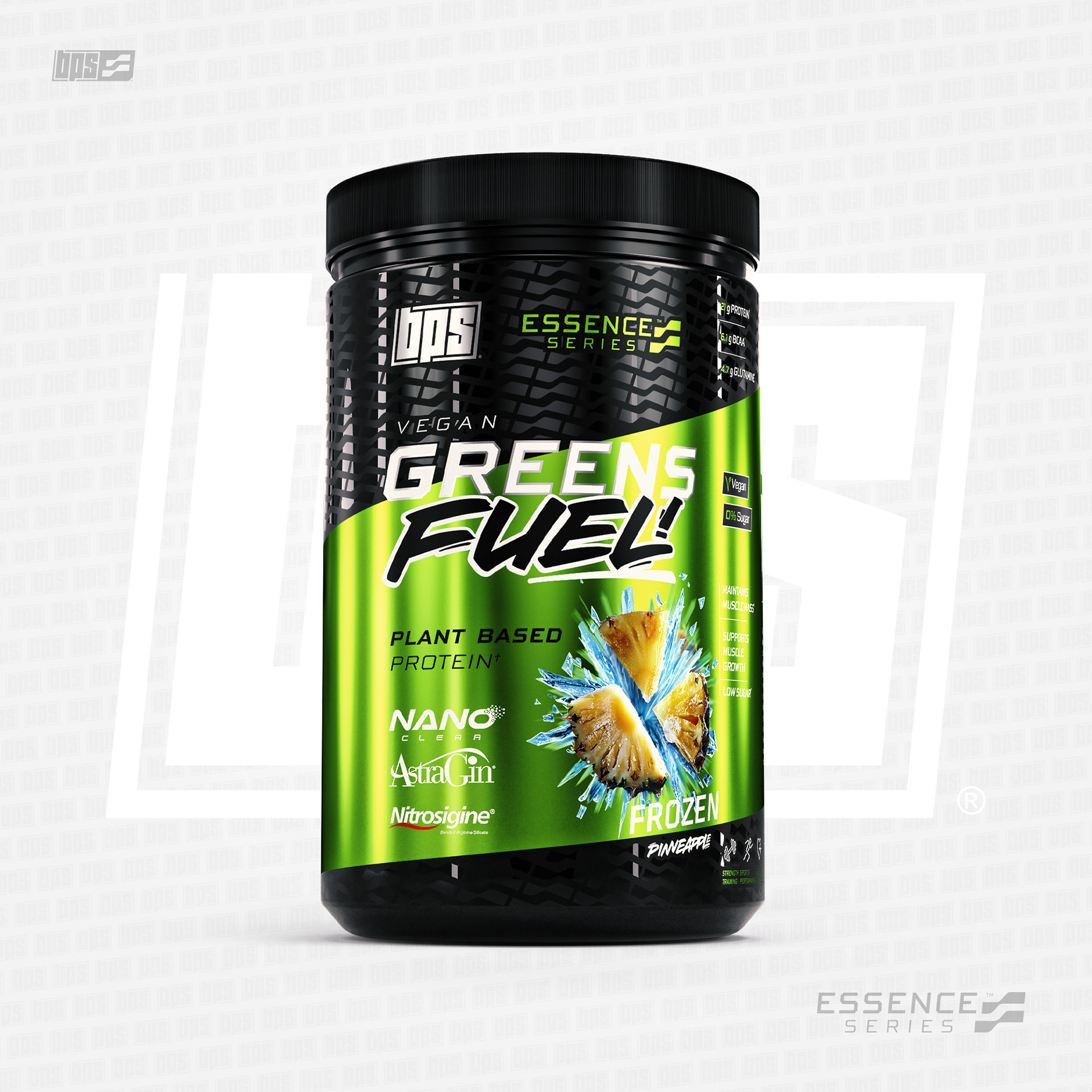
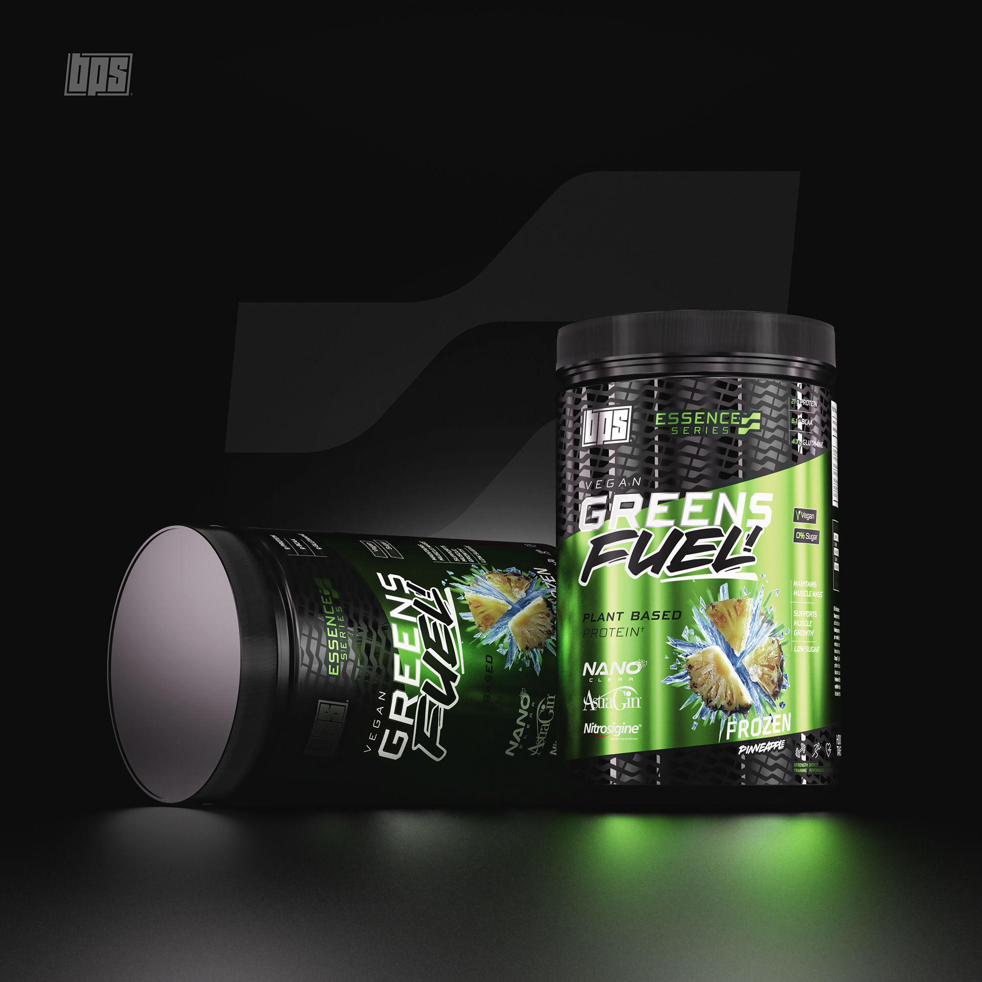
The label design for GREENS FUEL captures the spirit of ESSENCE Series perfectly. It blends a clean, plant-based aesthetic with a futuristic edge, creating a product image that feels both natural and advanced. The vibrant green gradient symbolizes freshness and purity, while the black carbon texture adds depth and precision. The diagonal cut and asymmetrical layout give the packaging a dynamic rhythm, reinforcing the idea of constant movement and wellness in action. The pineapple artwork, paired with high-contrast typography, injects flavor and energy into the design, making the product instantly eye-catching while staying true to its vegan and high-performance values.
THE PATTERN

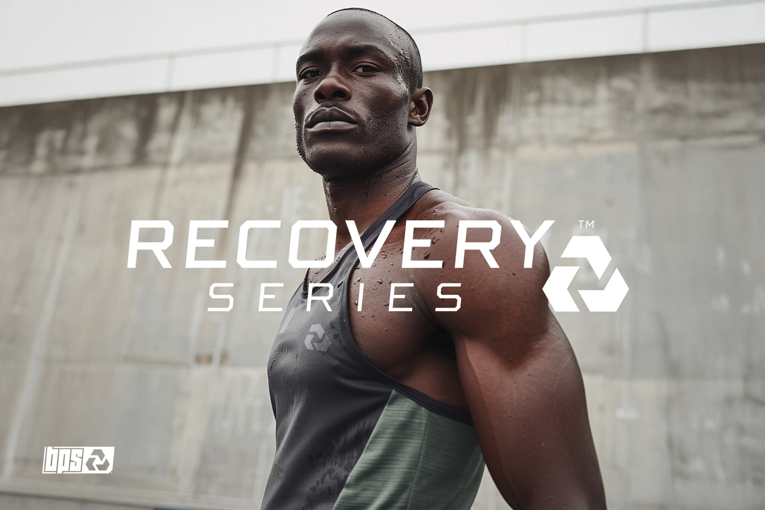
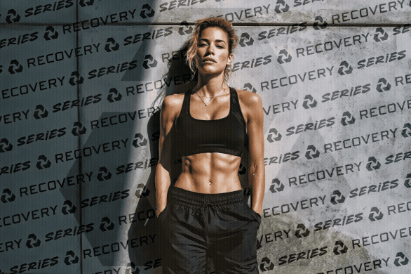
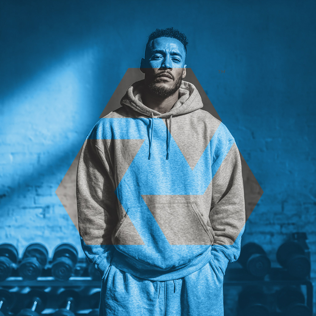
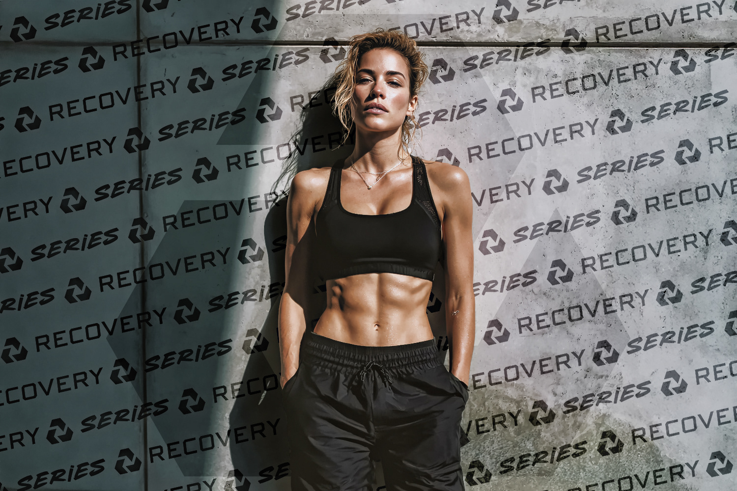
RECOVERY SERIES
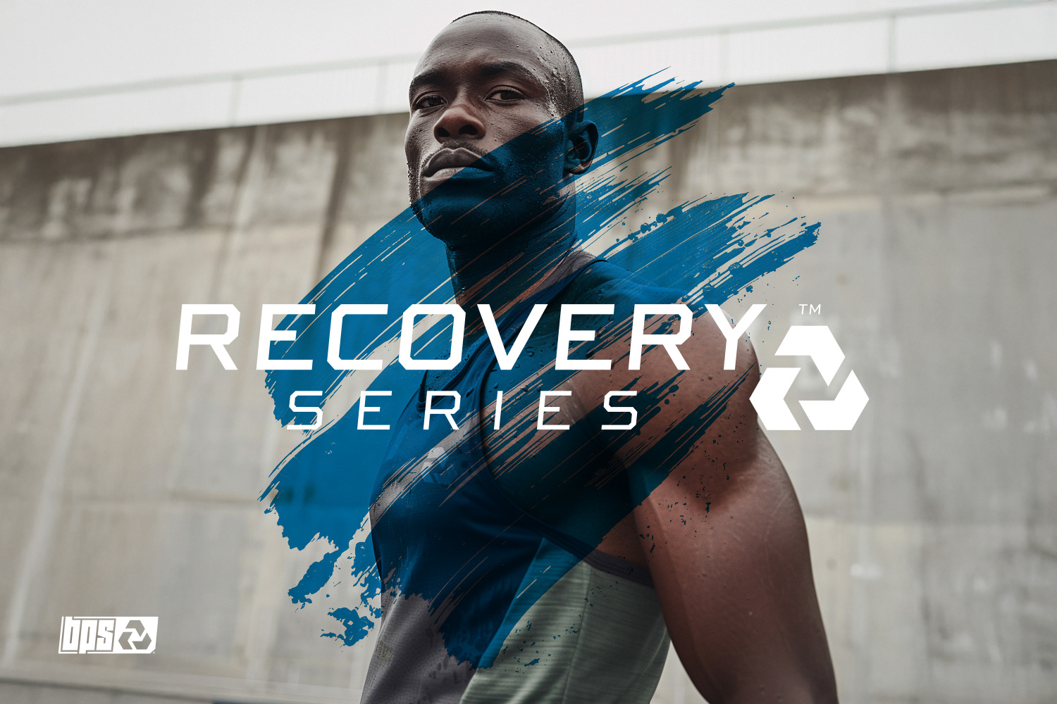
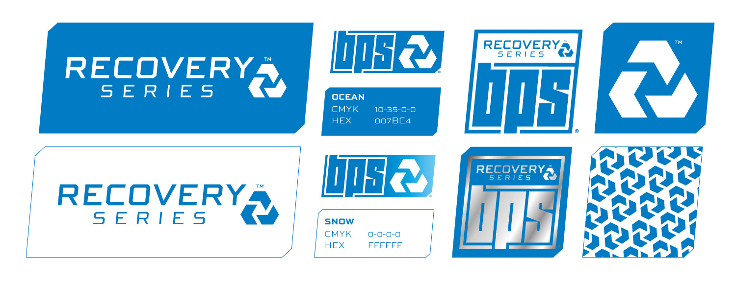
RECOVERY Series represents the calm after the storm. With its deep blue tone named “Ocean,” this line is all about regeneration, rest and balance. The visual identity is clean, structured and soothing, reflecting the values of recovery and optimization. The icon created for RECOVERY is based on rotational geometry, suggesting continuity, flow and restoration. Every design choice in this line points to stability and clarity. The color palette, minimalist layouts and solid compositions help position RECOVERY as the most focused and reassuring range of the BPS ecosystem. It brings the body back to center, ready to go again.
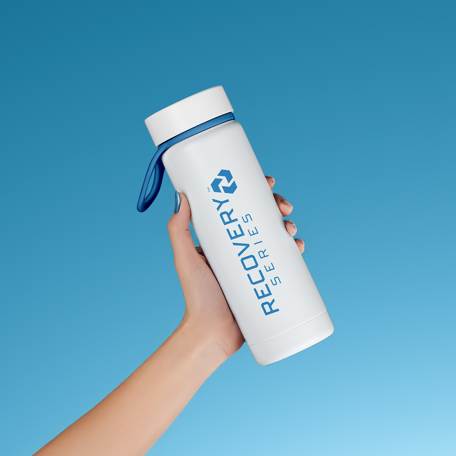
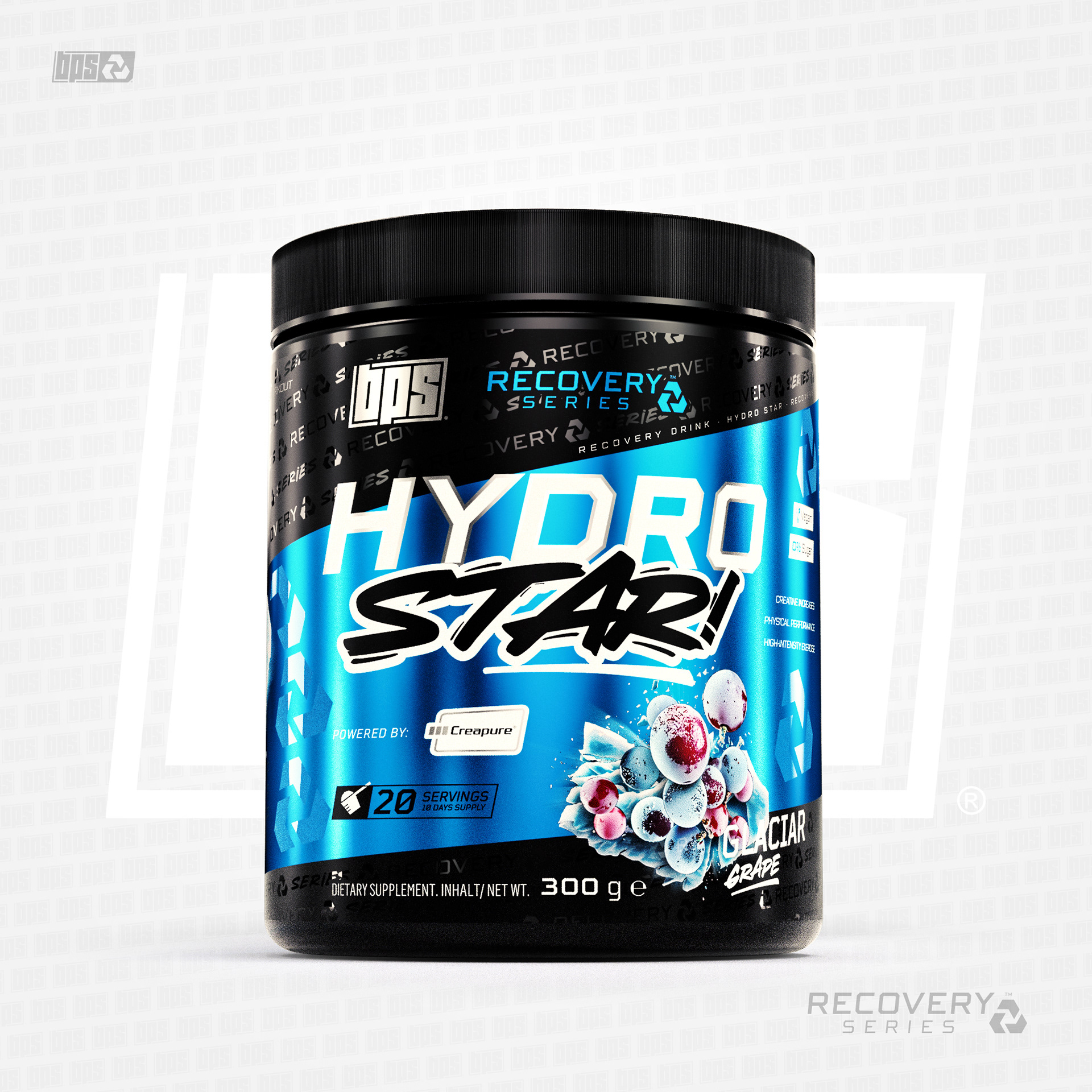
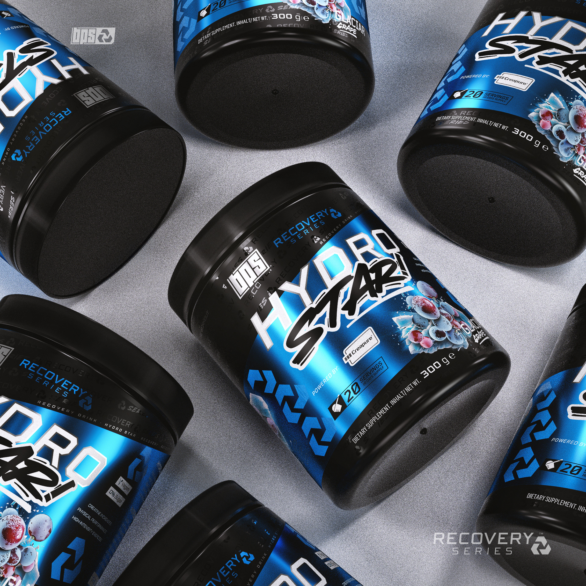
The label for HYDRO STAR! reflects the clean and refreshing spirit of the RECOVERY Series. The cool blue tones combined with a diagonal layout and high-gloss finishes create a feeling of hydration, clarity and precision. What truly sets this design apart is the visual treatment of the flavor. Across all BPS lines, we’ve chosen to break the mold with never-before-seen ingredient visuals. For HYDRO STAR!, the “Glacial Grape” comes to life through a hyper-realistic explosion of fruit, ice and texture that feels both tasty and powerful. These bold, artistic flavor visuals help each product stand out and bring a fresh identity to the supplement space.
THE PATTERN

This rebranding for BPS is much more than a visual update. It’s the result of a deep creative process, where every color, every shape and every texture has been chosen with purpose. My goal was clear: to elevate the brand with a new elegance, without losing its essence of strength, movement and sport. I wanted to build an identity that feels modern, bold and sharp, but also balanced and timeless. Behind each visual, there’s the care and obsession of someone who knows that design is not just decoration, but meaning. This project carries all my focus, all my effort and all my ambition. And I hope, as you scroll through it, you can feel the same passion that guided every step of its creation.