Investigation and conceptualization:
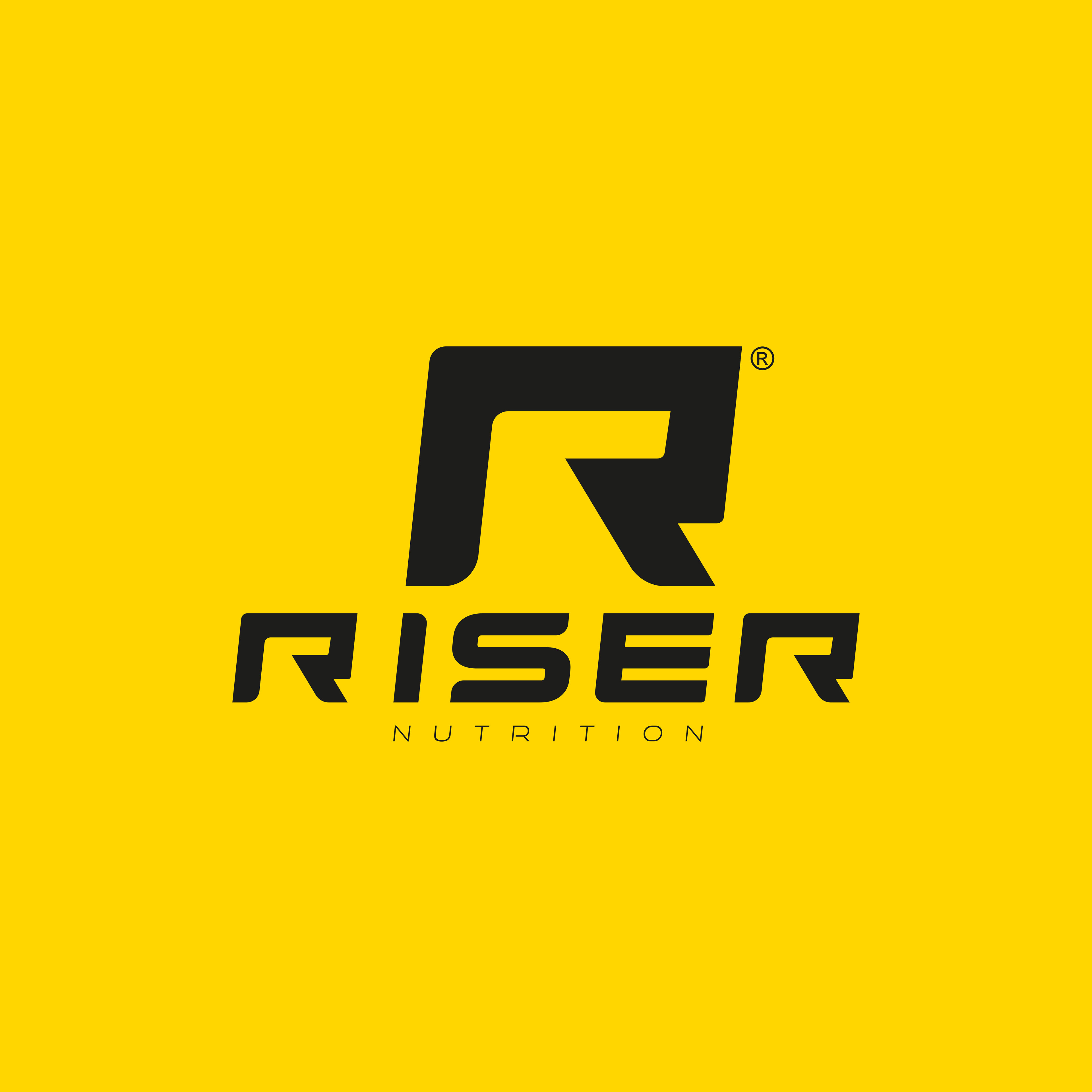
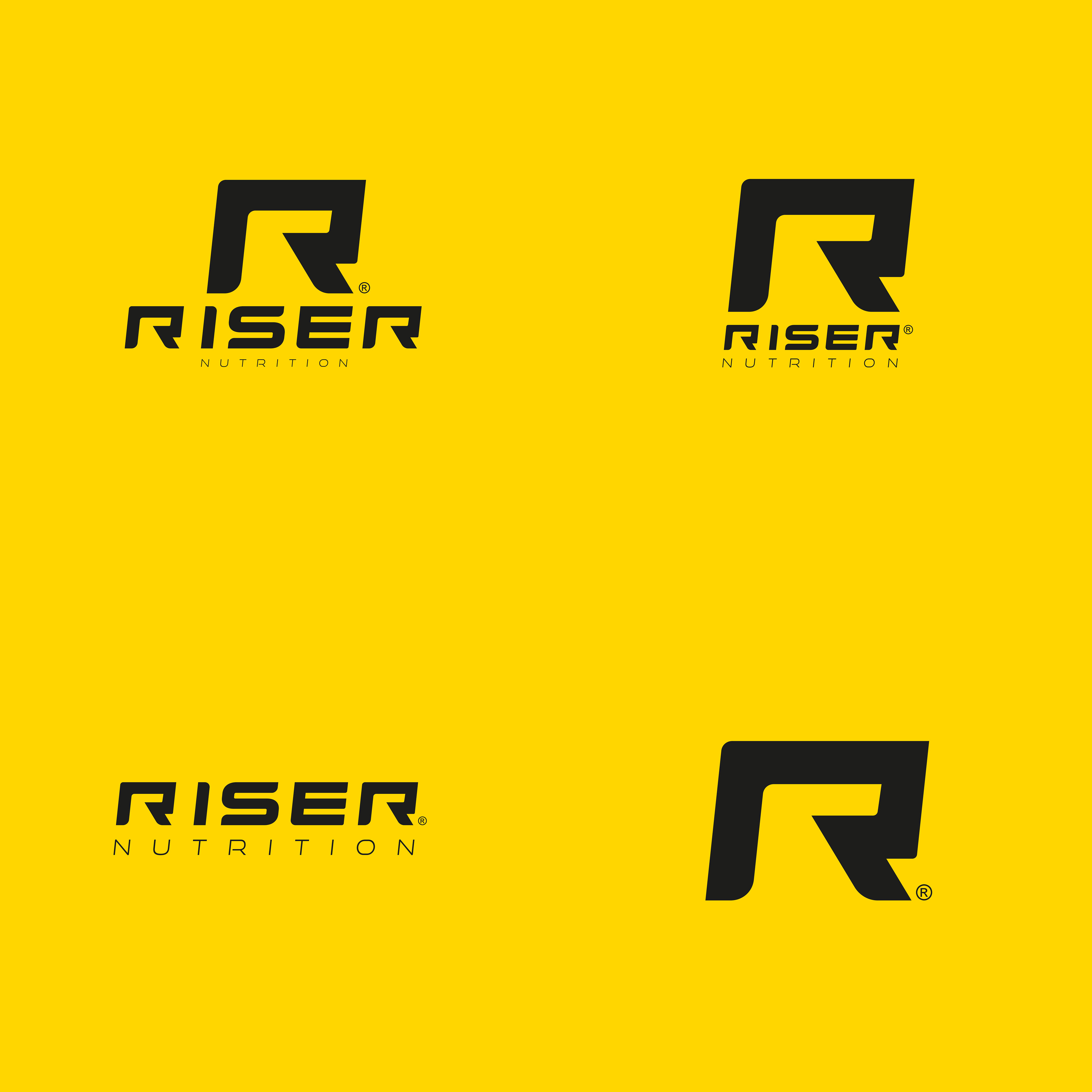
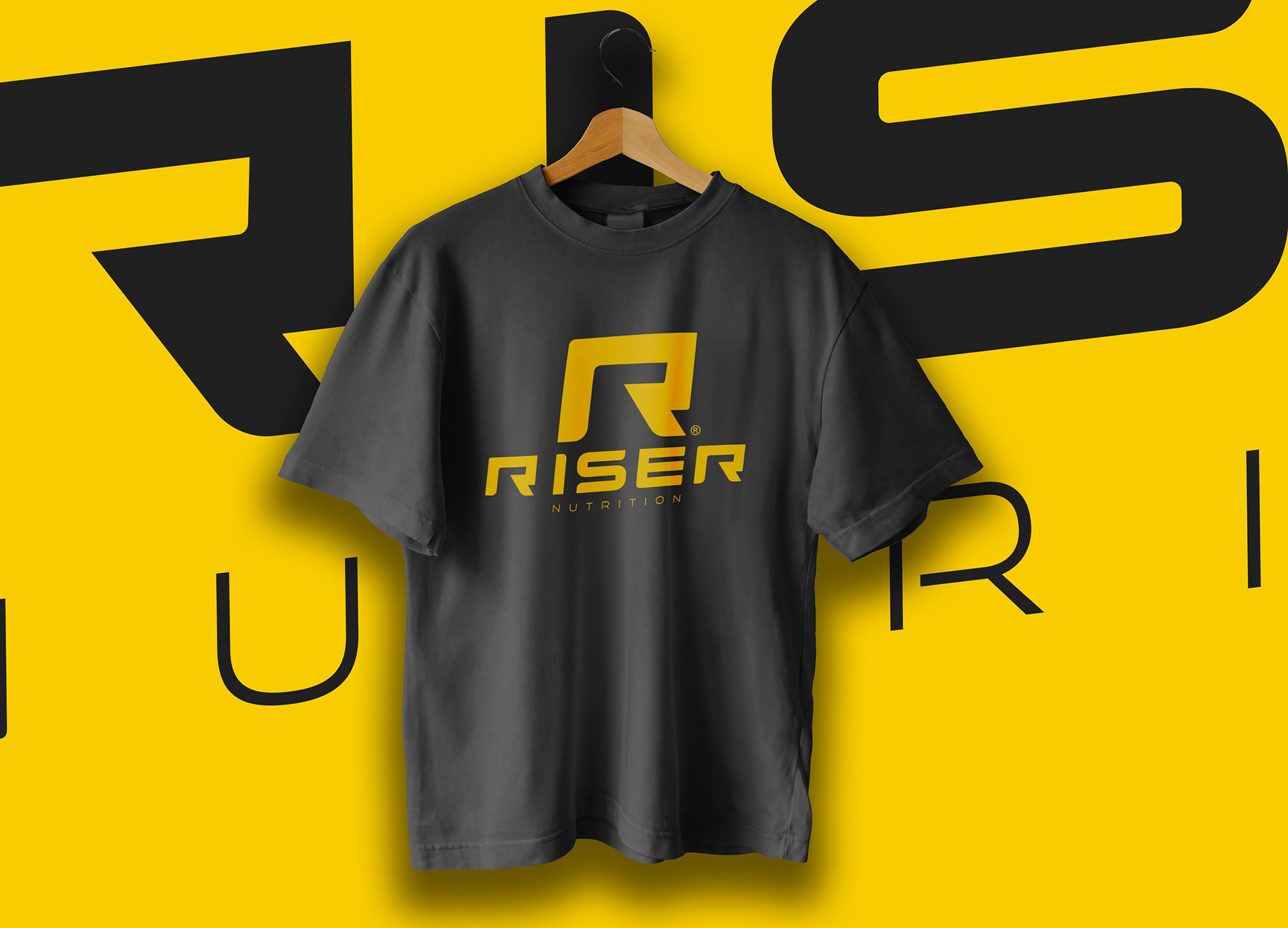
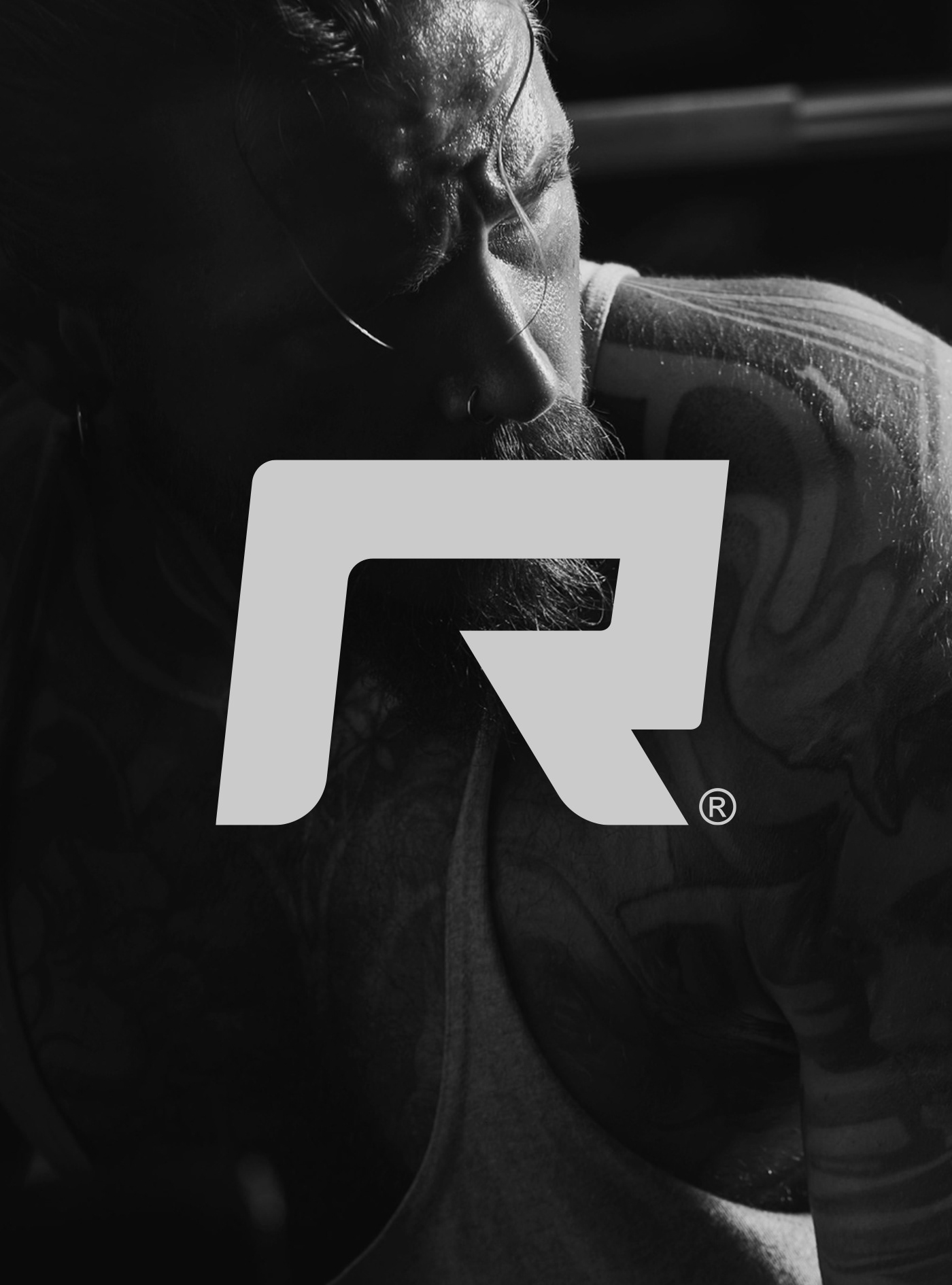
The logo for the sports nutrition brand "Riser" is characterised by its dynamic, italic design, which conveys a sense of movement and energy. It symbolises a large arrow indicating the upward path to follow. The brand name, "Riser", alludes to the verb "to Rise", which means to soar, evoking a sense of progress and achievement in sports and nutrition.
The cursive typeface used in the logo (handmade) accentuates the dynamic and fluid look of the brand. The letters are stylised and move fluidly, creating a sense of upward motion. This reinforces the idea of self-improvement and constant progress in the context of sports and nutrition.
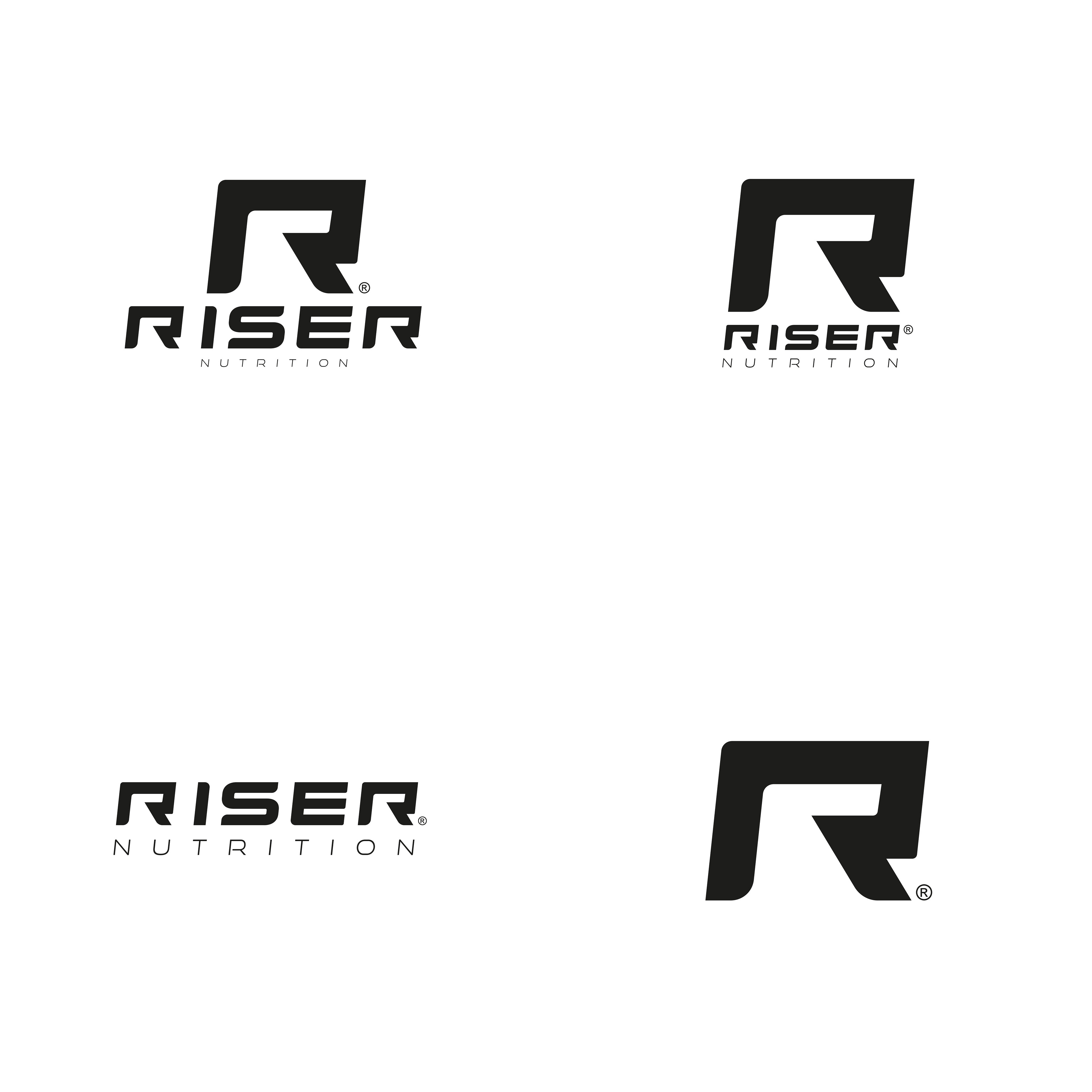
Digital prototypes: Following the sketching and ideation phase, the subsequent step entails developing digital prototypes. This involves transforming the initial sketches into vector-based designs utilizing design software such as Adobe Illustrator. Throughout this stage, diverse logo variations are generated, encompassing different color options, typographic elements, and iconography.
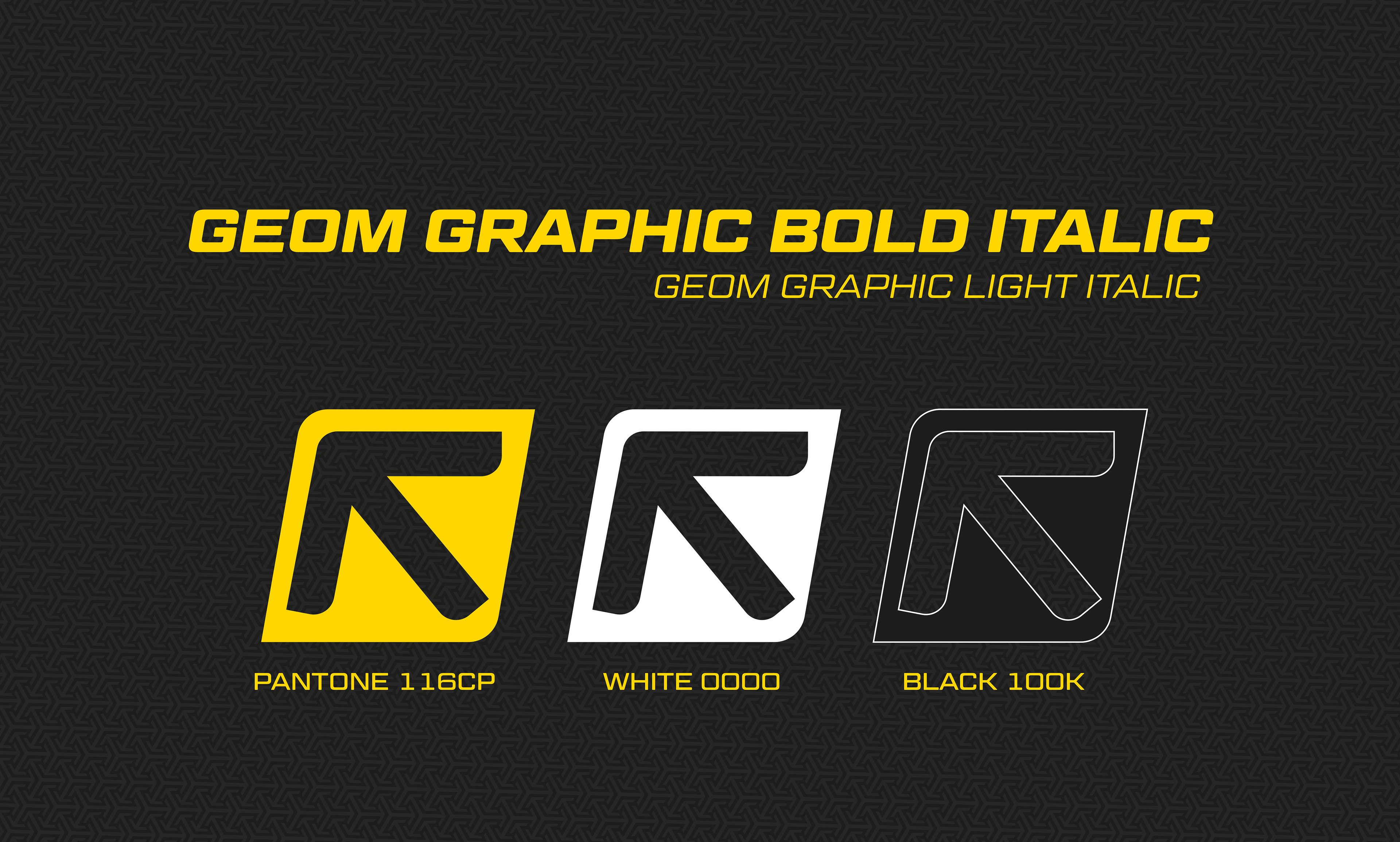
YELLOW COLOR
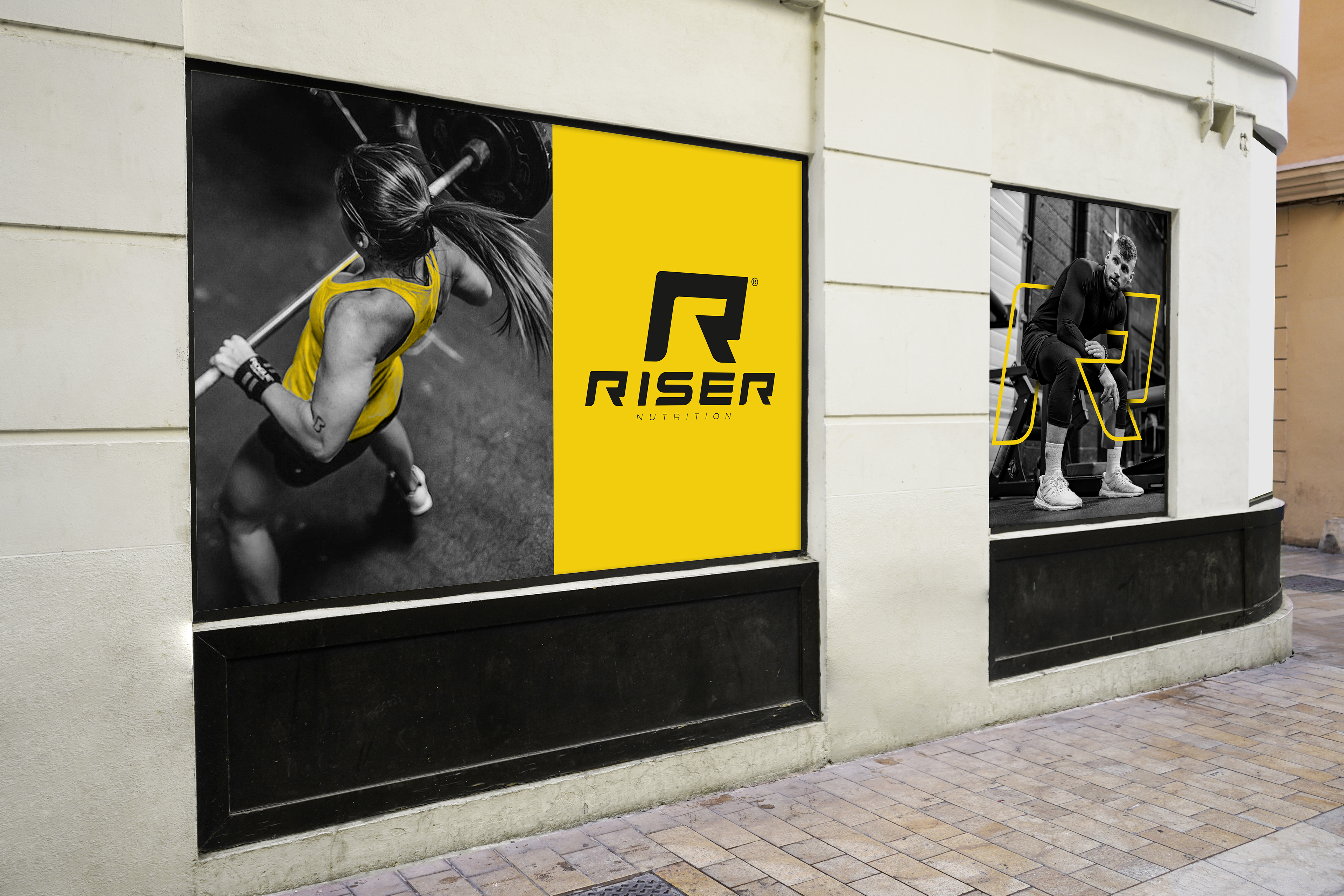
The logo uses a vibrant yellow colour, symbolising vitality, optimism and energy. Yellow is an apt choice for a brand related to sports nutrition, as it conveys a sense of enthusiasm and activation, inspiring users to achieve their goals and elevate their physical performance.
Additionally, studies have indicated that yellow can enhance focus and concentration, making it a fitting choice for individuals seeking to maximize their physical performance and reach their fitness goals.

Icons:
Integrate harmoniously into the visual identity of the sports nutrition brand, reflecting its aesthetic approach and commitment to health and physical performance. They complement the brand's logo by visually conveying its values, while offering instant recognition and aesthetic appeal to consumers.

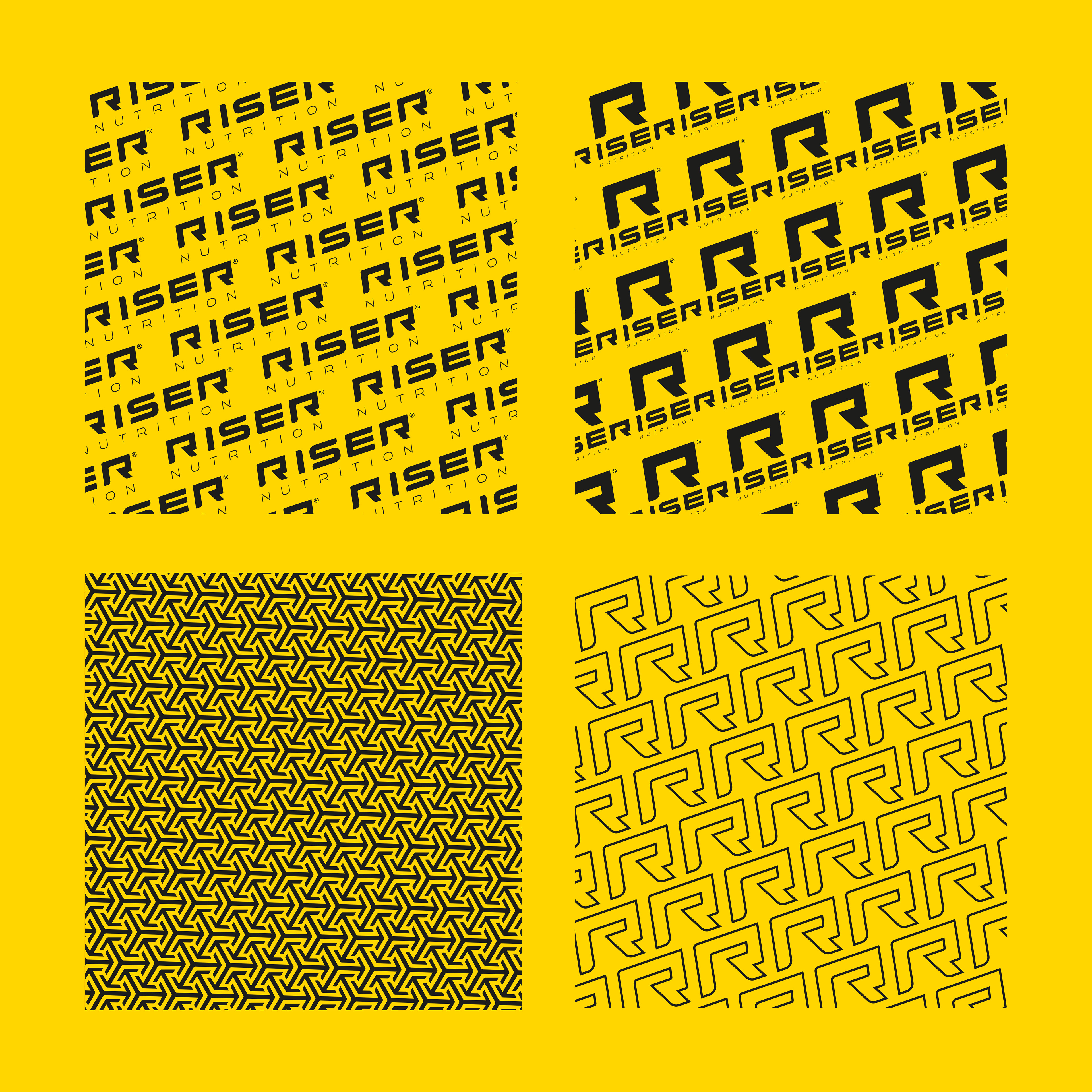
Patterns:
One of the patterns used consists of diagonal lines of the logo, symbolising the dynamic energy and interconnectedness of the different aspects of physical and nutritional wellness.
One of the patterns used consists of diagonal lines of the logo, symbolising the dynamic energy and interconnectedness of the different aspects of physical and nutritional wellness.
These icons and patterns combine harmoniously in the visual identity of the sports nutrition brand, conveying values such as health, vitality, balance and performance, while creating a visually appealing and recognisable image.
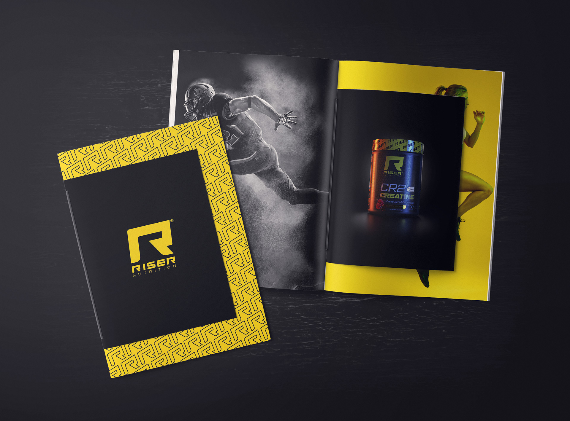
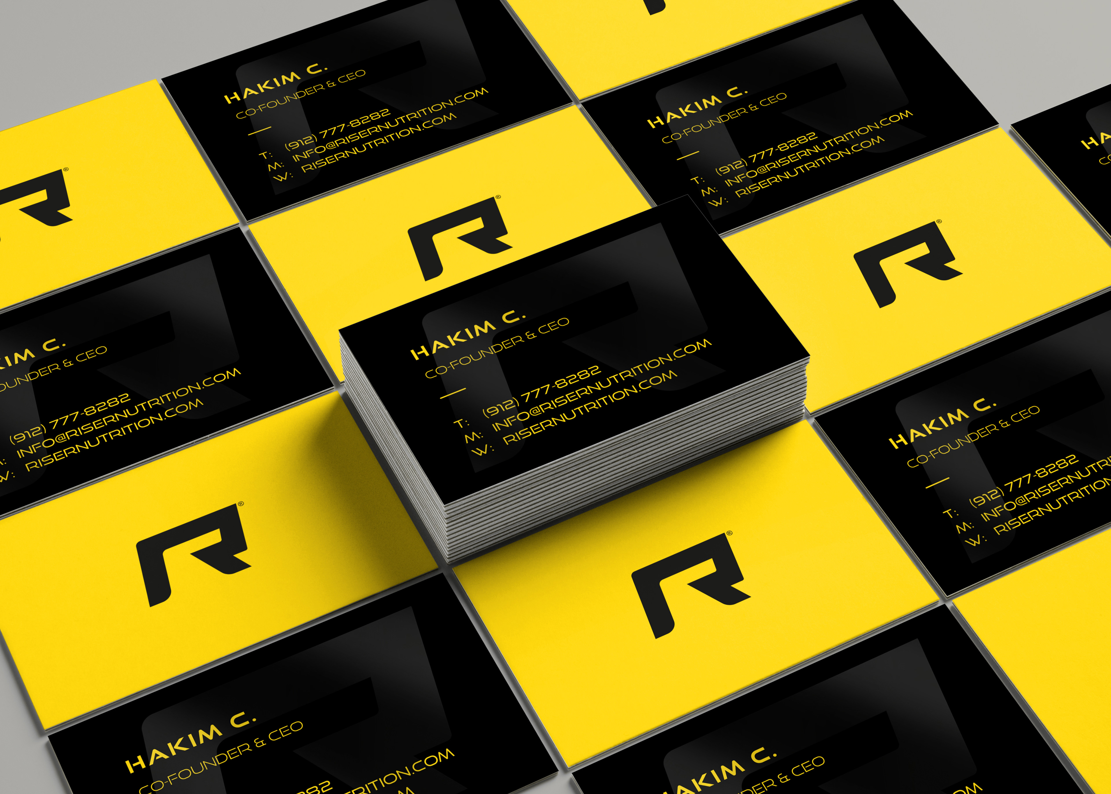
Riser on paper.
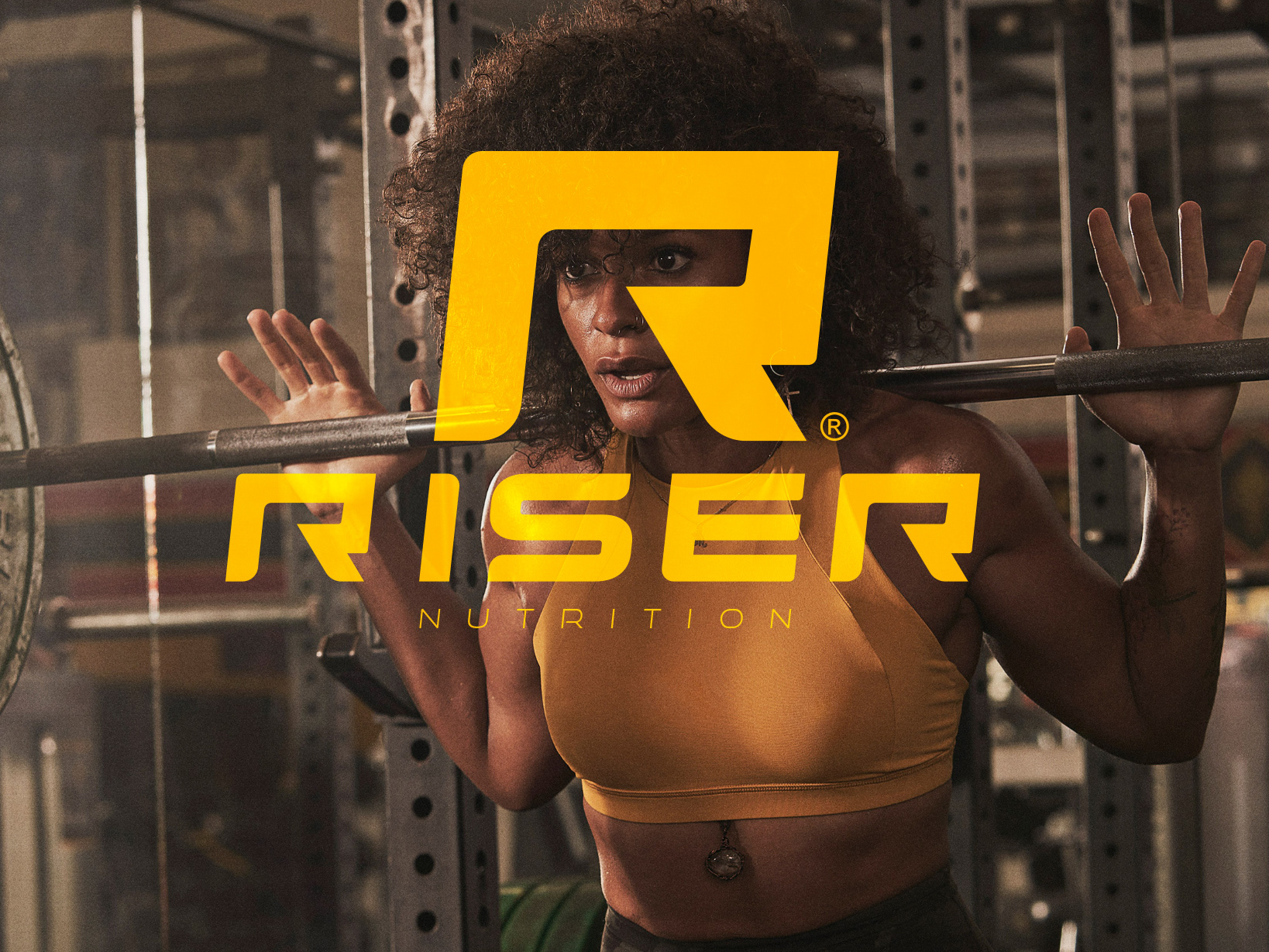
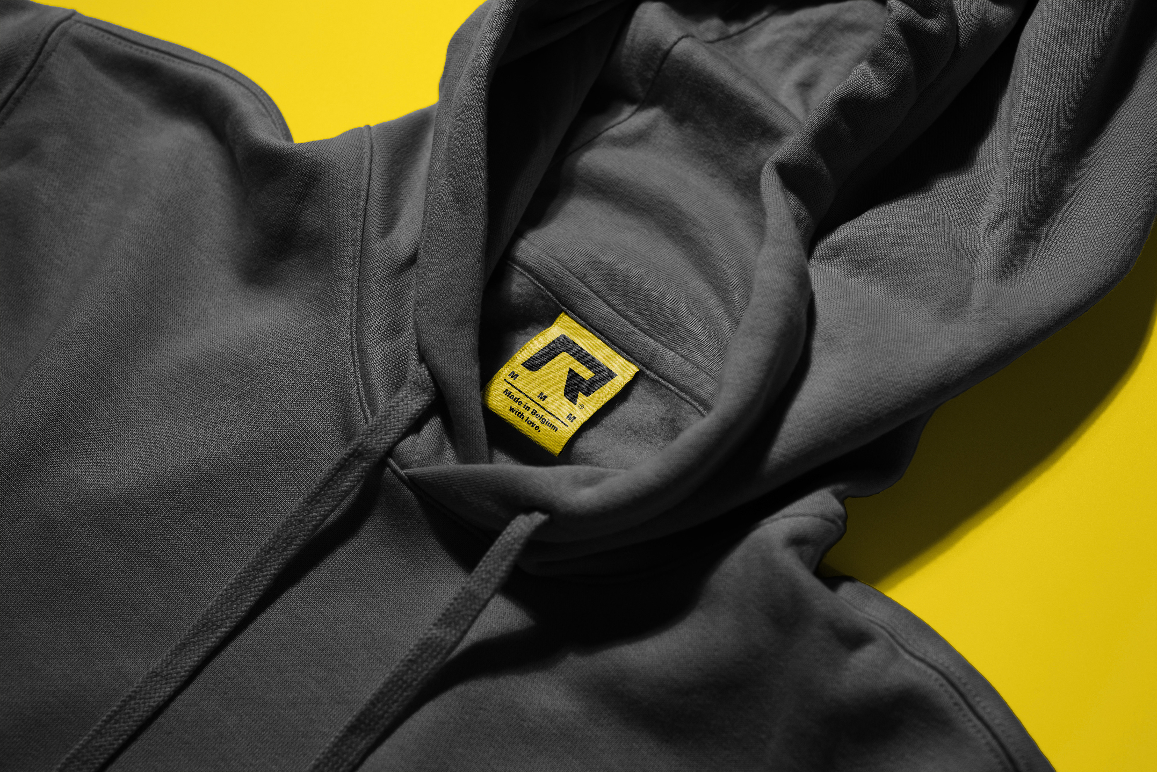
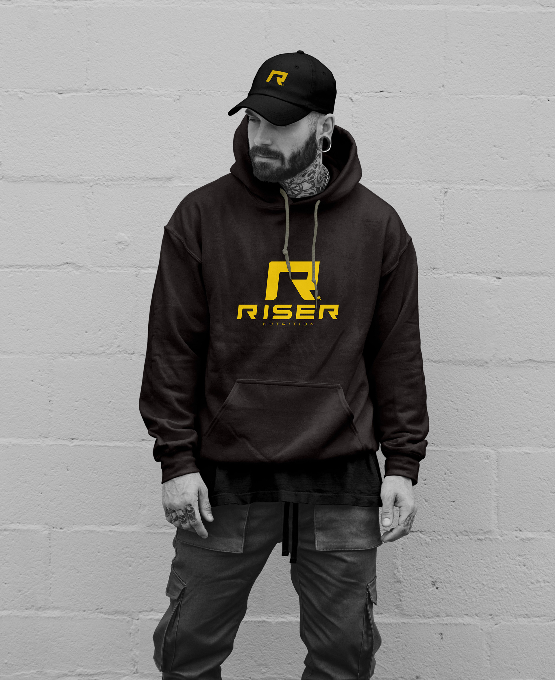
Riser over clothes.
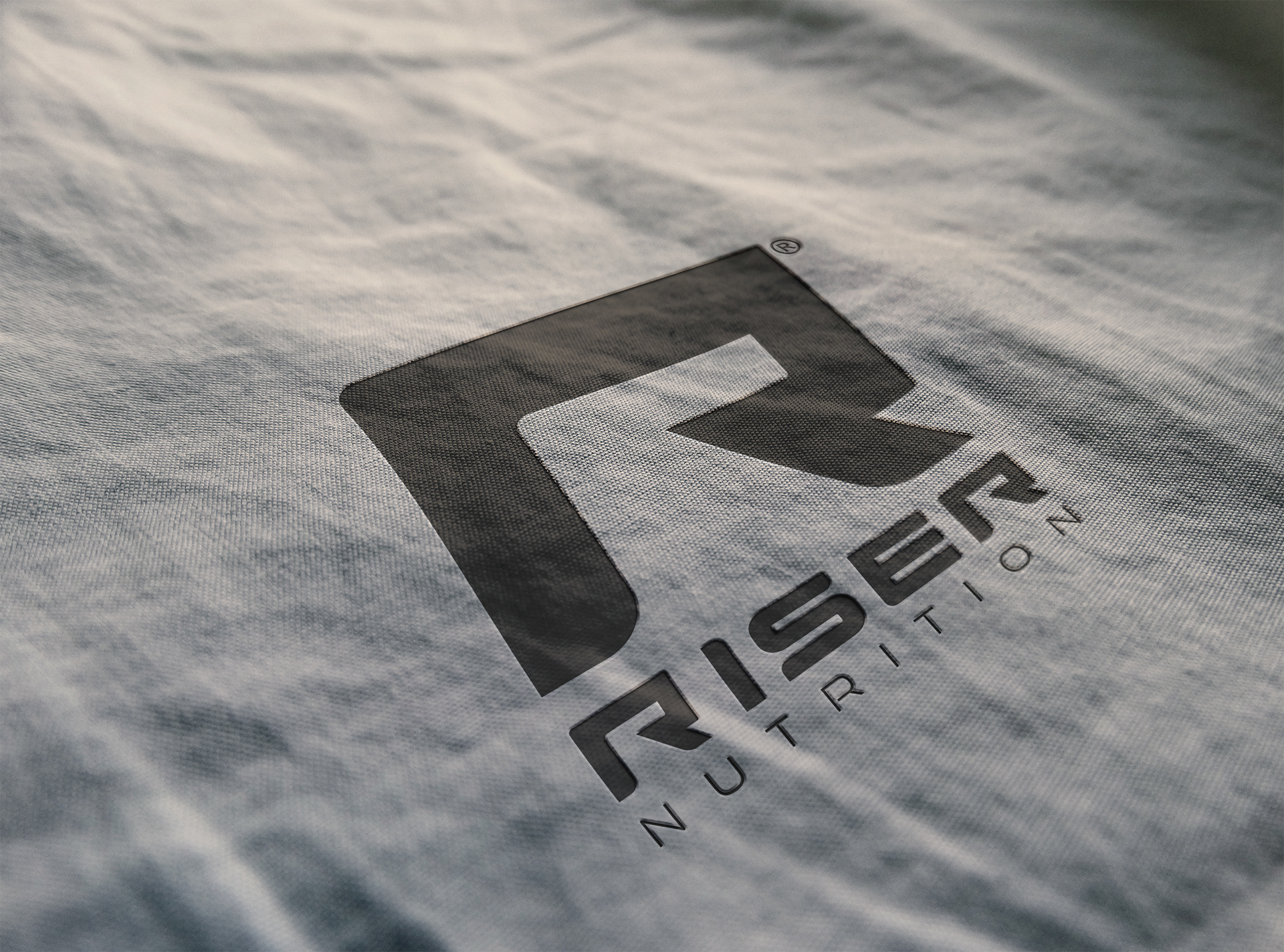


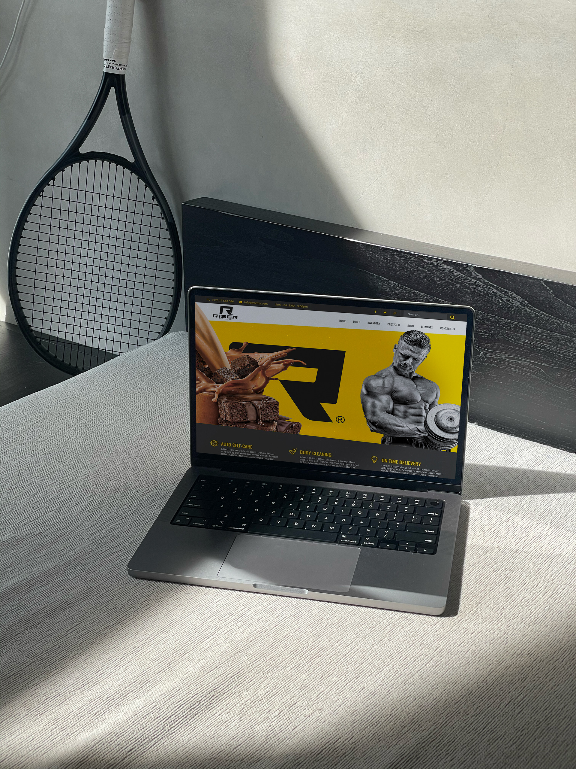
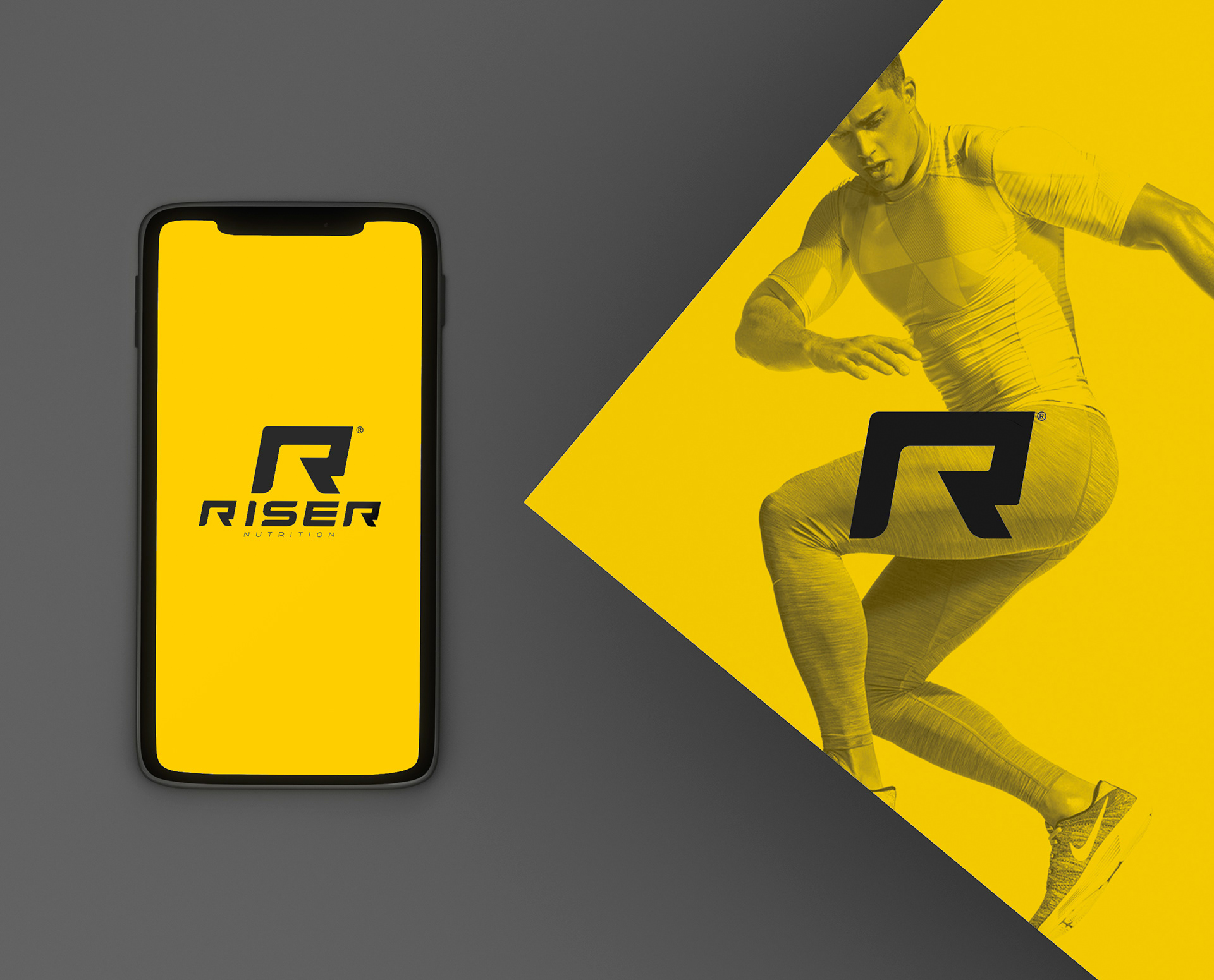
Riser digital.


Merchandising & Complements.
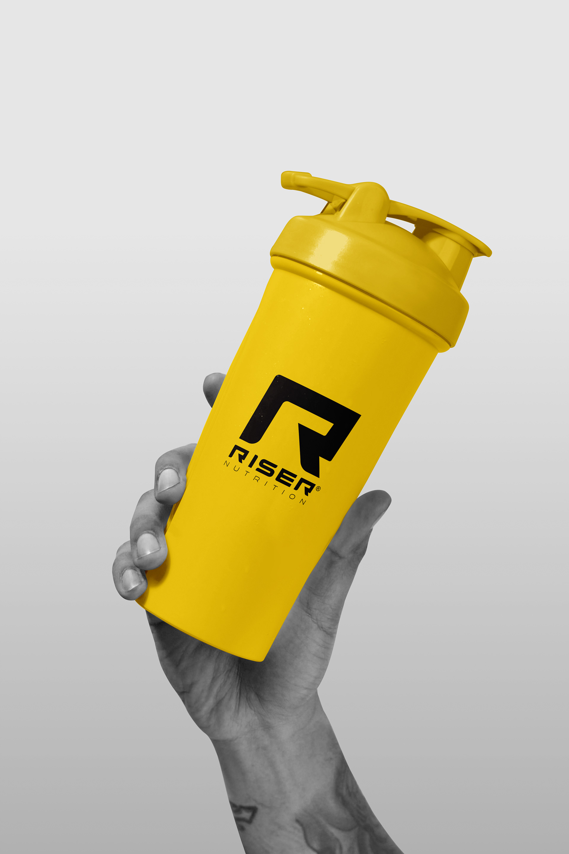
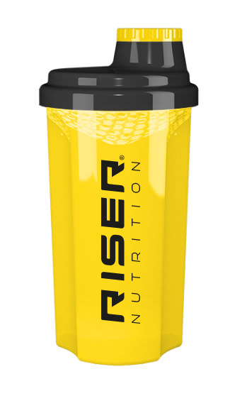
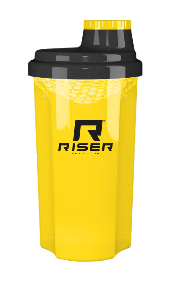
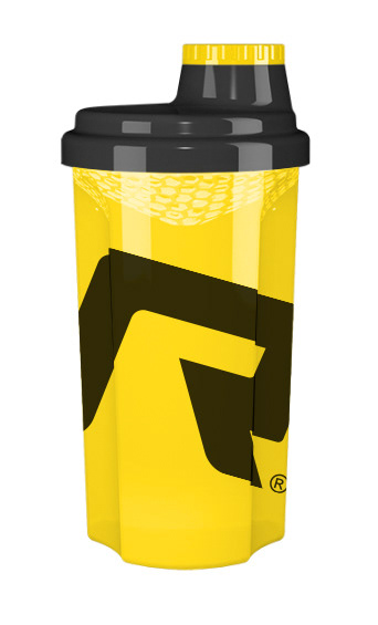
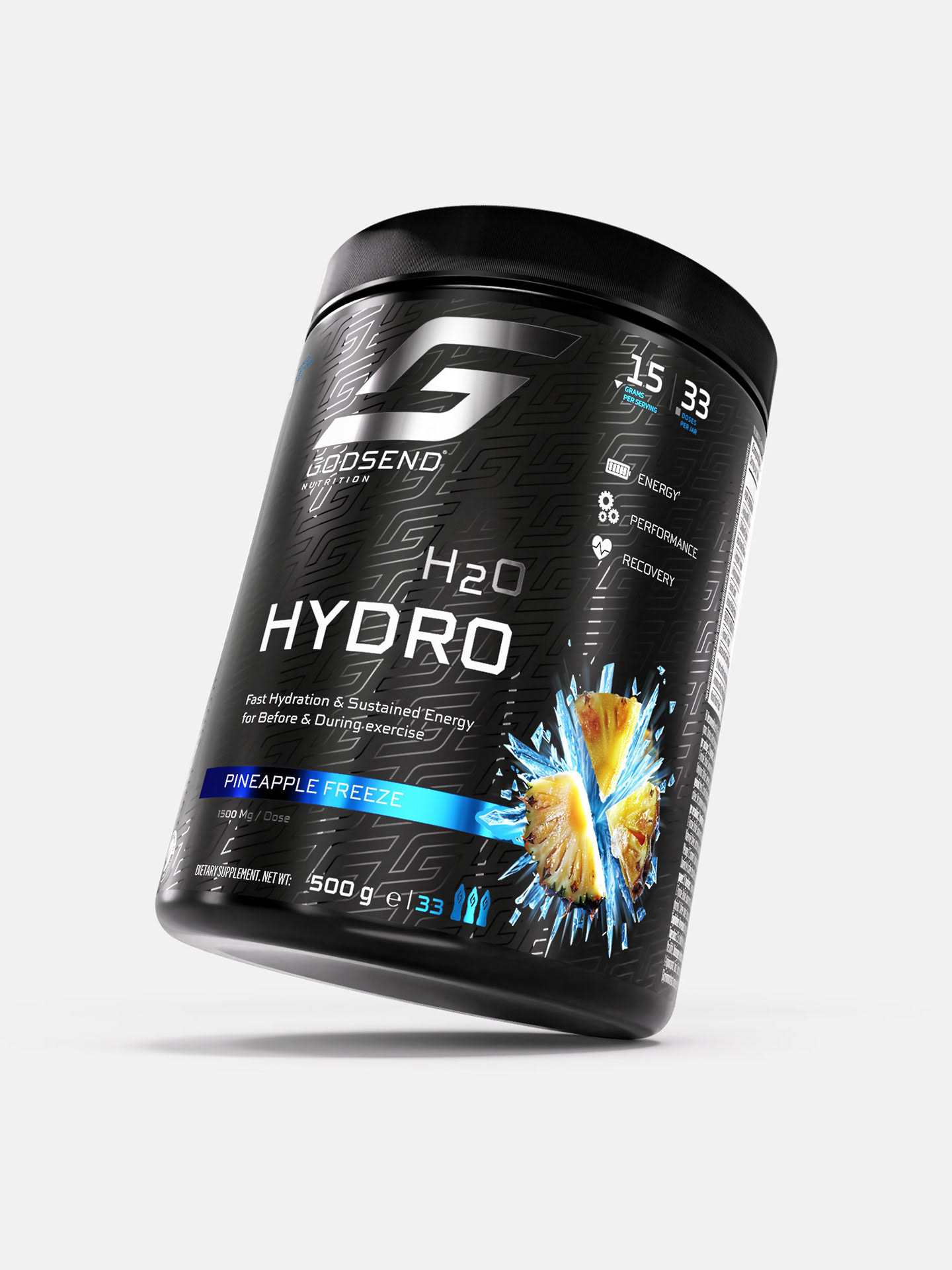
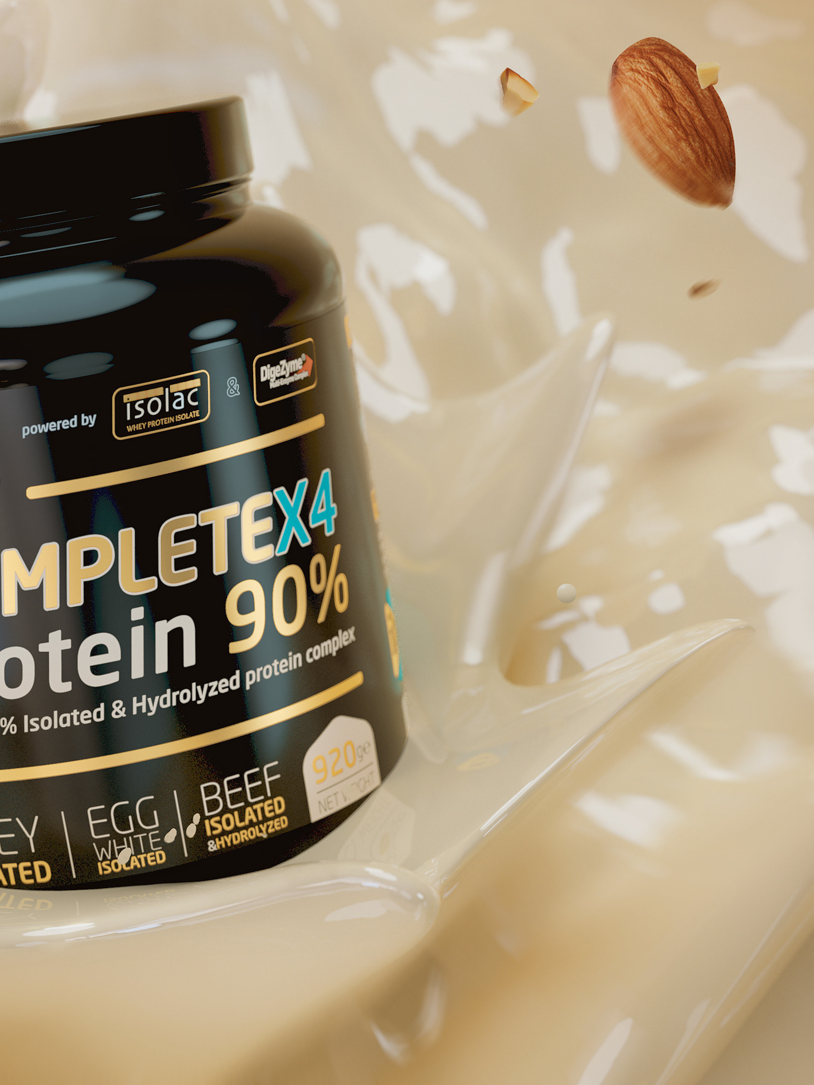
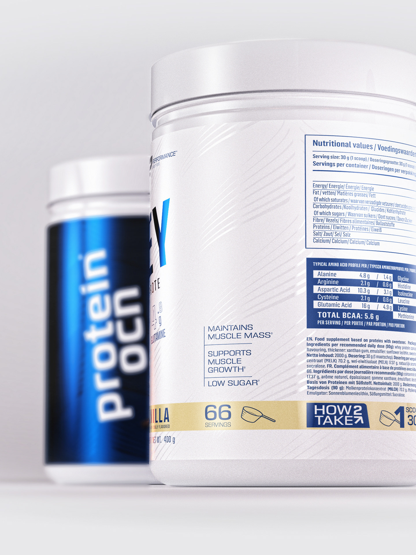
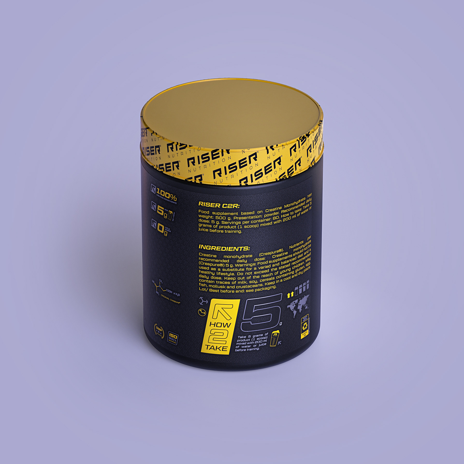
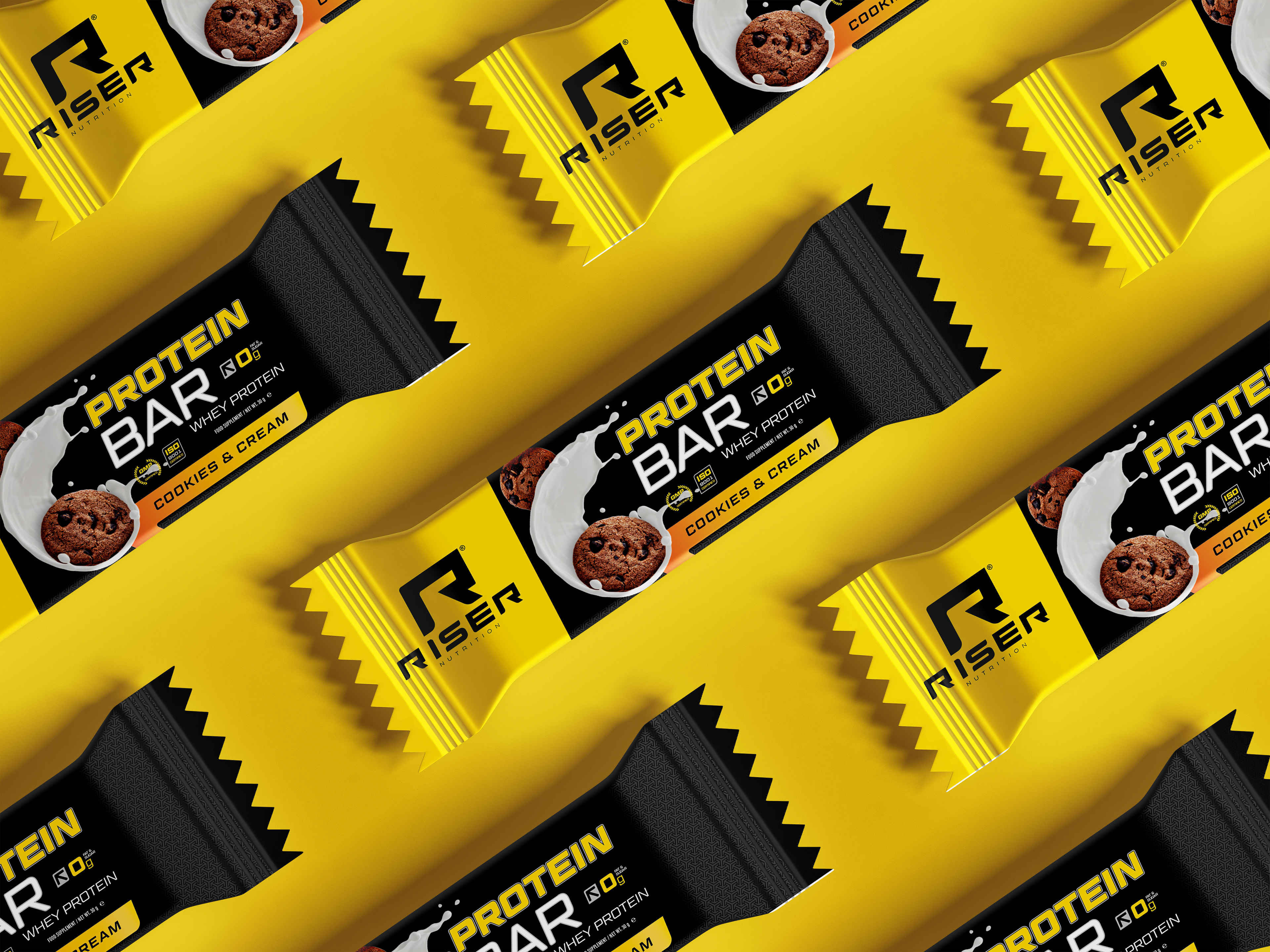
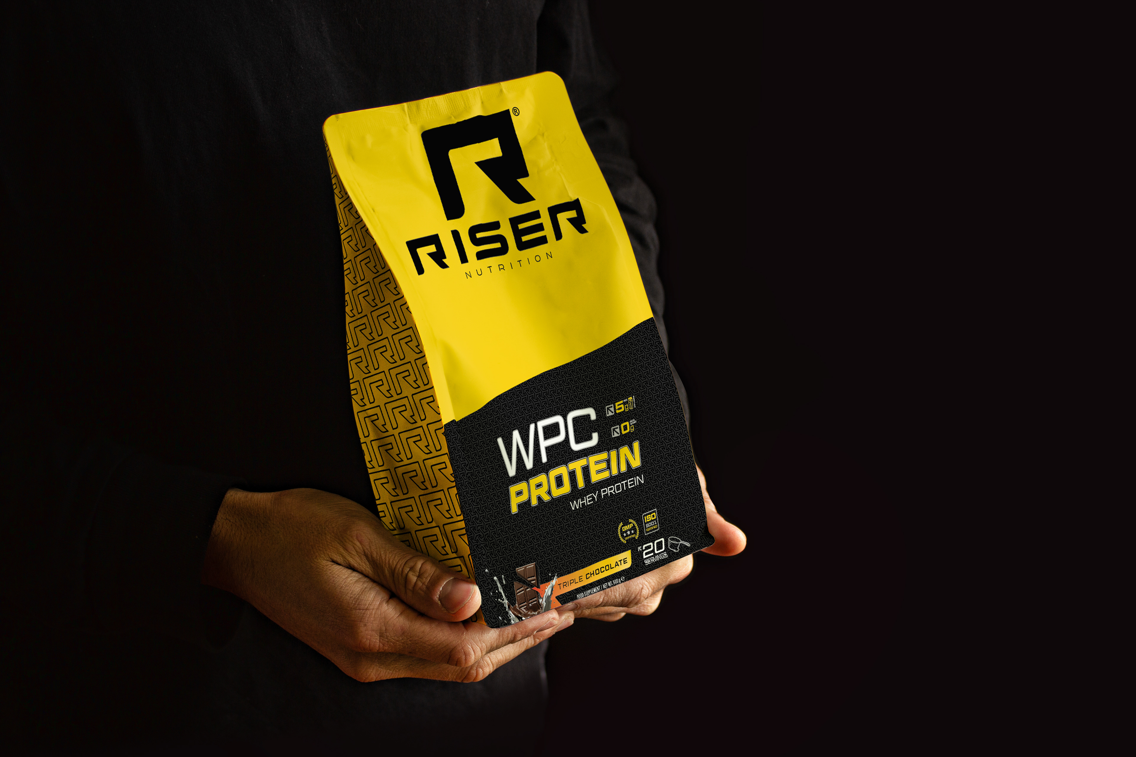
LABELING & PACKAGING.
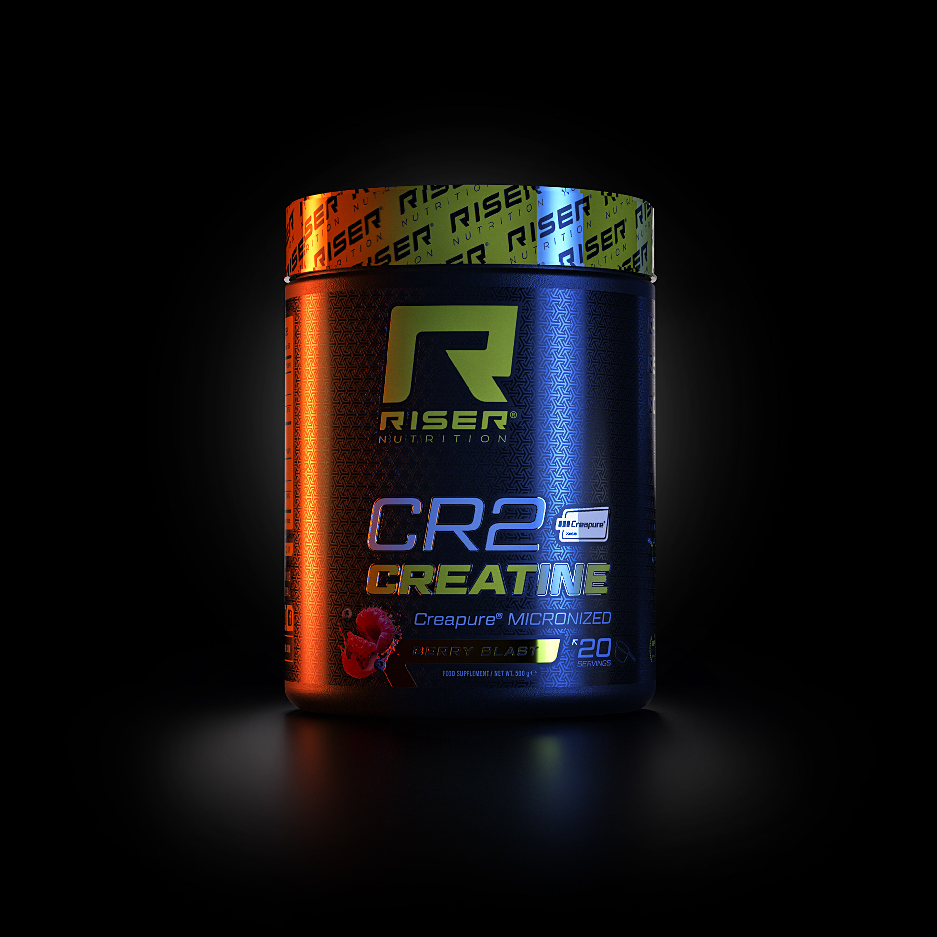
The Labels and Packaging of this new sports supplement brand are characterised by a fresh, contemporary and highly sporty design. The main colour combination used is yellow and black, which adds a striking contrast and modern aesthetic to the products.Label and packaging design is inspired by sports iconography, using symbols and visual elements associated with fitness and athletic performance. Sports icons, stylised silhouettes of specific sports or graphic elements representing strength, movement and determination are included.

In addition, modern and dynamic typefaces are used to accentuate the sporty and energetic feel of the design. Fonts are carefully chosen to convey a clear and legible message, but at the same time, add a touch of style and modernity.

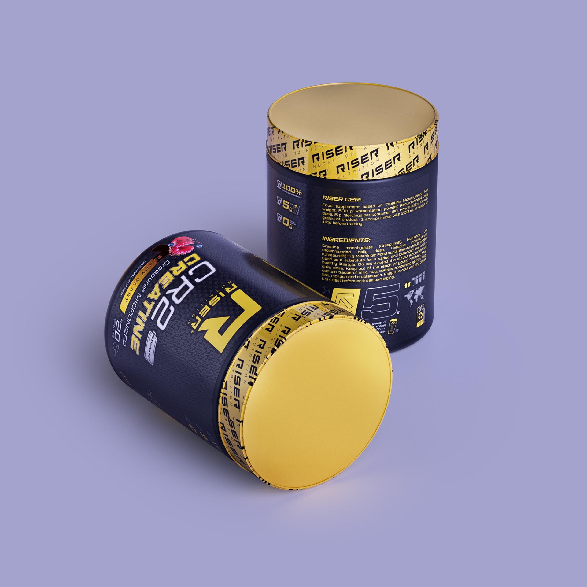
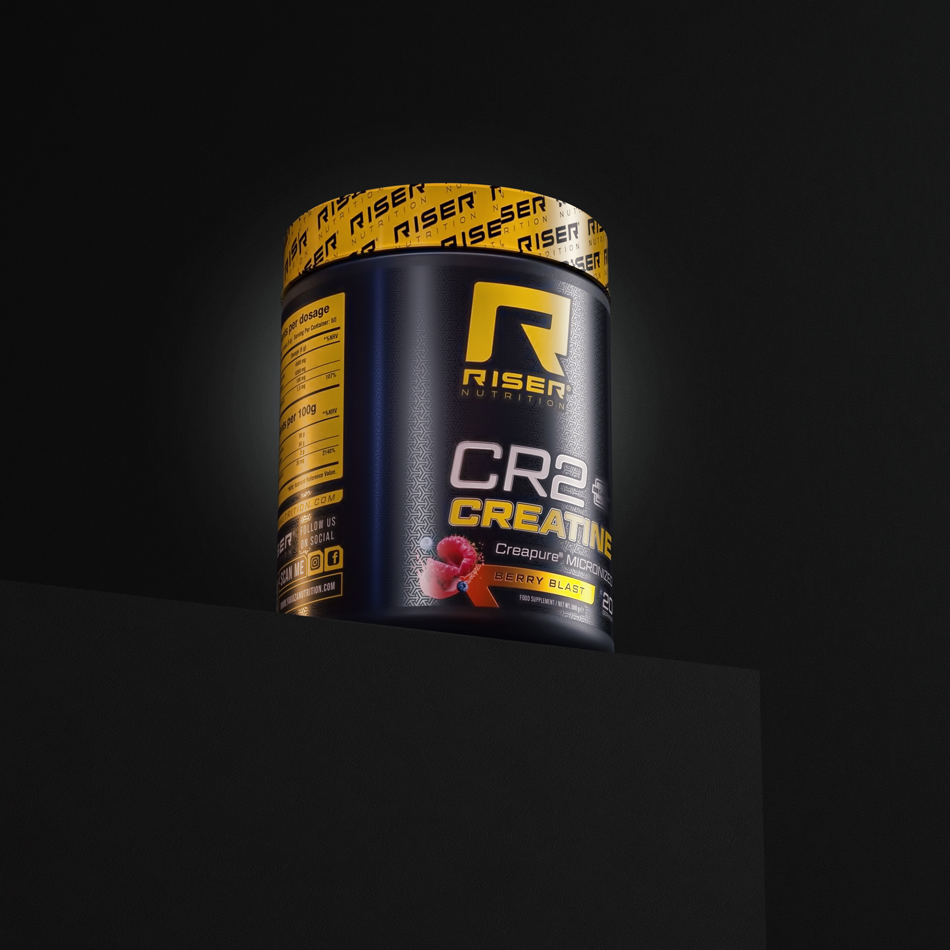
The Riser Nutrition design stands out for its fresh, contemporary and highly sporty approach, accepted by any age range and gender. The use of yellow and black colours, together with graphic elements inspired by the world of sport, creates a striking and attractive visual identity for the brand.

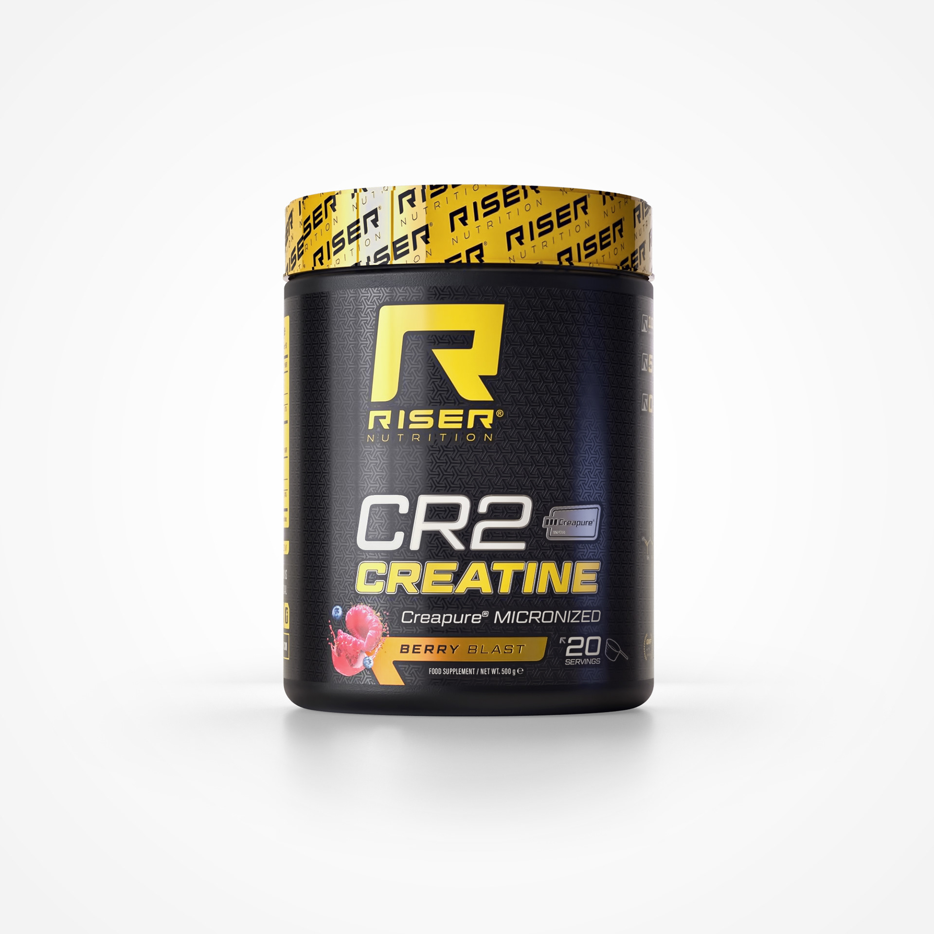
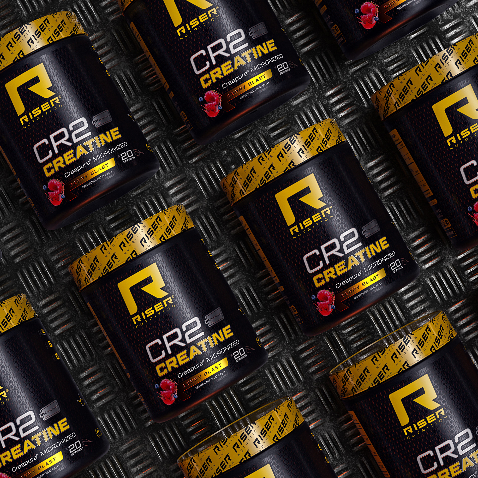
'CR2' RISER NUTRITION | BELGIUM
Graphic Designer | Javier Toscano
Modeleling and Render 3D | Javier Toscano
Edit | Javier Toscano
Modeleling and Render 3D | Javier Toscano
Edit | Javier Toscano
hola@javiertoscano.com