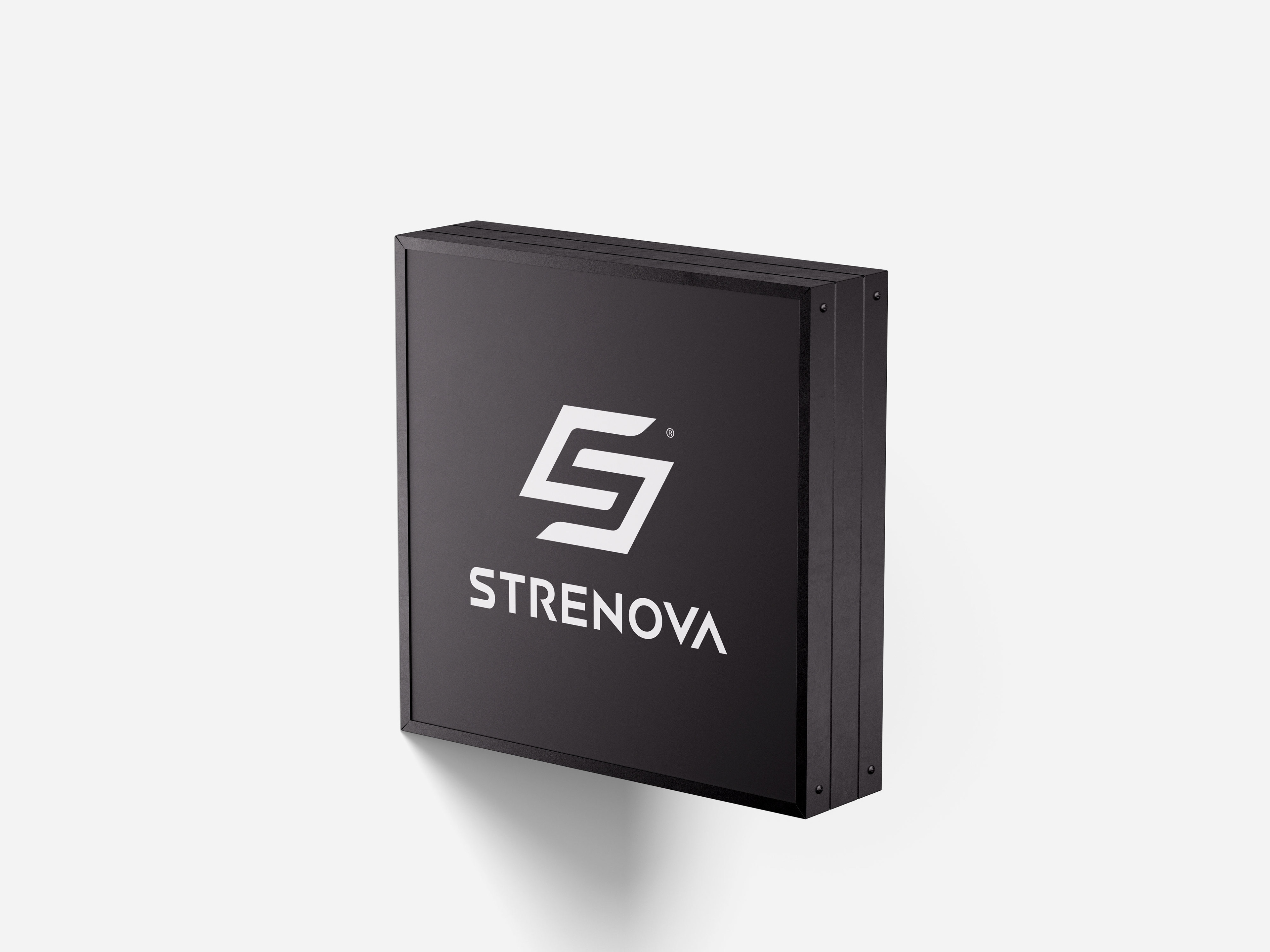
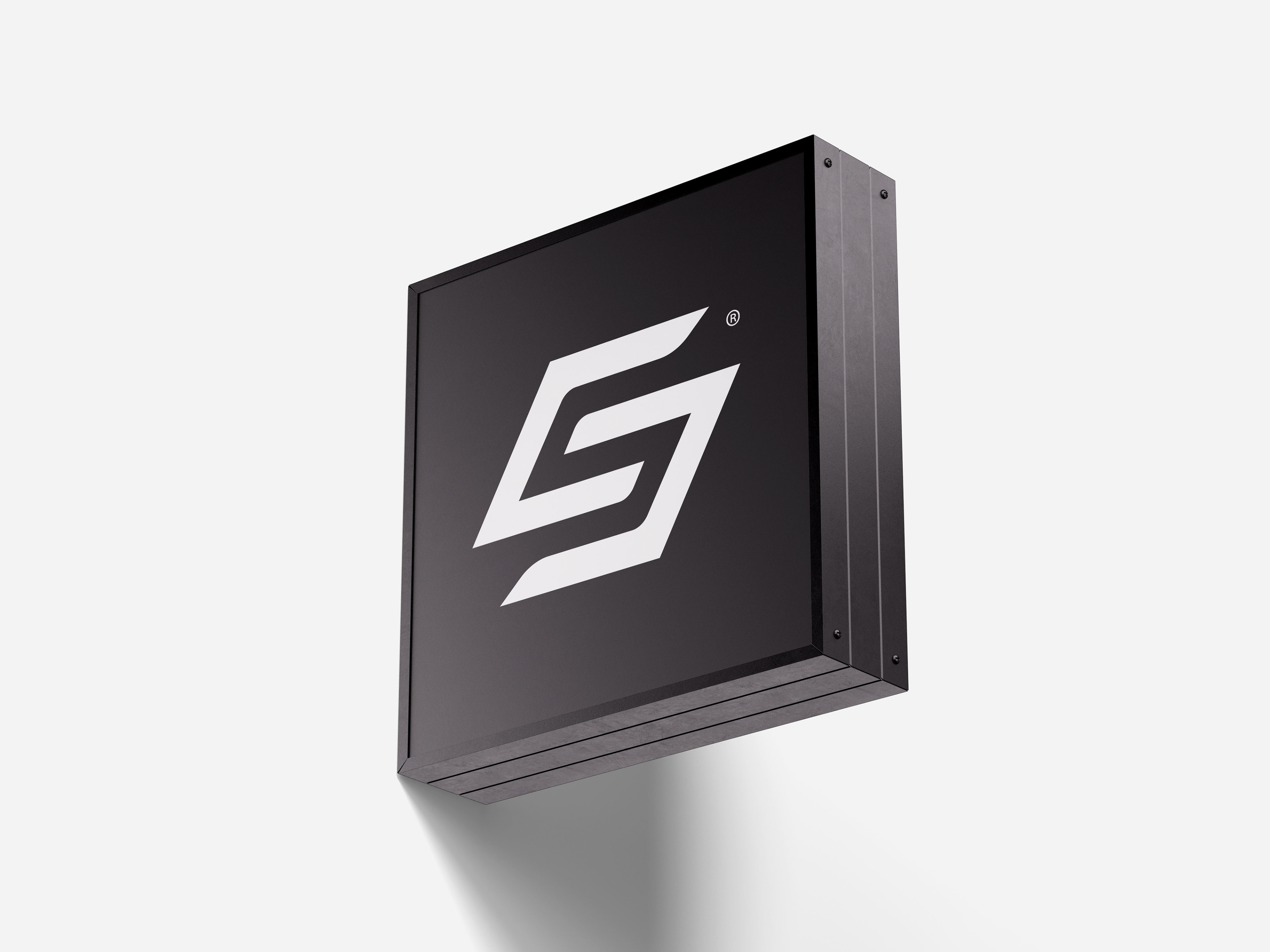
T H E L O G O
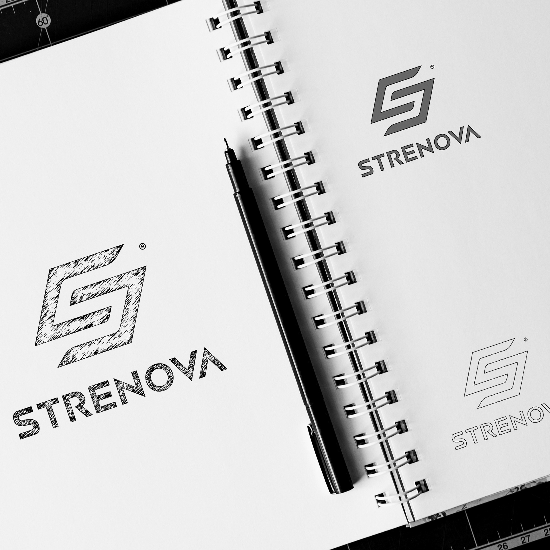
—The STRENOVA® logo embodies modernity, dynamism, and precision. Its stylized "S" icon features angular and fluid lines that convey both movement and stability, while the custom sans-serif typography reinforces trust and professionalism. The triangular detail in the "A" adds a unique touch, seamlessly connecting with the icon's design.
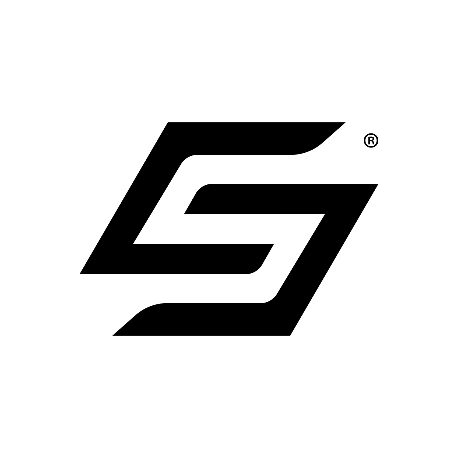
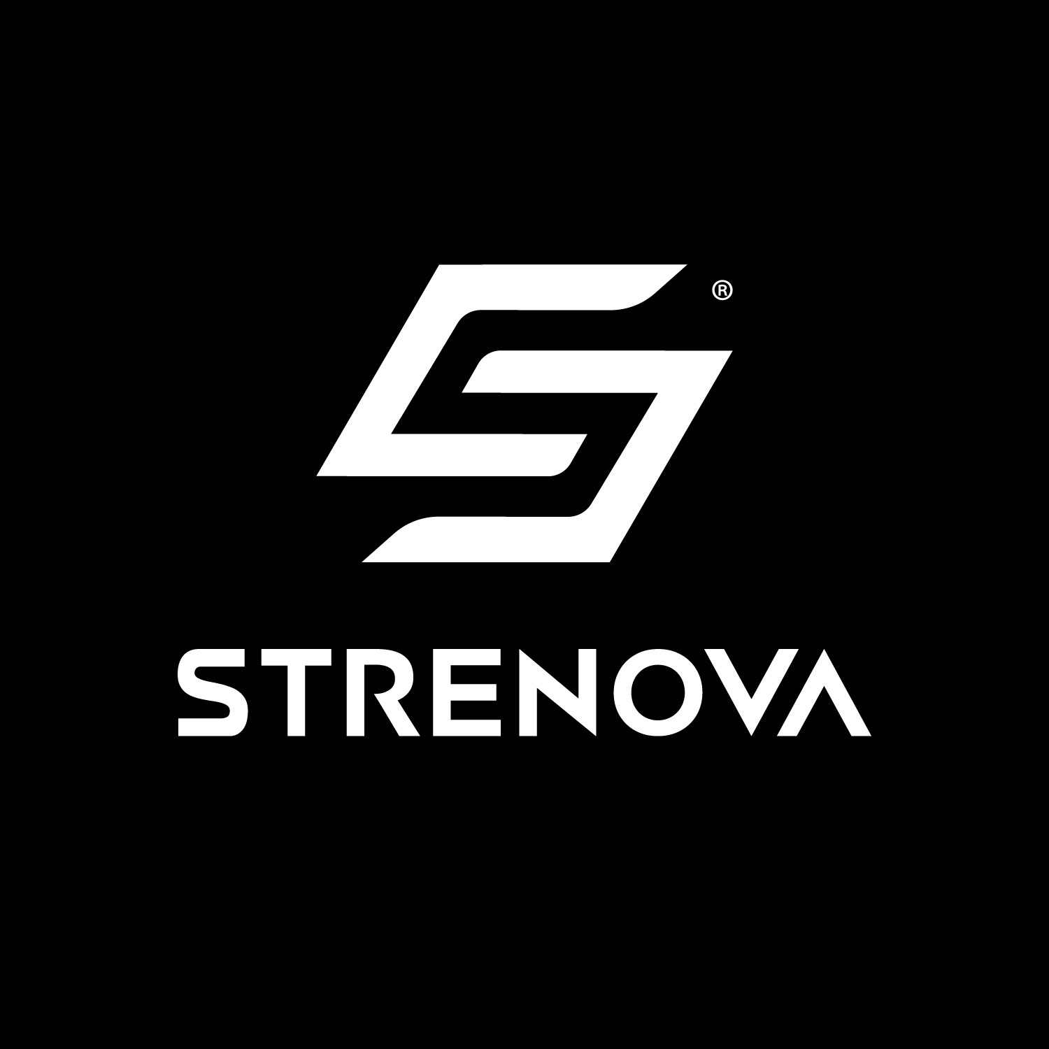

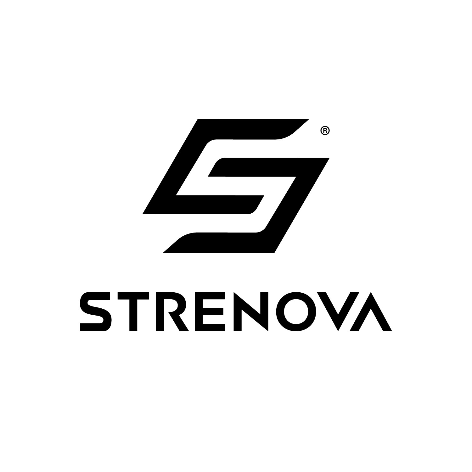
—The black-and-white monochromatic scheme ensures versatility and optimal reproduction across all formats, from print to digital. It is highly scalable, retaining impact in both small and large sizes, and designed for practical applications such as embroidery or engraving. This logo communicates innovation, strength, and reliability, making it a standout example of functional and aesthetic design.

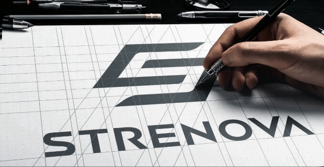
—The STRENOVA® logo is designed to convey energy, precision, and modernity—values that directly connect with the brand’s essence. The stylized "S" combines dynamic and bold lines that evoke constant movement, strength, and progress—essential qualities for a sports nutrition brand focused on innovation.
—The triangle in the "A" adds a unique and distinctive detail, breaking away from convention and reinforcing STRENOVA’s modern and visionary character. The clean and solid sans-serif typography enhances the professionalism and trust that the brand aims to project.
—Every element has been carefully crafted to balance functionality and aesthetics, ensuring that the logo is not only memorable but also effectively communicates the brand’s core values. This design seamlessly adapts to various applications, from digital platforms to physical products, guaranteeing that STRENOVA® stands out in any context.
—STRENOVA® is not just a logo—it is the beginning of a brand designed to lead.—
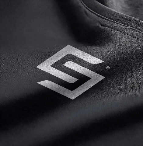
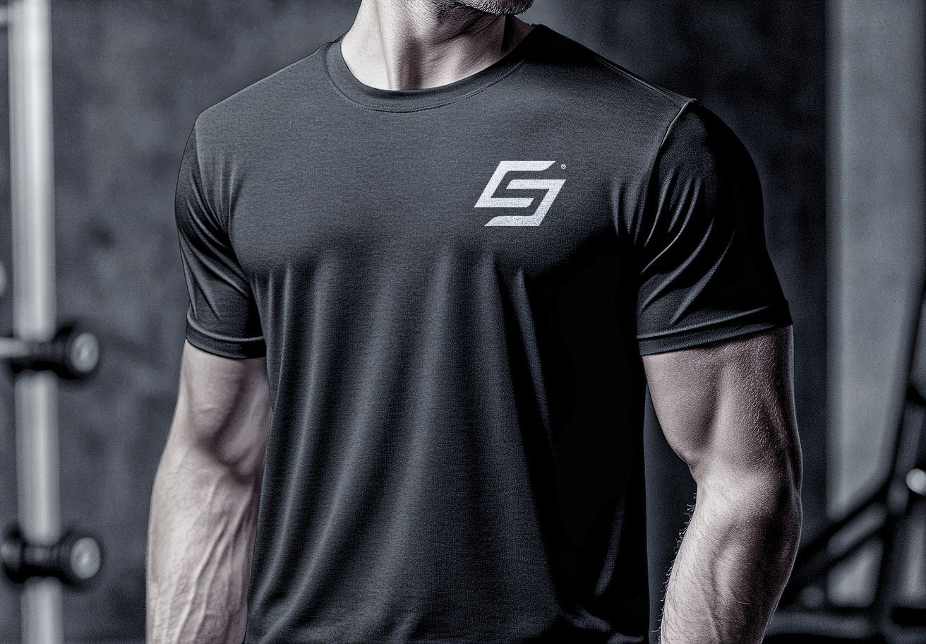
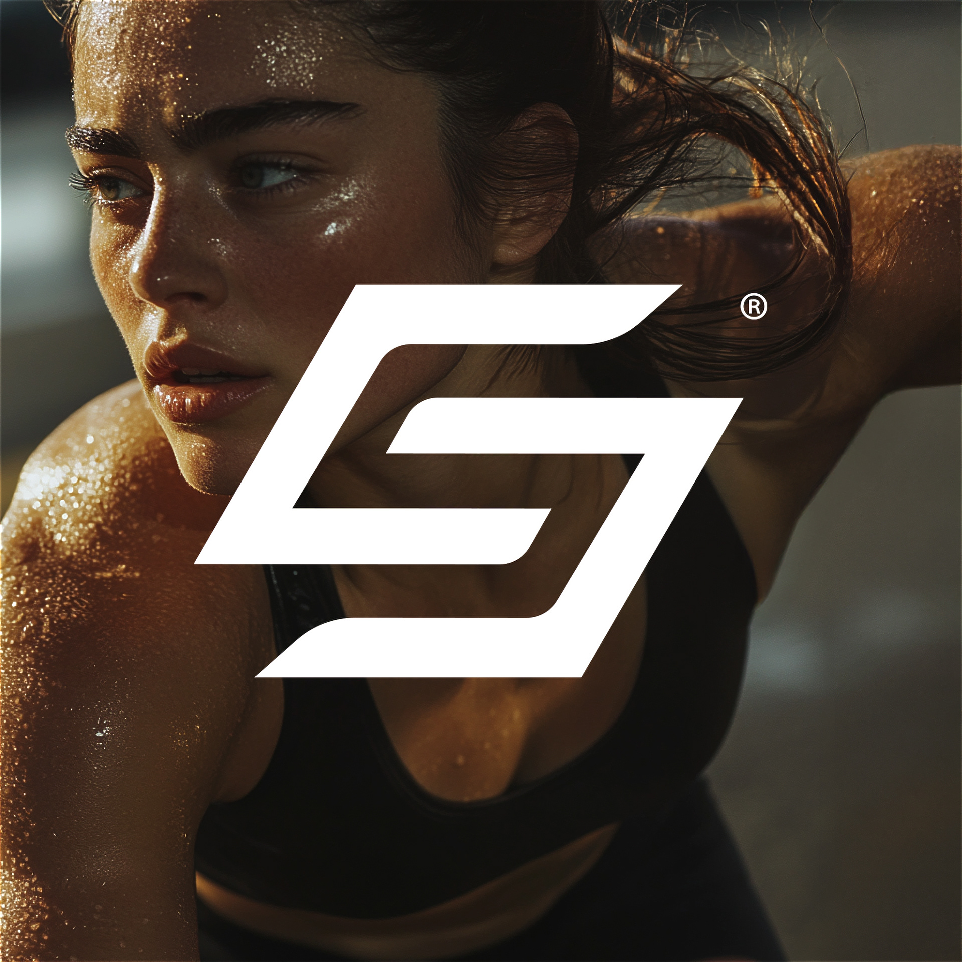
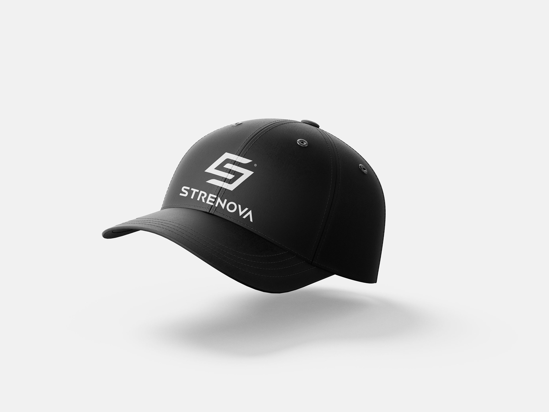
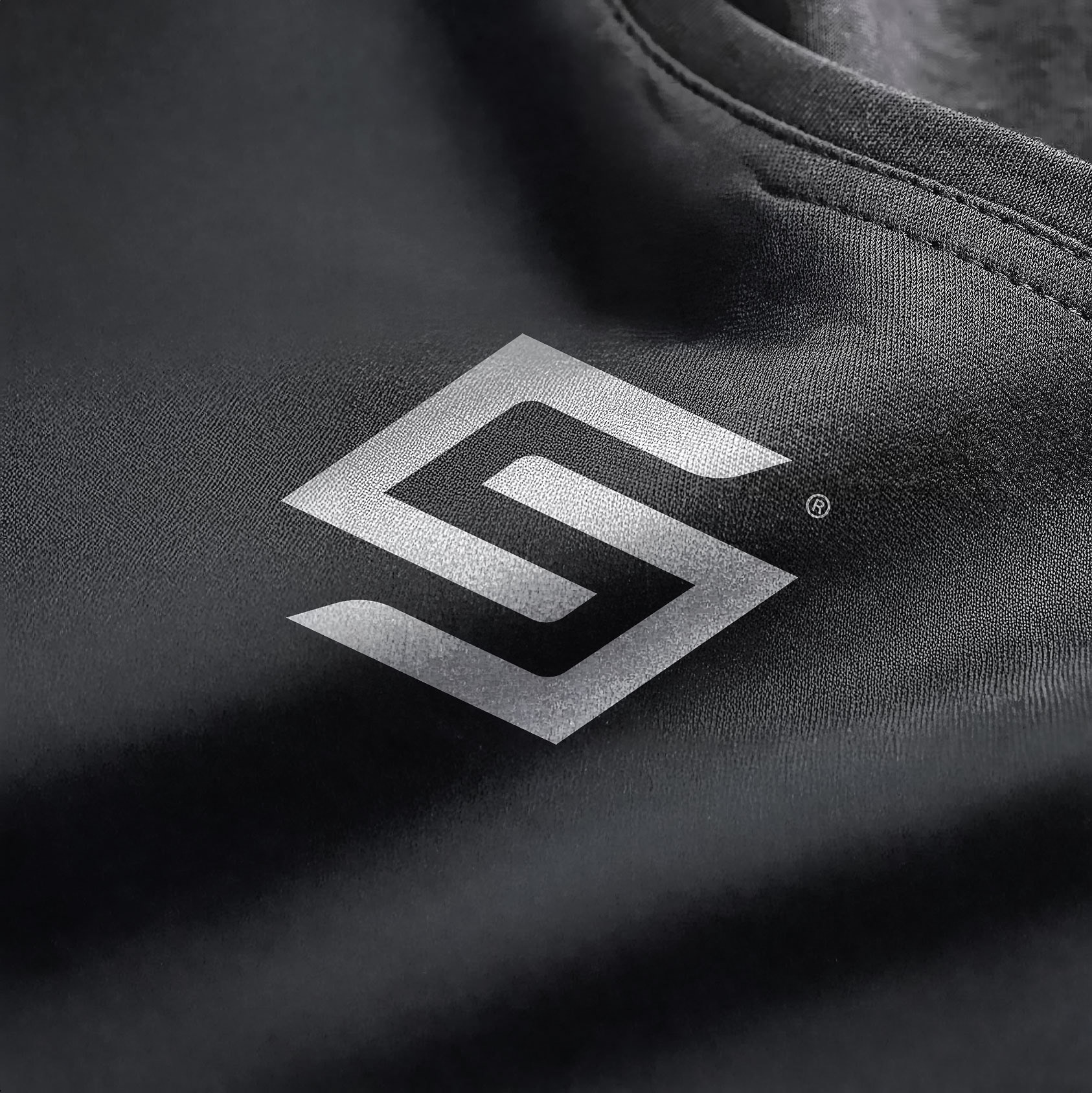
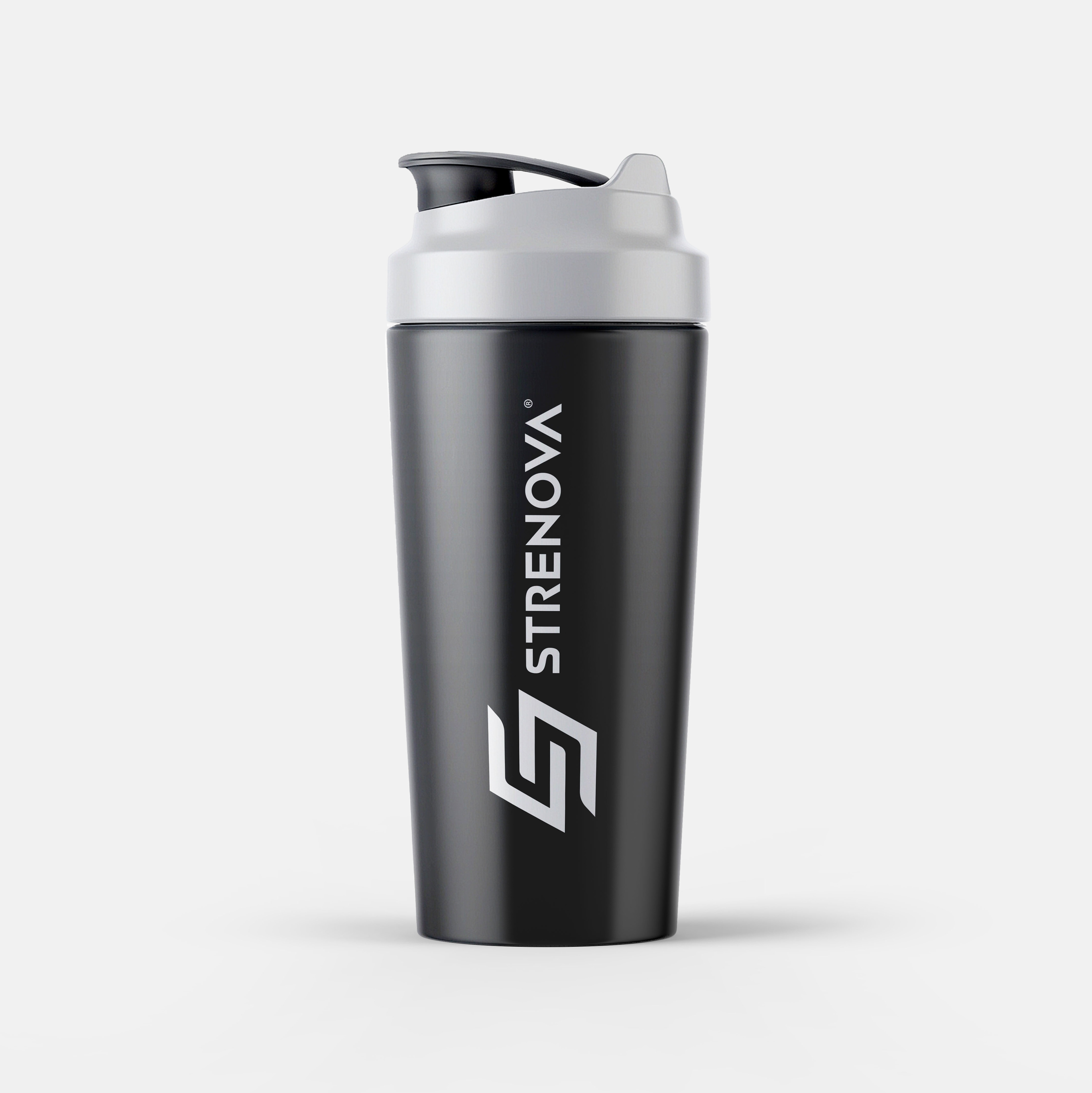
—The implementation of the STRENOVA® logo across various applications showcases the versatility and strength of its identity. From accessories like caps to high-performance sportswear, the iconic "S" seamlessly integrates, becoming a symbol of professionalism and style for athletes.
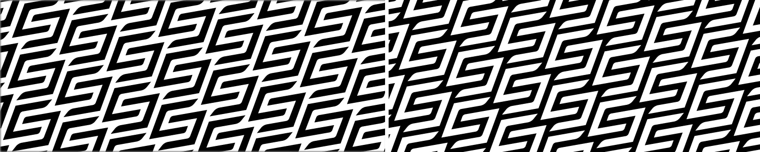
Pattern designs featuring the logo reinforce the brand as a visual benchmark, creating an immediate and distinctive impact across all touchpoints. Moreover, the presence of the logo in both digital and physical interfaces ensures that the brand transcends platforms, connecting with its audience wherever they are.
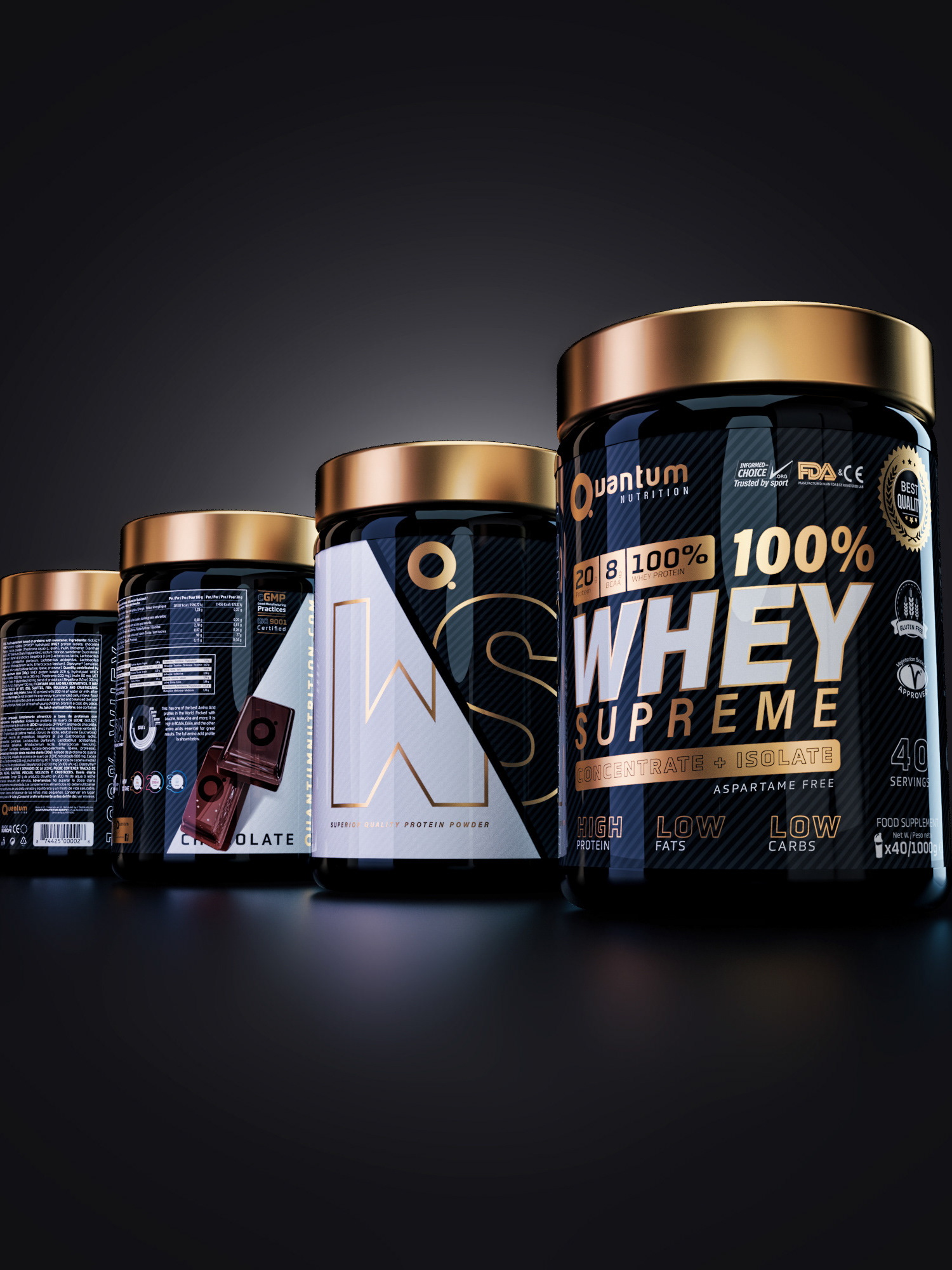
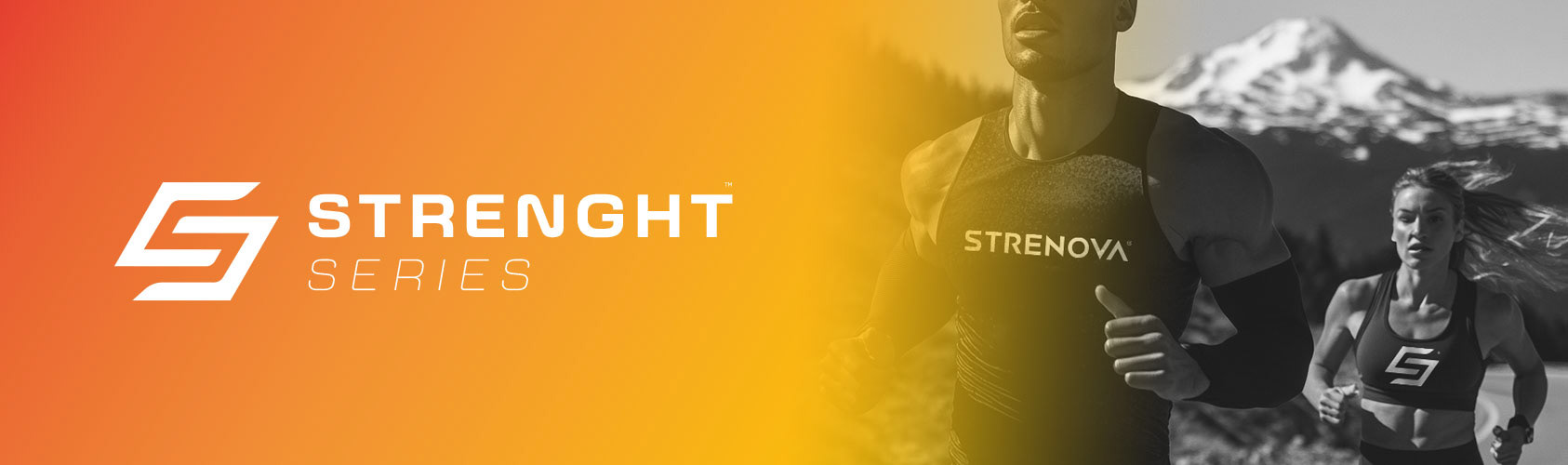
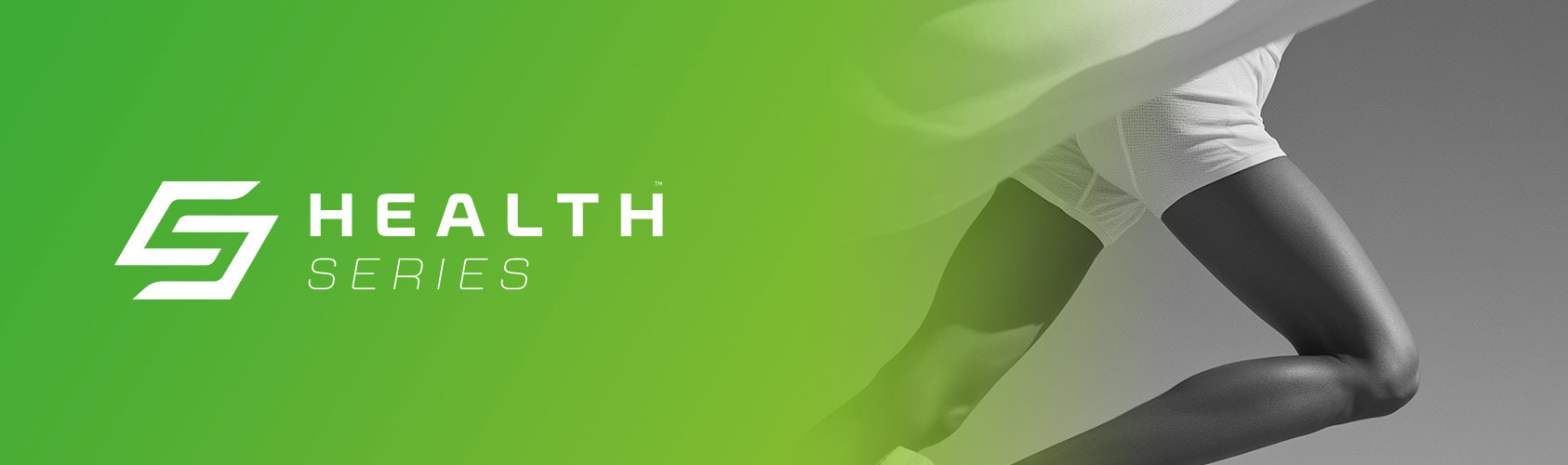
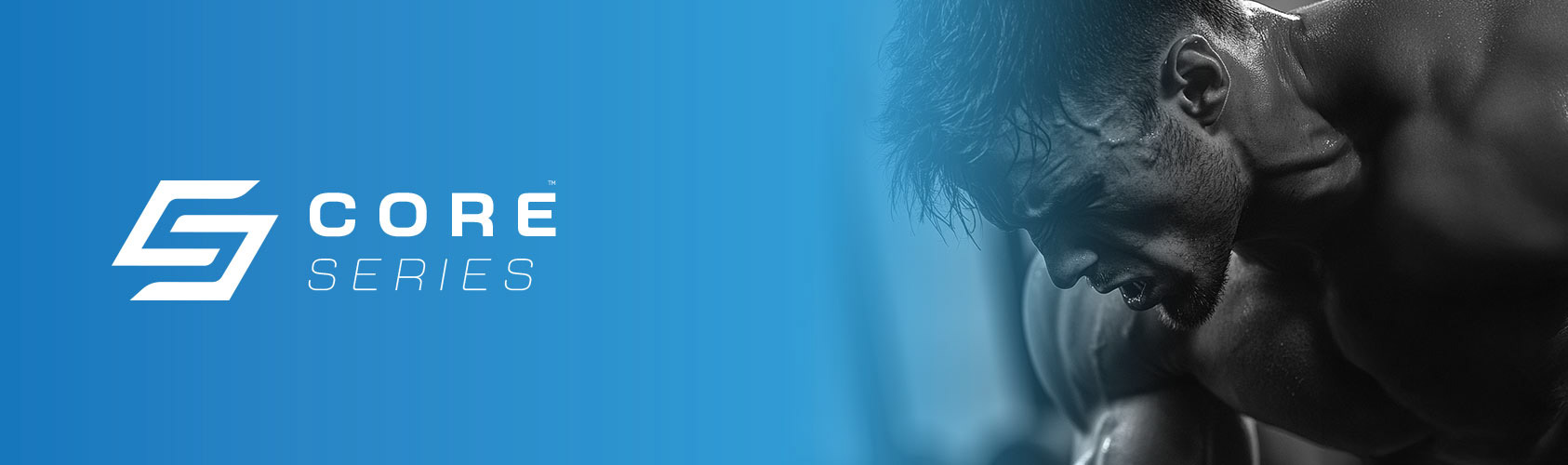
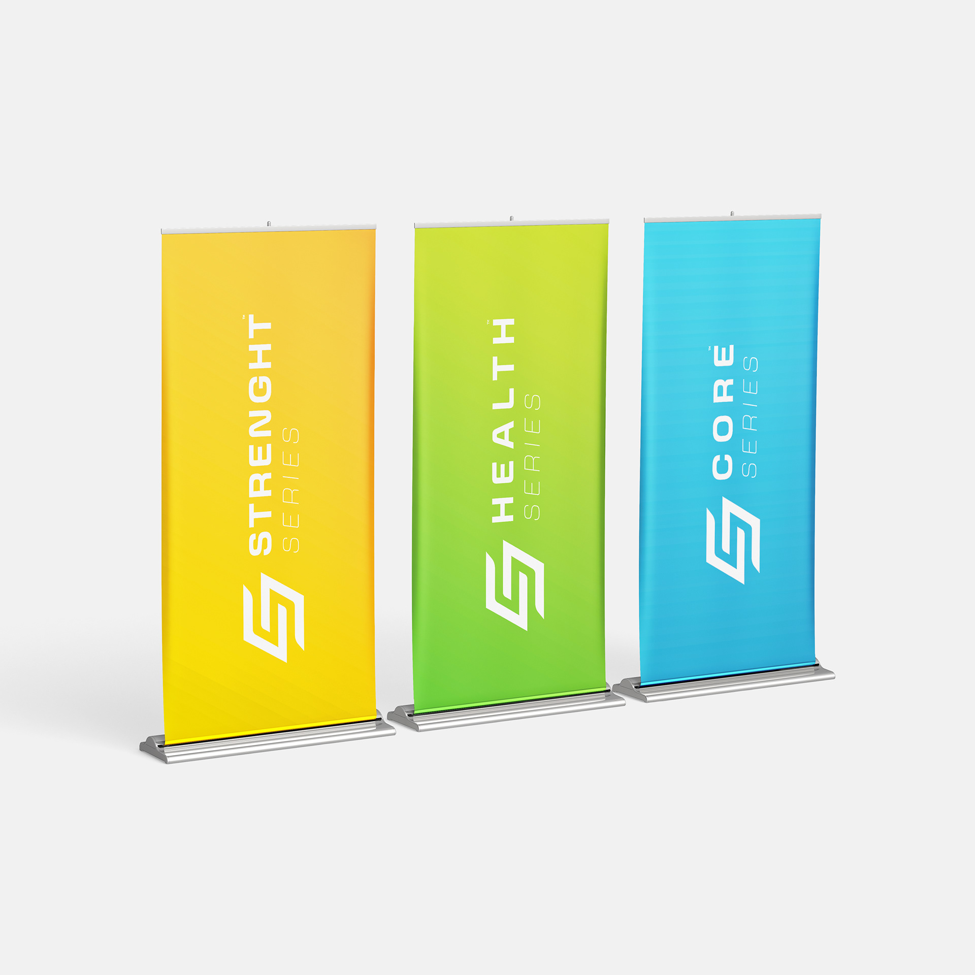
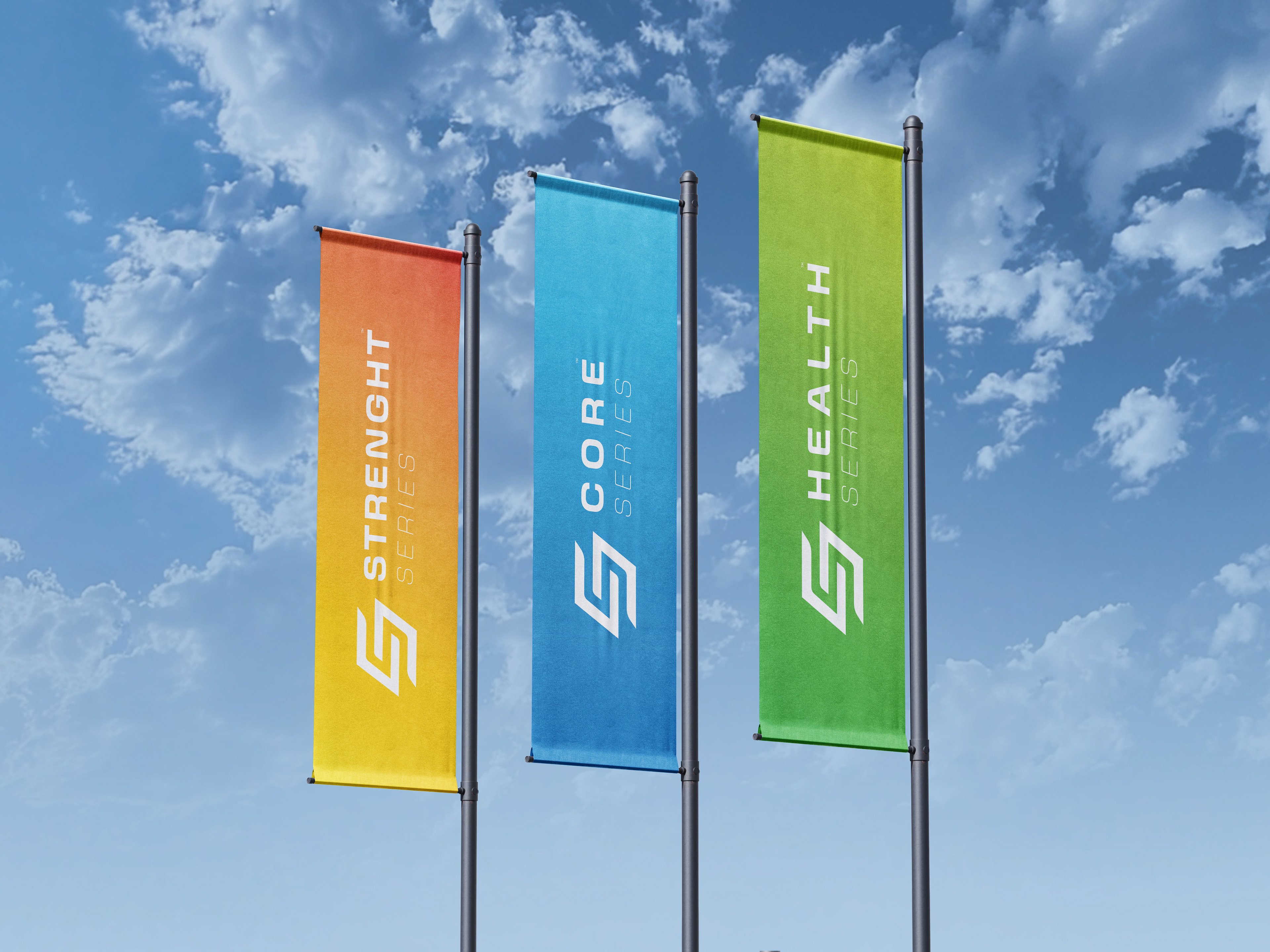
—Within the product line, the Strength, Health, and Core series stand out not only for their functionality but also for their vibrant and distinctive visual identity. Each range employs a carefully selected color scheme to convey its purpose: explosive strength, overall well-being, and essential performance. This segmentation enhances the perception of innovation and specialization that defines STRENOVA® .
—Every design application tells a story—movement, power, and excellence in every detail.—
S T O R E
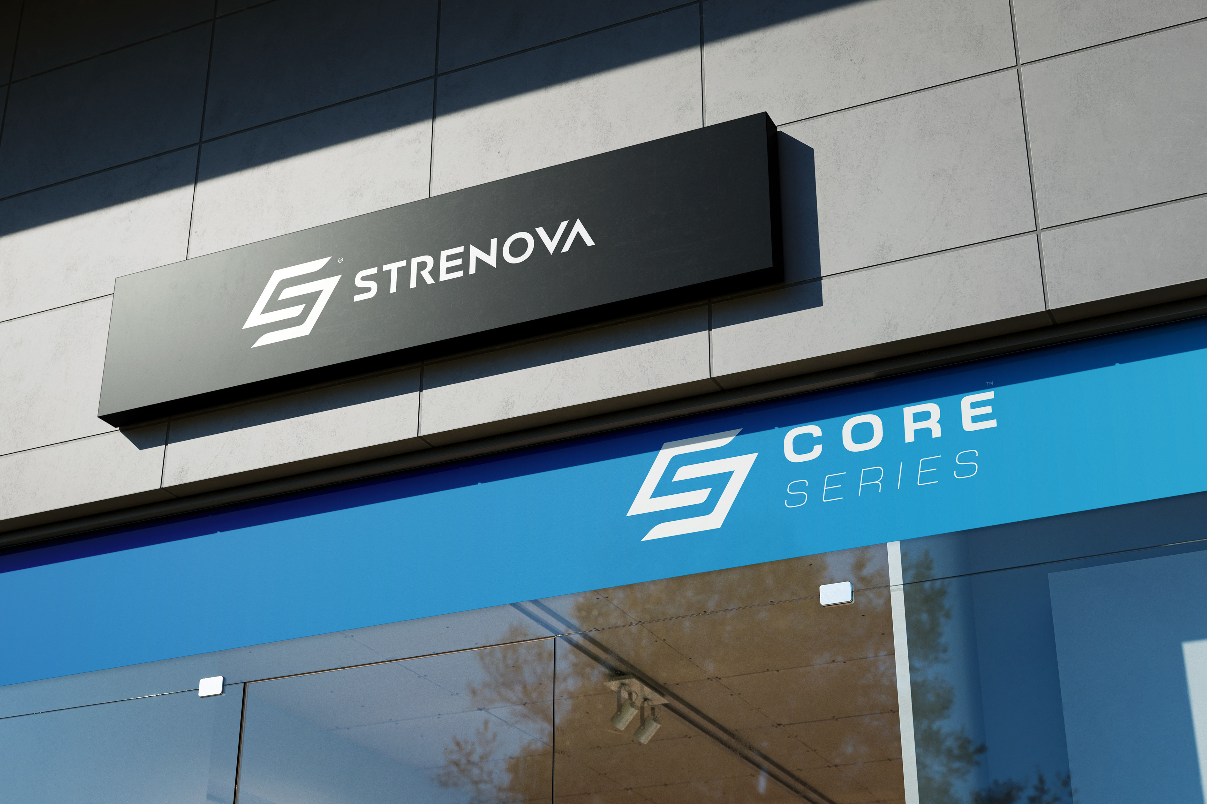
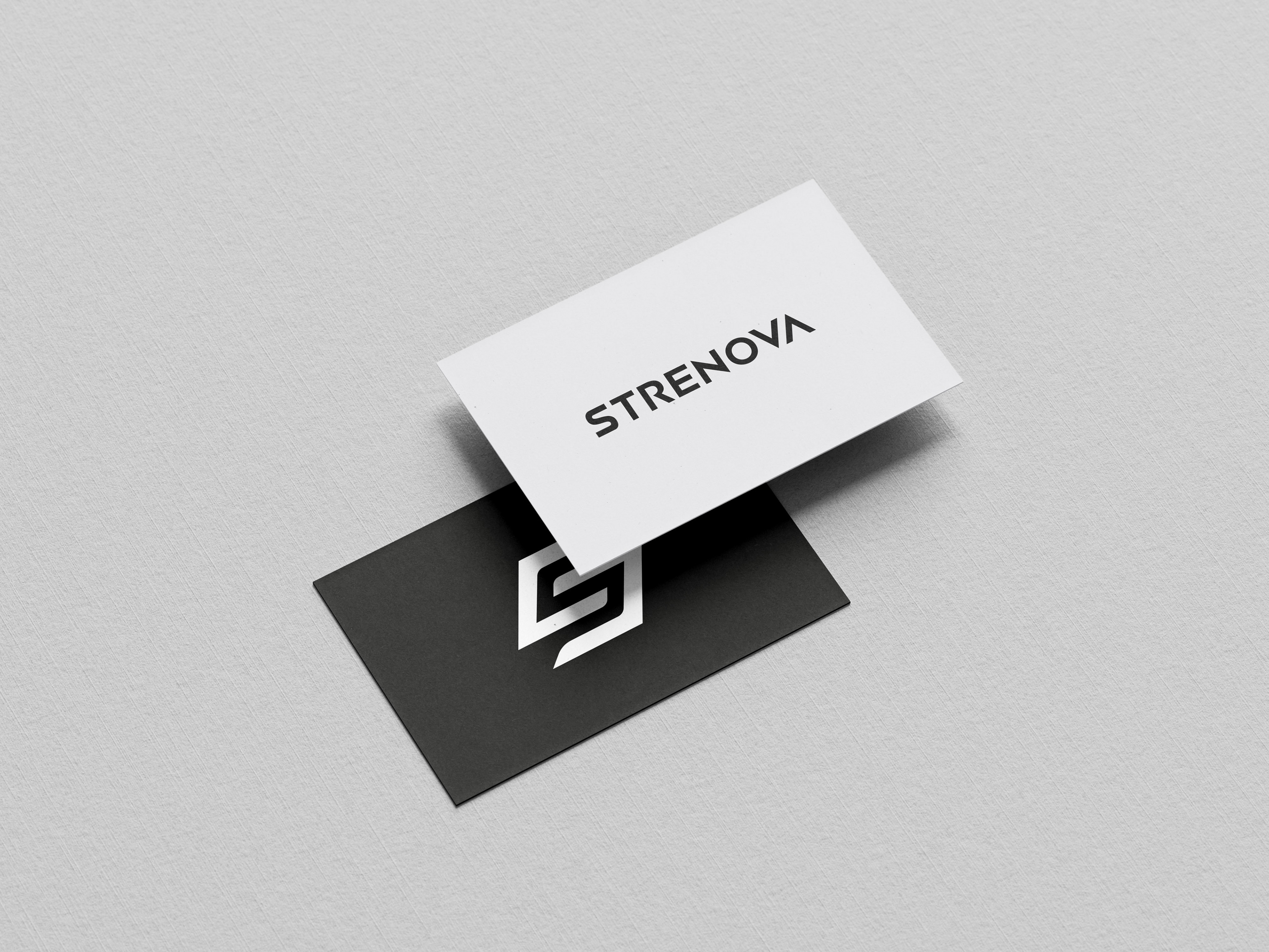
—STRENOVA’s visual identity comes to life in physical spaces and branding materials, ensuring a strong and professional presence.
—Physical assets like packaging and business cards reinforce the brand’s minimalist and elegant approach. Designed with precision and quality in mind, these elements embody STRENOVA’s essence. The black-and-white contrast on the cards adds sophistication, leaving a lasting impression in every professional interaction.
—Applied to high-quality apparel, the logo represents more than just products—it signifies a lifestyle. Every detail is crafted to make the brand stand out, not just on shelves but in the hands and experiences of those who choose it.
—STRENOVA® : A design that speaks of excellence at every level.—
S E R I E S
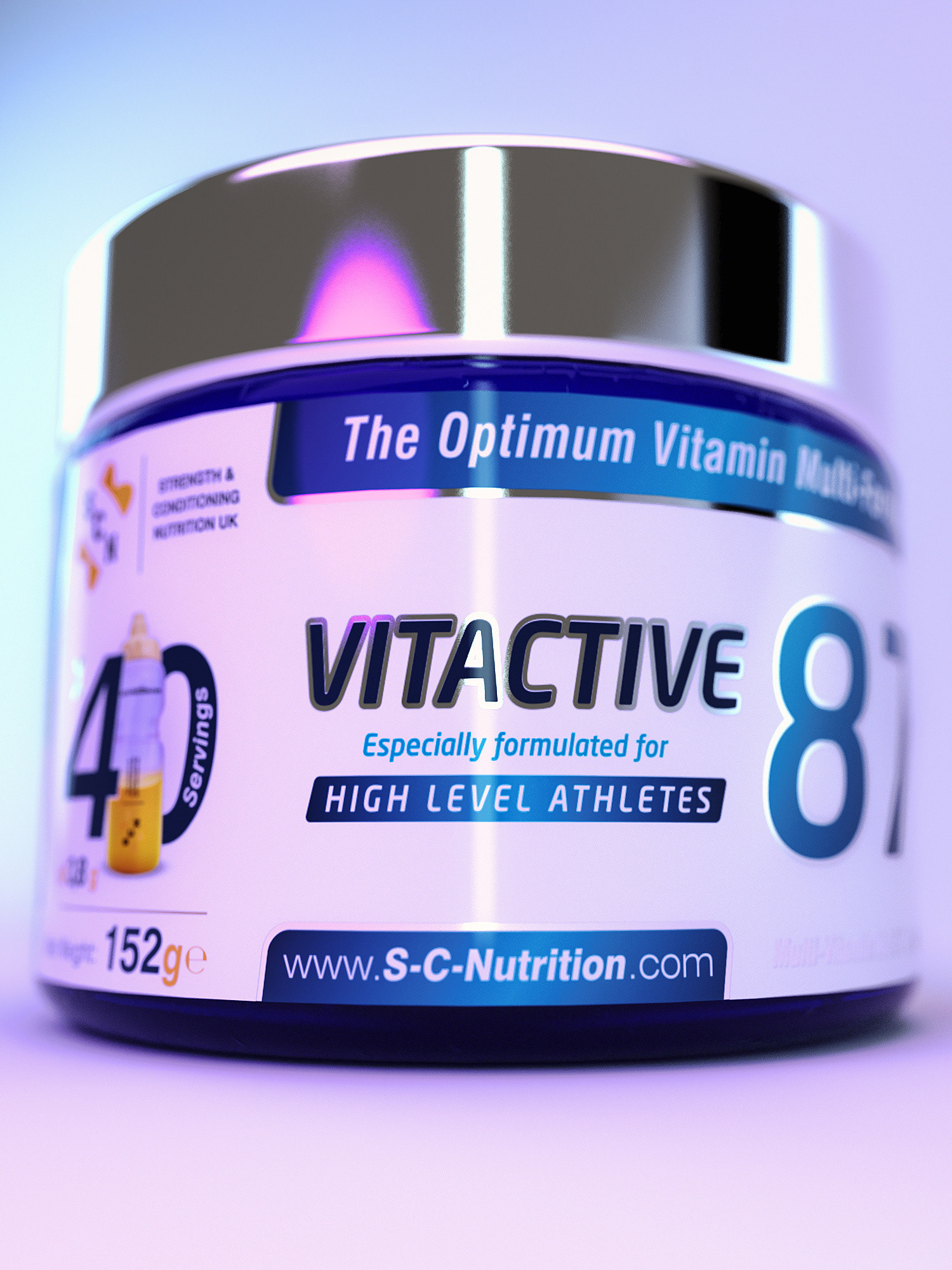
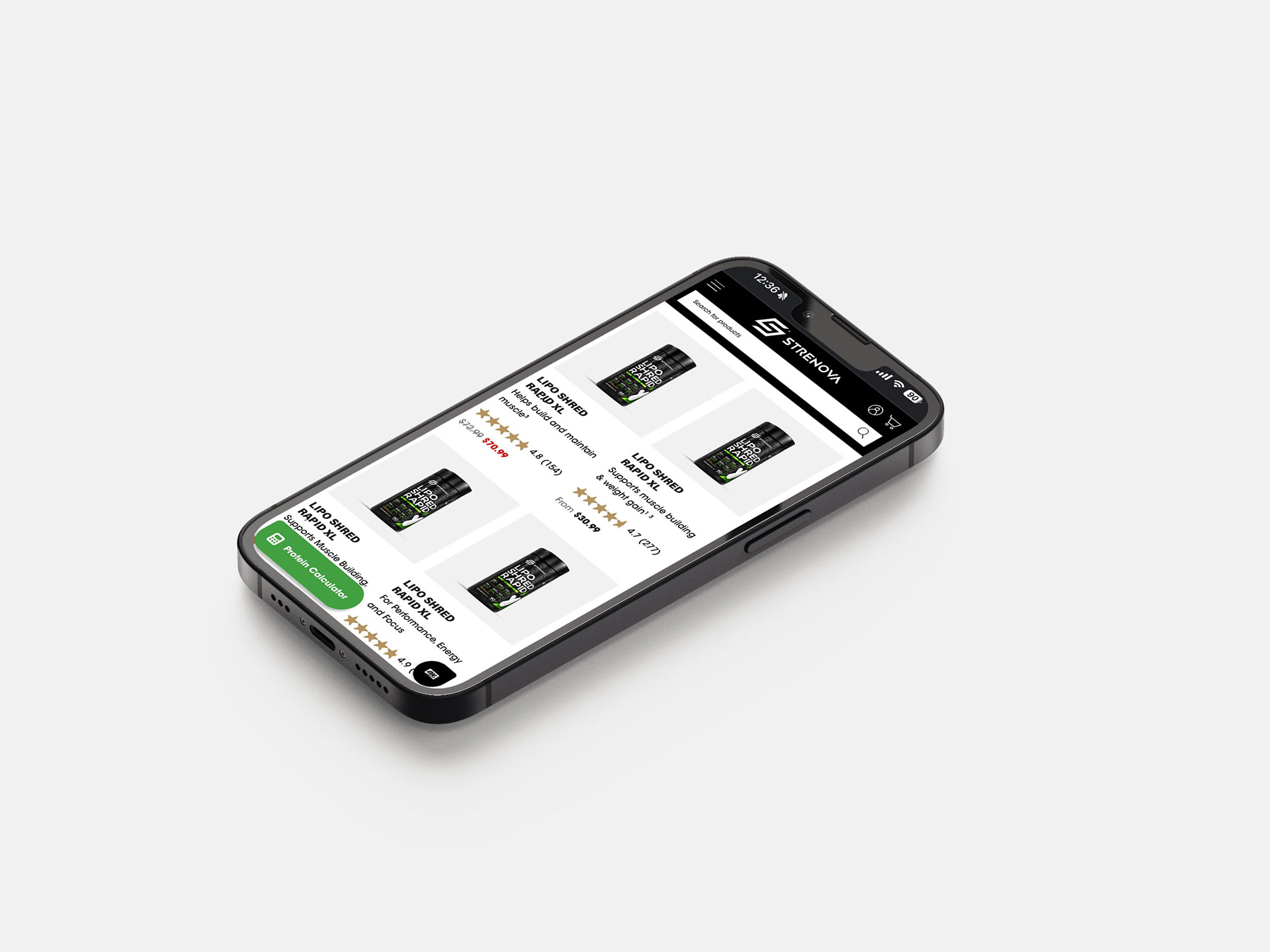
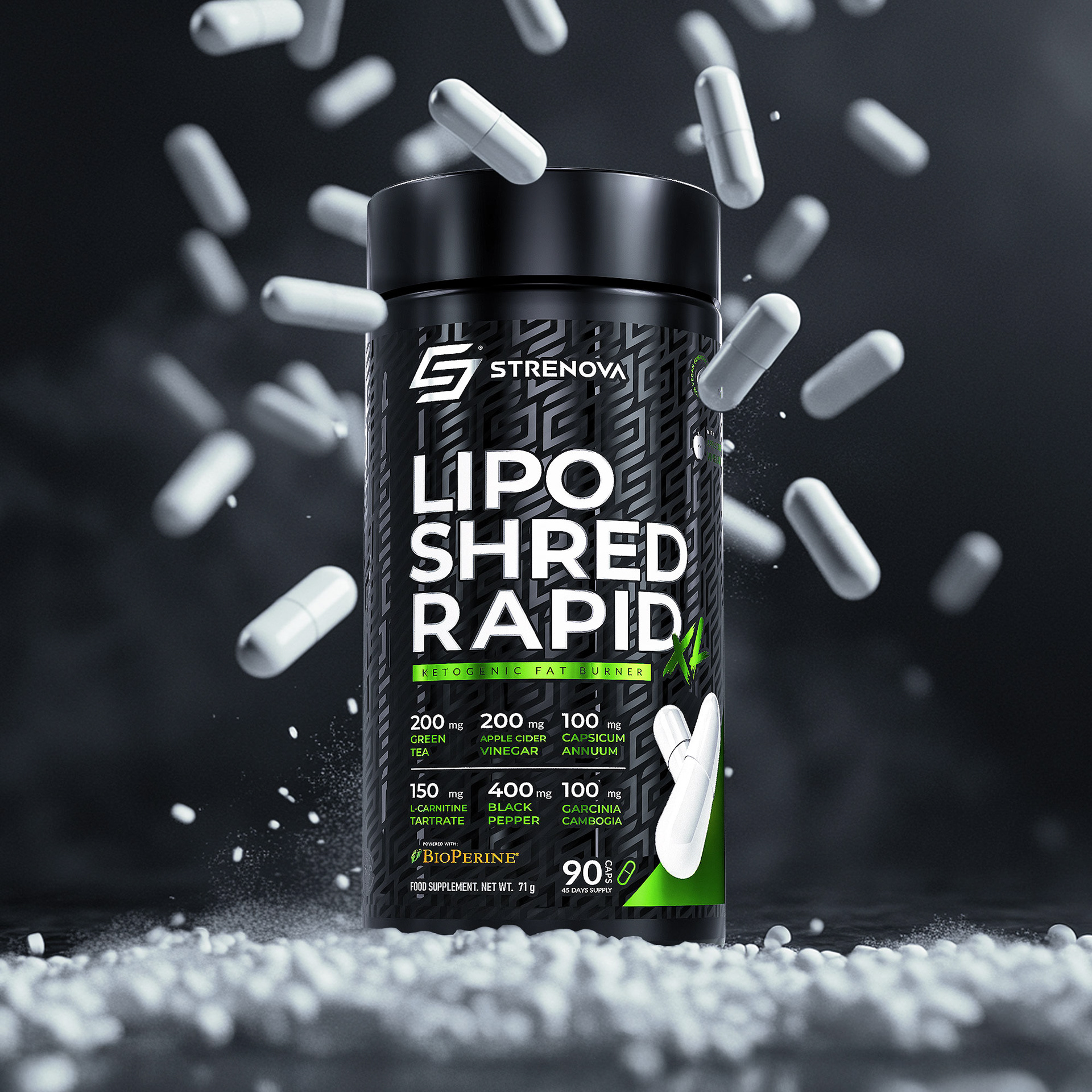
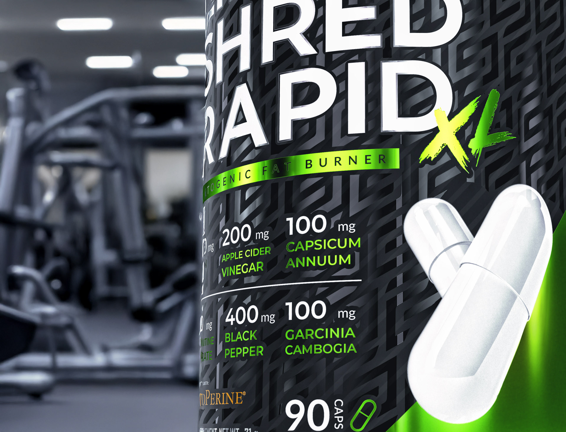
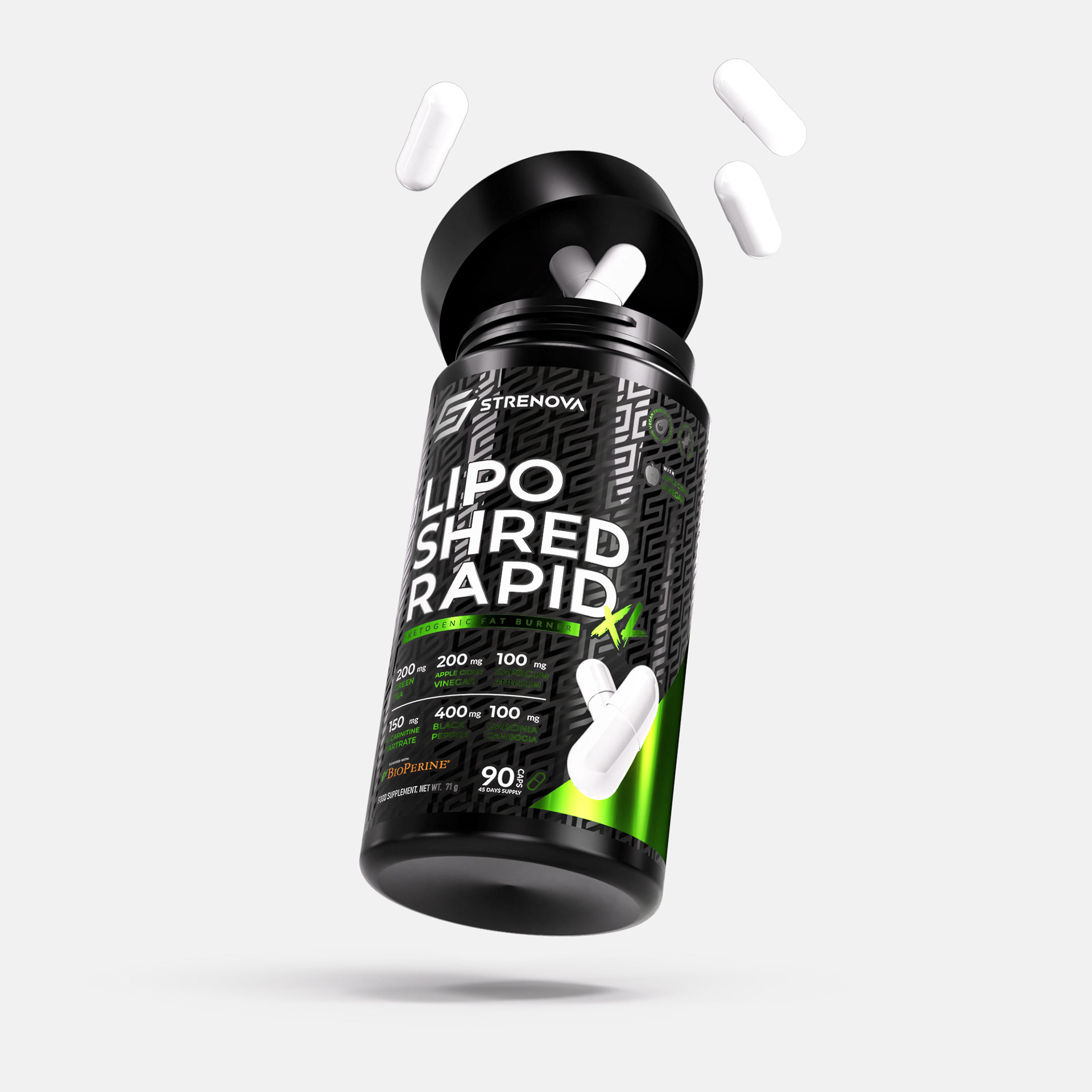
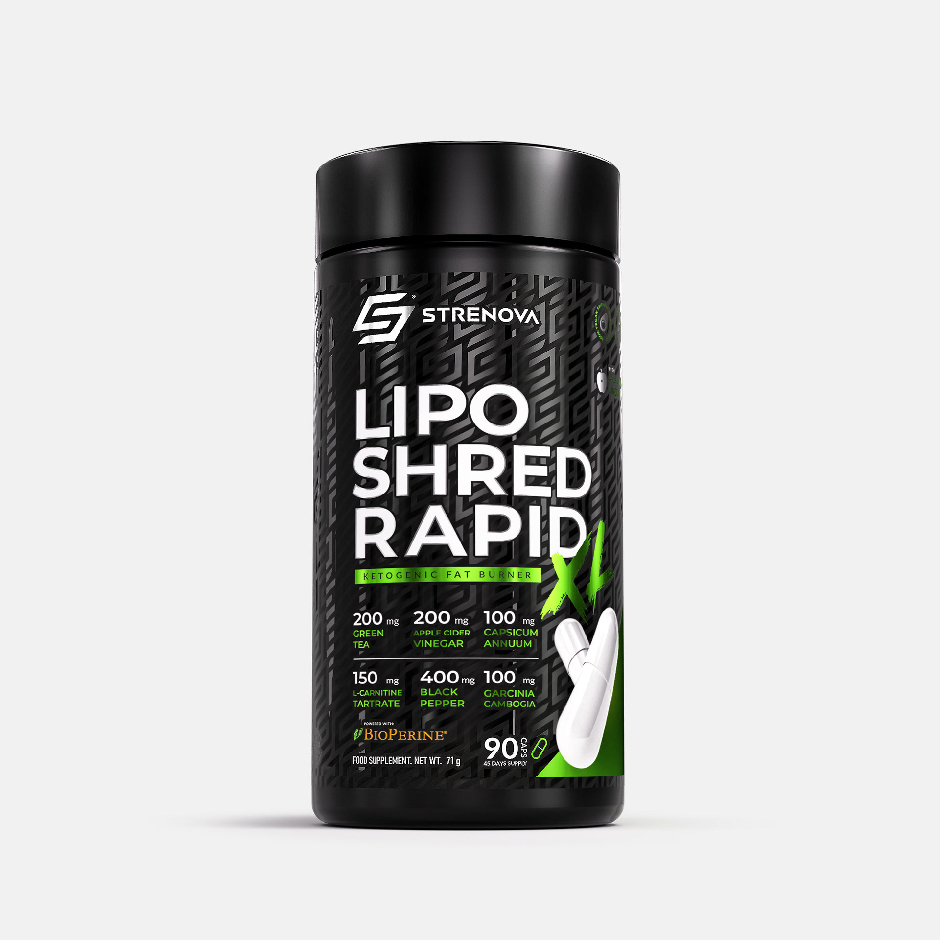
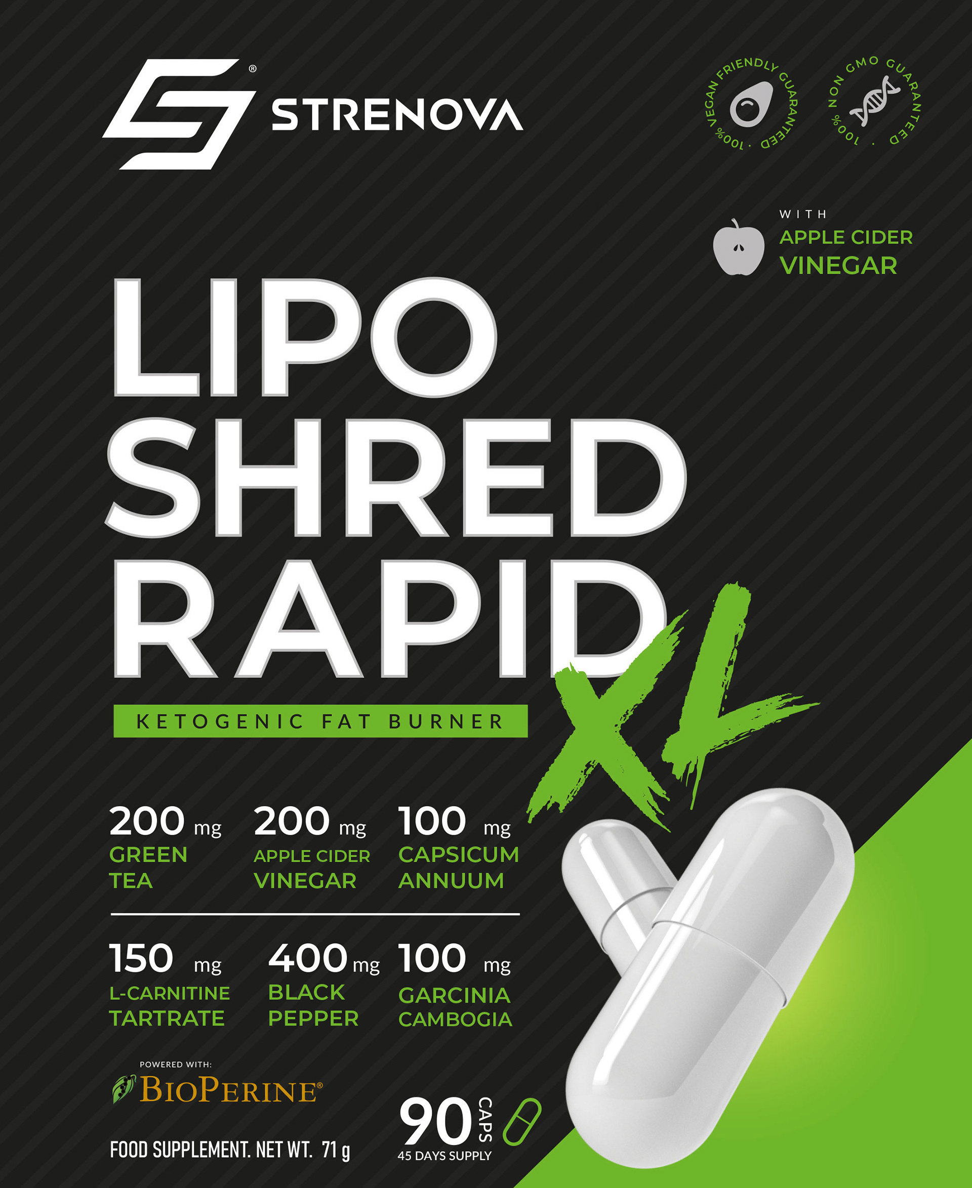
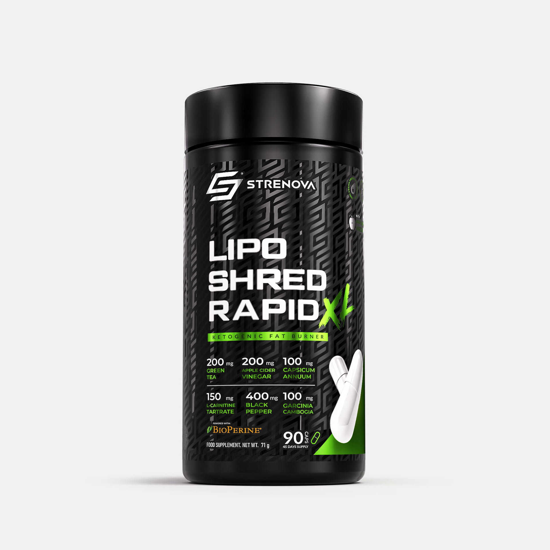
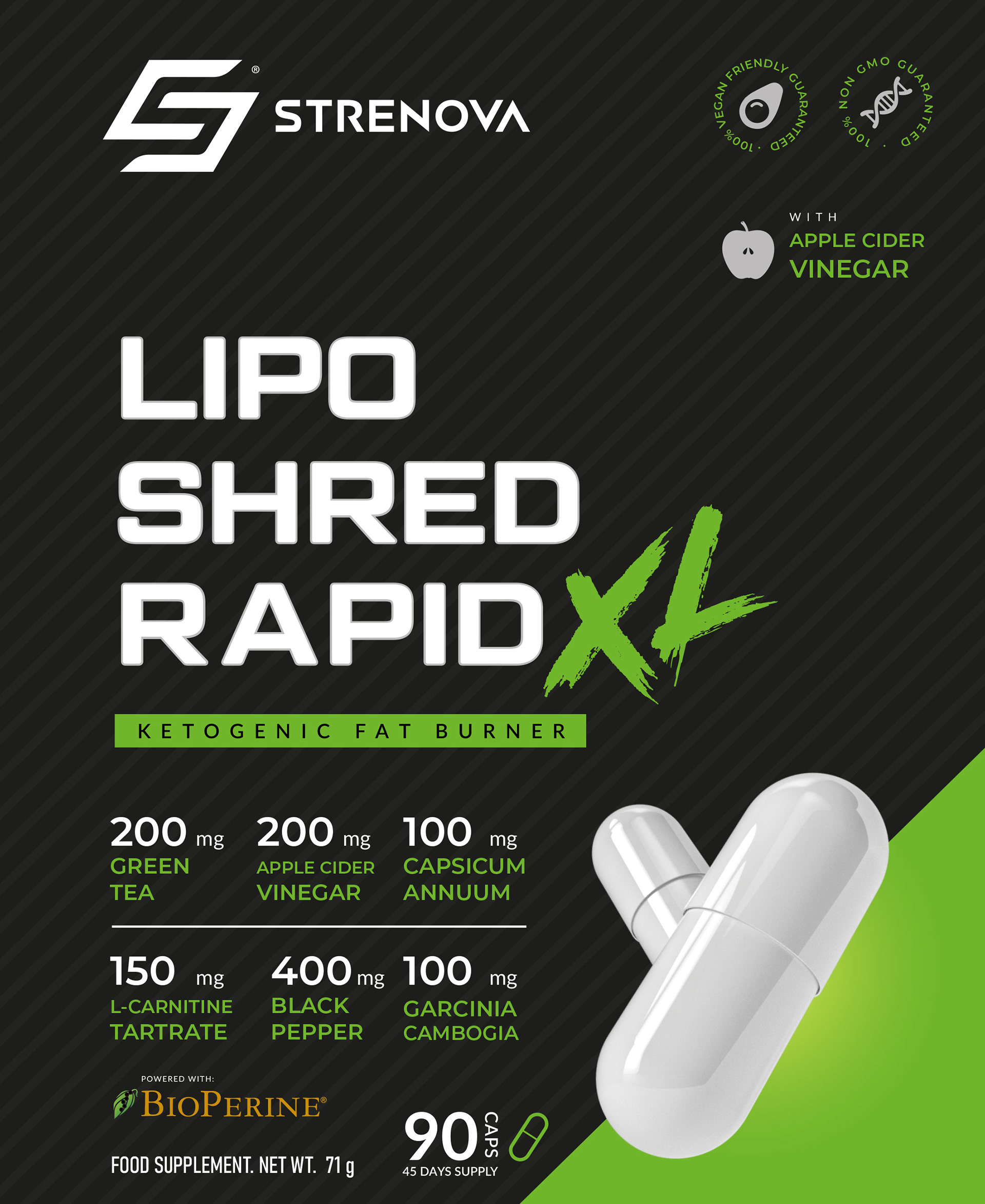
LIPO SHRED RAPID XL
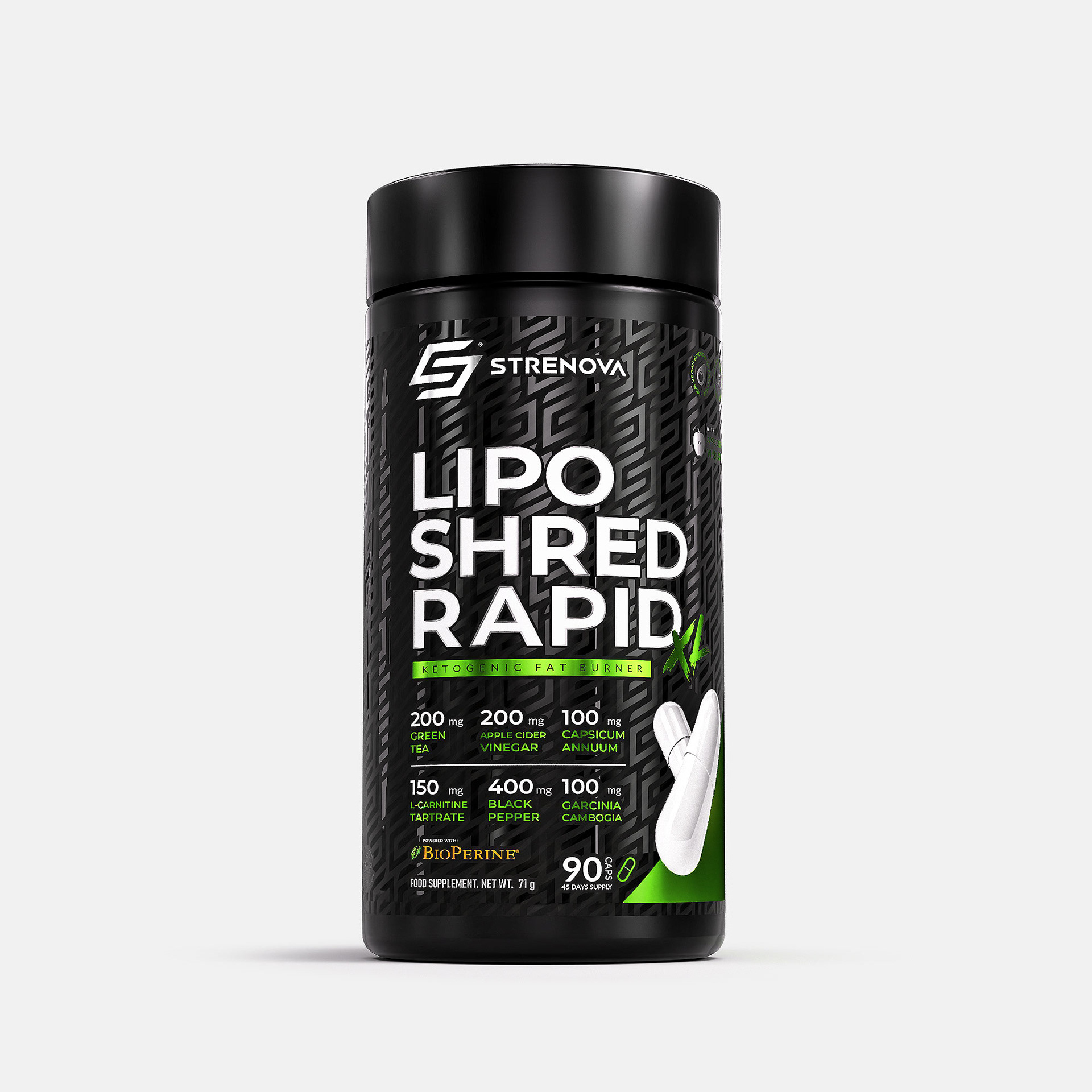
—The LIPO SHRED RAPID XL packaging perfectly embodies STRENOVA’s essence: power, innovation, and a results-driven focus. Featuring a sleek and modern design, the matte black packaging is accented with vibrant green details, symbolizing energy and vitality. These colors not only capture attention but also convey confidence and professionalism—key values for athletes who choose this product.

The bold white typography reinforces the message of strength and clarity, ensuring easy readability and highlighting essential information. Additionally, carefully integrated graphics add dynamism, visually connecting to the brand’s core concepts of movement and efficiency.
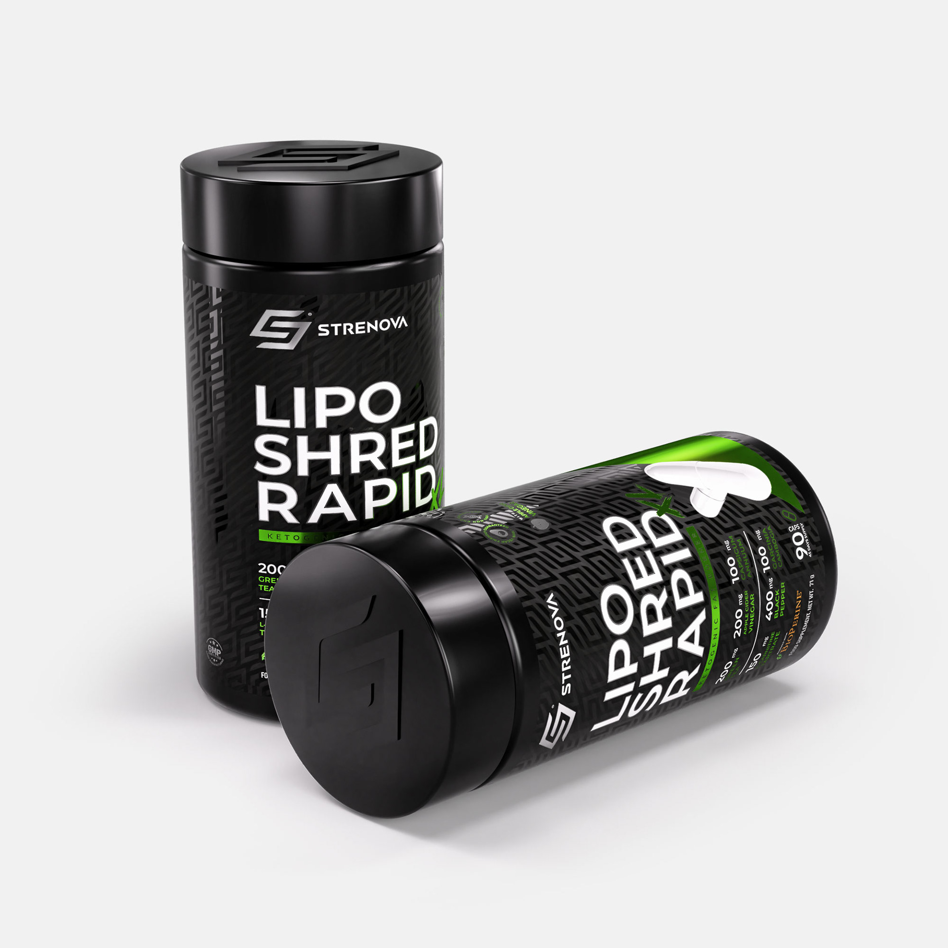
—The STRENOVA® emblem, engraved on the lid, enhances brand identity with every interaction. Complementary photographs showcase the packaging in action, resonating with the target audience: athletes seeking a trusted ally in their journey toward excellence.

—LIPO SHRED RAPID XL is more than just a product—it’s a statement of intent: turning goals into achievements.
—STRENOVA® : The Future of Performance and Sports Nutrition.
STRENOVA® is more than just a brand—it’s a commitment to innovation, performance, and well-being. Every design, from the logo to the product packaging, reflects a vibrant and modern energy that directly aligns with athletes’ goals. Our visual and conceptual approach is crafted to stand out on any platform, especially in the highly competitive digital market.
Inspired by strength and brilliance, we blend power and innovation to create a brand experience that fuels both body and mind. In every detail, STRENOVA® embodies excellence—designed to push boundaries and set a new standard in sports nutrition.

VERSION 02
VERSION 03
"Power Your Next Move"—this is STRENOVA’s driving force, an invitation to unlock your best self at every step of your journey to success.