VIGORMAX
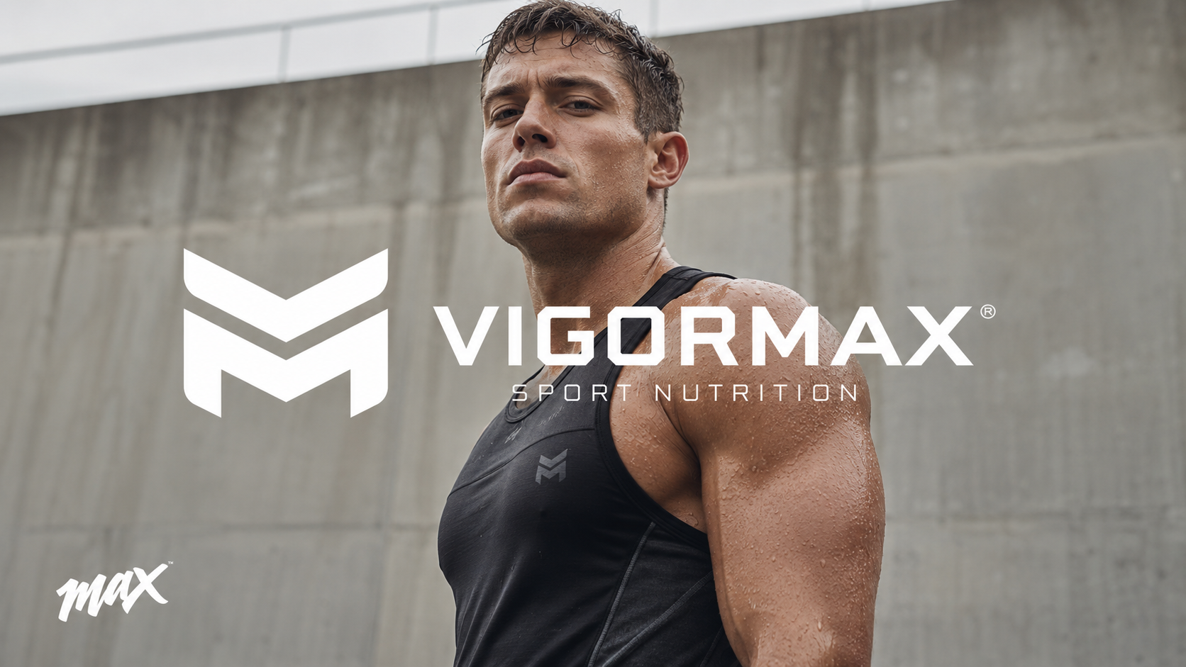
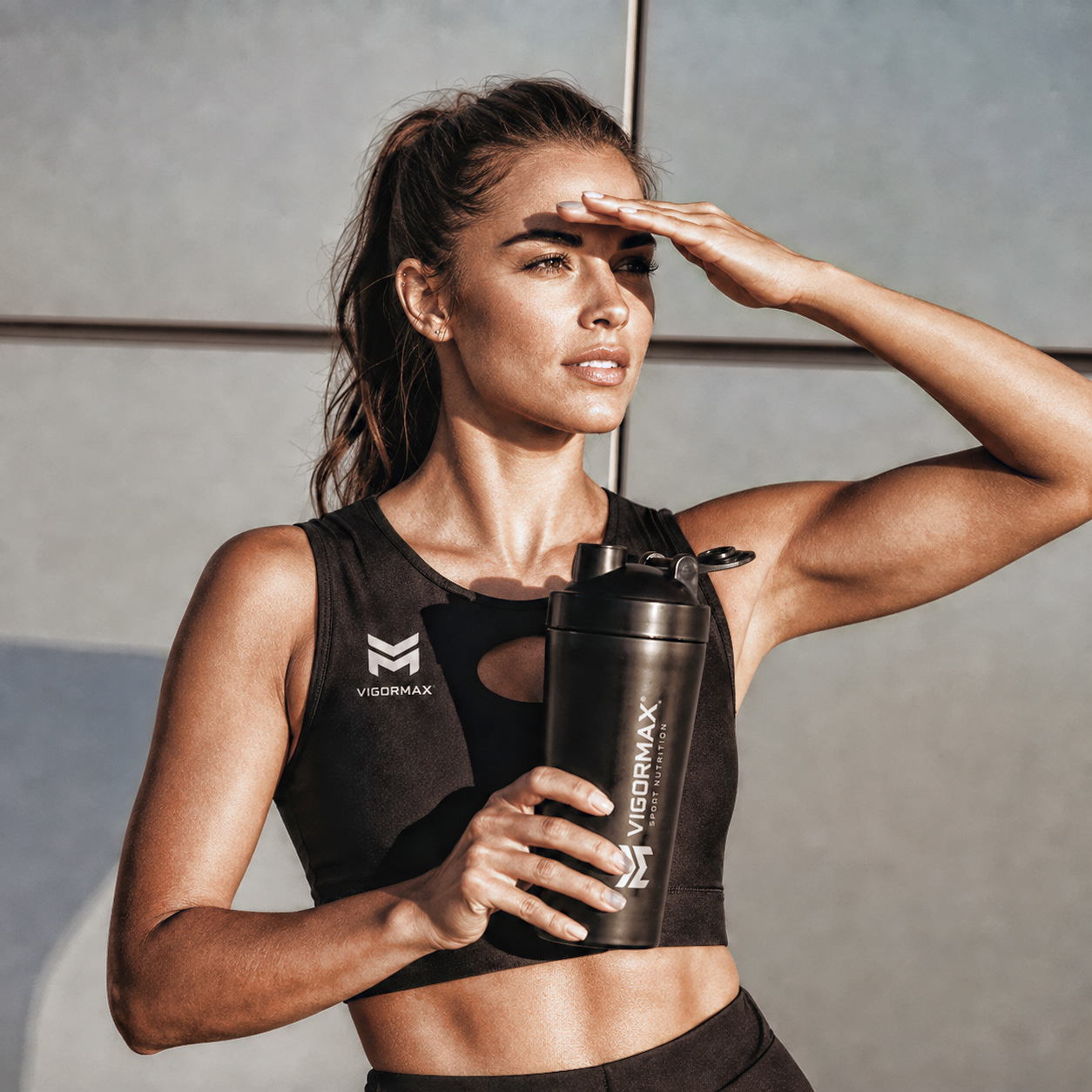
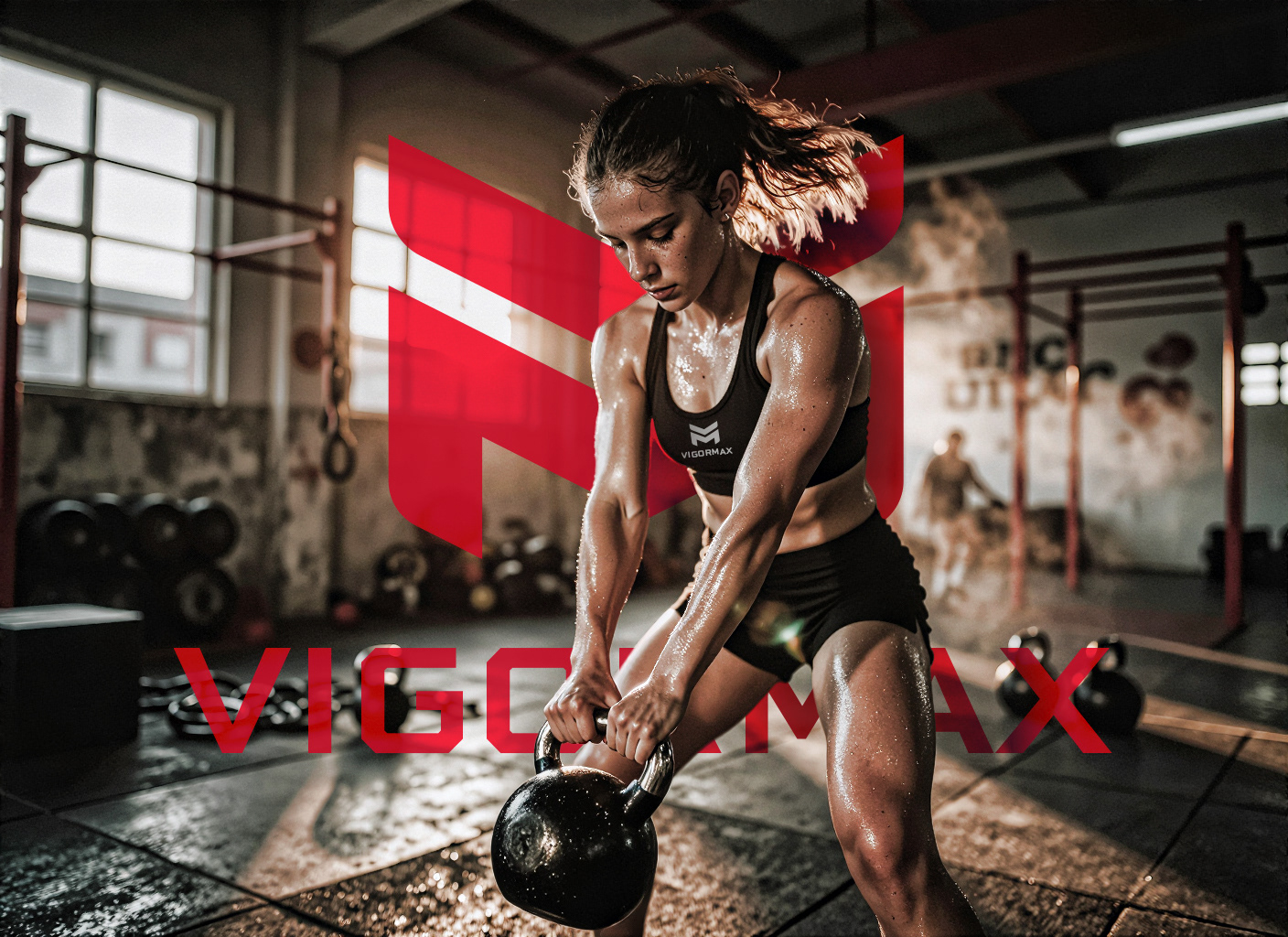
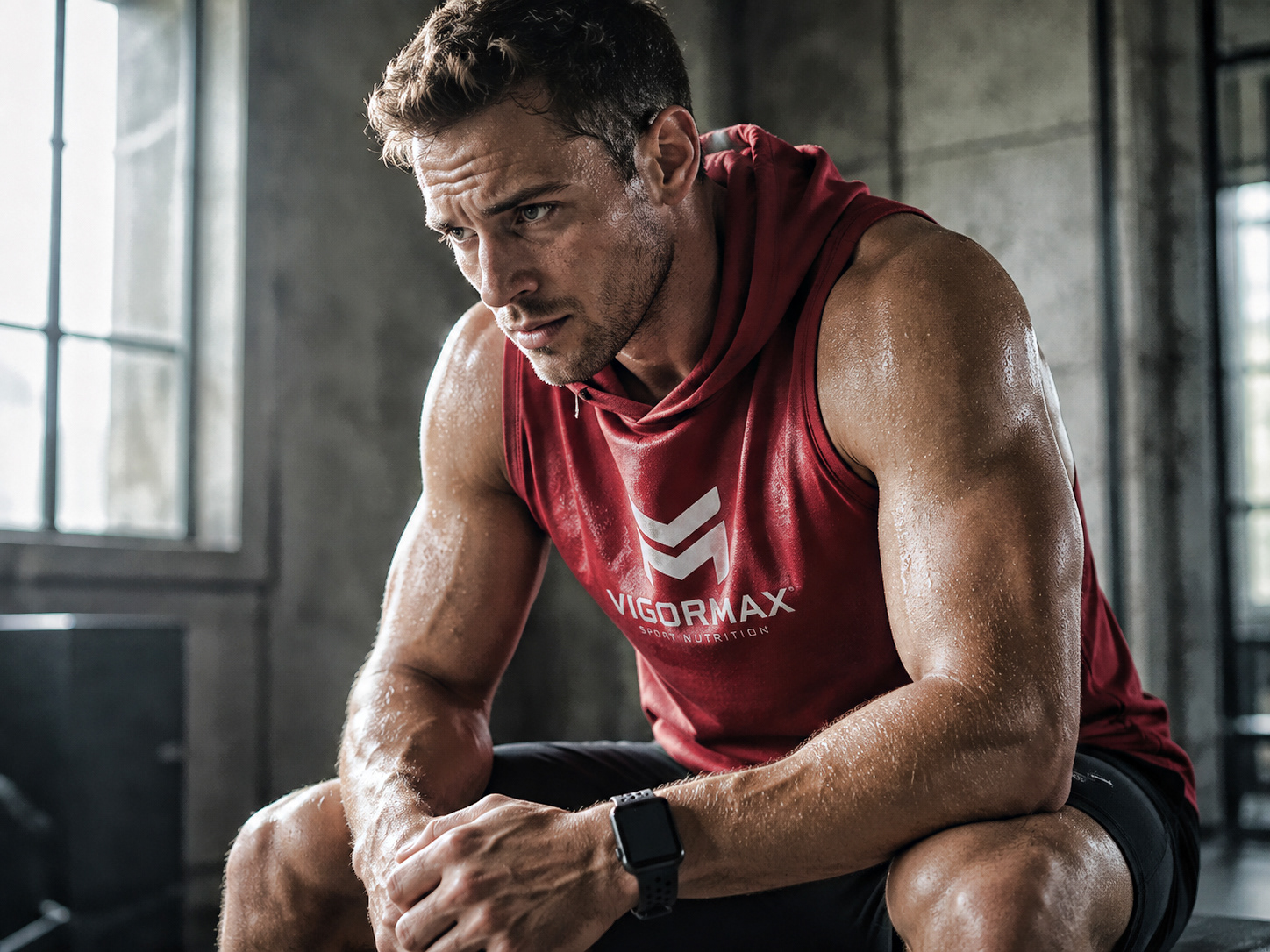
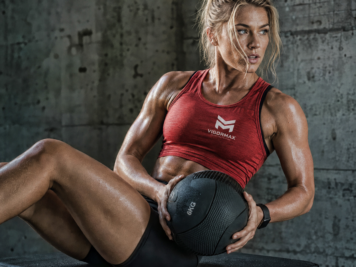
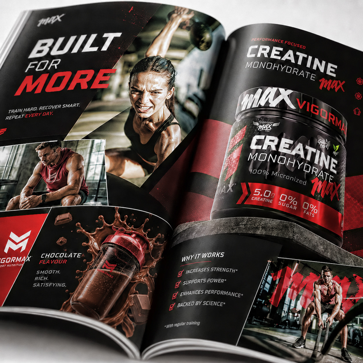
The new identity of VIGORMAX represents strength, intensity and maximum performance. Built around a bold visual language, the brand combines athletic energy, technical precision and a powerful urban edge. The result is a modern and highly recognizable identity, designed to stand out in a competitive market and remain relevant for years to come.
THE LOGO
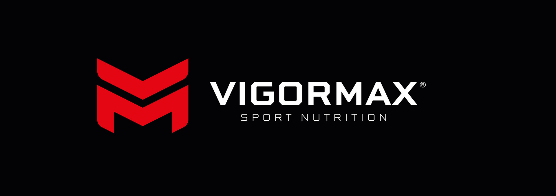
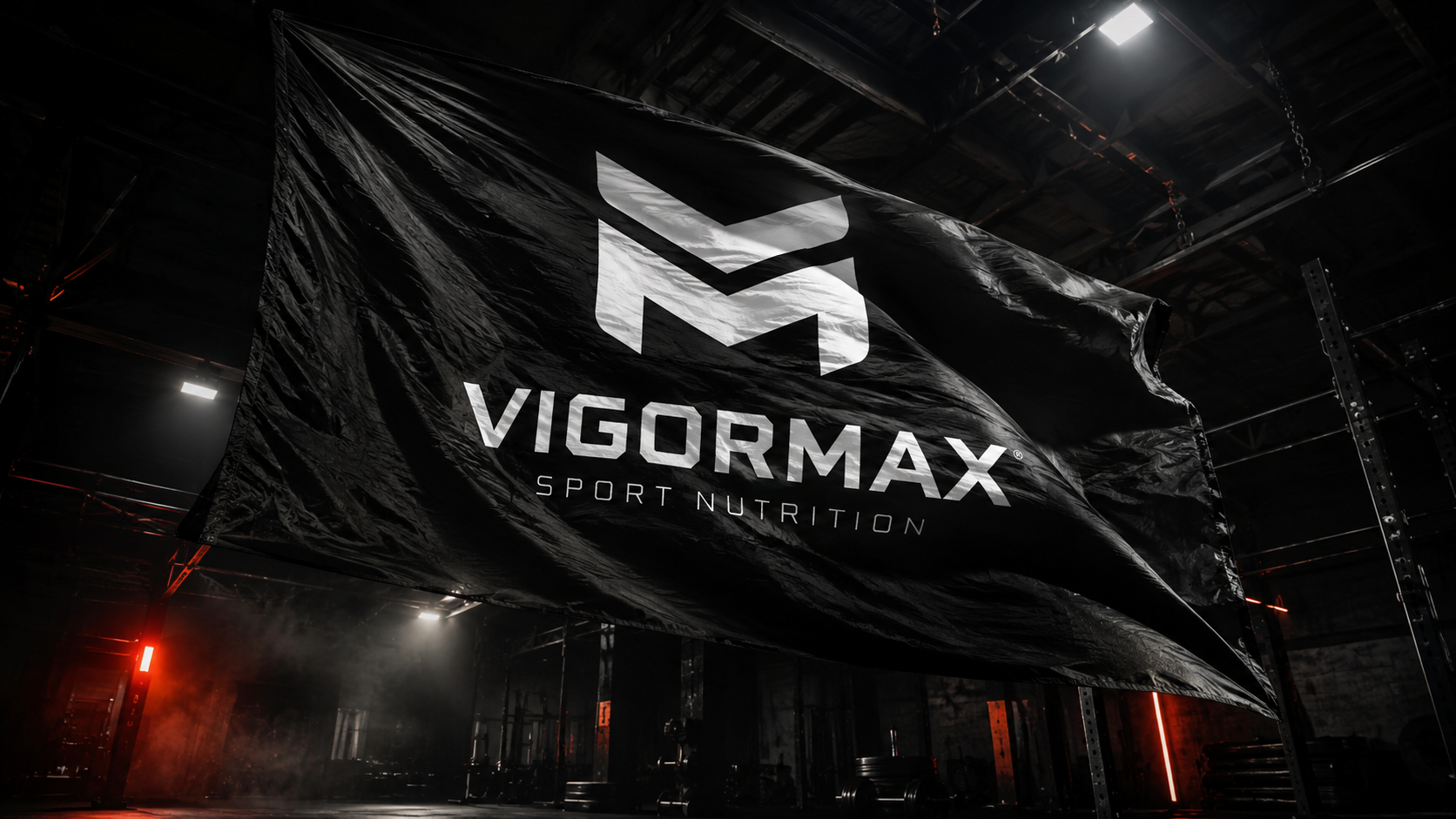
We’ve created a contemporary visual language that feels powerful, athletic and technically refined. From the bold typography and dynamic compositions to the sharp graphic details, every element has been designed to express constant motion, maximum intensity and a brand built to perform. VIGORMAX is confident, structured and unmistakably ready to lead.
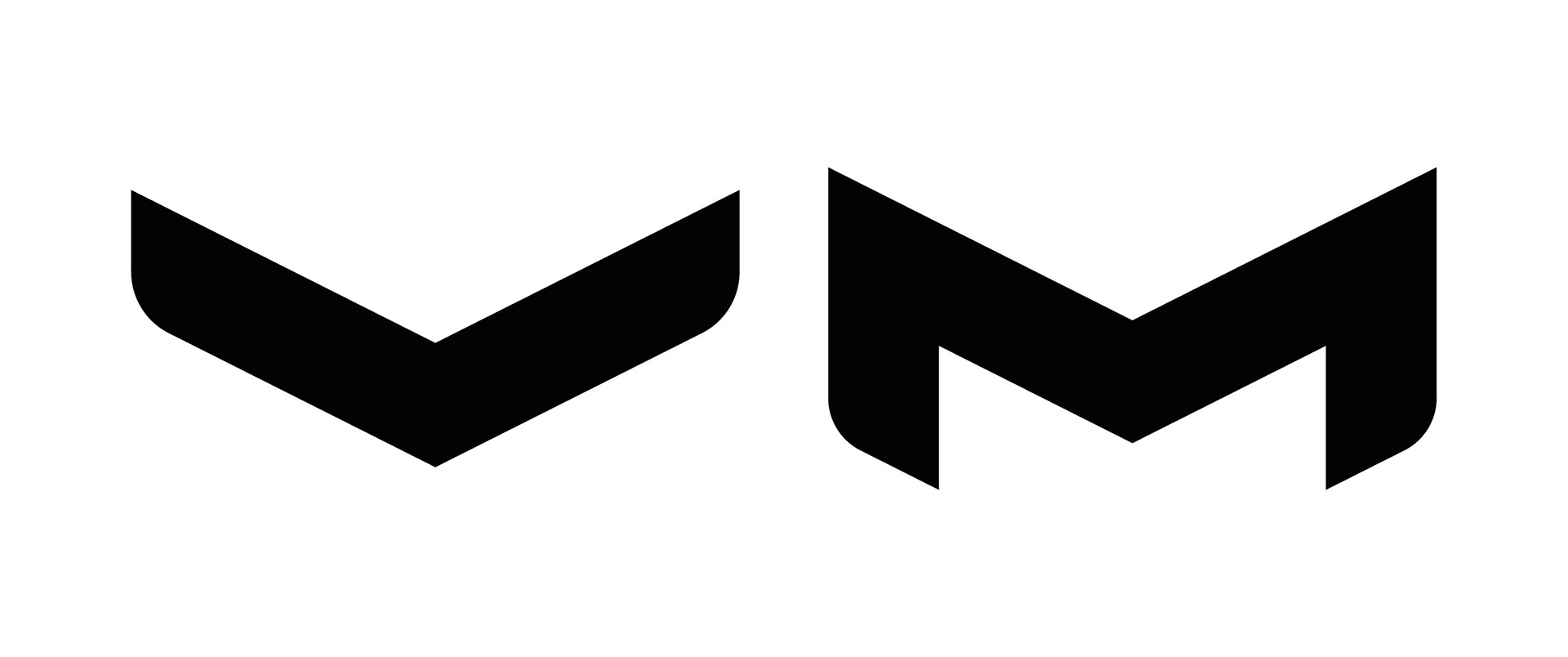
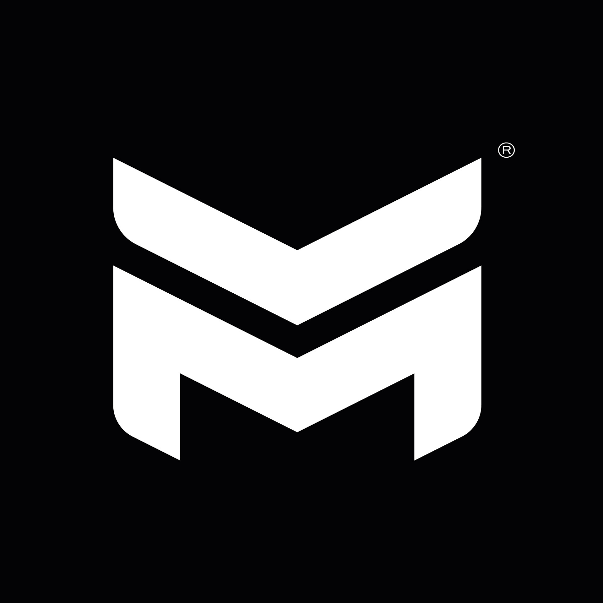
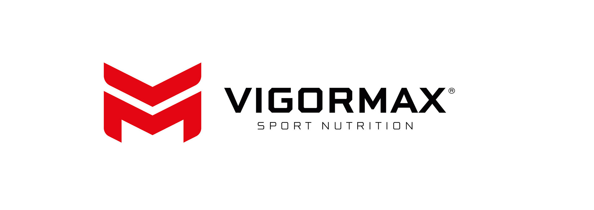
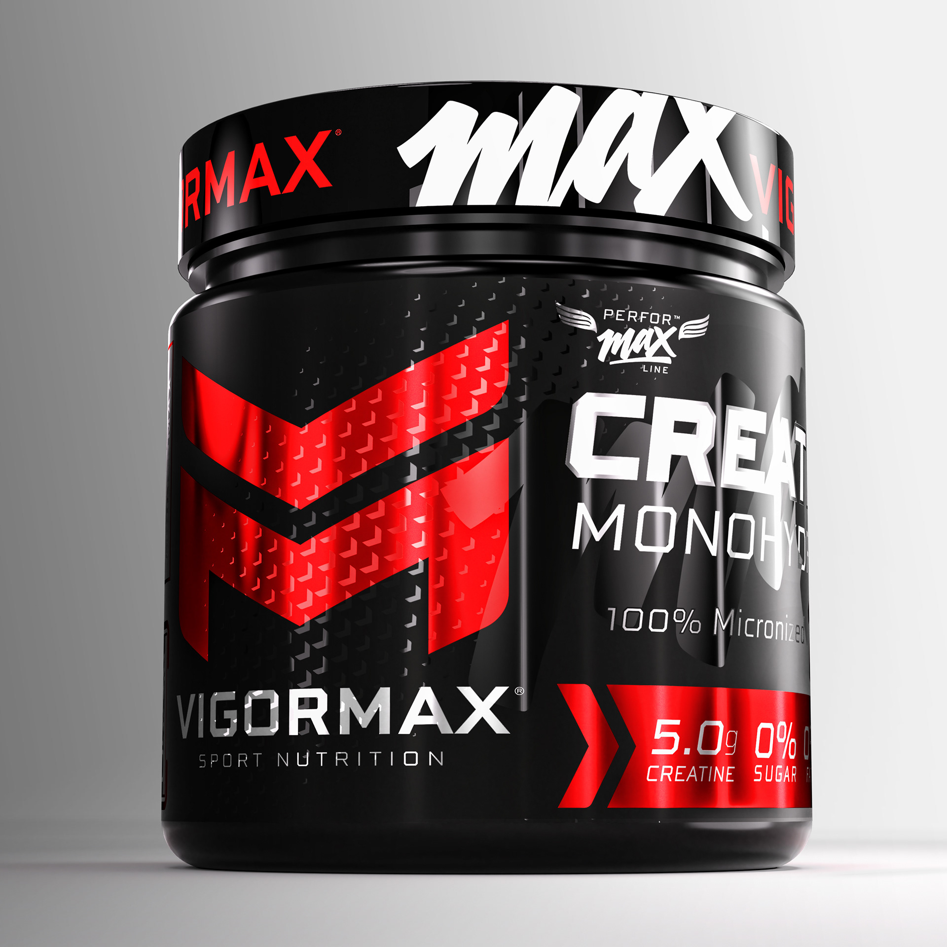
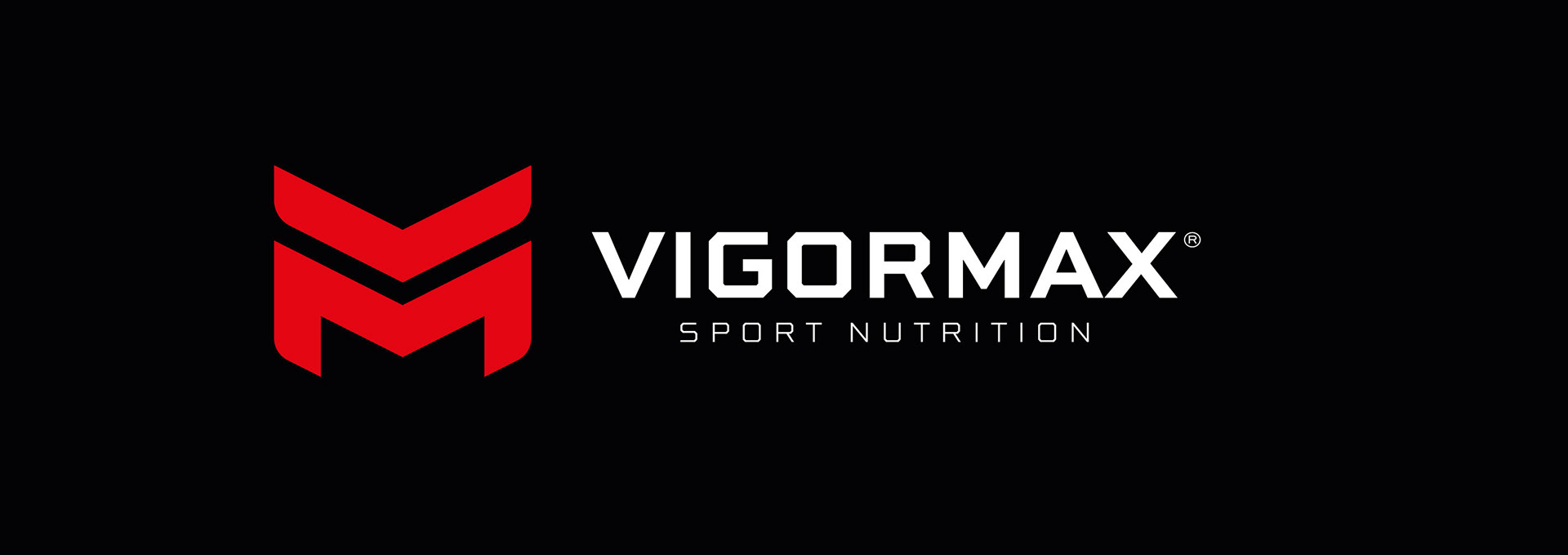
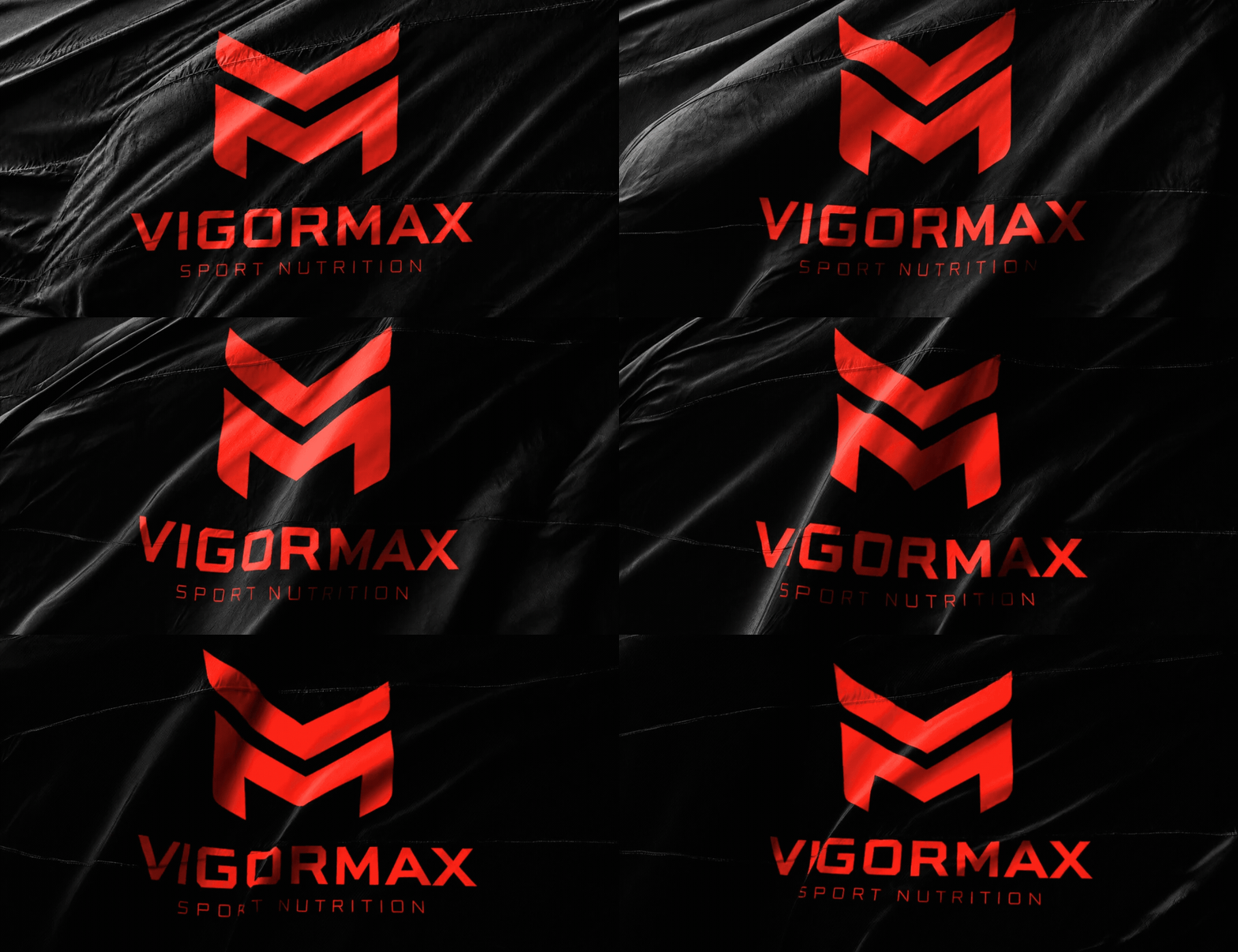
The VIGORMAX symbol combines the initials V and M into a single geometric monogram. The upper shape forms the V, while the lower structure completes the M, creating a bold and recognizable mark that communicates strength, movement and maximum performance.

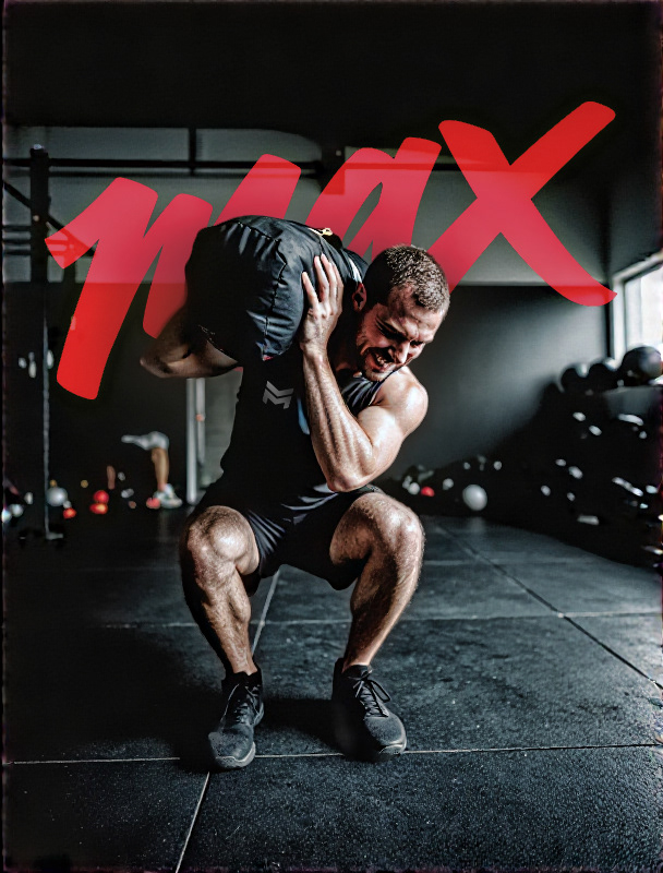
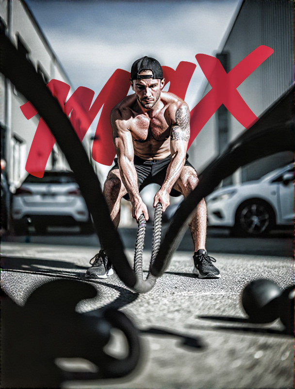
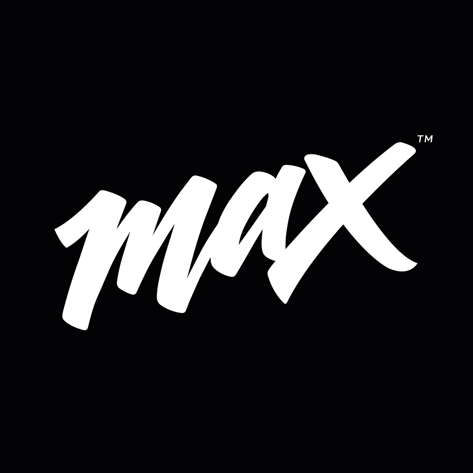
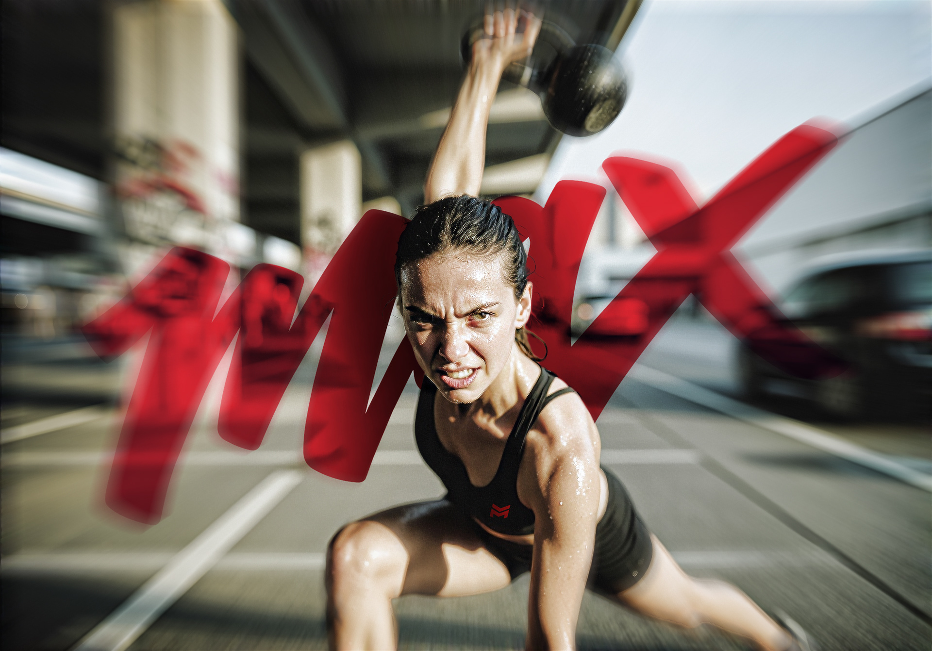
MAX™ acts as a secondary logo that supports the main VIGORMAX identity with a more relaxed, expressive and contemporary style. Its handwritten character adds energy and personality, making it ideal for identifying and differentiating the various product lines within the brand.
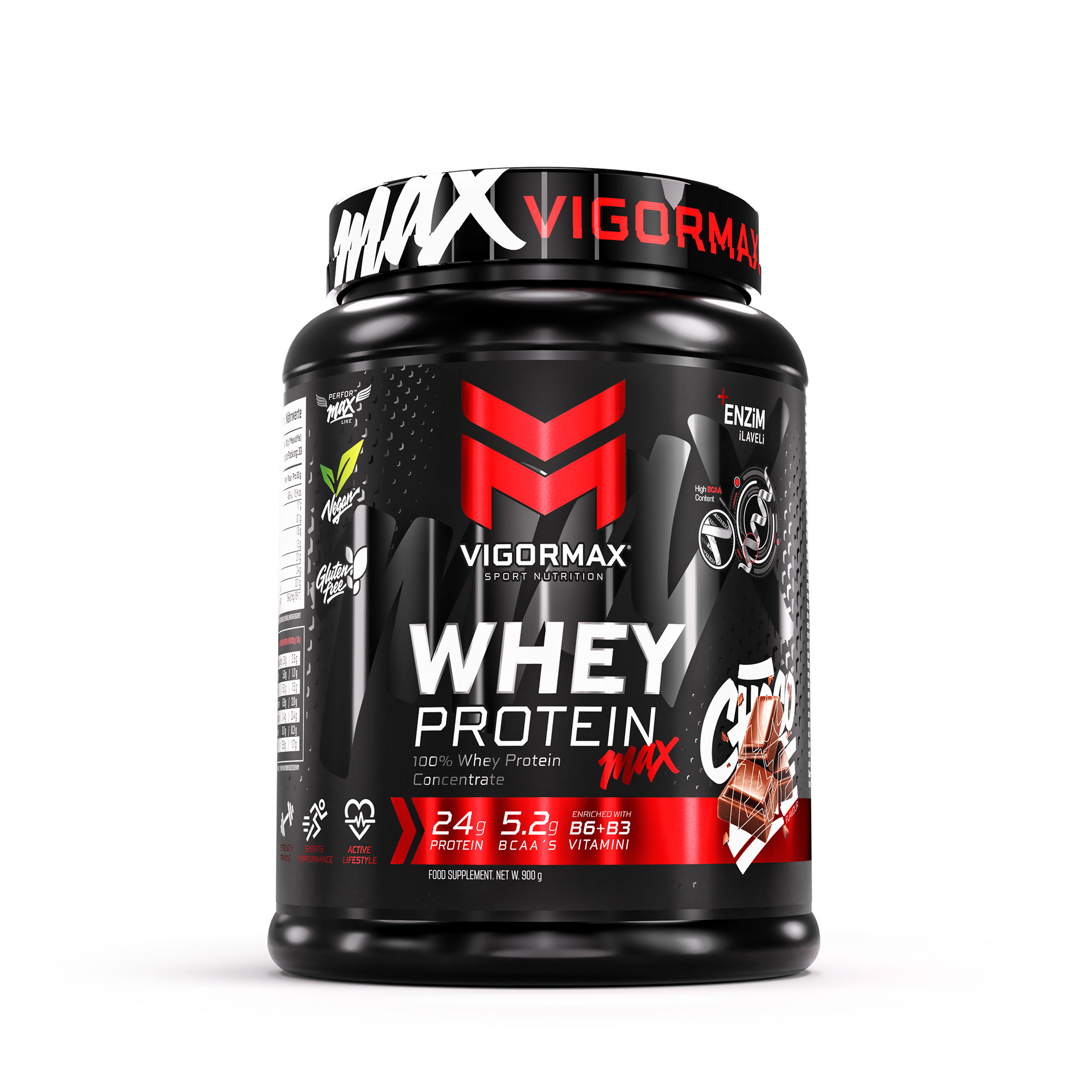
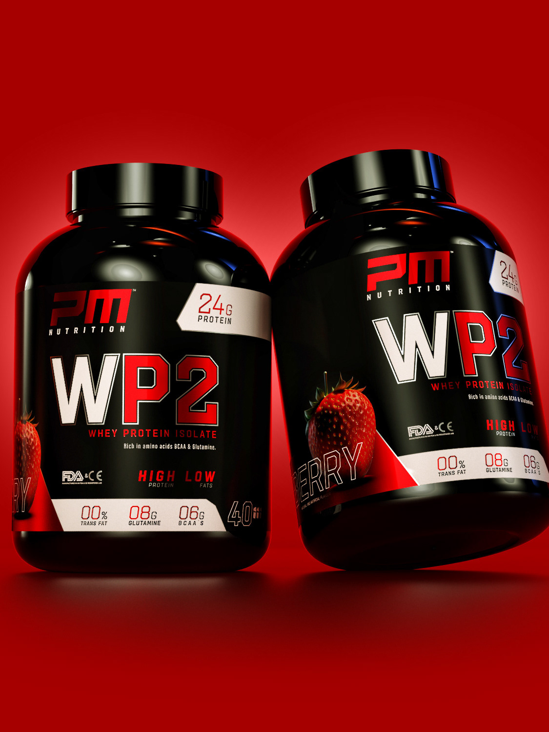
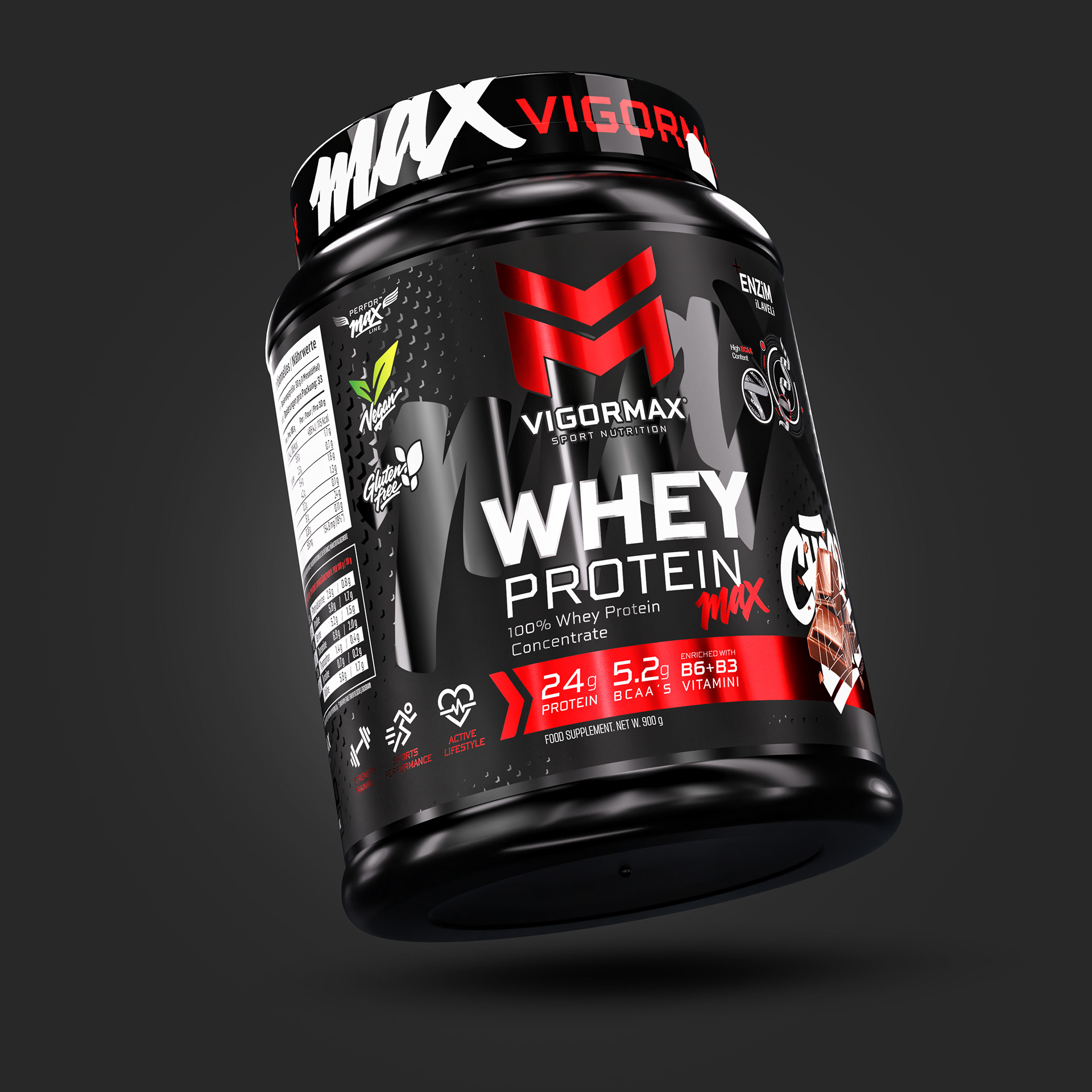
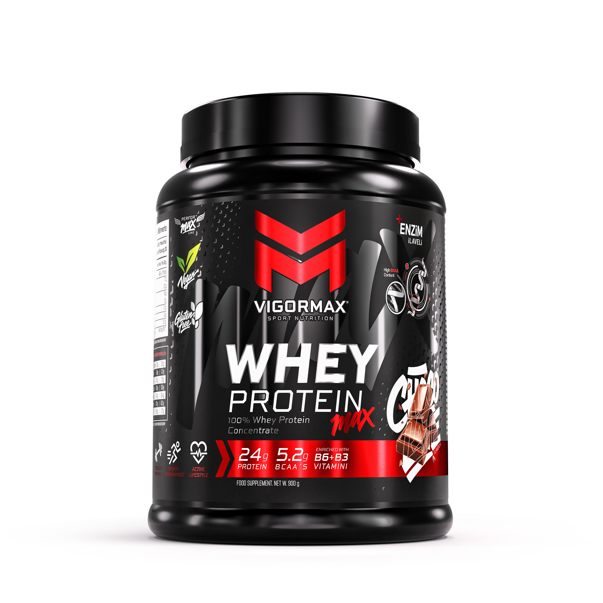
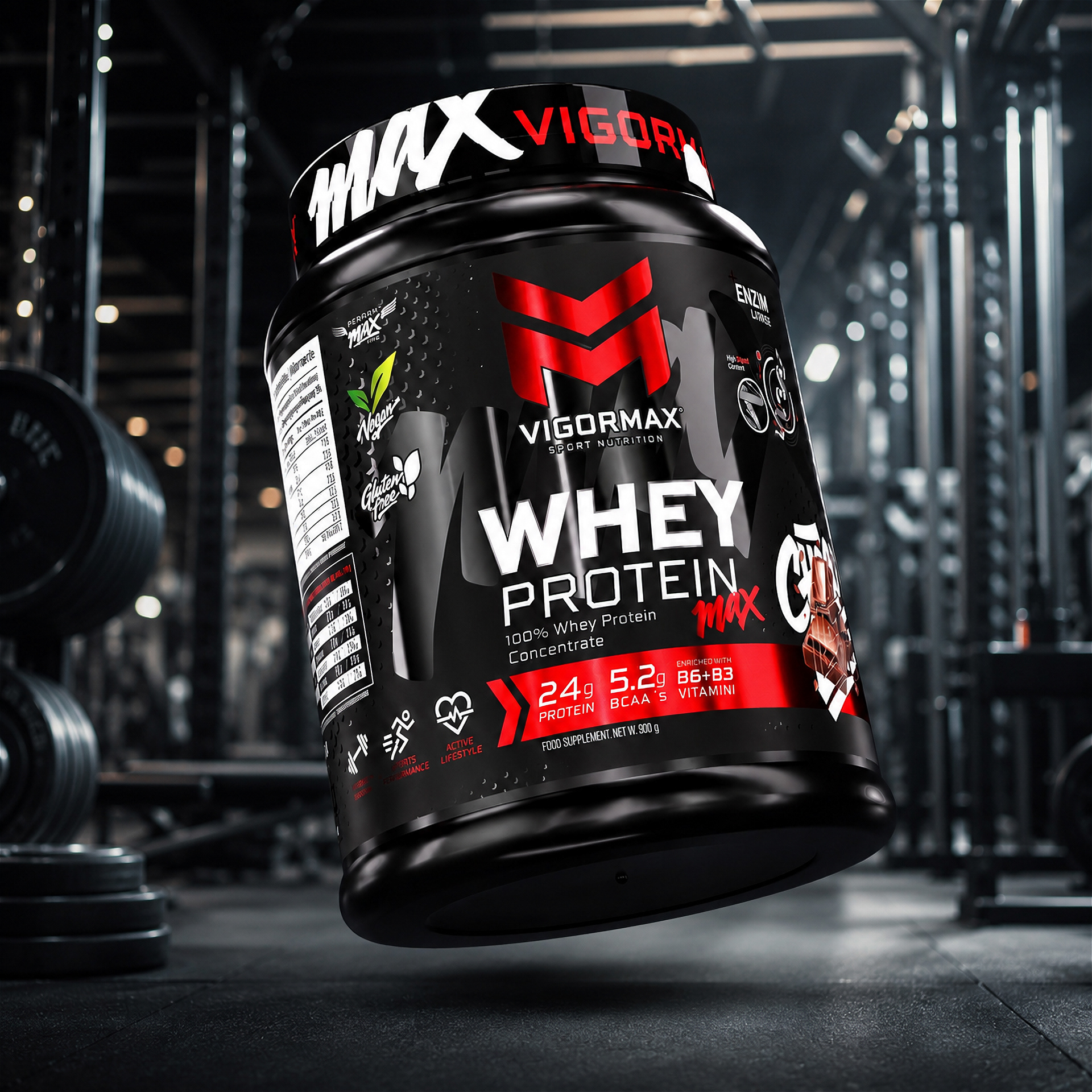
WHEY PROTEIN MAX introduces the visual language of VIGORMAX through a powerful and highly structured packaging design. A deep black base is combined with metallic red accents, bold typography and technical textures to convey strength, precision and high performance.
The central monogram creates immediate brand recognition, while the expressive MAX signature adds energy and differentiates the product line. Nutritional benefits, product information and flavour graphics are organised through a clear visual hierarchy, resulting in a design that feels intense, modern and unmistakably athletic.
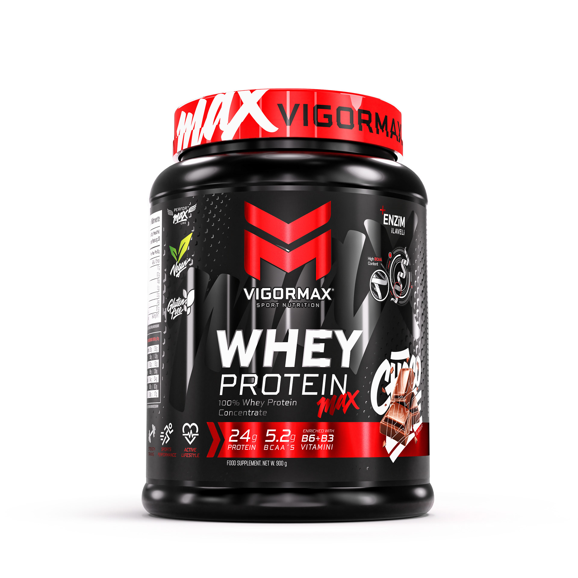
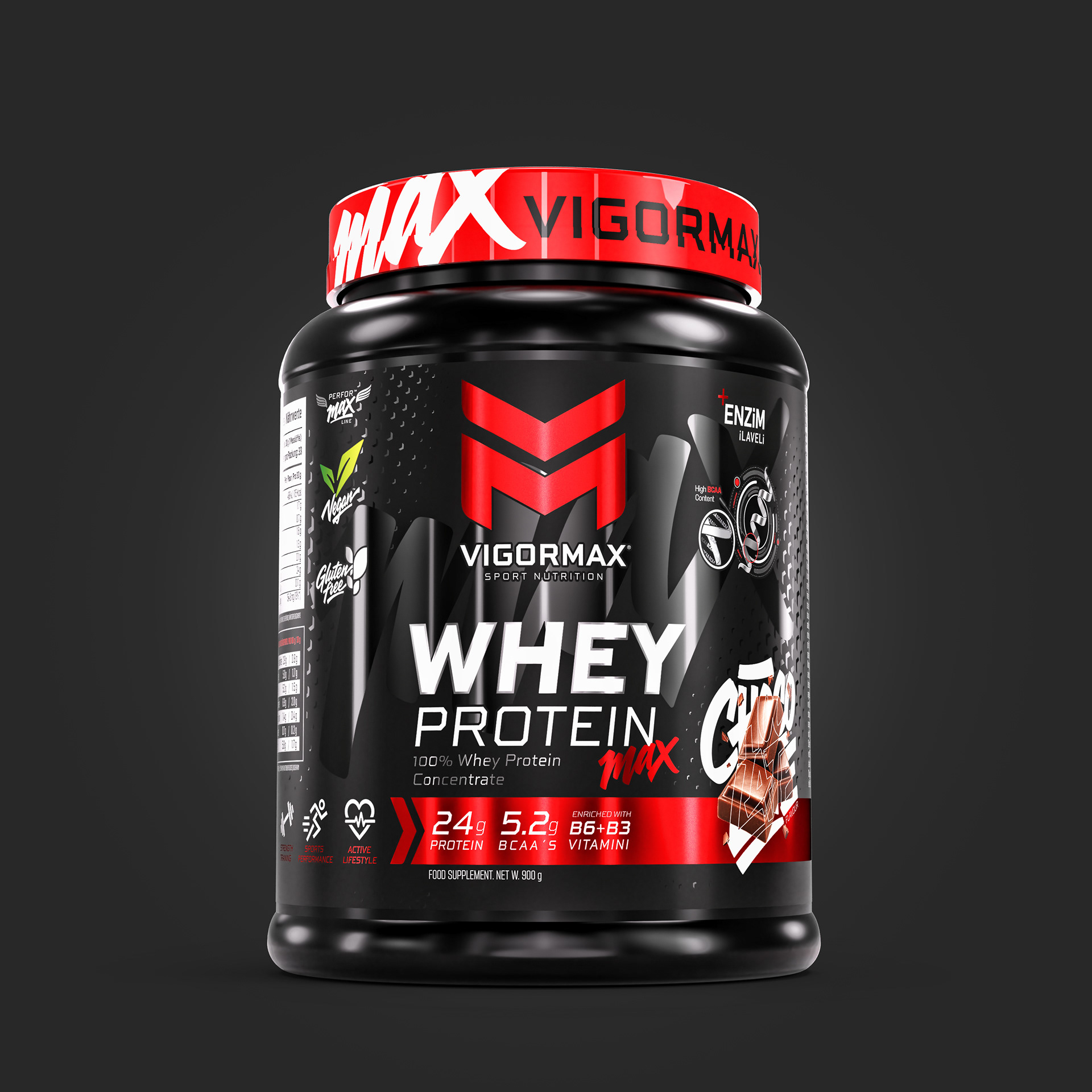
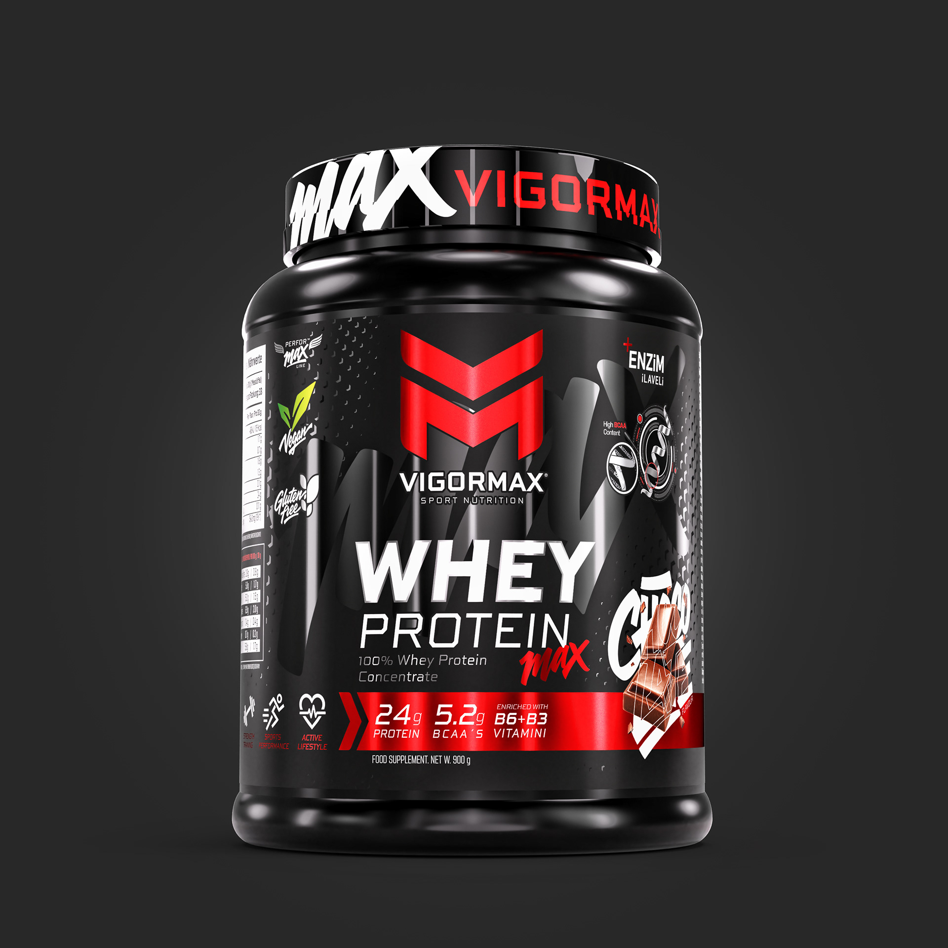
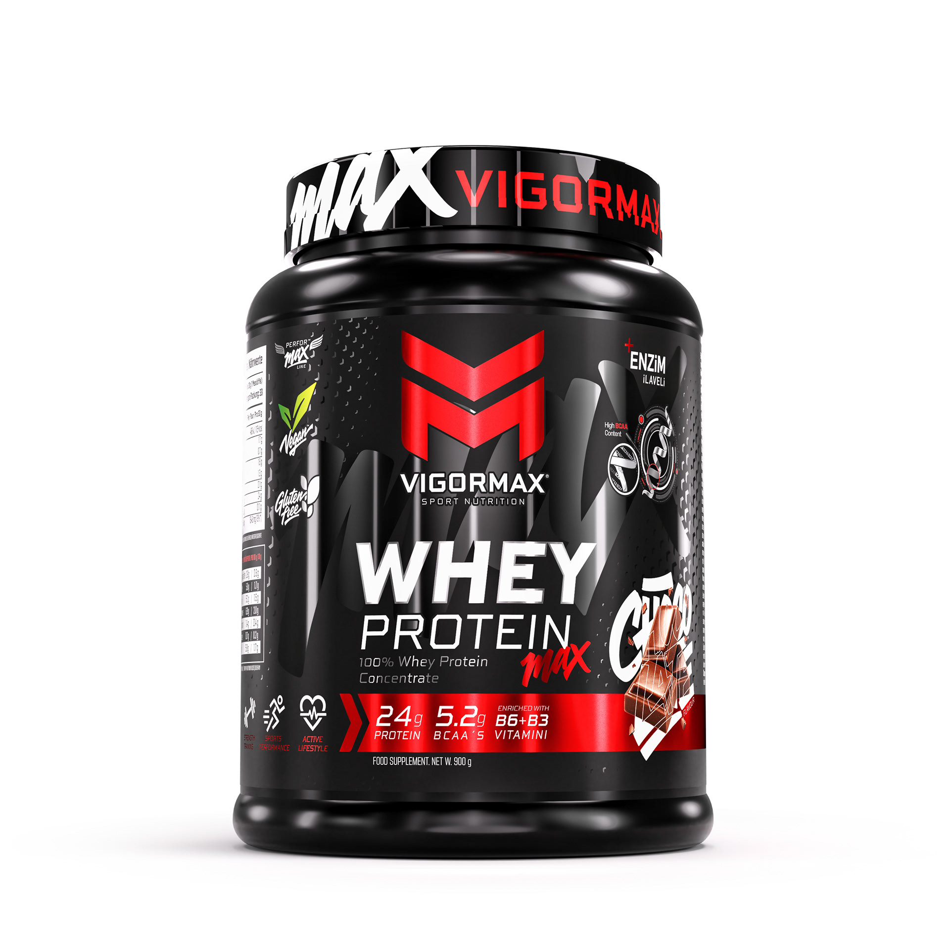
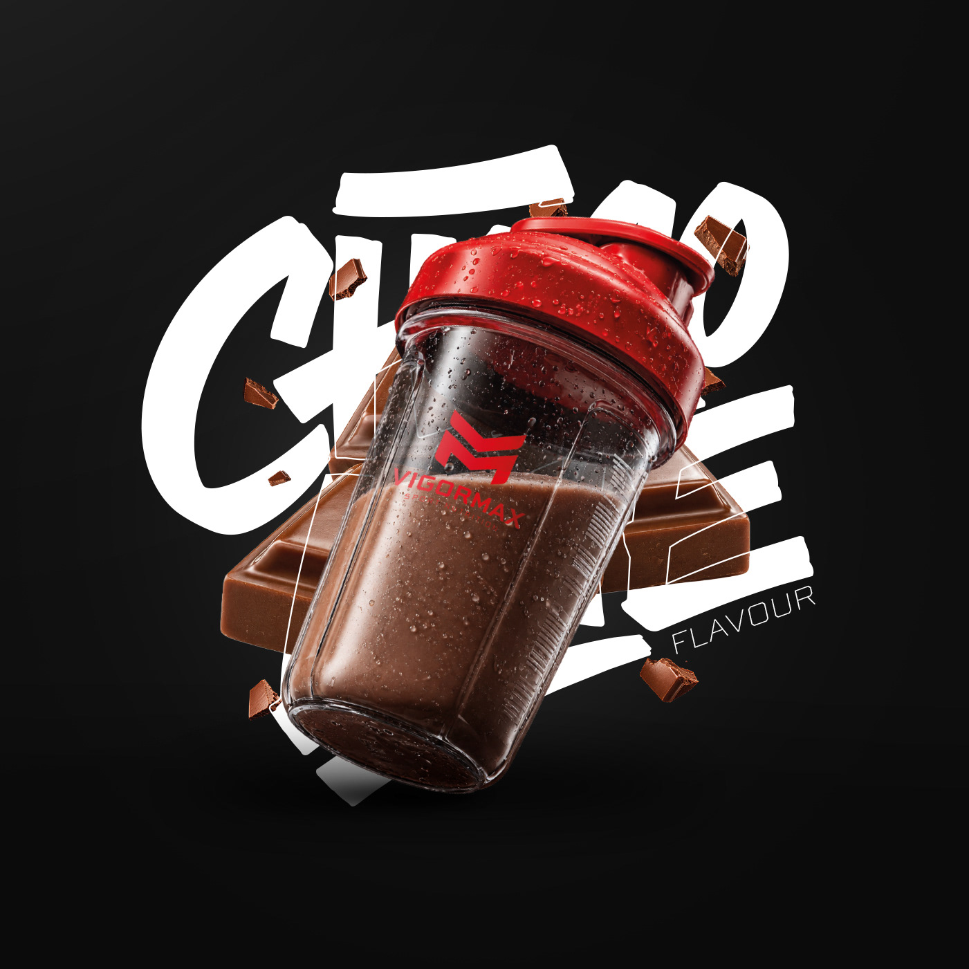
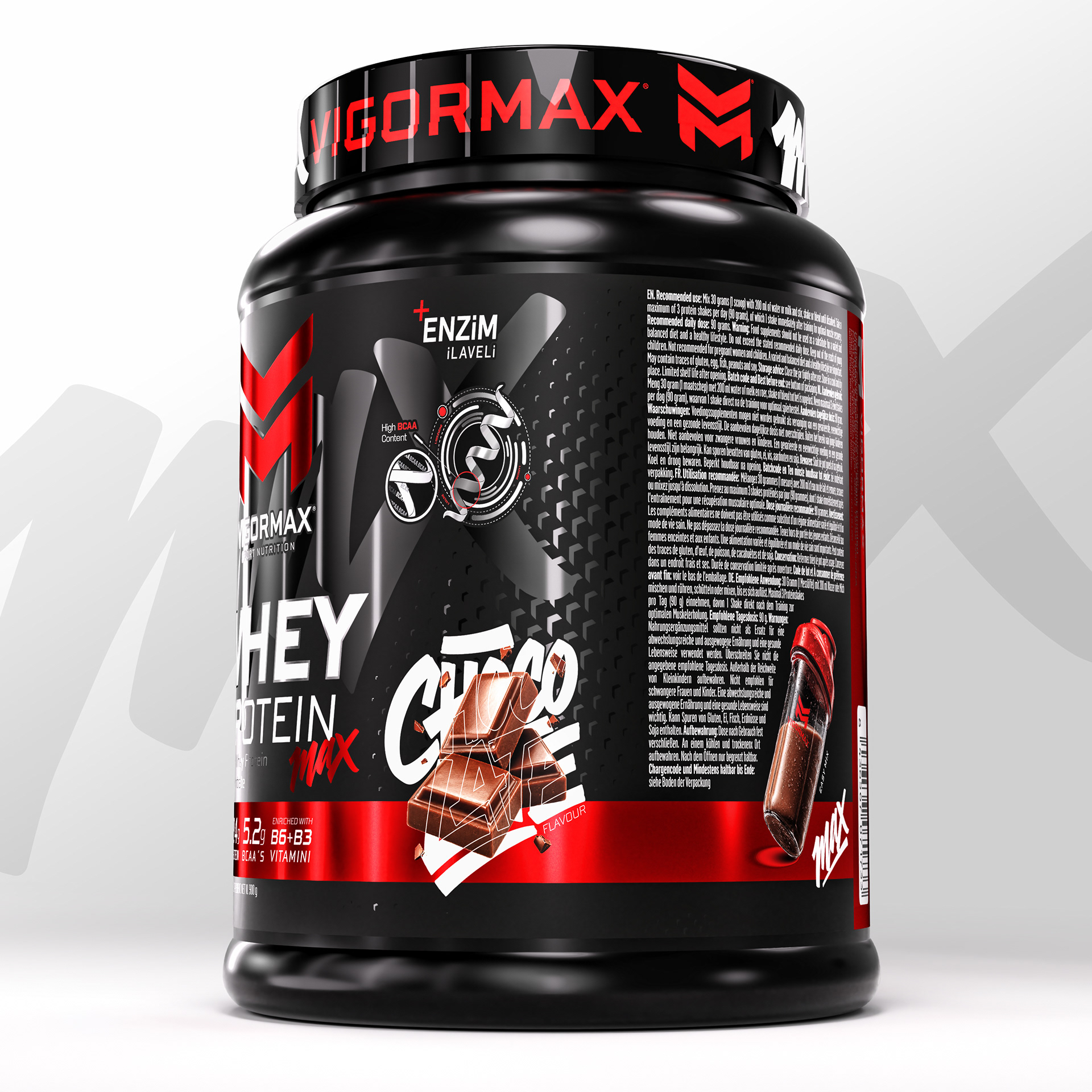
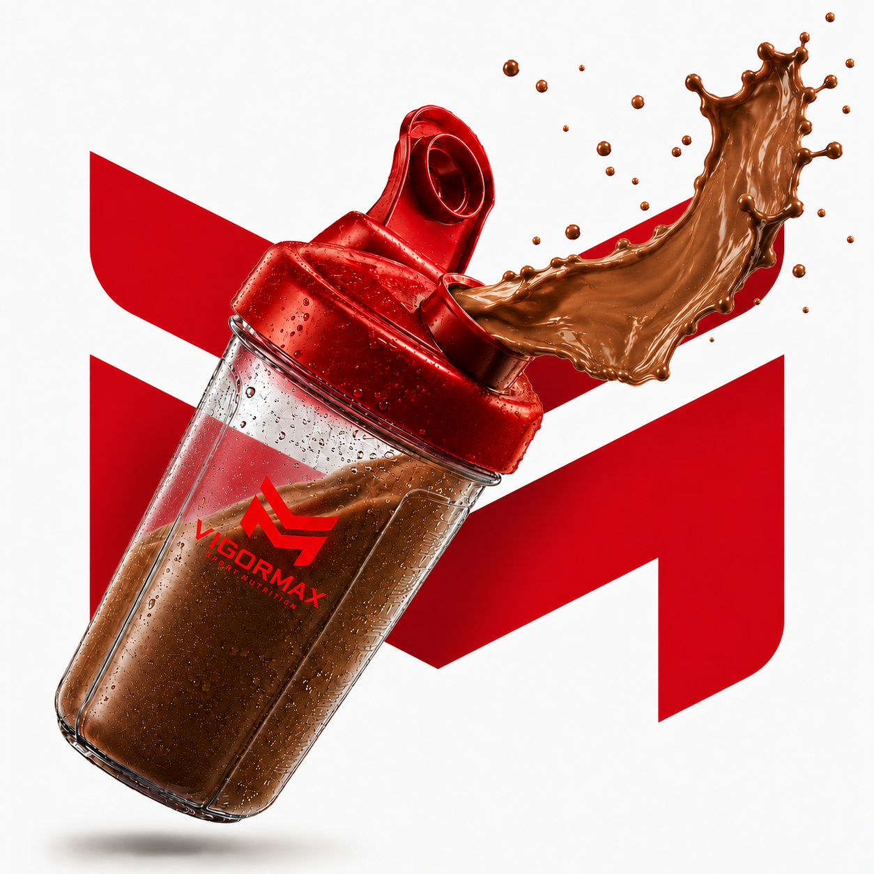
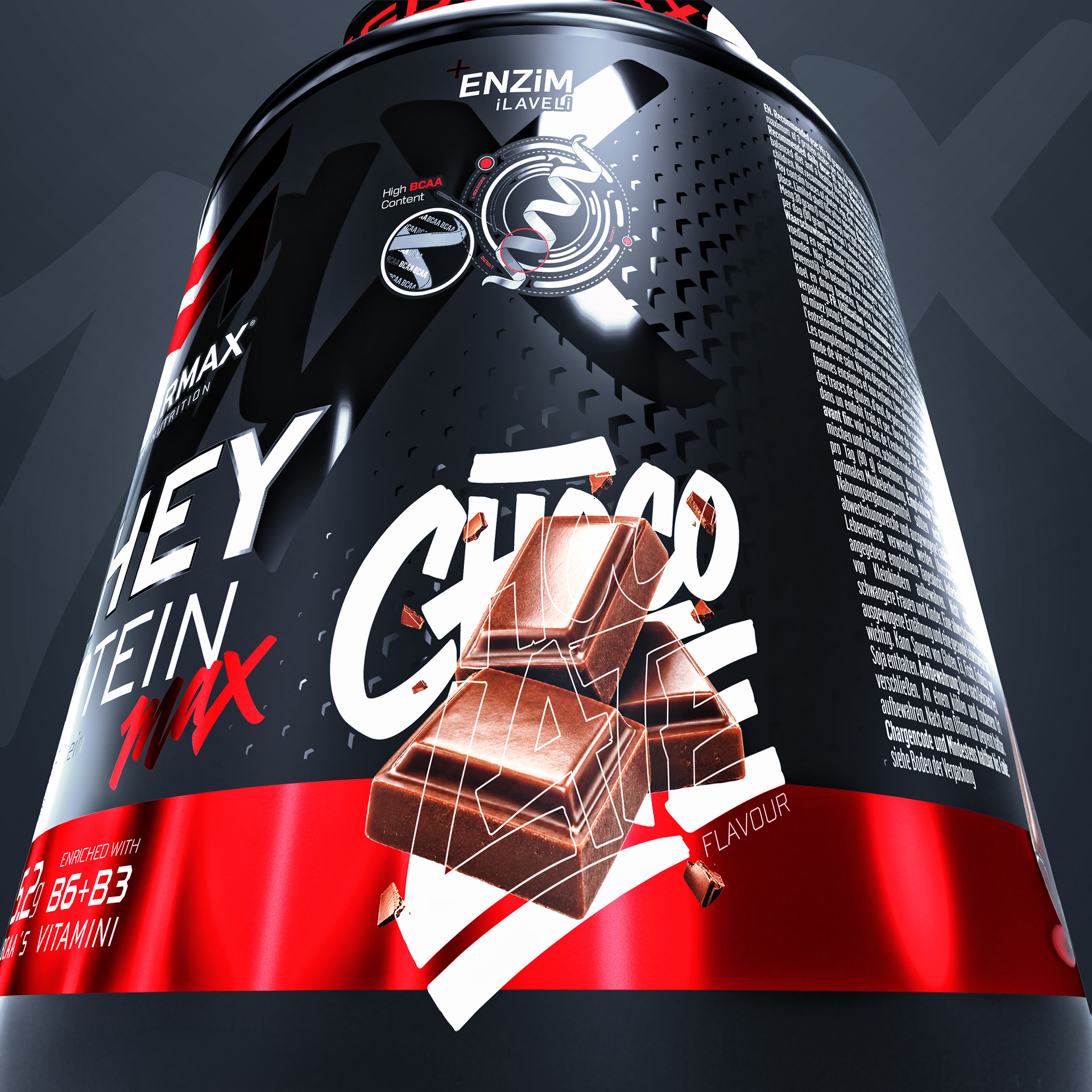
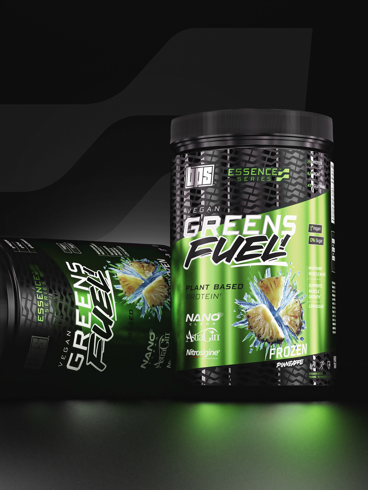
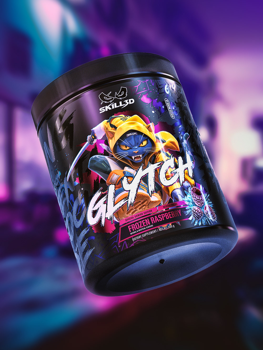
The flavour system introduces a more expressive and appetising layer to the technical identity. Bold handwritten lettering, dynamic ingredient imagery and energetic compositions give each flavour its own personality while ensuring immediate recognition on shelf.
A series of custom micro-icons complements the design by communicating key benefits quickly and clearly. Enzyme support, BCAA content, performance, gluten-free and vegan attributes are presented through compact visual elements that feel fully integrated into the VIGORMAX universe.
CREATINE MAX
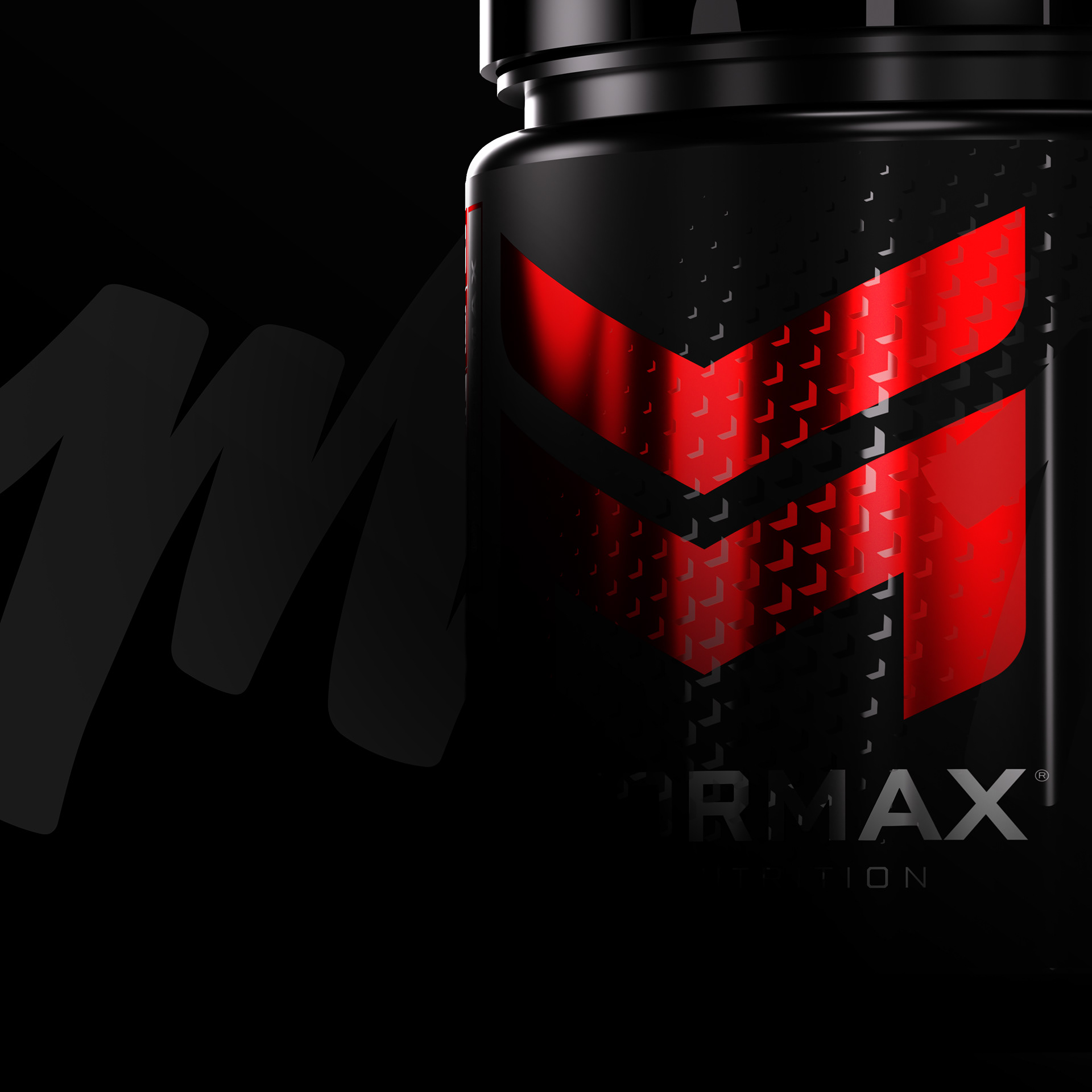
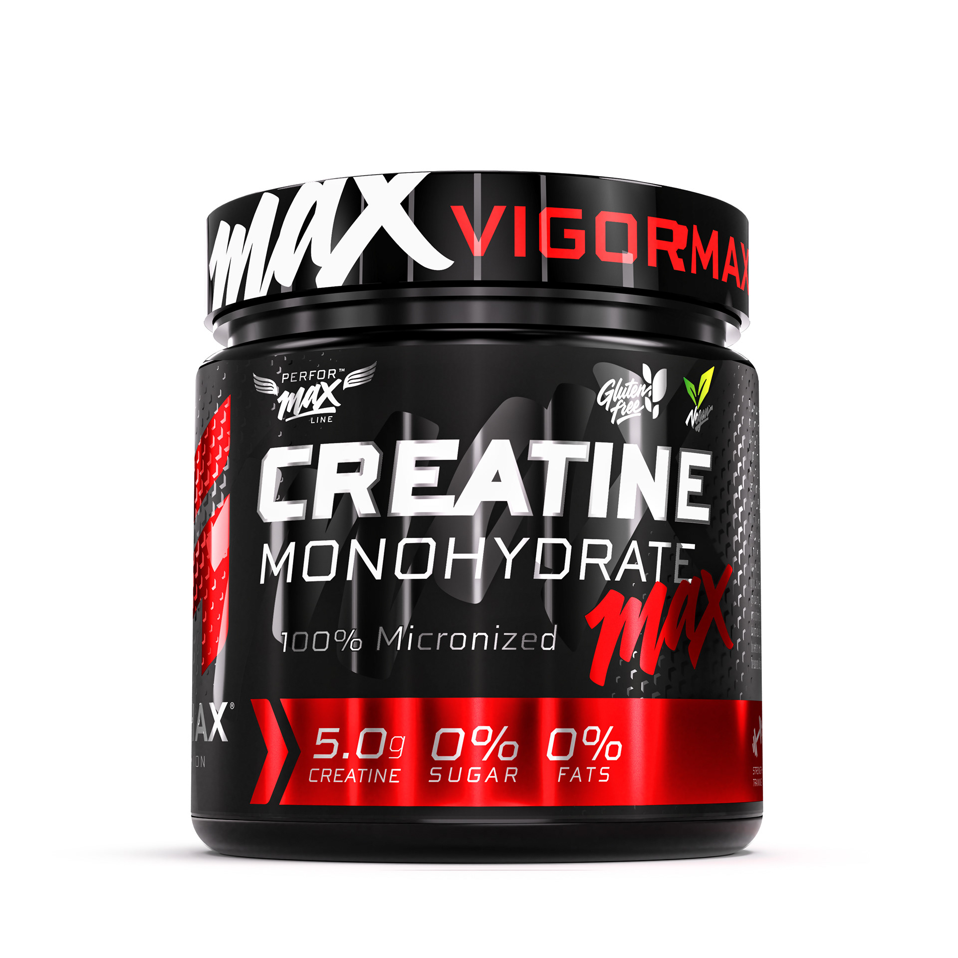
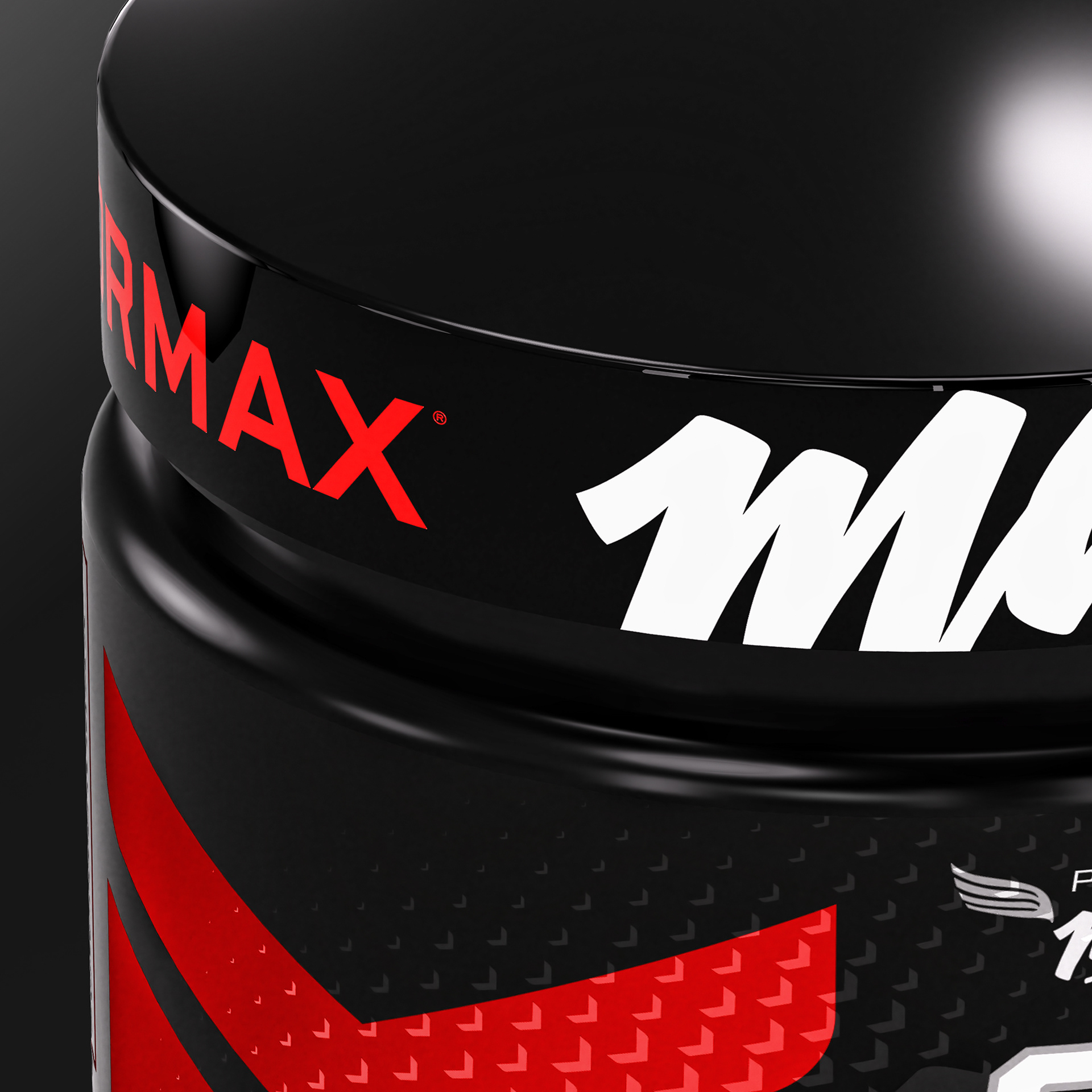
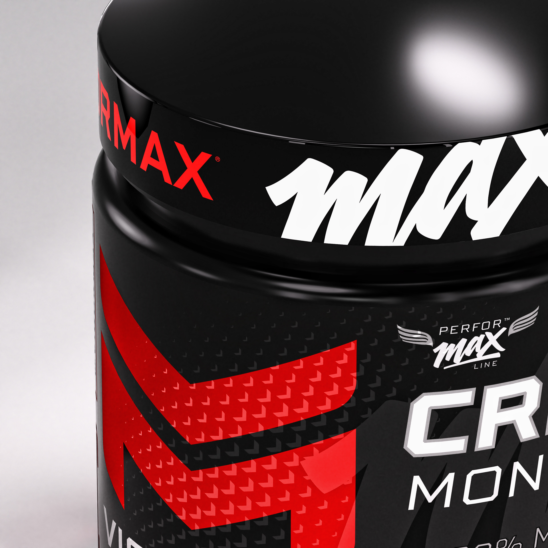
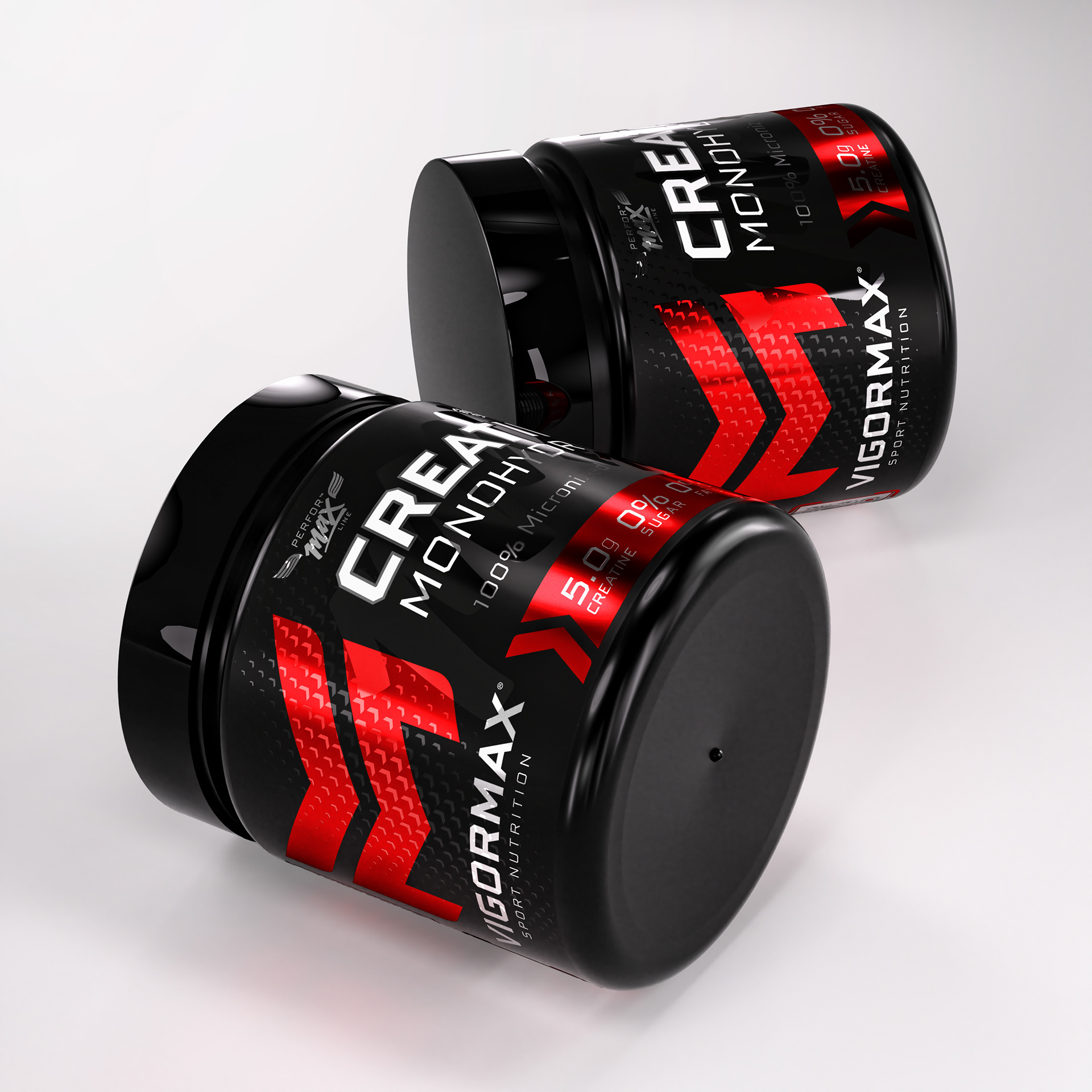
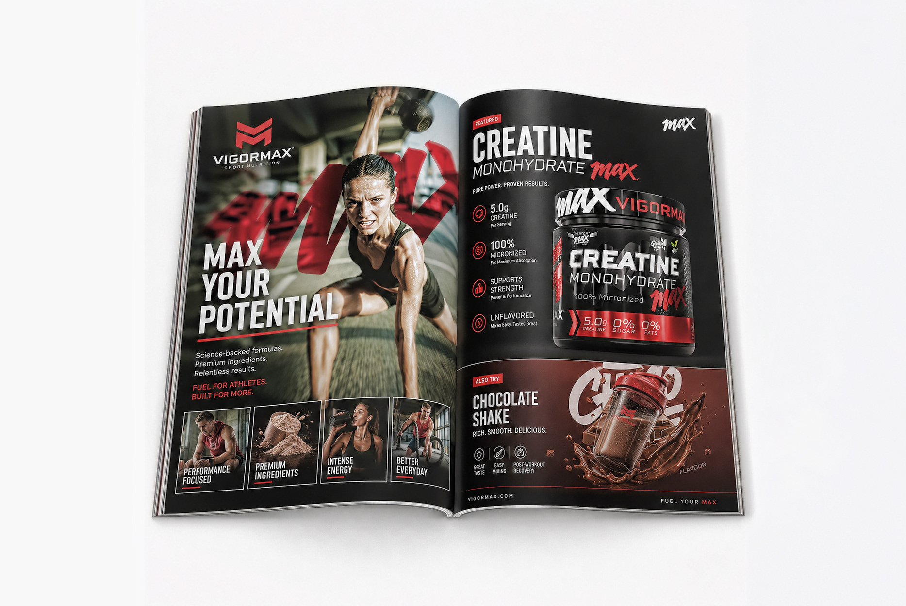
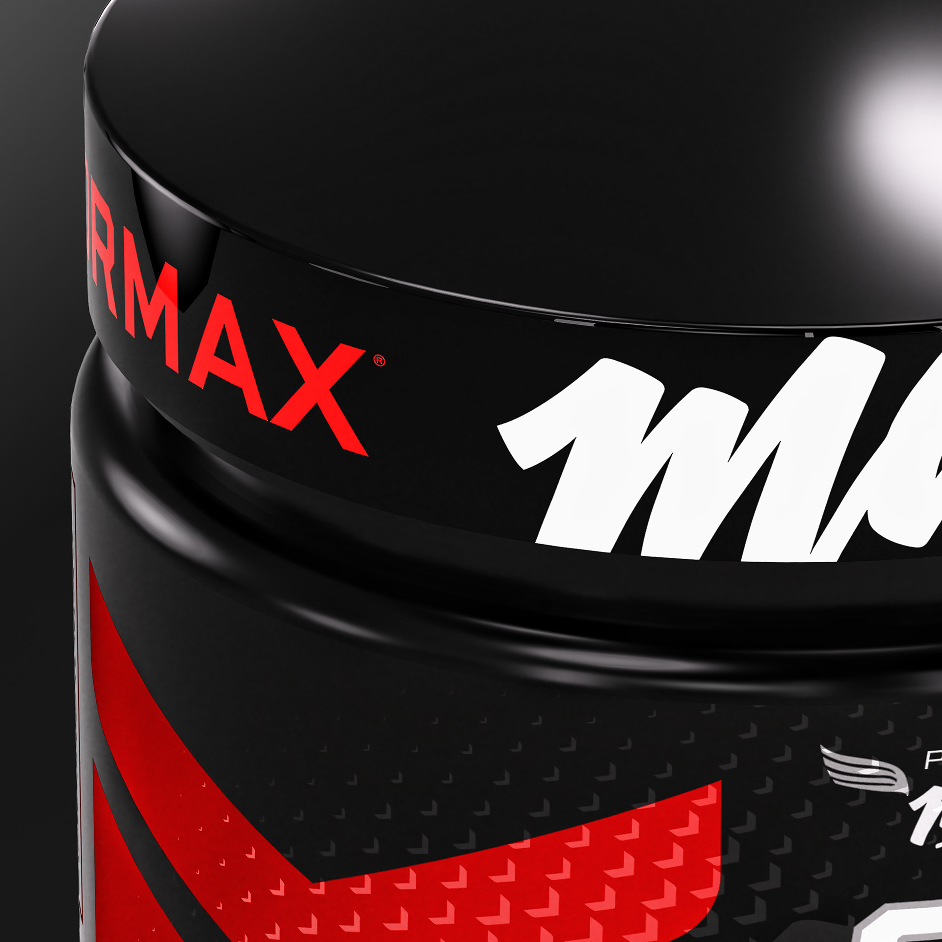
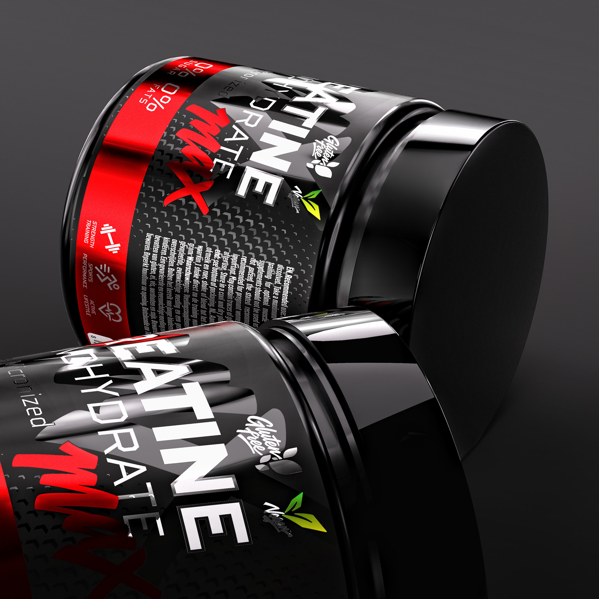
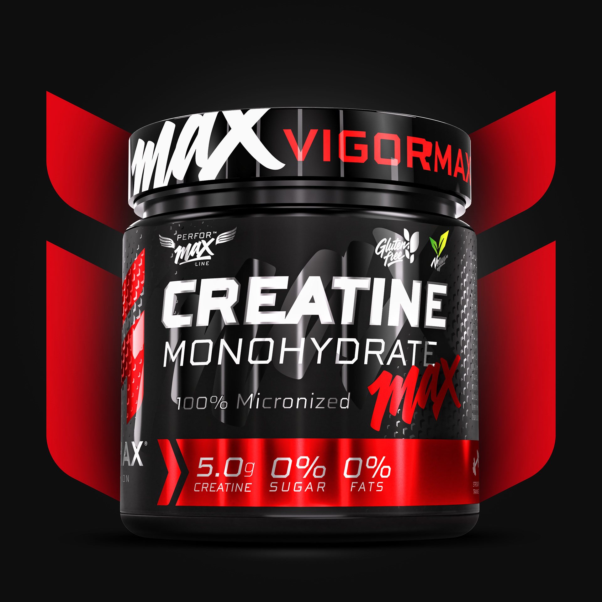
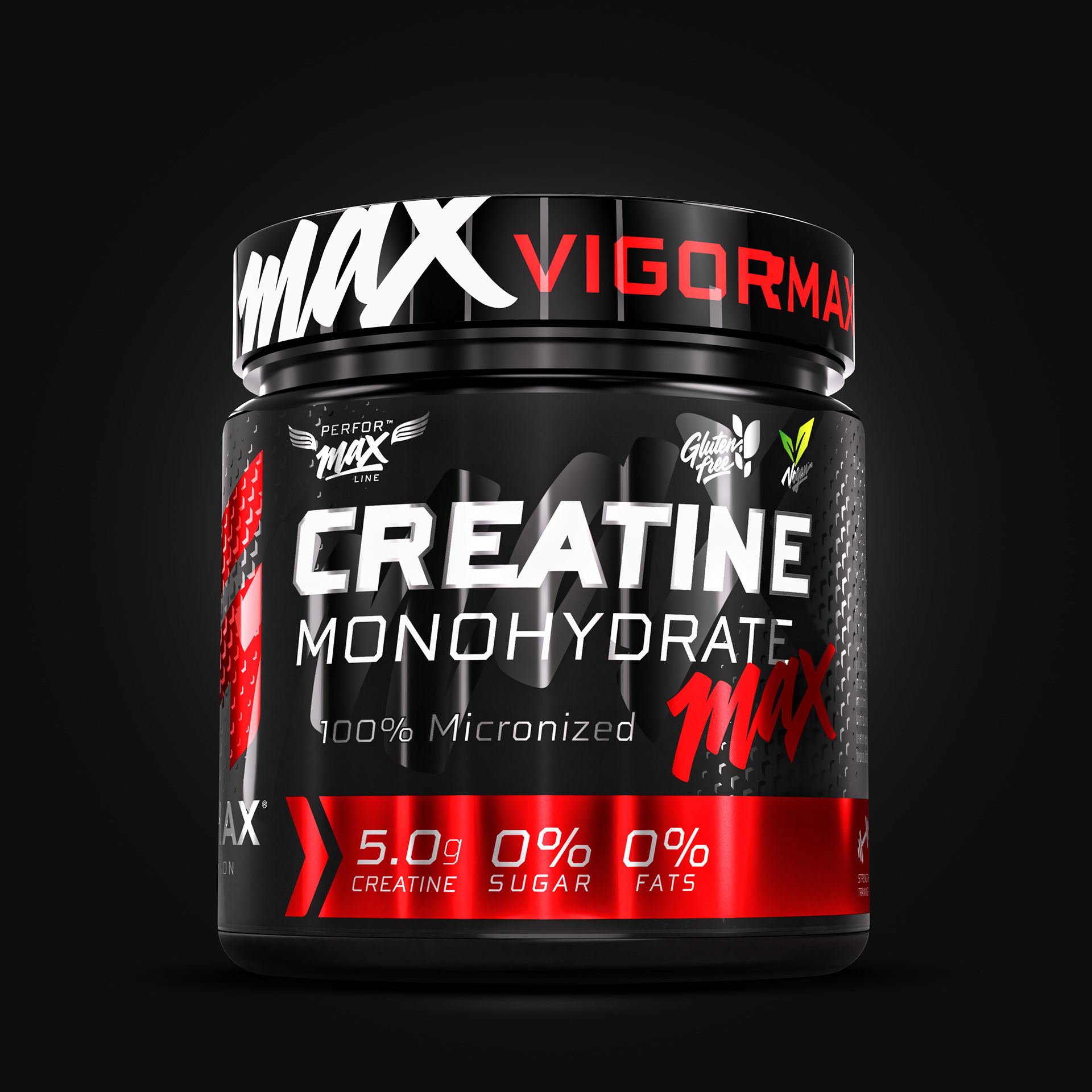
CREATINE MONOHYDRATE MAX extends the visual language of VIGORMAX through a powerful, compact and highly structured packaging design. A deep black base is combined with metallic red accents, bold typography and technical textures to communicate strength, precision and explosive performance.
The prominent product name creates immediate shelf impact, while the expressive MAX signature identifies and energises the product line. Key benefits and nutritional information are organised through a clear visual hierarchy, resulting in a design that feels intense, modern and unmistakably athletic.
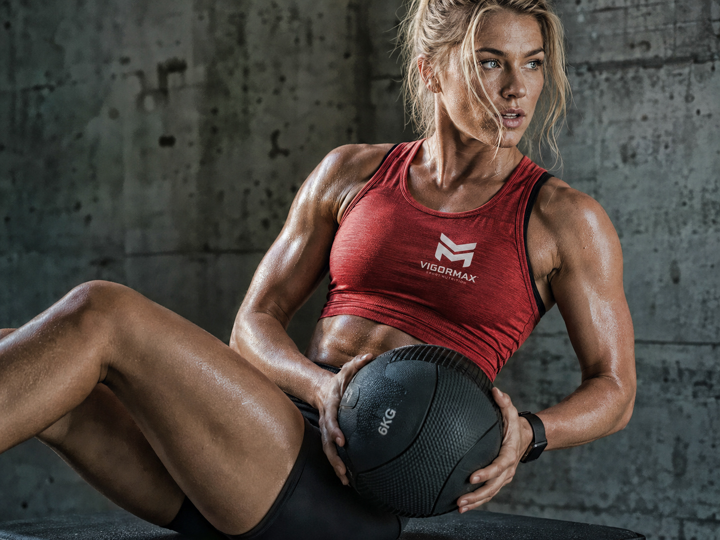
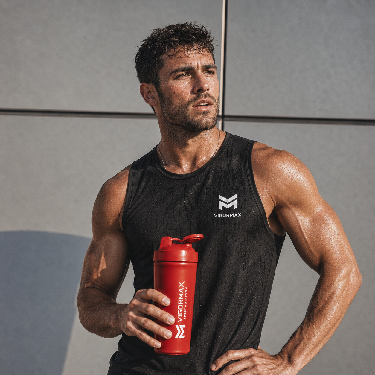
This new identity for VIGORMAX is much more than a visual transformation. It is the result of a focused creative process in which every shape, colour, texture and detail has been designed with intention. My goal was to build a brand that feels powerful, technical and unmistakably athletic, while remaining clear, consistent and ready to evolve.
From the strength of the main symbol to the expressive energy of the MAX signature, every element works together to create a bold and recognisable visual system. An identity designed not only to stand out, but to communicate performance, ambition and confidence at every point of contact.
Behind this project are countless decisions, refinements and hours of work, driven by the belief that design should do more than look strong. It should give a brand direction, character and meaning. I hope that, as you explore this presentation, you can feel the same intensity and passion that shaped every stage of VIGORMAX.