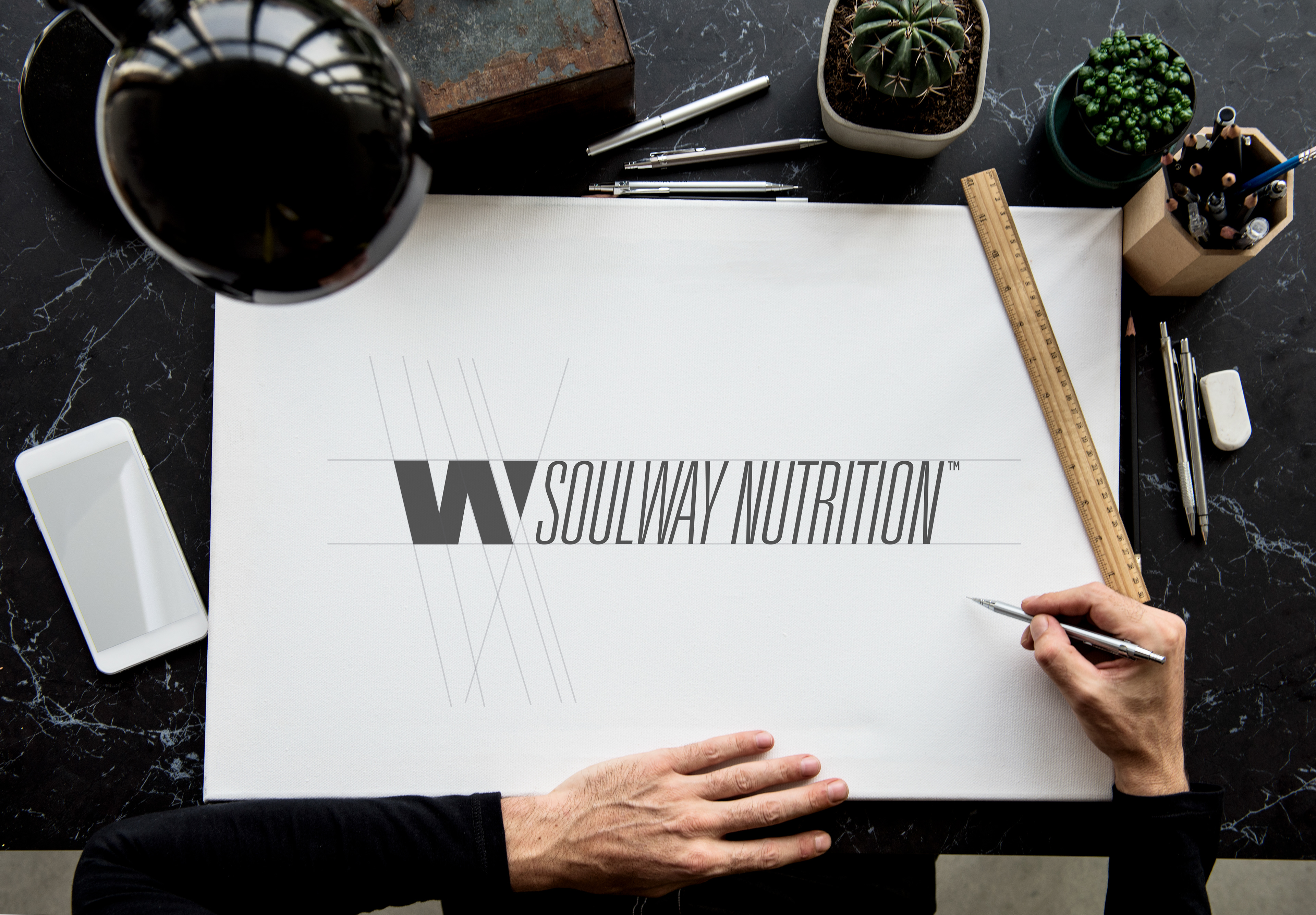
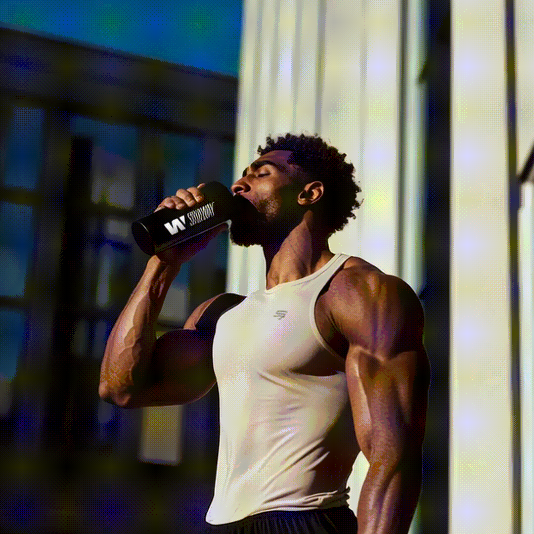
SoulWay Nutrition™
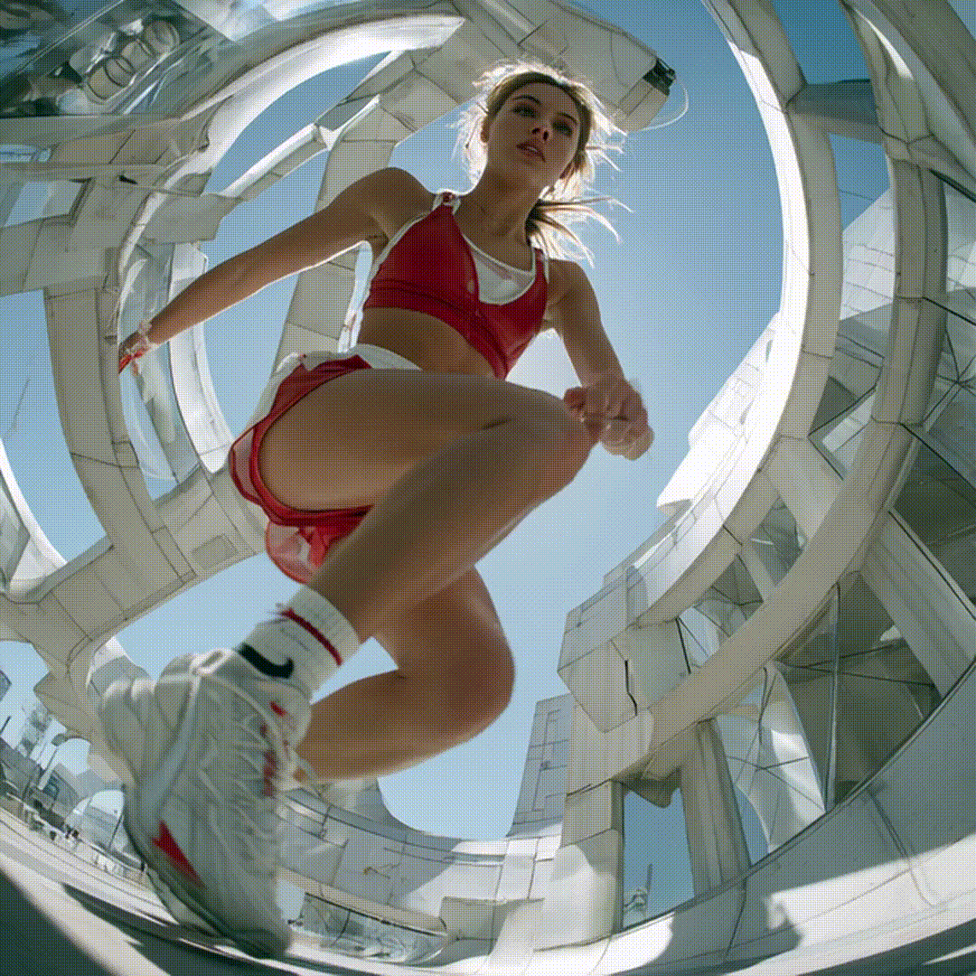
Harder lines and curbless apexes to show more aggressiveness, sportiness and freshness with today's times.
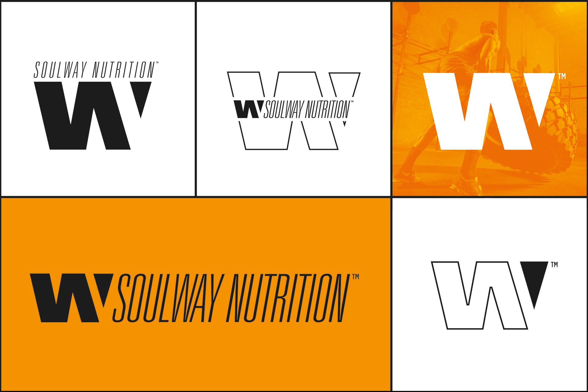
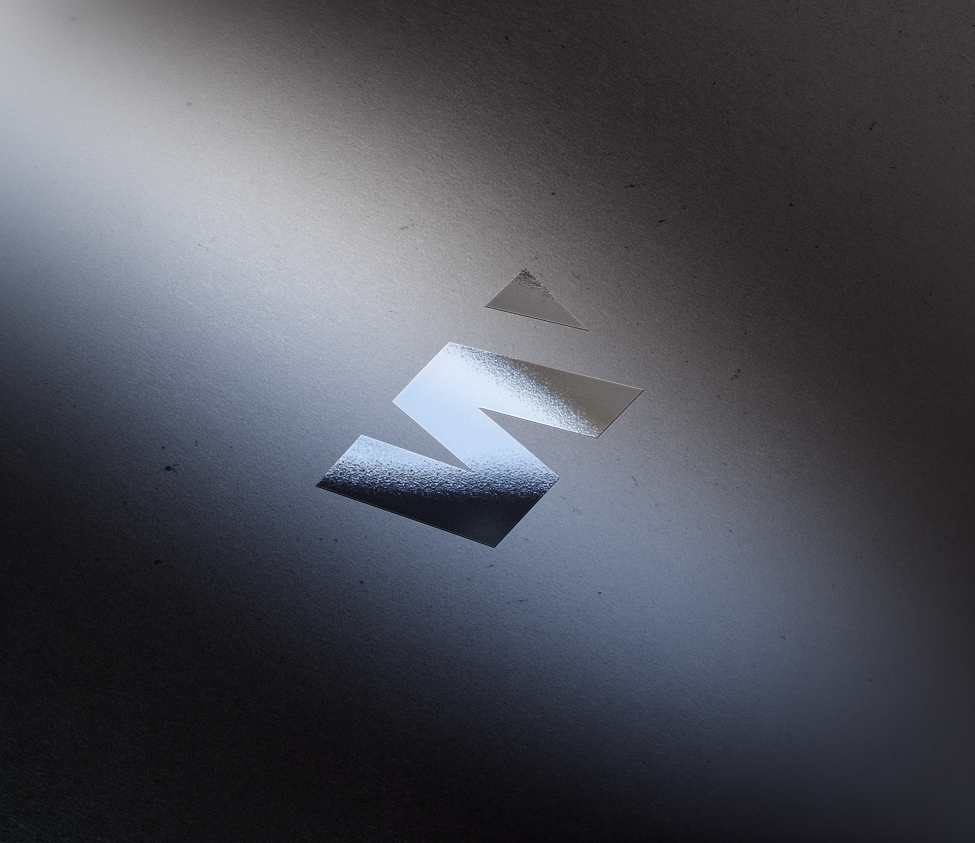
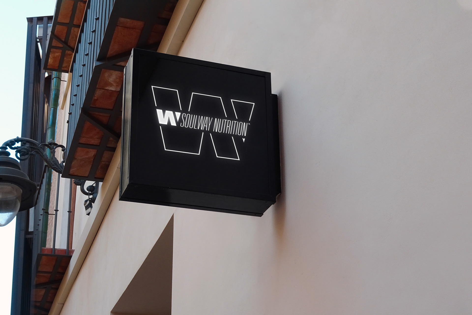
We have managed to merge the brand initials "S" & "W" in the same isotype.

This is how the brand will look in different media.
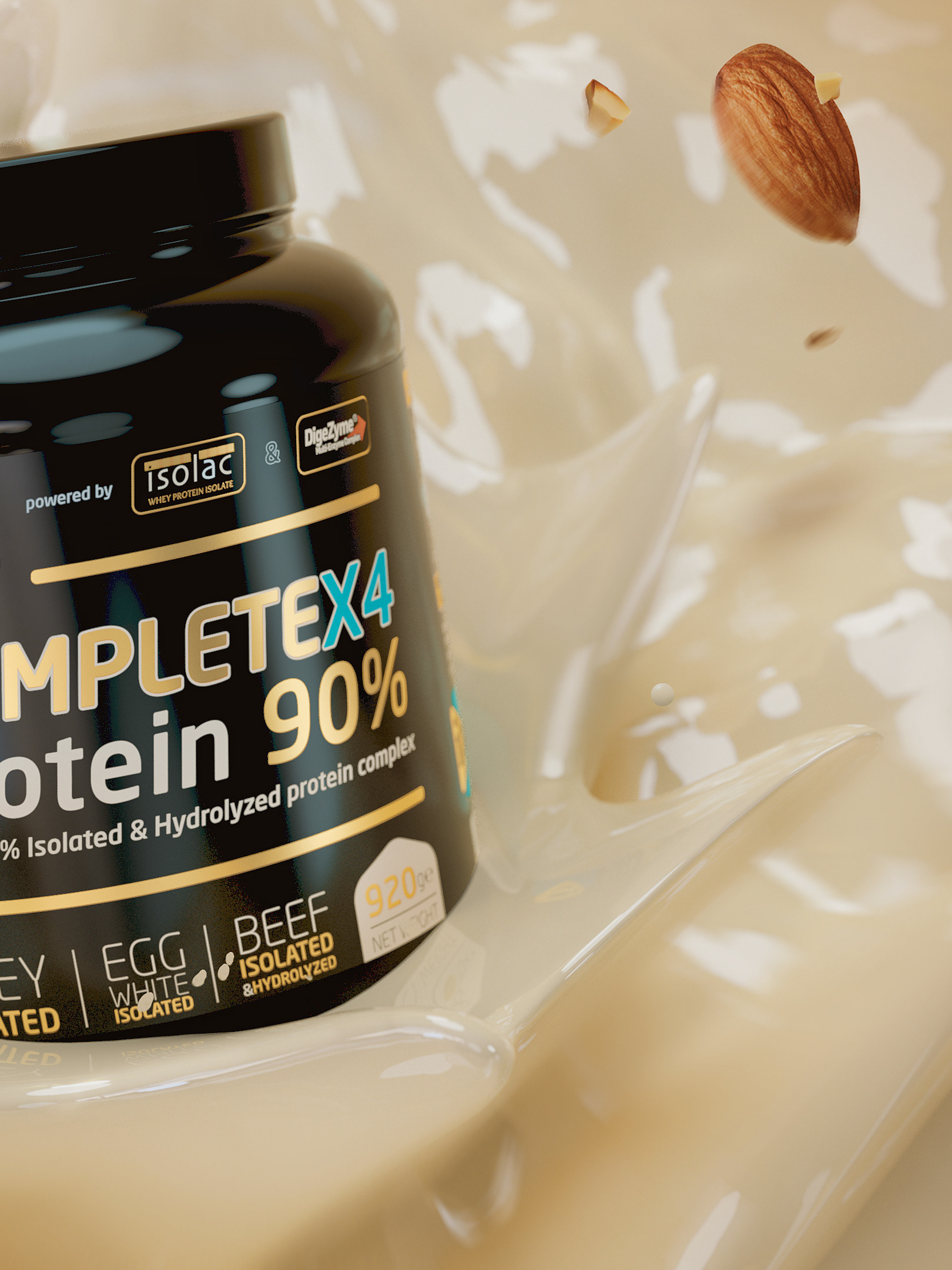
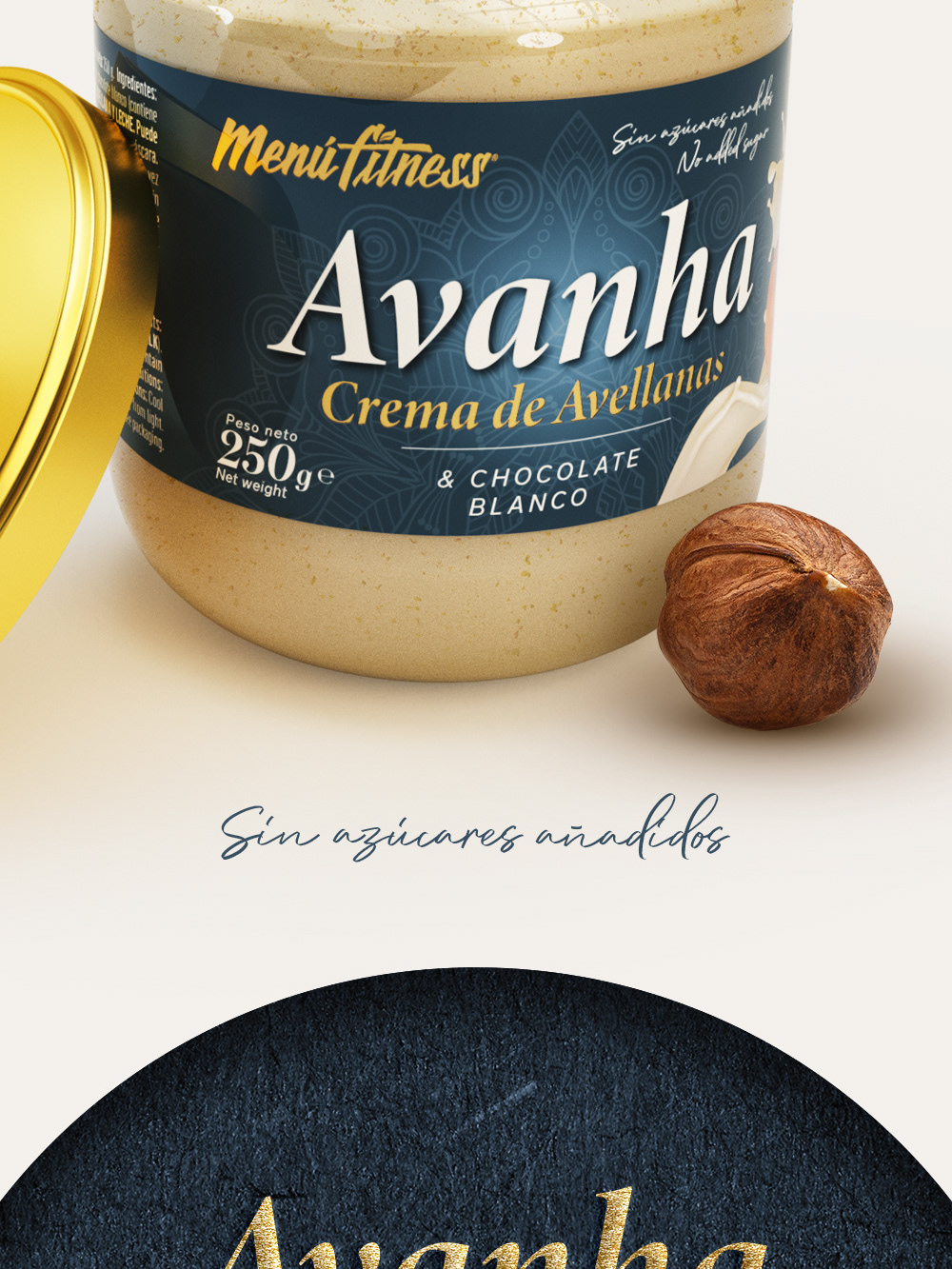
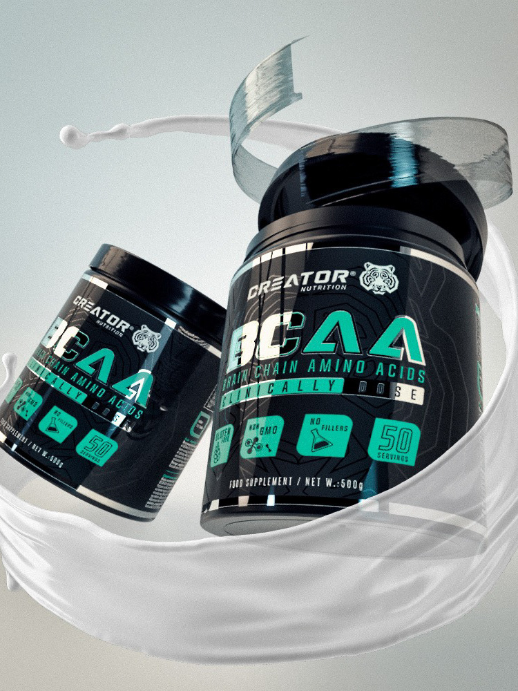
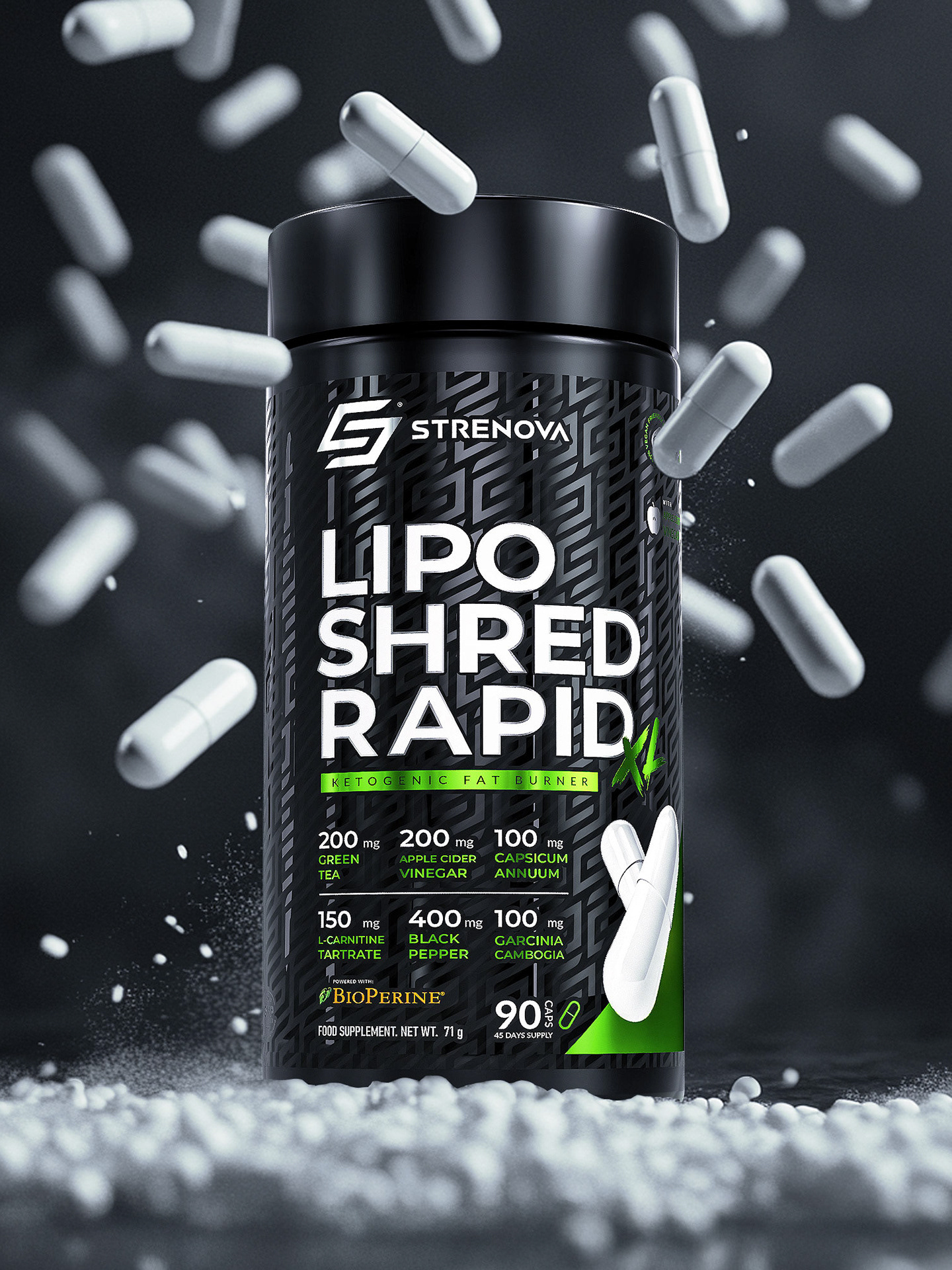
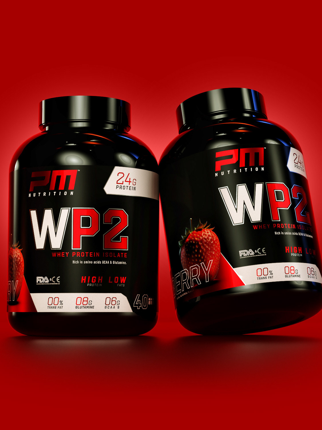
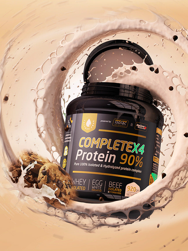
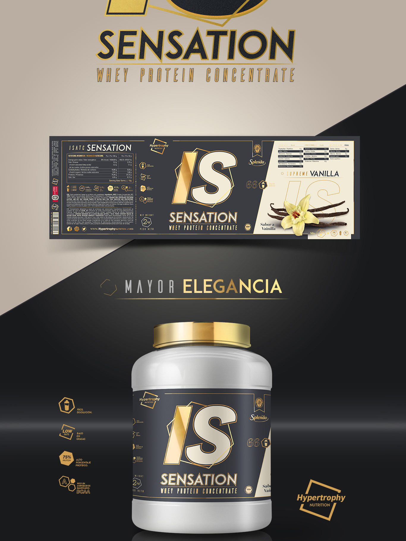
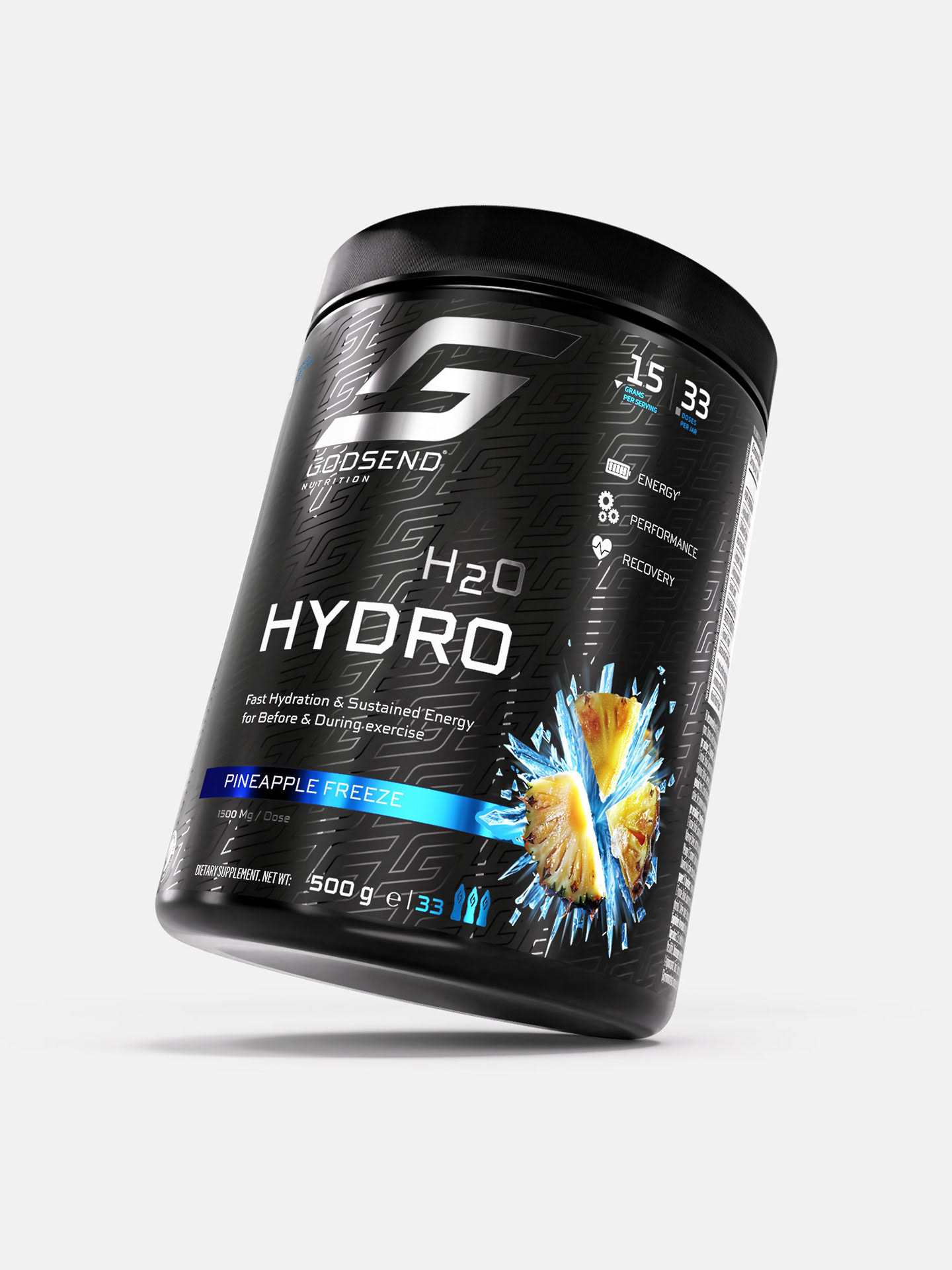
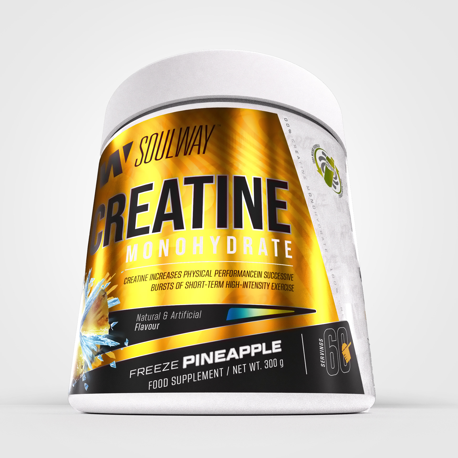
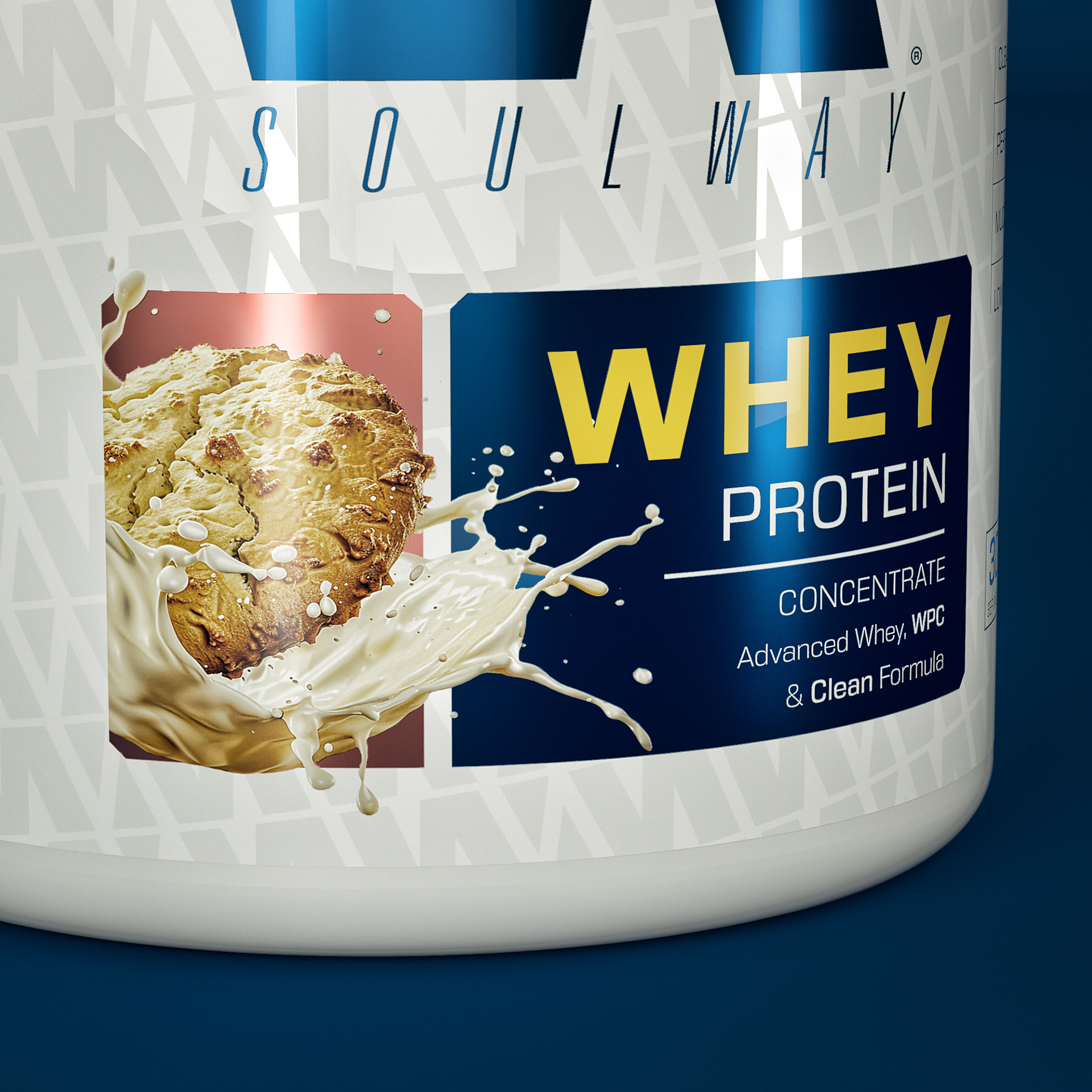
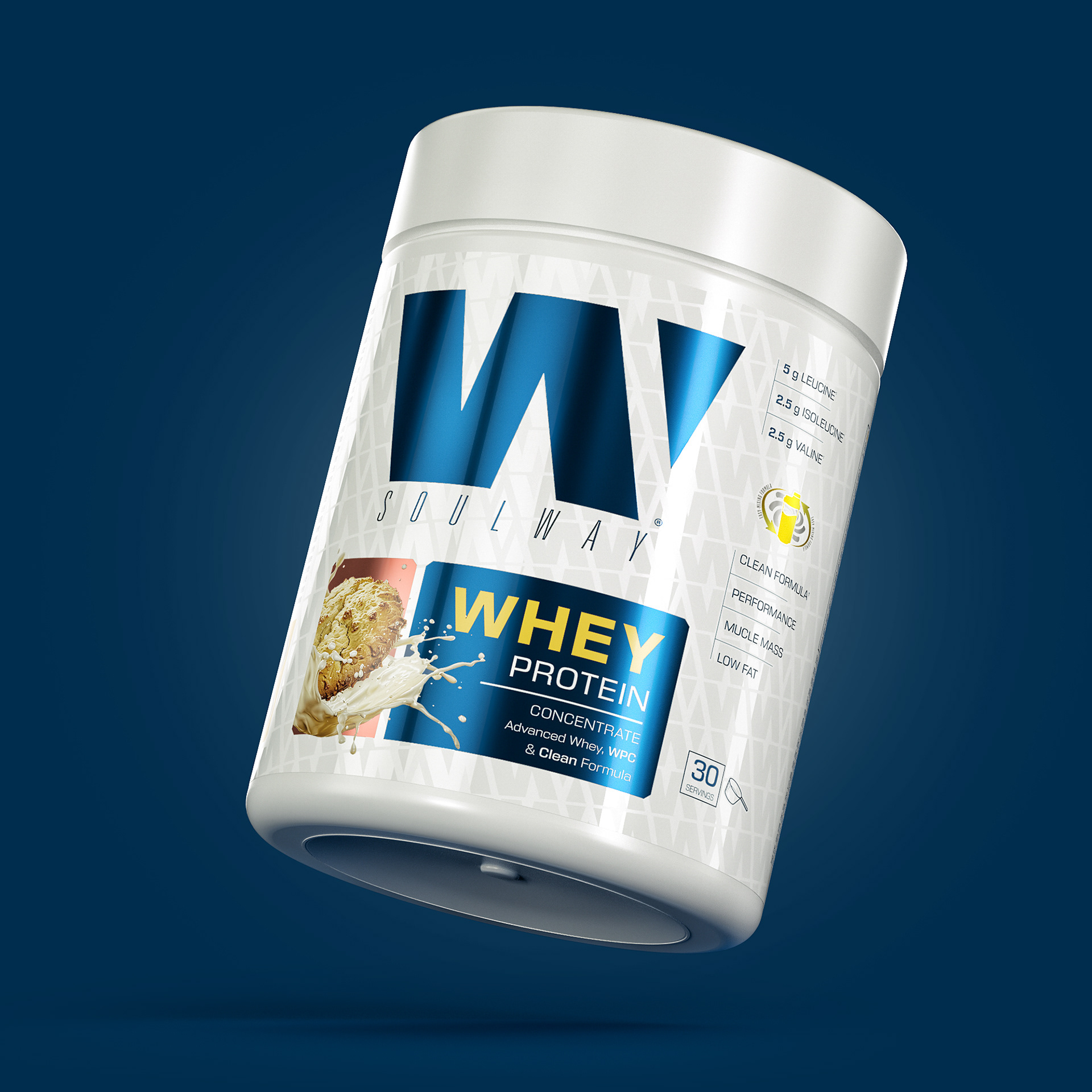
The product:
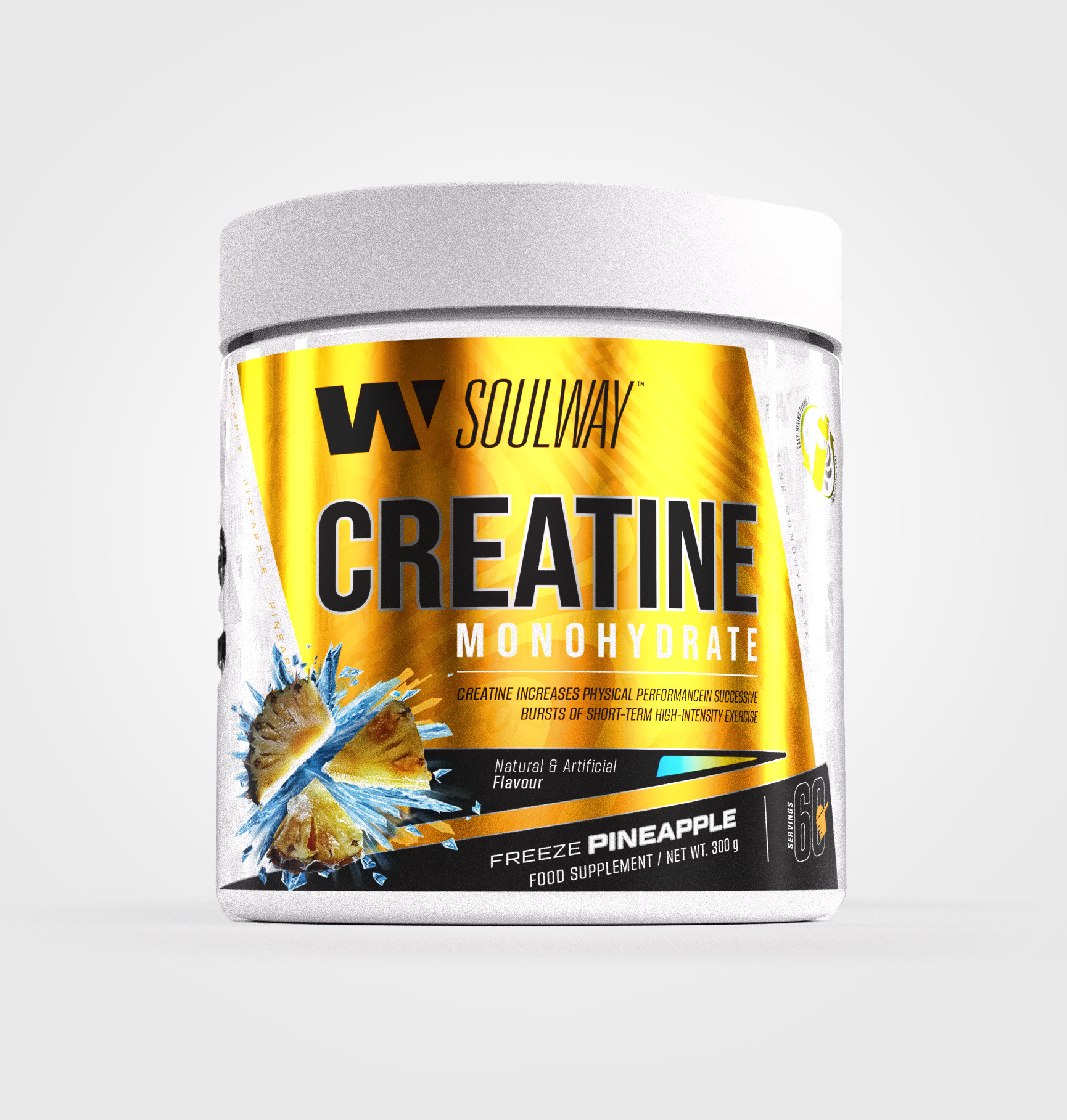
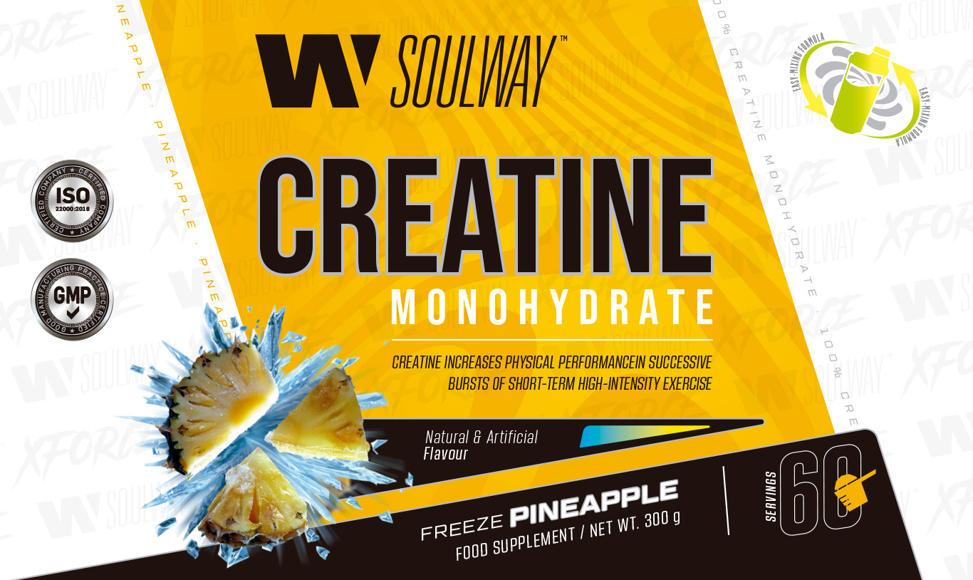
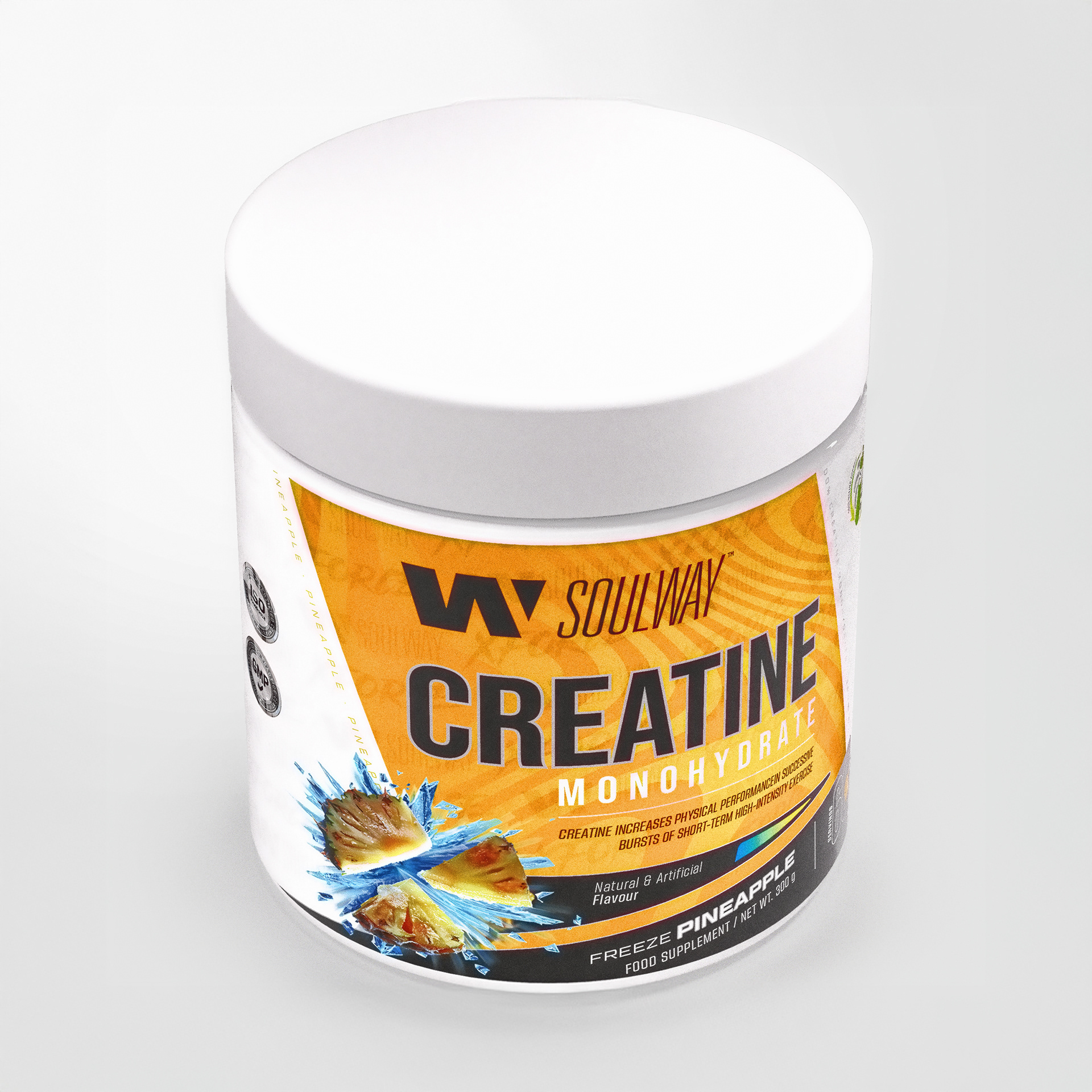
The headline was updated with a clean, modern typeface for a stronger and more professional presence. The background now features dynamic geometric shapes that add depth and movement, replacing simple gradients. A premium gold palette contrasts with darker tones, while the explosive pineapple imagery reinforces freshness and flavor recognition. The result is a bold, modern label that balances impact with clarity.
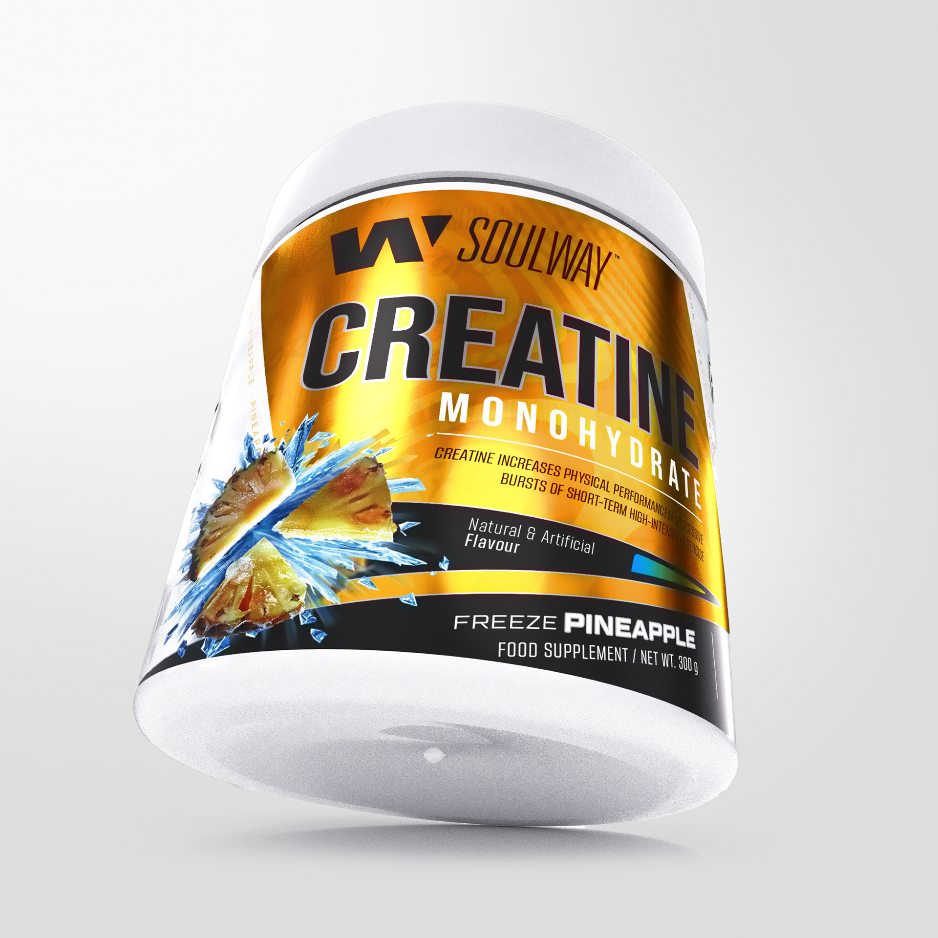


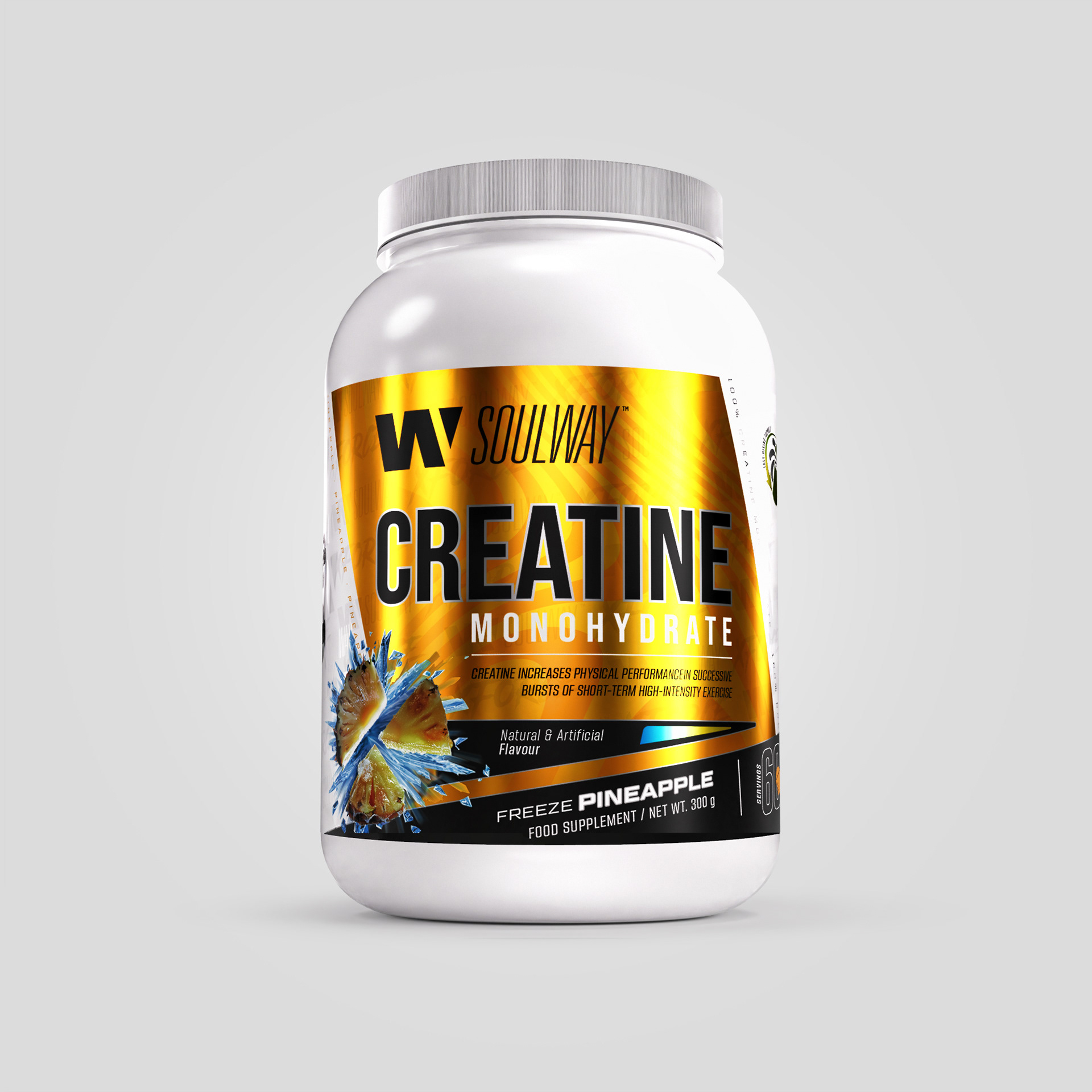
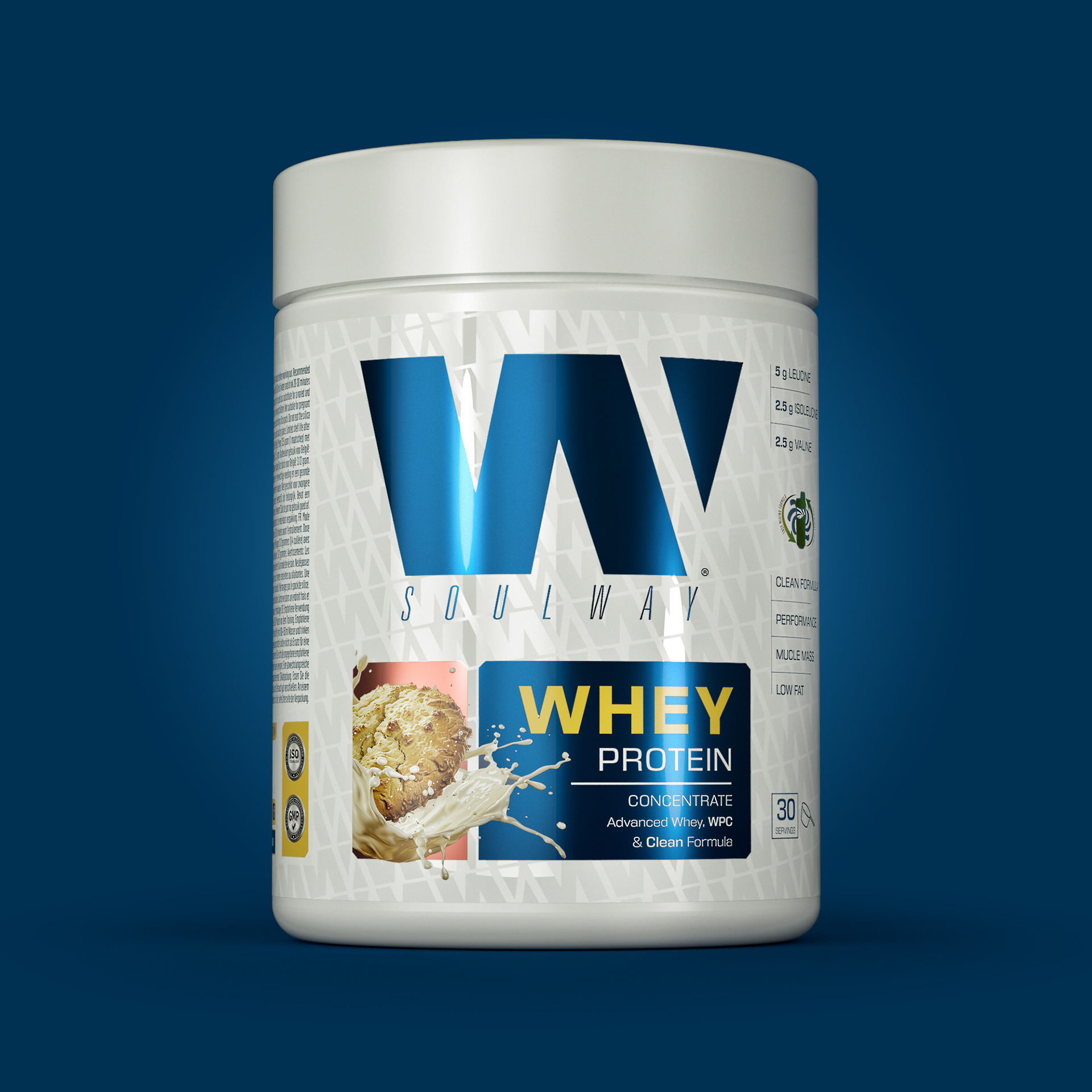
When adapted to a larger jar, the design gains even more visual impact. The clean, bold typography maintains excellent legibility from a distance, while the dynamic background shapes scale naturally, creating a strong sense of movement across the wider surface. The metallic gold finish becomes more dominant on the bigger canvas, enhancing the premium perception. Flavor imagery, such as the pineapple explosion, has more breathing space, allowing it to stand out as a powerful focal point. Overall, the design translates seamlessly to bigger packaging, ensuring consistency across the product line while amplifying shelf presence.
V E R S I O N 3
Thanks for watching.