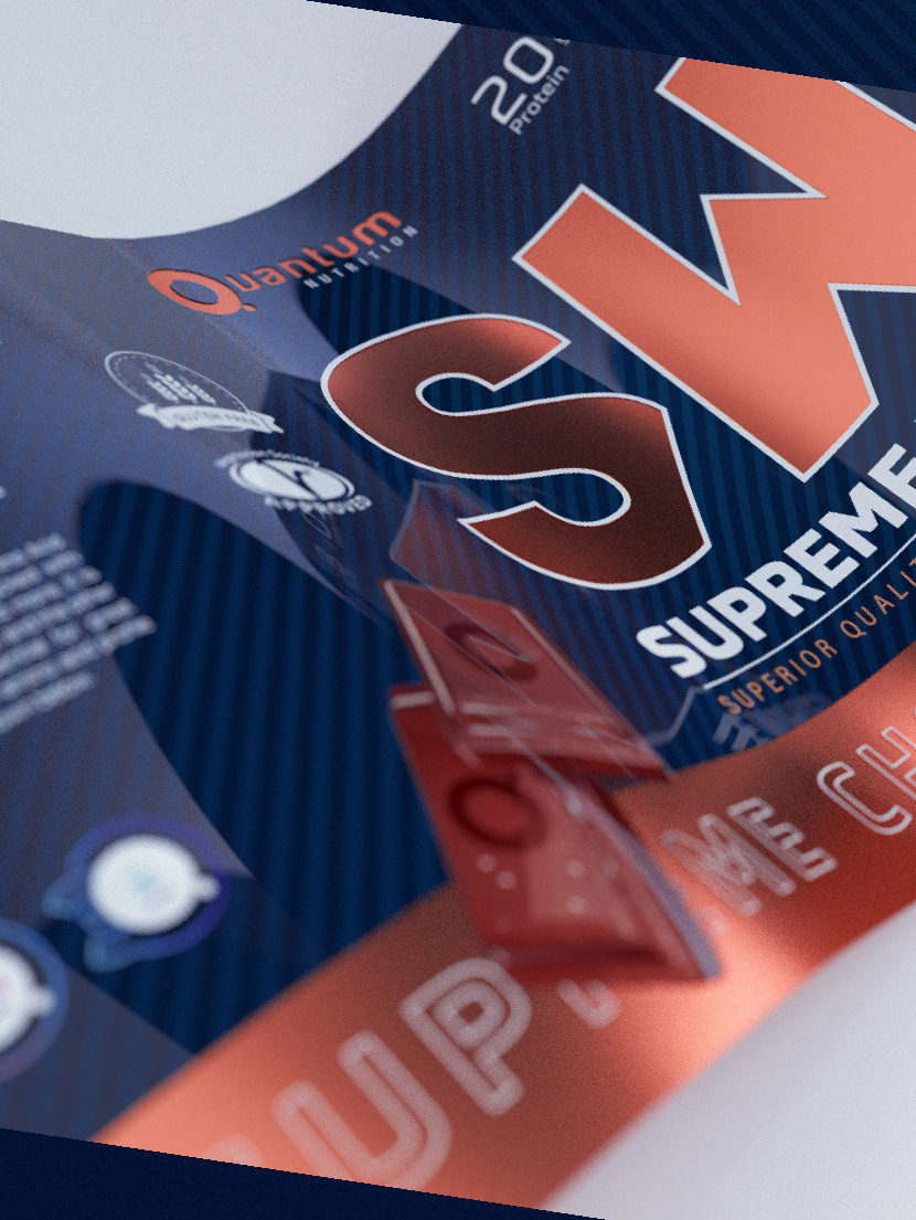

Sticking to Quantum Nutrition's initial design, we have used the minimalist front, identifying the protein with that big WS, which in practice could be any other two letters. For the logo we have used in this front the minimalist version (Isotype). At the bottom left the full name of the supplement with an Arabic font, very similar to Emirates. Very subtly, we have a background with a glossy varnish that simulates an Arabic geometric pattern. Above, on the cover, a sleeve with the full logo accompanied by the Arabic pattern that resembles a type of Muslim hats called Kufi.

Silver cap version.

If in the black area we had an Arabian pattern, in the white area we will find lines inspired by the dunes of the Sahara desert.

The flavor identifier, also minimalist, gives a touch of color and image to the product.

The gold version offers a different vision, closer to luxury.

Here I offer you a different version of what Sahara Nutrition could be. Less minimalist and closer to the Saharaui spirit.


'SAHARA NUTRITION' | Canada
Graphic Designer | Javier Toscano
Modeleling and Render 3D | Javier Toscano
Retoucher | Javier Toscano
Modeleling and Render 3D | Javier Toscano
Retoucher | Javier Toscano
hola@javiertoscano.com