If the product were packaged in the same type of can that we have seen in other inspirations, it would look very similar to this one.

We had to indicate many features of this product, so in order not to confuse the customer, we have placed all the highlights on the right, in the same place, so that you can see all its qualities at once.

The title will consist of two different text fonts; the first will refer to the Sahara world, will be white and smaller in size. The second, sans serif, Bold and metallic gold, will be the eye-catching impact. It suggests luxury and elegance.

The HALAL seal, which corresponds more to a quality seal than to an ingredient, is on the left, on the same side as the flavour.

Not bad at all. But this would be the real presentation of the product. The same label on our 4000 ml container:


Here we can see in detail the lines that simulate the desert sand, the dunes, where we have used one of these lines to indicate the flavour by changing the colour:


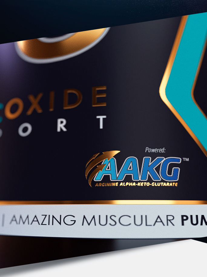
On the background, the Arabic pattern is only made with gloss varnish on matt varnish.

'ENRICHED ISO' SAHARA NUTRITION | CANADA
Graphic Designer | Javier Toscano
Modeleling and Render 3D | Javier Toscano
Retoucher | Javier Toscano
Modeleling and Render 3D | Javier Toscano
Retoucher | Javier Toscano
hola@javiertoscano.com